Filter Control
- 3 minutes to read
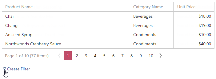
The filter control allows end-users to build complex filter criteria with an unlimited number of filter conditions, combined by logical operators.
This topic contains the following sections:
- How to invoke the filter control
- How to specify the filter control elements visibility
- Filter operators visibility
How to Invoke the Filter Control
The filter control can be invoked by clicking the filter image or filter expression displayed in the filter bar. To show the filter bar, set the TreeListSettings.ShowFilterBar property to one of the following values.
- Hidden - The filter bar is always hidden.
- Visible - The filter bar is always visible.
- Auto - The filter bar is shown when grid data is filtered (for example, by the filter row or header filter).
You can control the filter control’s visibility programmatically using the following methods:
| Action | Client-side methods | Server-side methods |
|---|---|---|
| Show | ASPxClientTreeList.ShowFilterControl | ASPxTreeList.ShowFilterControl |
| Hide | ASPxClientTreeList.CloseFilterControl | ASPxTreeList.HideFilterControl |
How to Specify the Filter Control Elements Visibility
Tab Visibility
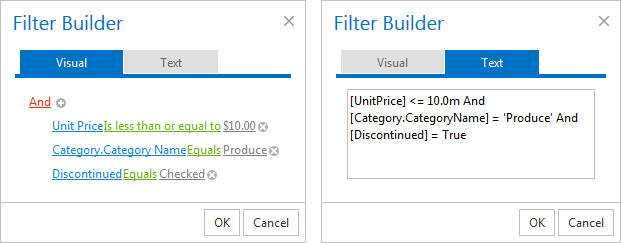
End-users can create filter criteria using the Visual tab or by typing the criteria as text (Text tab). The Text tab is disabled by default. Set the ASPxGridFilterControlSettings.ViewMode property to VisualAndText to enable both the Text and Visual tabs. A tab’s content is automatically synchronized.
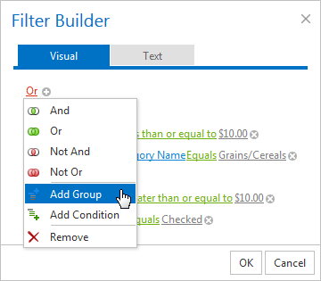
Group Operator Visibility
Specify the group operators’ visibility in the drop-down menu using the ASPxGridFilterControlSettings.GroupOperationsVisibility property.
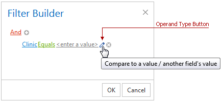
Operand Type Button Visibility
The operand type button allows end-users to switch a filter condition between two modes: comparing a field’s value to a value; or comparing a field’s value to another field’s value. Use the ASPxGridFilterControlSettings.ShowOperandTypeButton property to show this button visible.
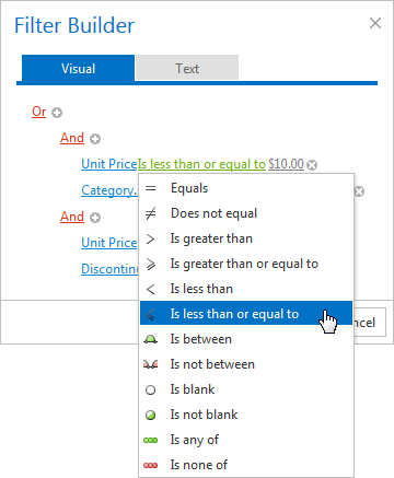
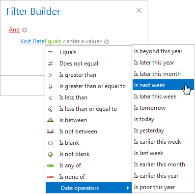
Visibility of Filter Operators
The filter control drop-down window displays different comparison operators based on the column data type. The table below lists comparison operator’s visibility for different column types.
| Filter Comparison Operator | String Column[1] | ComboBox Column | Binary Image Column | Date Column | Other Type Column (Numbers, etc.) |
|---|---|---|---|---|---|
| Equals | yes | yes (default value) | no | yes (default value) | yes |
| Does not equal | yes | yes | no | yes | yes |
| Is greater than | yes | no | no | yes | yes (default value) |
| Is greater than or equal to | yes | no | no | yes | yes |
| Is less than | yes | no | no | yes | yes |
| Is less than or equal to | yes | no | no | yes | yes |
| Is between | yes | no | no | yes | yes |
| Is not between | yes | no | no | yes | yes |
| Contains | yes | no | no | no | no |
| Does not contain | yes | no | no | no | no |
| Begins with | yes (default value) | no | no | no | no |
| Ends with | yes | no | no | no | no |
| Is like | yes | no | no | no | no |
| Is not like | yes | no | no | no | no |
| Is blank | yes | yes | no | yes | yes |
| Is not blank | yes | yes | yes (default value) | yes | yes |
| Is any of | yes | yes | yes | yes | yes |
| Is none of | yes | yes | no | yes | yes |
| Date operators[2] | no | no | no | yes | no |
Online Demos
-
A string column is a column containing string values or a column whose TreeListDataColumn.FilterMode property is set to DisplayText.
-
For date columns, the filter control displays an additional list of date operators.