Create a Report with Charts
- 8 minutes to read
This tutorial describes how to create a report that uses XRChart controls to visualize data.
You can view the online demo or view the desktop demo (the DevExpress Demo Center should be installed).
Add a new blank report to your application and follow the steps below to create a report with charts.
Bind to Data
In this tutorial, the report is bound to a federated data source that joins the order information from an SQL database with product categories stored as JSON data. The report’s data member is not set.
Create an SQL data source.
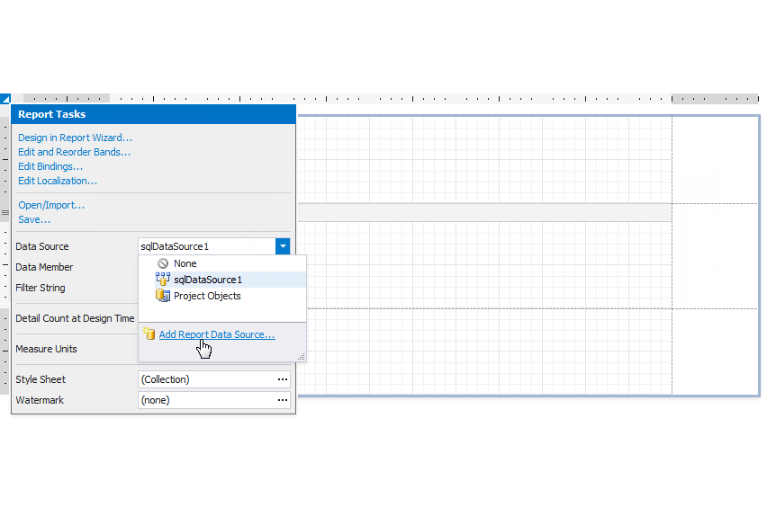
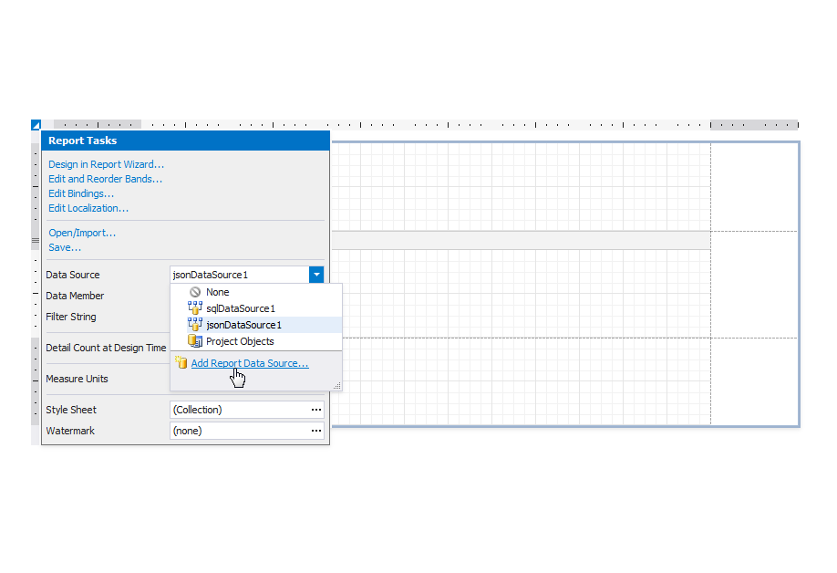
 property's drop-down list, and select **Add Report Data Source** to invoke the [Data Source Wizard](xref:120164).](/XtraReports/images/chart-report-sql-step1.png)
Click the report’s smart tag, expand the Data Source property’s drop-down list, and select Add Report Data Source to invoke the Data Source Wizard.
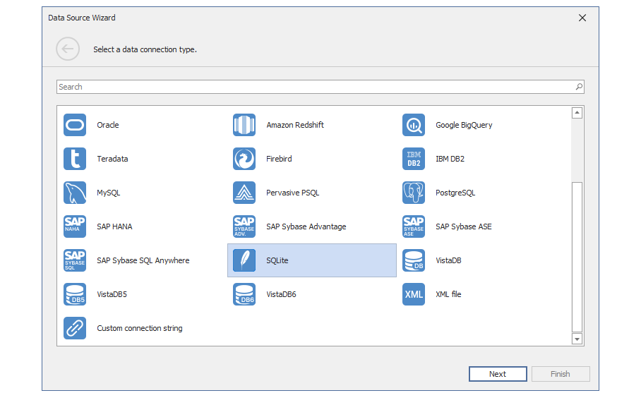
Select SQLite and click Next.
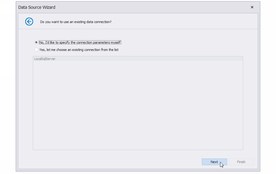
Select No, I’d like to specify the connection parameters myself and click Next.
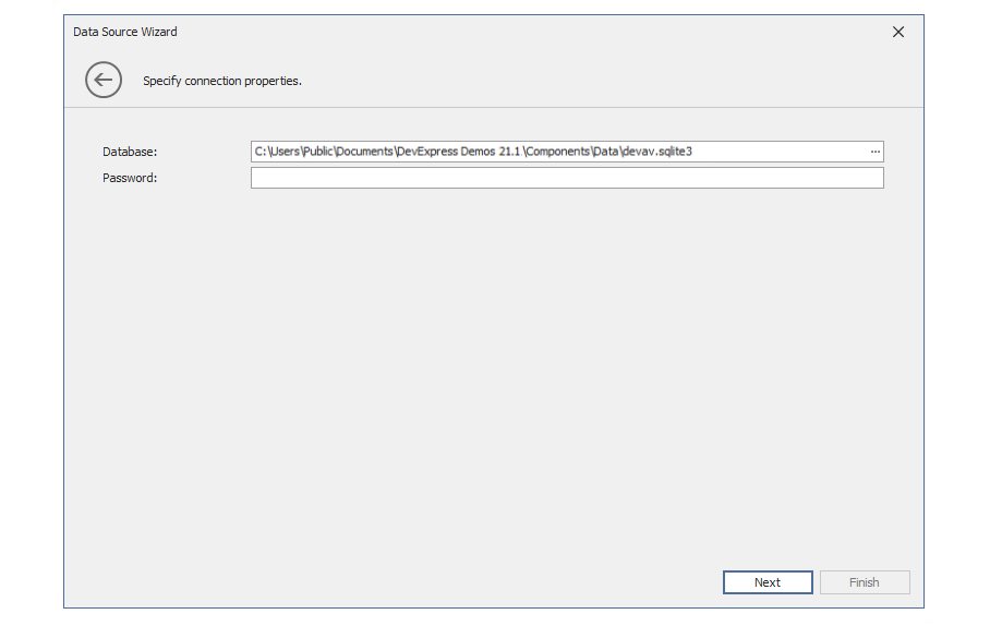
Select the devav.sqlite3 database that is included in the DevExpress Demo Center installation, and click Next.
.](/XtraReports/images/chart-report-sql-step5.png)
Click the plus button next to Queries to invoke the Query Builder.
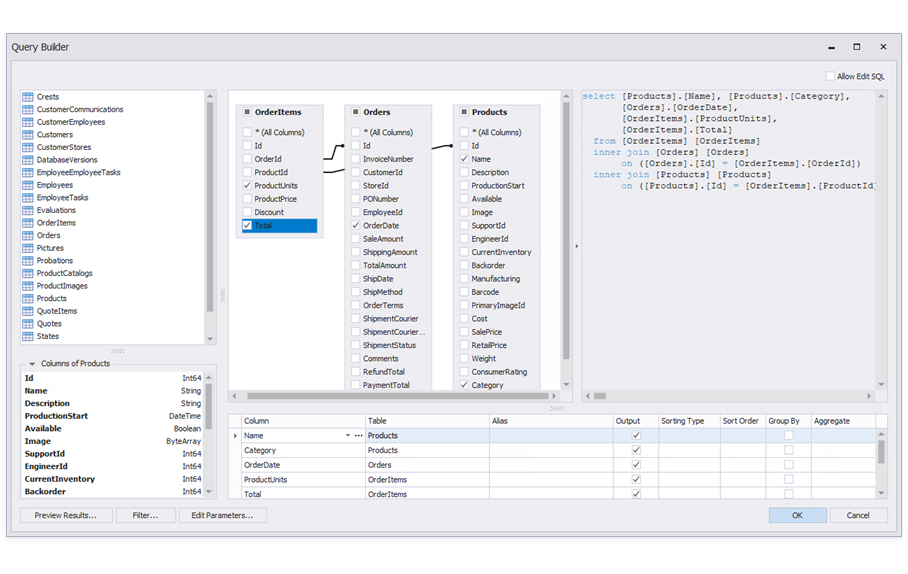
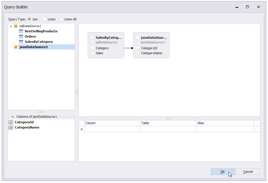
Build a query that joins the OrderItems, Orders, and Products database tables as shown on the image and click OK.
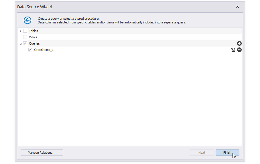
Click Finish to close the Data Source Wizard.
, right-click the created data source, and select **Manage Queries** from the context menu. Rename the query to _Orders_ in the invoked **Manage Queries** dialog.](/XtraReports/images/chart-report-sql-step8.png)
Switch to the Field List, right-click the created data source, and select Manage Queries from the context menu. Rename the query to Orders in the invoked Manage Queries dialog.
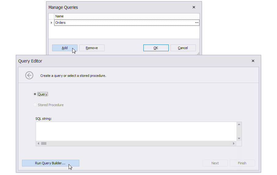
Click Add in the Manage Queries dialog, then click Run Query Builder.
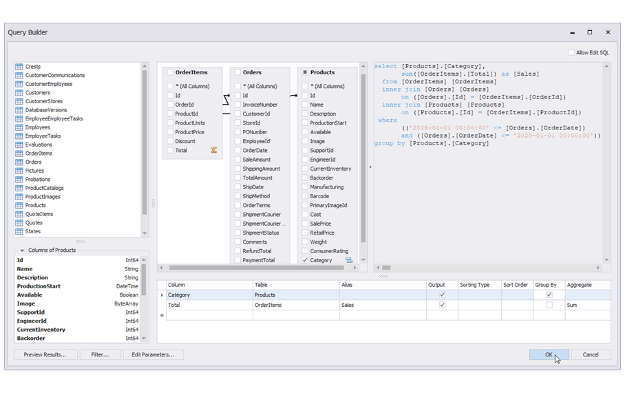
Create another query as shown on the image. Click OK to close the Query Builder and rename the new query to SalesByCategory.
Create a JSON data source.
Click the report’s smart tag, expand the Data Source property’s drop-down list, and select Add Report Data Source to invoke the Data Source Wizard.
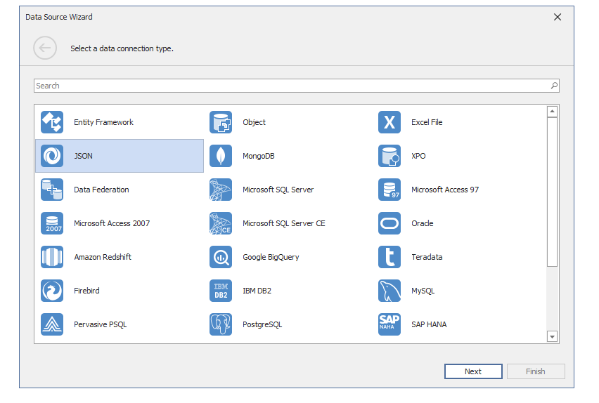
Select JSON and click Next.
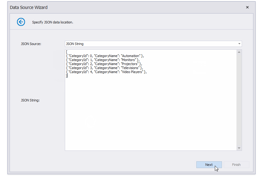
Set JSON Source to JSON String, specify the JSON String as shown on the image, and click Next.
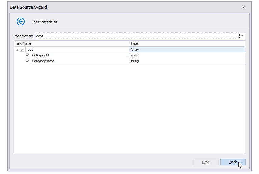
Click Finish to close the Data Source Wizard.
Create a Federation Data Source to unite the SQL and JSON data.
Click the report’s smart tag, expand the Data Source property’s drop-down list, and select Add Report Data Source to invoke the Data Source Wizard.
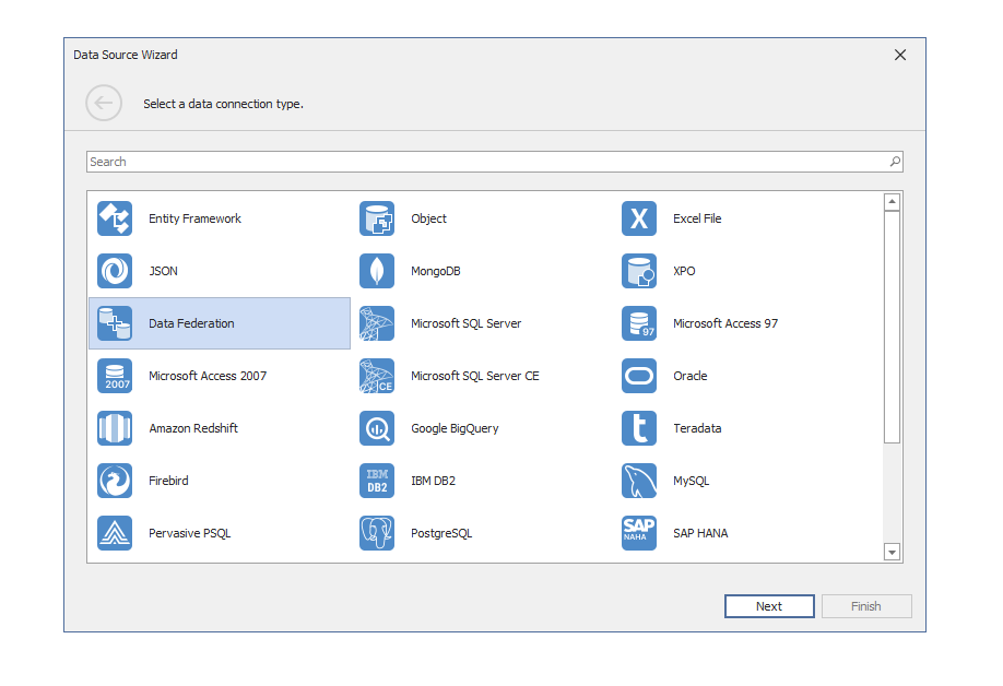
Select Data Federation and click Next.
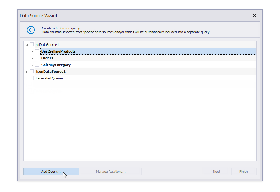
Click Add Query to invoke the Query Builder.
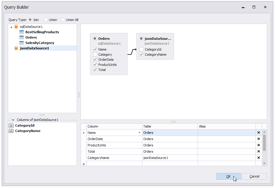
Create a query that joins the SQL data source’s Orders table with JSON data as shown on the image and click OK.
Click Add Query to invoke the Query Builder again. Create a query that joins the SQL data source’s SalesByCategory table with JSON data and click OK.
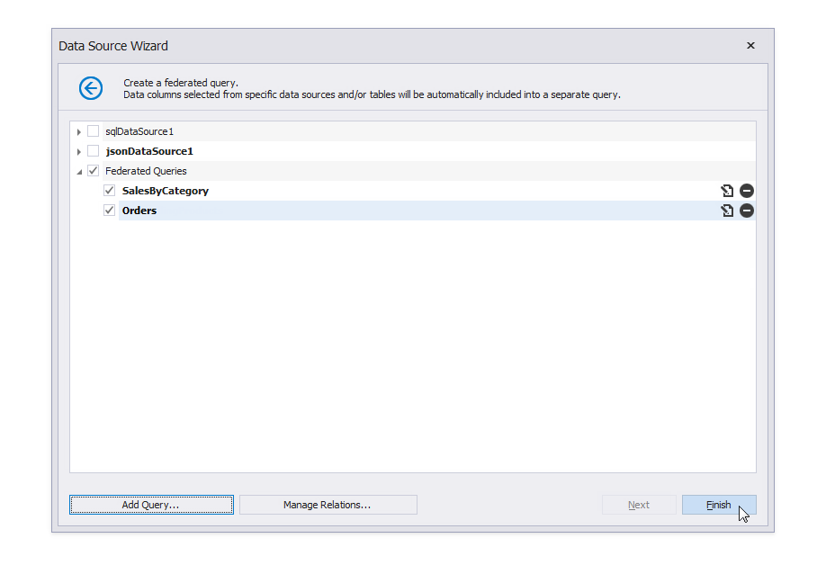
Click Finish to close the Data Source Wizard.
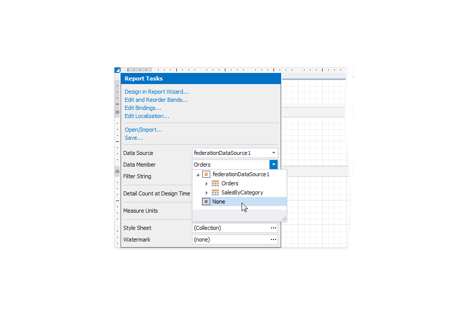
The report is bound to the created data source and data member. Expand the report’s smart tag and set Data Member to None.
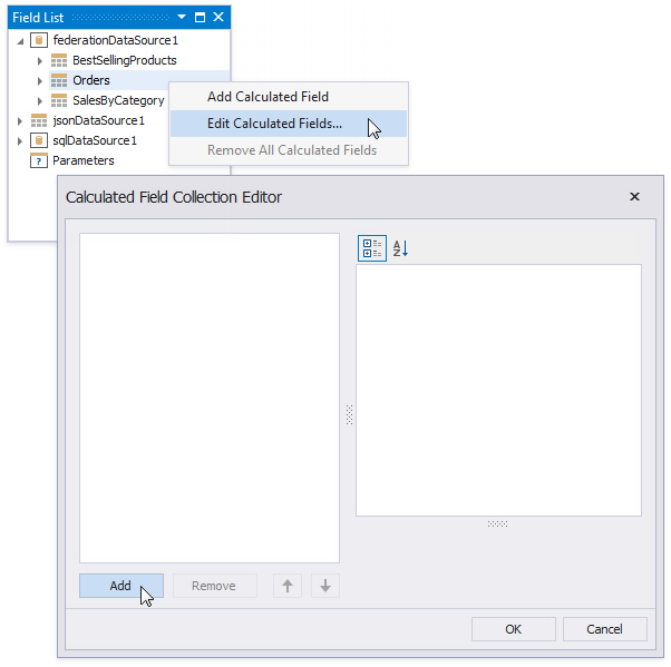
Add calculated fields to the Field List.
Right-click Orders in the Field List and select Edit Calculated Fields from the context menu. In the invoked Calculated Field Collection Editor, click Add to add a calculated field.
Configure the following properties to create calculated fields:
Calculated Field Property Value Year DataMember Orders Expression GetYear([OrderDate]) FieldType Int32 Name Year Month DataMember Orders Expression [GetMonth([OrderDate])] FieldType Int32 Name Month Quarter DataMember Orders Expression [Month] / 4 + 1 FieldType Int32 Name Quarter TotalSales DataMember SalesByCategory Expression Sum([Sales]) FieldType Decimal Name TotalSales
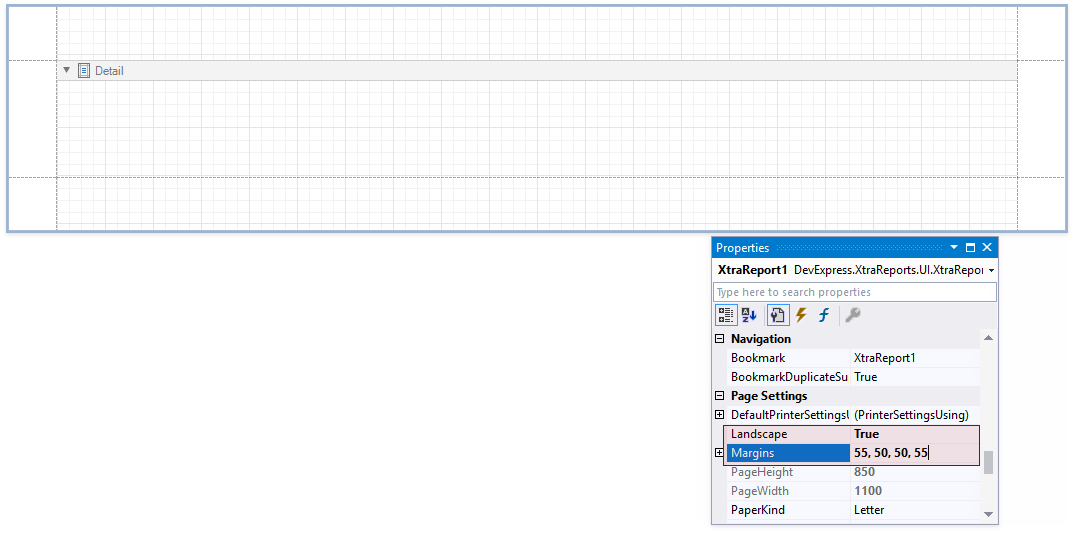
Create the Report Layout
Select the report and enable the Landscape property. Set report margins to 55, 50, 50, 55.
Add the following bands and controls to the report:
-
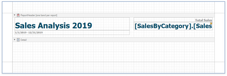
Right-click the report and select Insert Band | ReportHeader from the context menu.

Drop four XRLabel controls from the Toolbox onto the added Report Header band and set their properties:
Label Property Value XRLabel1 Text Sales Analysis 2019 Font Tahoma, 28pt, Bold ForeColor 0, 74, 101 Size 570, 63 Location 10, 0 XRLabel2 Text 1/1/2019 - 12/31/2019 Font Tahoma, 8pt, Bold ForeColor Gray Size 570, 23 Location 10, 63 XRLabel3 Text Total Sales Font Tahoma, 11pt, Bold ForeColor Gray Size 390, 23 Location 600, 0 XRLabel4 Expression [SalesByCategory].[Sales] Format String {0:$#,##0} Font Tahoma, 22pt, Bold ForeColor 0, 74, 101 Size 390, 40 Location 600, 23
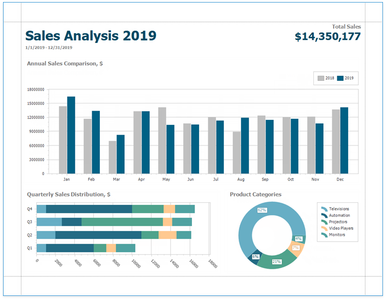
The resulting report layout should look like the one in the image below.
Add Charts to the Report
The Chart Report contains three charts:
- Annual Sales Comparison
- Quarterly Sales Distribution
- Product Categories
Add the Annual Sales Comparison chart to the report.
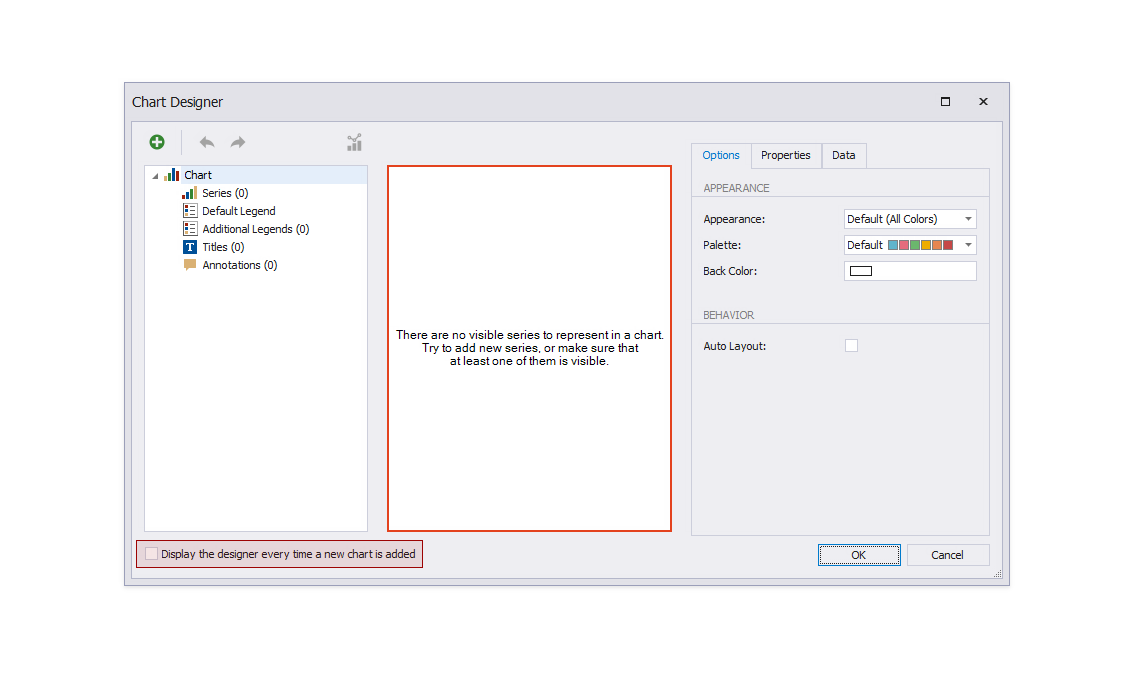
The Chart Designer wizard is invoked. Disable the Display the designer every time a new chart is added option if you do not want to trigger the wizard the next time you create a chart.
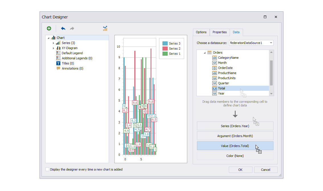
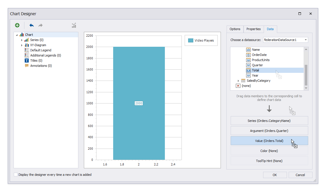
Specify auto-created chart series. Switch to the Data tab and expand Orders. Drop the Year field onto Series; drop the Month field onto Argument; drop the Total field onto Value.
![Filter the chart data. Switch to the **Properties** tab and set the **Data | SeriesTemplate | FilterString** property to _[Orders.Year] In (2018, 2019)_.](/XtraReports/images/chart-report-chart1-filter-string.png)
Filter the chart data. Switch to the Properties tab and set the Data | SeriesTemplate | FilterString property to [Orders.Year] In (2018, 2019).
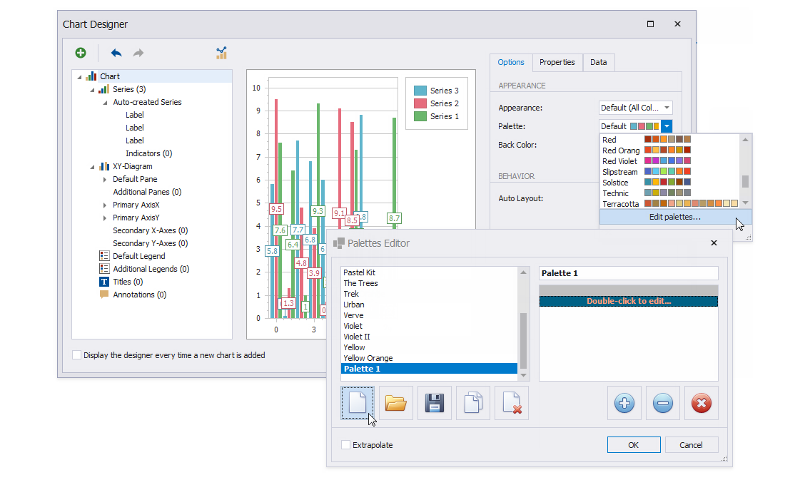
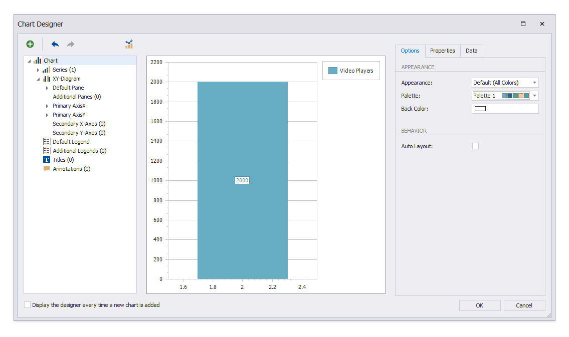
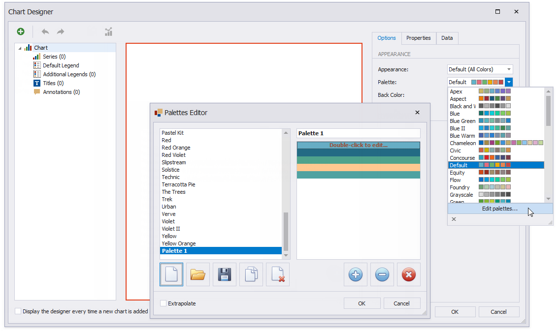
Change the chart palette. Switch to the Options tab and expand the Palette property’s drop-down list. Select a palette for the chart or click Edit Palettes to create a new palette.
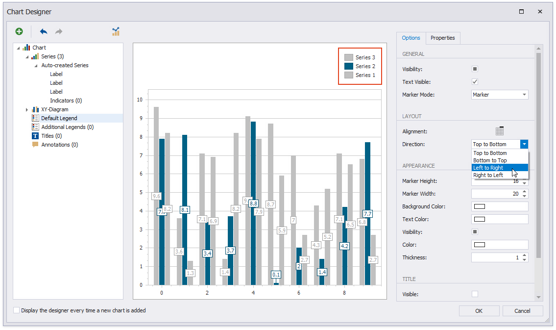
Align the chart legend at the top. Switch to the Default Legend node and set the Alignment and Direction properties.
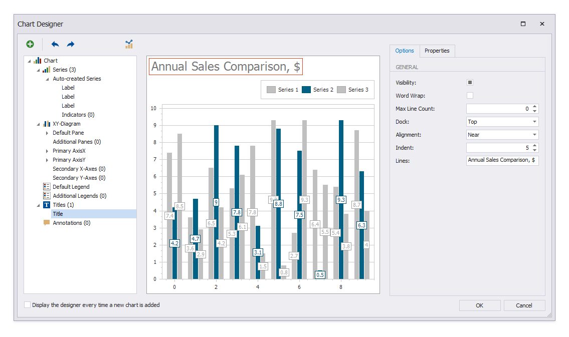
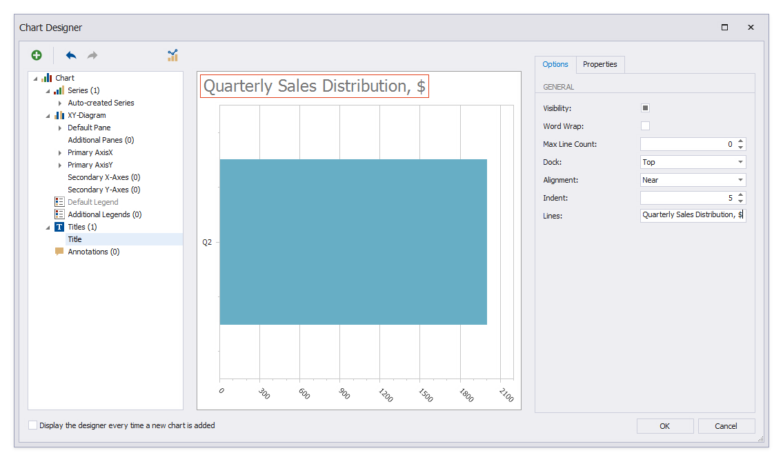
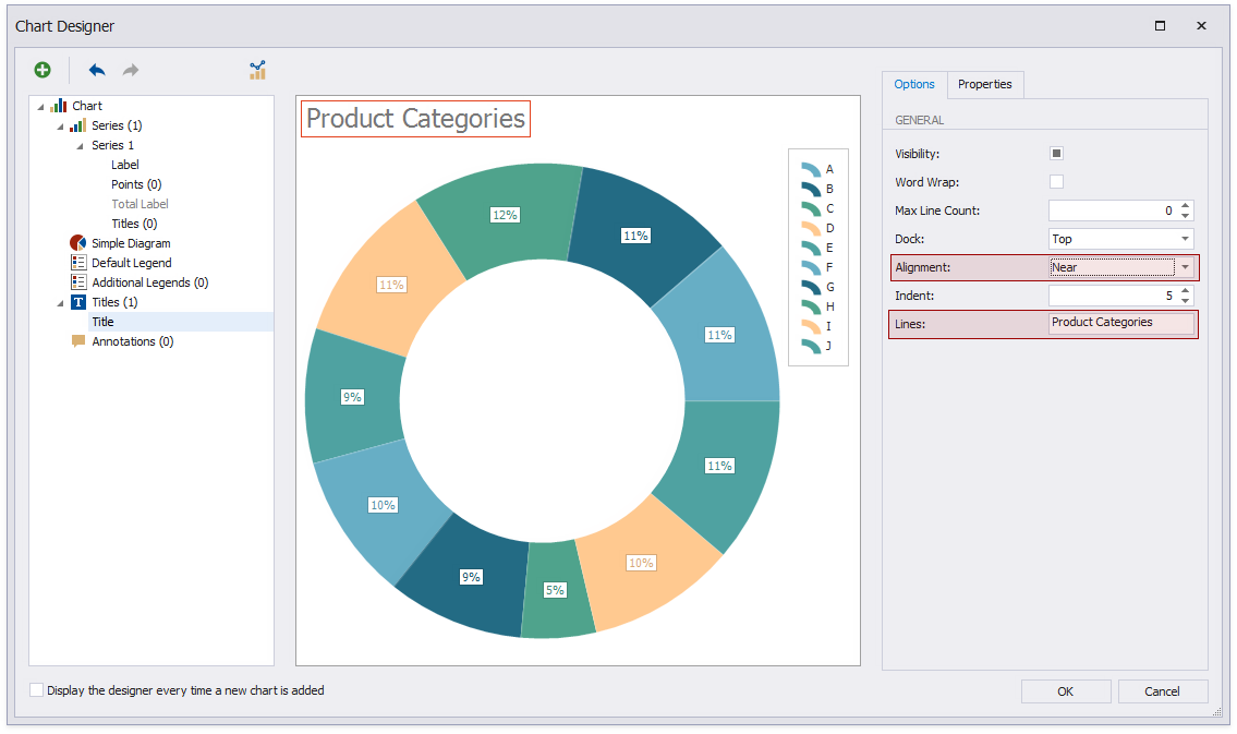
Add a title to the chart (click the plus button next to the Titles node). Specify the Visibility, Dock, Alignment, and Lines properties as shown on the image.
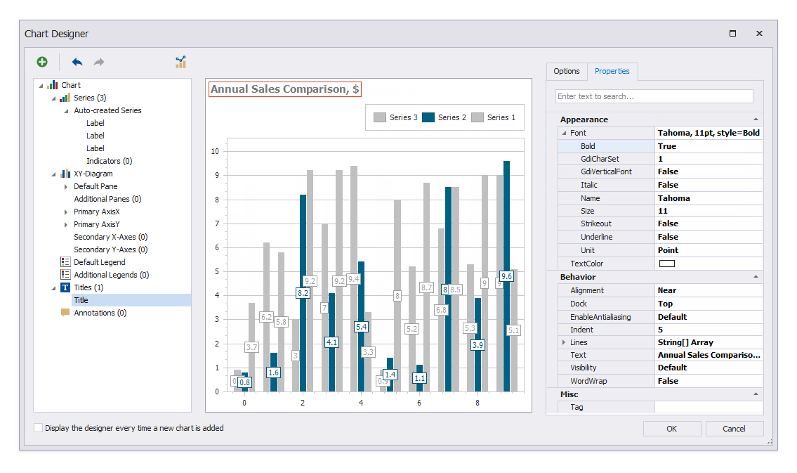
Adjust the title’s font settings. Switch to the Properties tab and set the font to Tahoma, 11pt, style=Bold.
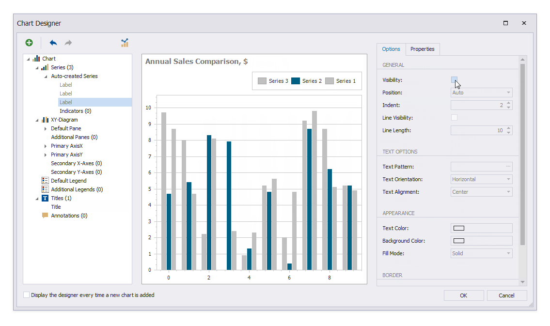
Hide the bar labels. Select the Label node and switch to the Options tab. Disable the Visibility property.
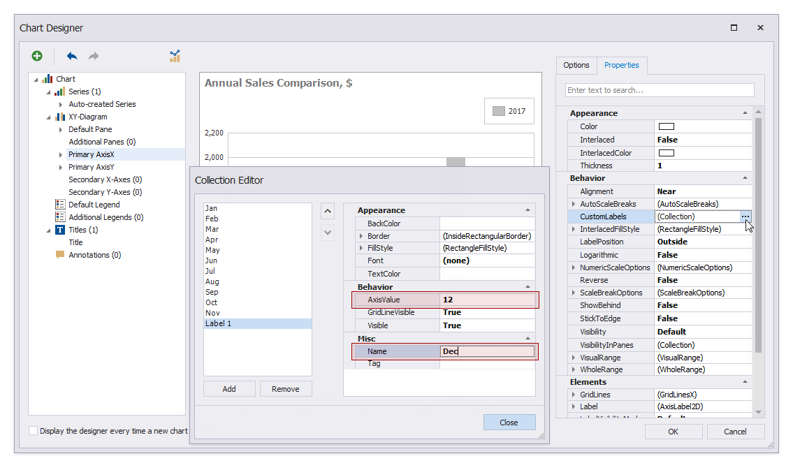
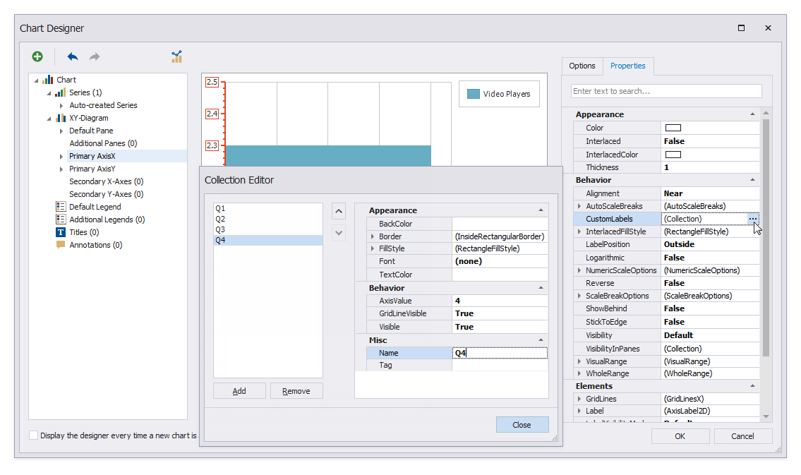
Add month names to the chart’s Argument axis. Select the Primary AxisX node and switch to the Properties tab. Click the CustomLabels property’s ellipsis button. Add a record for each month in the invoked Collection Editor. Click Close when done.
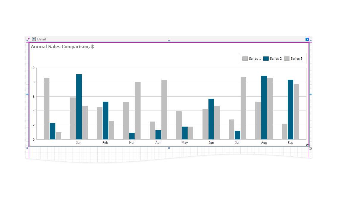
Click OK to close the Chart Designer. Drag the chart corners to resize the control.
Add the Quarterly Sales Distribution chart to the report.
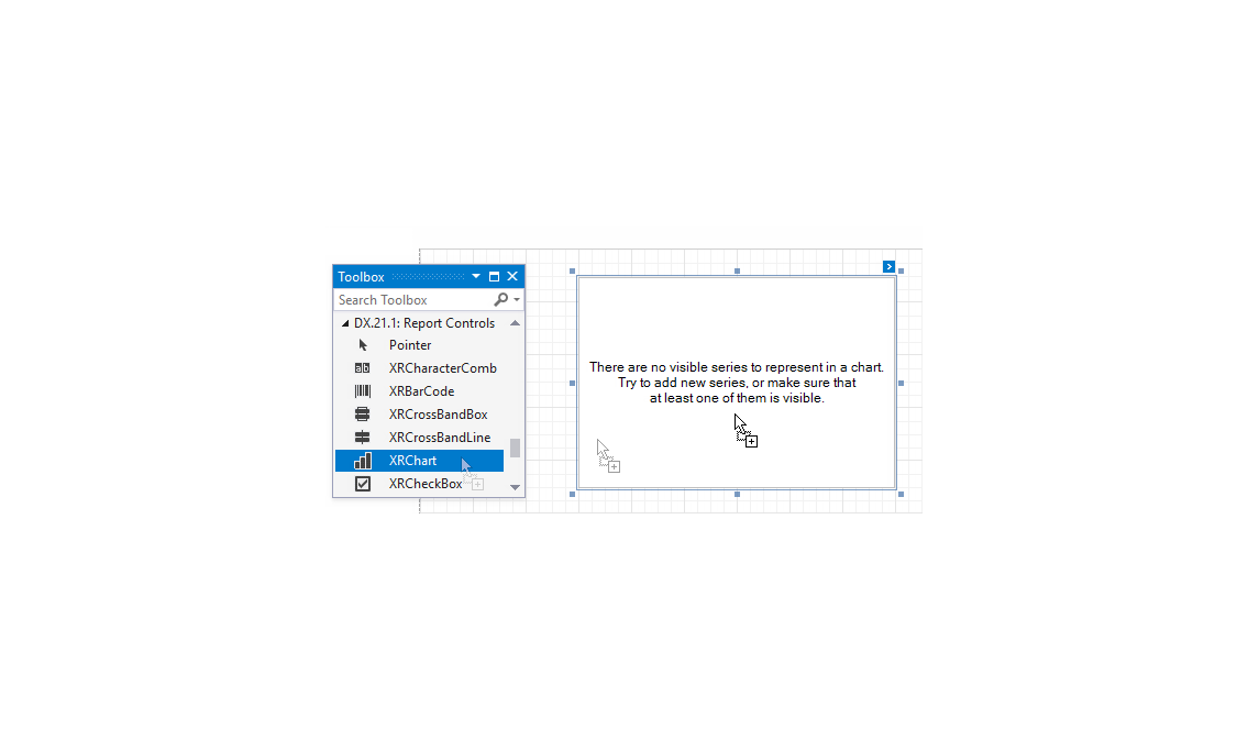
Drop the XRChart item from the Toolbox onto the Detail band.
If you disabled the Display the designer every time a new chart is added option in the Chart Designer, expand the new chart’s smart tag and click Run Designer.
Specify auto-created chart series. Switch to the Data tab and expand Orders. Drop the CategoryName field onto Series; drop the Quarter field onto Argument; drop the Total field onto Value.
Change the chart palette colors in the same way as for the Annual Sales Comparison chart.
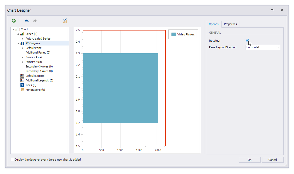
Orient the chart horizontally. Select the XY-Diagram node, enable the Rotated property, and set Pane Layout Direction to Horizontal.
Specify custom labels in the same way as for the Annual Sales Comparison chart. Add custom labels for Quarters 1, 2, 3, and 4.
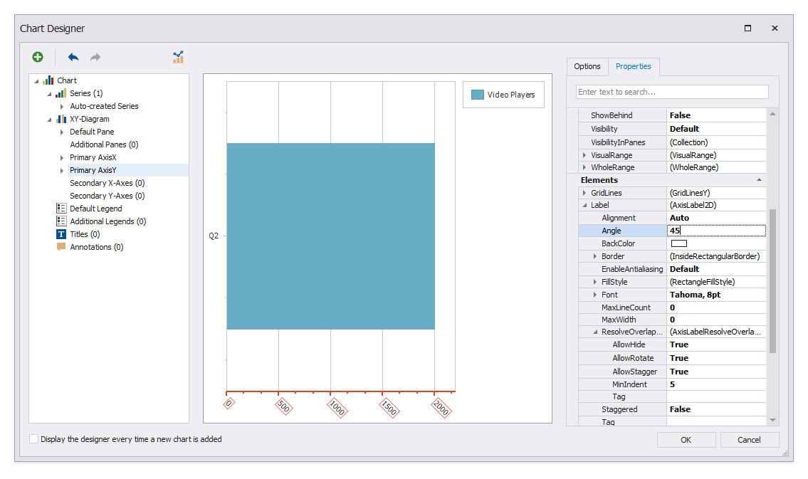
Rotate the Value axis captions. Select the Primary AxisY node and set the Elements | Label | Angle property to 45.
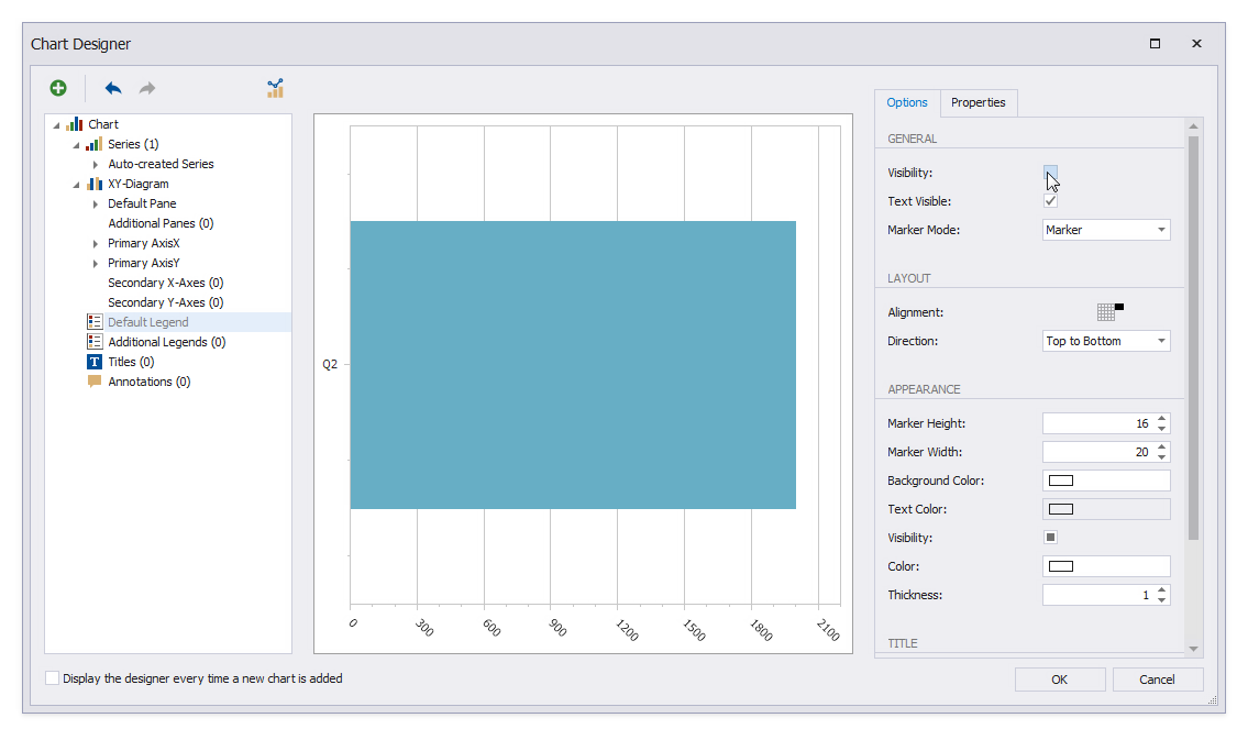
Hide the chart legend. Select the Default Legend node, switch to the Options tab, and disable the Visibility property.
Add a chart title in the same way as for the Annual Sales Comparison chart.
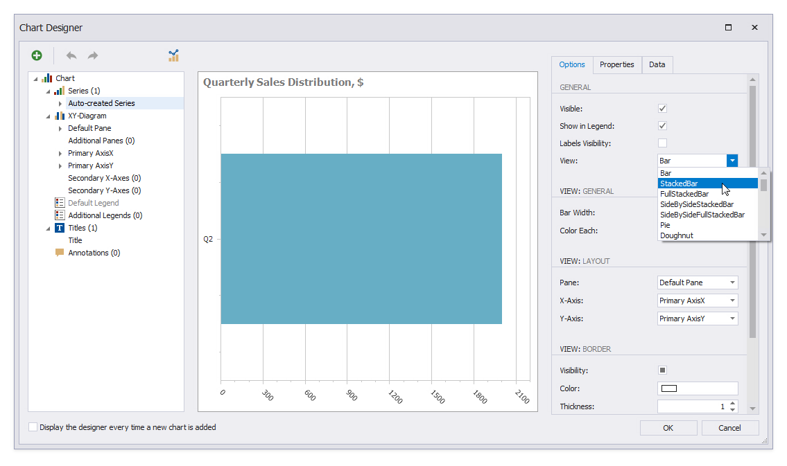
Change the chart’s view type. Select the Auto-created Series node and set the View property to StackedBar. Click OK to close the Chart Designer.
Add the Product Categories chart to the report.
Drop the XRChart item from the Toolbox onto the Detail band.
If you disabled the Display the designer every time a new chart is added option in the Chart Designer, expand the new chart’s smart tag and click Run Designer.
Change the chart palette colors in the same way as for the previous charts.
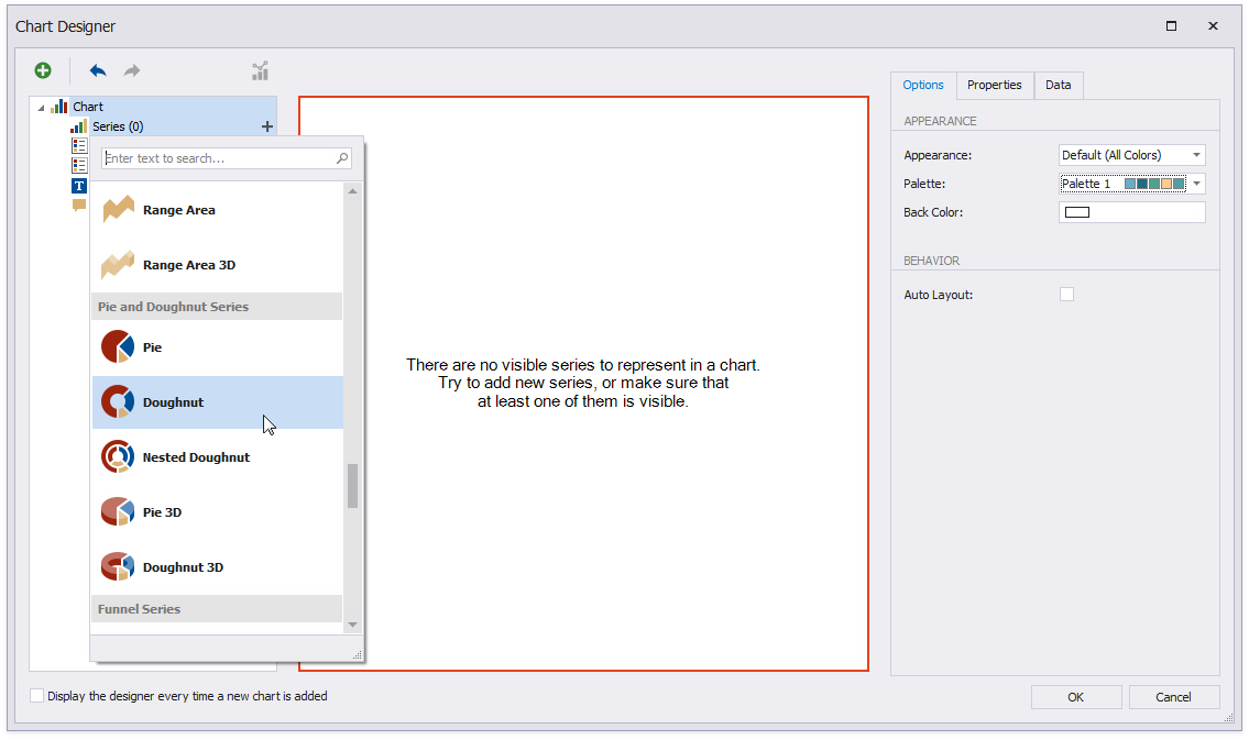
Create a chart series. Click the plus button next to the Series node and select the Doughnut series type.
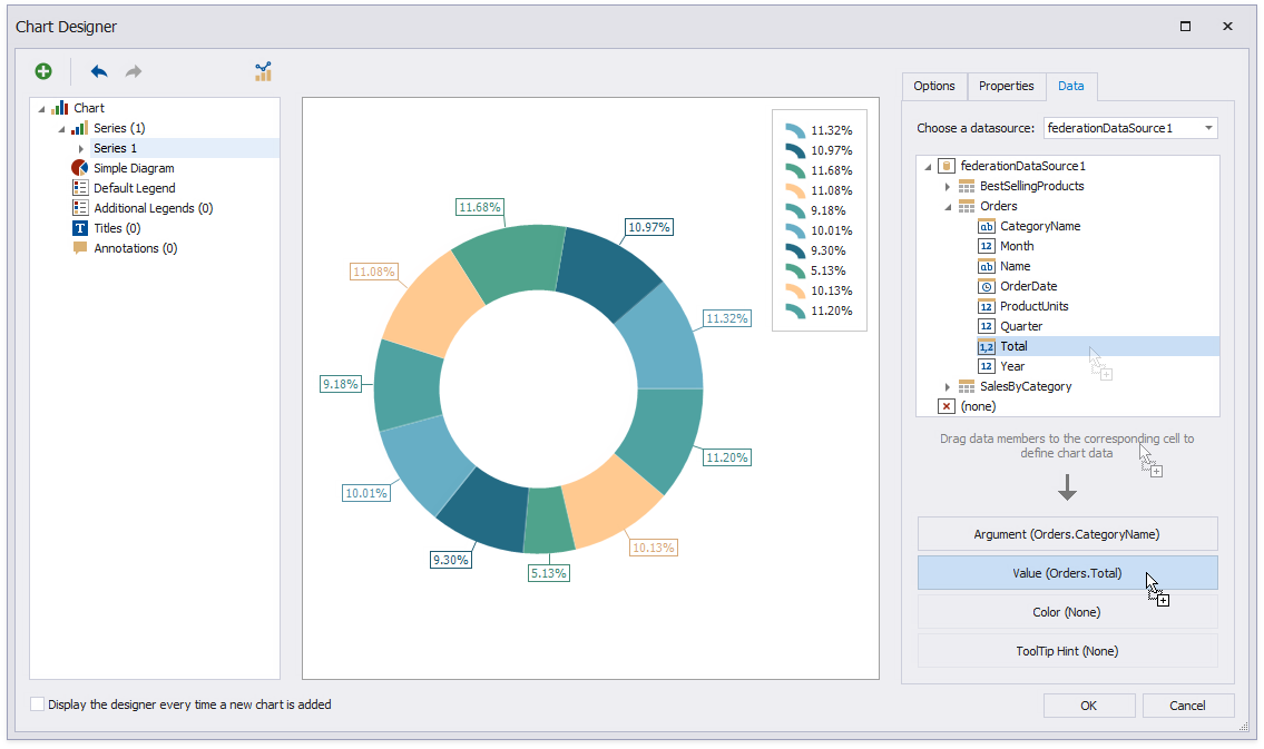
Specify chart points. Switch to the Data tab. Drop the CategoryName field onto Argument; drop the Total field onto Value.
![Shape the series data. Switch to the **Properties** tab and set the **Behavior | LegendTextPattern** property to _{A}_. Set **Data | FilterString** to _[Orders.OrderDate] >= #2019-01-01# And [Orders.OrderDate] < #2020-01-01#_. Set **Data | QualitativeSummaryOptions | SummaryFunction** to _SUM([Orders.Total])_.](/XtraReports/images/chart-report-chart3-configure-series.png)
Shape the series data. Switch to the Properties tab and set the Behavior | LegendTextPattern property to {A}. Set Data | FilterString to [Orders.OrderDate] >= #2019-01-01# And [Orders.OrderDate] < #2020-01-01#. Set Data | QualitativeSummaryOptions | SummaryFunction to SUM([Orders.Total]).
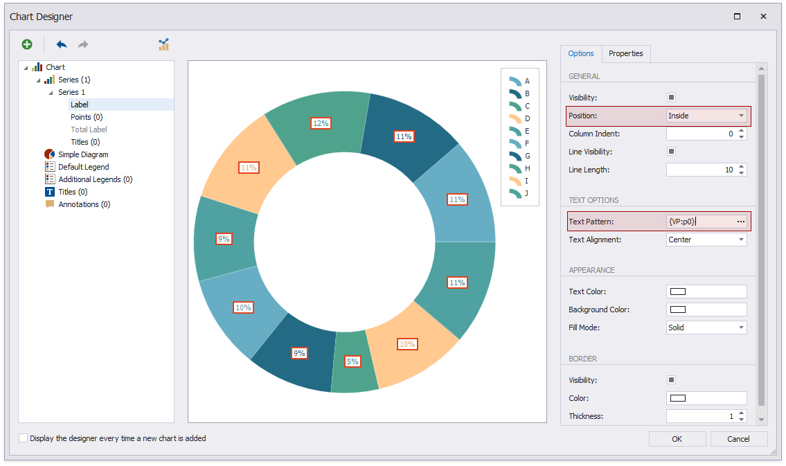
Specify display point labels inside the chart slices. Select the Label node and switch to the Options tab. Set the General | Position property to Inside. Set Text Options | Text Pattern to {VP:0%}.
Add the chart title in the same way as the previous charts. Click OK to close the Chart Designer when you are done.
View the Result
The report is ready. Switch to Preview to view the report.