ListBoxControl Class
A control that displays a list of items that a user can select. Can be populated with items from a data source.
Namespace: DevExpress.XtraEditors
Assembly: DevExpress.XtraEditors.v21.2.dll
NuGet Packages: DevExpress.Win.Design, DevExpress.Win.Navigation
Declaration
[ListBoxControl.ListBoxControlCustomBindingProperties]
public class ListBoxControl :
    BaseListBoxControl,
IBehaviorPropertiesFilterRemarks
A ListBoxControl displays a list of items and allows a user to select none, one, or multiple items.
Data Source
Use the DataSource property to bind the control to a data source. The control automatically creates items based on the data source.
Example
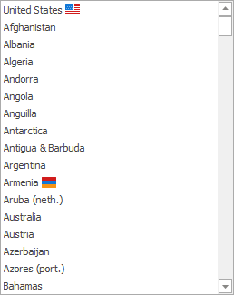
The code below shows how to use a DataTable as a data source.
using DevExpress.XtraEditors;

listBoxControl1.DataSource = GetCountries();
listBoxControl1.DisplayMember = "Name";
listBoxControl1.ValueMember = "PhoneCode";
listBoxControl1.SelectedValueChanged += ListBoxControl1_SelectedValueChanged;

private void ListBoxControl1_SelectedValueChanged(object sender, EventArgs e) {
    var listBoxControl = sender as ListBoxControl;
    XtraMessageBox.Show(listBoxControl.SelectedValue.ToString());
}

DataTable GetCountries() {
    DataTable table = new DataTable();
    DataColumn name = new DataColumn("Name", typeof(string));
    DataColumn phoneCode = new DataColumn("PhoneCode", typeof(int));
    table.Columns.AddRange(new DataColumn[] { name, phoneCode});
    table.Rows.Add(new object[] { "United States", 1 });
    table.Rows.Add(new object[] { "Afghanistan", 93 });
    // ...
    table.Rows.Add(new object[] { "Zimbabwe", 263 });
    return table;
}
String Representation and Value
If objects in the data source expose multiple data fields, use the following properties to specify fields that contain an item’s value and string representation:
- ValueMember - Gets or sets the field name in the bound data source whose contents are assigned to item values.
- DisplayMember - Gets or sets the name of the data source field that provides display text for listbox items. This property is not supported when listbox items are rendered based on Item Templates.
Example
The code below uses the ValueMember and DisplayMember properties to specify data fields that contain a business object’s value and string representation. If you do not specify these properties, the control uses the business object as a value and the ToString() method to obtain the object’s string representation.
using DevExpress.XtraEditors;

listBoxControl1.DataSource = Country.Countries;
listBoxControl1.DisplayMember = "Name";
listBoxControl1.ValueMember = "PhoneCode";
listBoxControl1.SelectedValueChanged += ListBoxControl1_SelectedValueChanged;

private void ListBoxControl1_SelectedValueChanged(object sender, EventArgs e) {
    var listBoxControl = sender as ListBoxControl;
    XtraMessageBox.Show(listBoxControl.SelectedValue.ToString());
}

public class Country {
    public string Name { get; set; }
    public int PhoneCode { get; set; }

    public override string ToString() {
        return $"{Name}, {PhoneCode}";
    }

    public static Country[] Countries = (new Country[] {
        new Country() { Name = "United States", PhoneCode = 1 },
        new Country() { Name = "Afghanistan", PhoneCode = 93 },
        // ...
        new Country() { Name = "Zimbabwe", PhoneCode = 263 }
    });
}
Unbound Mode
You can use a ListBoxControl if it is not bound to a data source. The Items property allows you to populate the control with items in unbound mode.
Example
The code below uses an array of strings to populate the Items collection.
// Initialize an array of strings.
string[] myColors = {
                        Color.Black.Name,
                        Color.Blue.Name,
                        Color.Brown.Name,
                        Color.Green.Name,
                        Color.Red.Name,
                        Color.Yellow.Name,
                        Color.Orange.Name
                     };
// Check whether a data source is assigned to the ListBoxControl.
if (listBoxControl1.DataSource == null)
   // Add items to the ListBoxControl.
   listBoxControl1.Items.AddRange(myColors);
Item Template
You can use a template to render items in the control. An item can display multiple text and image elements arranged and painted in any manner.
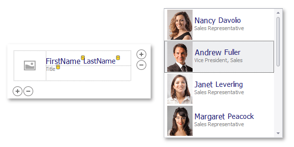
See the following topic for more information: Templated ListBox Controls.
Selection
Use the SelectionMode property to specify whether a user can select none, one, or multiple items. To obtain the selection, use the SelectedIndex, SelectedIndices, SelectedItem, SelectedItems, or SelectedValue property.
The SelectedIndexChanged and SelectedValueChanged events fire when the selection changes.
Example
The ListBoxControl displays system color names. The following sample code handles the BaseListBoxControl.SelectedIndexChanged event to change the form’s background color to the color whose name is currently selected. The formBkColors hashtable is created for this purpose. Its key is a string representing the system color name. The value, in turn, represents the proper color object. Hence, when a desired color name is selected, the proper color is assigned to the form’s BackColor property.
The image below demonstrates the ListBoxControl‘s look & feel after sample code execution.
// Creates and initializes a new Hashtable.
Hashtable formBkColors = new Hashtable();
// Creates an array containing system colors
Color[] sysColors = {
                           SystemColors.ActiveCaption,
                           SystemColors.ActiveCaptionText,
                           SystemColors.AppWorkspace,
                           SystemColors.Control,
                           SystemColors.ControlDark,
                           SystemColors.ControlLight,
                           SystemColors.ControlText,
                           SystemColors.Desktop,
                           SystemColors.Highlight,
                           SystemColors.InactiveBorder,
                           SystemColors.InactiveCaption,
                           SystemColors.Info,
                           SystemColors.InfoText,
                           SystemColors.Menu,
                           SystemColors.MenuText,
                           SystemColors.ScrollBar,
                           SystemColors.Window,
                           SystemColors.WindowFrame
                        };
// ...
for(int i = 0; i < sysColors.Length; i++){
   // Fills the hashtable
   formBkColors[sysColors[i].Name] = sysColors[i];
   // Populates the ListBoxControl items collection
   listBoxControl1.Items.Add(sysColors[i].Name);
}
private void listBoxControl1_SelectedIndexChanged(object sender, System.EventArgs e) {
   this.BackColor = (Color)formBkColors[(sender as ListBoxControl).Text];
}
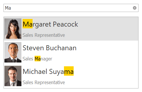
Search and Filtering
You can provide end-users with the ability to filter items in a ListBoxControl. For this purpose, attach the ListBoxControl to a SearchControl by using the SearchControl.Client property.
When an end-user types a search request into the SearchControl, the ListBoxControl automatically filters its items, and highlights the requested string in the filtered items.
Note
If items are formatted using the HTML tags (see BaseListBoxControl.AllowHtmlDraw), the items are filtered, but not highlighted.
You can use the SearchControl‘s FilterCondition property to specify the comparison operator (Equals, Starts With, and so forth) used to compare the attached ListBoxControl‘s items with the query in the search box.
Context Buttons
Use the ContextButtons collection to specify context buttons displayed in each item. See the following topic for more information: Context Buttons.
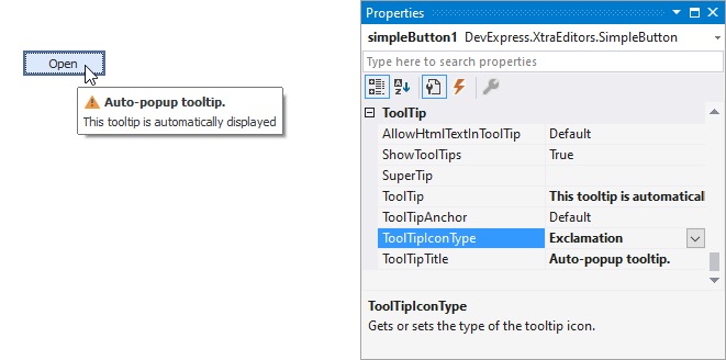
Tooltips
DevExpress controls support regular and super tooltips. If the ShowToolTips option is enabled, tooltips are shown when the mouse pointer hovers over the control.
Use the following properties to specify a regular tooltip’s content:
- ToolTip — A regular tooltip’s text. If the text is not specified, the tooltip is not displayed even if the title is specified. You can use line breaks in regular tooltips. Use the AllowHtmlTextInToolTip property to specify whether to parse HTML tags in the text. HTML tags allow you to format the text: size, style, hyperlinks, etc.
- ToolTipTitle — A regular tooltip’s title. If the title is not specified, it is not displayed.
ToolTipIconType — A regular tooltip’s predefined icon. Use the controller’s IconSize property to specify the image size.
To display a custom image in all regular tooltips, use the controller’s ImageList and ImageIndex properties.
To display a custom image in a specific regular tooltip, handle the BeforeShow event. Use the ImageOptions event argument to assign a raster or vector image to the processed tooltip.
Use the SuperTip property to assign a super tooltip to a control. Enable the AllowHtmlText property to use HTML tags in the super tooltip.
To replace regular tooltips with super tooltips, set the ToolTipController.ToolTipType property to SuperTip. The controller automatically converts regular tooltips to super tooltips. To access this property, you can use the DefaultToolTipController component or a custom controller assigned to the ToolTipController property. See the following topic for more information: Tooltips.
Example
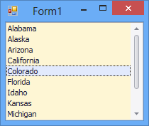
The following sample code demonstrates how to initialize and create a new instance of the ListBoxControl class at runtime.
using DevExpress.XtraEditors;
// ...
// Initialize an array of strings
string[] States = {
                     "Alabama",
                     "Alaska",
                     "Arizona",
                     "California",
                     "Colorado",
                     "Florida",
                     "Idaho",
                     "Kansas",
                     "Michigan",
                     "Nevada",
                     "Texas",
                     "Utah"
                  };
// Initialize and create an instance of the ListBoxControl class
ListBoxControl listBox = new ListBoxControl();
// Define the parent control
listBox.Parent = this;
// Set the listBox's background color
listBox.BackColor = Color.FromArgb(254, 246, 212);
// Dock to all edges and fill the parent container
listBox.Dock = DockStyle.Fill;
// Add items
listBox.Items.AddRange(States);