GroupControl Class
The panel with a title which can be aligned along the top, bottom, left or right edge.
Namespace: DevExpress.XtraEditors
Assembly: DevExpress.Utils.v21.2.dll
NuGet Packages: DevExpress.Utils, DevExpress.Win.Design, DevExpress.Wpf.Core
Declaration
public class GroupControl :
    PanelControl,
    IGroupBoxButtonsPanelOwner,
    IButtonsPanelOwner,
    IButtonPanelControlAppearanceOwner,
    IAppearanceOwner,
    IToolTipControlClient,
    IGroupStyleProvider,
ISupportImageDragDropRemarks
The GroupControl is a container control that can be used to define groups of controls. It displays a frame around controls and allows you to display text and image within the header region.

The control’s main features include:
- The caption can be located along the left, right, top or bottom side of the group control, or hidden (GroupControl.CaptionLocation, GroupControl.ShowCaption).
- Displaying an image in the header (GroupControl.CaptionImage, GroupControl.CaptionImageLocation, GroupControl.CaptionImagePadding, GroupControl.CaptionImageUri, GroupControl.AllowGlyphSkinning).
- Custom buttons in the header (GroupControl.CustomHeaderButtons, GroupControl.CustomHeaderButtonsLocation).
- Colorizing the header region and border in skinning paint schemes (GroupControl.AllowBorderColorBlending).
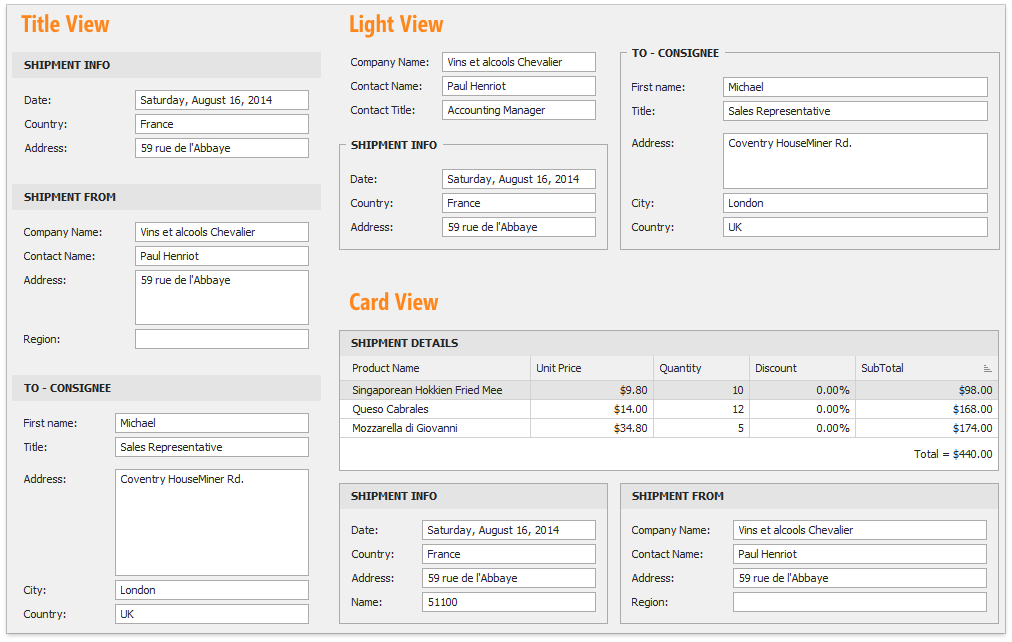
The GroupControl.GroupStyle property allows you to select between three unique control styles that specify the appearance of group borders and header.

The GroupControl supports both the look and feel and appearances technologies. The XtraScrollableControl.LookAndFeel and PanelControl.Appearance inherited properties allow the control’s look and feel and appearance settings to be accessed, respectively.
The GroupControl.AppearanceCaption property provides the appearance settings used to paint the GroupControl’s caption. The GroupControl also allows its caption to be painted manually. For this purpose, handle the GroupControl.CustomDrawCaption event.