LabelControl Class
The label that supports formatted text, images, multi-line text strings and HTML formatting.
Namespace: DevExpress.XtraEditors
Assembly: DevExpress.XtraEditors.v21.2.dll
NuGet Packages: DevExpress.Win.Design, DevExpress.Win.Navigation
Declaration
public class LabelControl :
    BaseStyleControl,
    IMouseWheelSupportIgnore,
    ISupportCommandBinding,
    ISupportsAutoSize,
    ISupportsBaselineAlignment,
    ISupportImageDragDrop,
IImageDropInfoRemarks
Labels are used to provide descriptive text or other helpful information. Use the Text property to specify the label’s text. You can provide either plain or formatted text (see LabelControl.AllowHtmlString).
A LabelControl can display an image (regular or animated GIF file). Different images can be provided in the normal, disabled, hovered and pressed states. To specify images, use the label’s appearance settings, accessed via the LabelControl.Appearance, LabelControl.AppearanceDisabled, LabelControl.AppearanceHovered and LabelControl.AppearancePressed properties. For instance, use the LabelControl.Appearance.Image or LabelControl.Appearance.ImageIndex (LabelControlAppearanceObject.ImageIndex) property to provide the default image for the label.
The alignment of an image relative to the label’s text is specified by the LabelControl.ImageAlignToText property.
If the LabelControl.ImageAlignToText property is set to ImageAlignToText.None, the alignment of an image within the label is specified by the label’s appearance settings (LabelControlAppearanceObject.ImageAlign).
When the LabelControl.LineVisible property is set to true, a LabelControl displays a line in its empty space.
The properties that affect the line display include:
The line is displayed when the label’s width/height exceeds the width/height of its text. In some cases, you may need to manipulate the LabelControl.AutoSizeMode property to resize a label to custom dimensions.
A LabelControl participates in the tab order of a form, but does not receive focus (the next control in the tab order receives focus). For instance, if the LabelControl.UseMnemonic property is set to true, and a mnemonic character - the first character after an ampersand (&) - is specified in the label’s Text property, when a user presses ALT+ the mnemonic key, focus moves to the next control in the tab order. This feature provides keyboard navigation for a form.
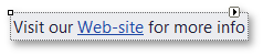
A LabelControl can display a hyperlink. To do so, set the LabelControl.AllowHtmlString property to true and format the required text with the <href></href> tag, as shown below.
myLabelControl.AllowHtmlString = true;
myLabelControl.Text = "Visit our <href="www.devexpress.com">Web-site</href>";
When an end-user clicks the hyperlink, the LabelControl.HyperlinkClick event occurs. Handle it to perform specific operations, depending on the link.
To format text using HTML syntax in cells in container controls (e.g., Data Grid, Tree List, etc.), use the RepositoryItemHypertextLabel in-place editor.
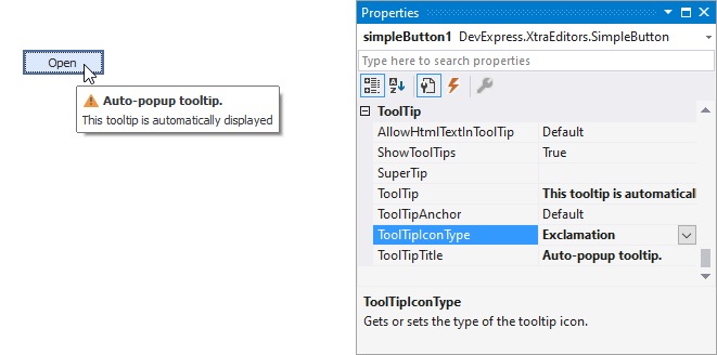
Tooltips
DevExpress controls support regular and super tooltips. If the ShowToolTips option is enabled, tooltips are shown when the mouse pointer hovers over the control.
Use the following properties to specify a regular tooltip’s content:
- ToolTip — A regular tooltip’s text. If the text is not specified, the tooltip is not displayed even if the title is specified. You can use line breaks in regular tooltips. Use the AllowHtmlTextInToolTip property to specify whether to parse HTML tags in the text. HTML tags allow you to format the text: size, style, hyperlinks, etc.
- ToolTipTitle — A regular tooltip’s title. If the title is not specified, it is not displayed.
ToolTipIconType — A regular tooltip’s predefined icon. Use the controller’s IconSize property to specify the image size.
To display a custom image in all regular tooltips, use the controller’s ImageList and ImageIndex properties.
To display a custom image in a specific regular tooltip, handle the BeforeShow event. Use the ImageOptions event argument to assign a raster or vector image to the processed tooltip.
Use the SuperTip property to assign a super tooltip to a control. Enable the AllowHtmlText property to use HTML tags in the super tooltip.
To replace regular tooltips with super tooltips, set the ToolTipController.ToolTipType property to SuperTip. The controller automatically converts regular tooltips to super tooltips. To access this property, you can use the DefaultToolTipController component or a custom controller assigned to the ToolTipController property. See the following topic for more information: Tooltips.