GridLookUpEdit Class
The editor that provides lookup functionality using a dropdown feature-rich Data Grid (GridControl). You can display lookup records in a tabular format, banded tabular format, or as tiles (which can be arranged in one or multiple columns/rows, rendered as a list or a Kanban board).
Namespace: DevExpress.XtraEditors
Assembly: DevExpress.XtraGrid.v21.2.dll
NuGet Packages: DevExpress.Win.Design, DevExpress.Win.Grid
Declaration
Related API Members
The following members return GridLookUpEdit objects:
Remarks
A lookup editor is an editor with an embedded dropdown window that displays lookup records (the records from which an end-user can select). When a lookup record is selected, the editor’s value (the BaseEdit.EditValue bindable property) and display text are modified accordingly.
The GridLookUpEdit can display lookup records in the dropdown using multiple data presentation formats (Views), which you can choose with the RepositoryItemGridLookUpEditBase.PopupViewType property:
Grid View (default) - Displays data in a tabular form. The following features, and many more, can be employed for the Grid View embedded in the GridLookUpEdit: data sorting, grouping, filtering, summaries, hiding column headers, changing row height, etc. See Grid View to learn more.
Tile View - Displays records as read-only tiles, using one of the following layout modes: default (standard table layout), list (tiles have no space between them), and Kanban. This View includes the Tile Template feature, which helps you arrange fields relative to other fields, specify absolute or relative field display bounds, etc. See Tile View.

Banded Grid View - Displays data in a tabular form and allows grouping of columns into bands. See Banded Grid Views.
Advanced Banded Grid View - Displays data in a tabular form, allows grouping columns into bands and supports complex data cell arrangements. See Banded Grid Views.
When you change the data presentation format (RepositoryItemGridLookUpEditBase.PopupViewType), the GridLookUpEdit control creates a corresponding View object (accessible from the RepositoryItemGridLookUpEditBase.PopupView property). You may need to perform additional customizations of the created View. For instance, after you activate the BandedView or AdvBandedView format, you need to manually create bands and add columns to the bands. Otherwise, these Views cannot display data.
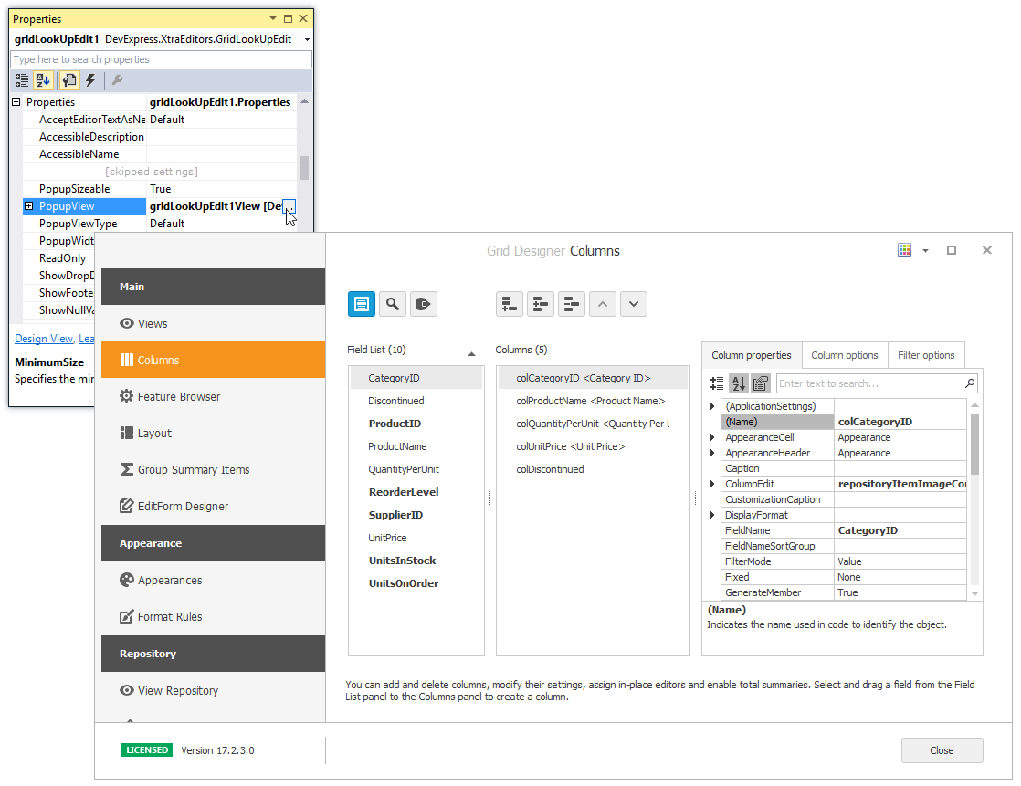
At design time, you can customize the View with the Data Grid Designer. To open the designer, do one of the following:
- click the ellipsis button for the PopupView property in Properties grid.
- invoke the Designer View command from the Properties window or the control’s smart tag.
Note
You can use the Grid Control and View’s methods only when the drop-down window is open if you want to access the data source and calculated data. To access the View, handle the QueryPopUp or Popup event.
private void gridLookUpEdit1_Properties_QueryPopUp(object sender, CancelEventArgs e) {
   GridLookUpEdit gridLookUpEdit = sender as GridLookUpEdit;
   gridLookUpEdit.Properties.PopupView.Columns["ID"].Visible = false;
}
When the drop-down window is closed, use the data source’s methods.
If you customize the View in an event, do not use objects to identify the View, columns, and so on - use field names, captions, etc. instead. The example below shows how to identify a column in a CustomDrawCell event handler.
To learn how to set up lookup editors in different binding modes, see the following topics:
- Standard Binding (to Simple Data Types)
- Advanced Binding (to Business Objects)
- Using a Dictionary Lookup Data Source
- Combobox Mode - Allow Entering New Values
You may want to filter the popup data source of one (secondary) lookup editor based on the value of another (primary) lookup editor. This scenario is covered in the following topic:
In case you need to access lookup grid columns before the editor has created them, call the RepositoryItemGridLookUpEditBase.PopulateViewColumns method to manually trigger column generation.
Additional Customization
The following list shows some of the members that help you perform additional customization of the GridLookUpEdit control.
- RepositoryItemGridLookUpEditBase.PopupViewType - Gets or sets the type of View used to represent data in the dropdown.
RepositoryItemGridLookUpEditBase.PopupView - Gets or sets the View used to represent data in the dropdown.
The View property provides settings to change the grid appearance, access columns, create unbound columns, apply data grouping, filtering, summaries, etc.
For instance, if you use one of ColumnView descendants (e.g., GridView), you can use the ColumnView.Columns property to customize the column collection. To set up columns at design time, use the GridControl’s designer, which can be invoked from the RepositoryItemGridLookUpEditBase.PopupView property in the Properties window.
- RepositoryItemLookUpEditBase.TextEditStyle property - Enables the text editing feature in the edit box.
- RepositoryItemGridLookUpEdit.AutoComplete - Gets or sets whether the editor predicts the value that the user is typing and automatically applies that value. This property is obsolete, use SearchMode instead.
- RepositoryItemLookUpEditBase.ProcessNewValue event - Enables you to add a new record to the lookup data source (RepositoryItemLookUpEditBase.DataSource) for new values entered in the edit box.
- RepositoryItemLookUpEditBase.BestFitMode - Gets or sets the “best-fit” mode for columns in the dropdown window.
- RepositoryItem.NullText - Gets or sets the text that presents the editor’s null value (null, System.DBNull.Value and RepositoryItemDateEdit.NullDate - for DateEdit).
- RepositoryItemPopupBaseAutoSearchEdit.ImmediatePopup - Gets or sets whether the popup window is displayed immediately after an end-user has typed a character in the edit box.
To embed a GridLookUpEdit in a cell within a container control (XtraGrid, XtraTreeList, etc), use the RepositoryItemGridLookUpEdit component. See the “Repository Items” section in the Editors and Simple Controls topic for more information.
Note
The GridLookUpEdit control does not support Instant Feedback Mode.
Note
You can use the Grid Control and View’s methods only when the drop-down window is open if you want to access the data source and calculated data. To access the View, handle the QueryPopUp or Popup event.
private void gridLookUpEdit1_Properties_QueryPopUp(object sender, CancelEventArgs e) {
   GridLookUpEdit gridLookUpEdit = sender as GridLookUpEdit;
   gridLookUpEdit.Properties.PopupView.Columns["ID"].Visible = false;
}
When the drop-down window is closed, use the data source’s methods.
If you customize the View in an event, do not use objects to identify the View, columns, and so on - use field names, captions, etc. instead. The example below shows how to identify a column in a CustomDrawCell event handler.
Note
The Find Panel is not supported for the GridLookUpEdit‘s dropdown GridControl. If you need to enable the Find Panel for a look up editor, use the SearchLookUpEdit control instead.
Item Search
If you want users to be able to search for lookup items, change the RepositoryItemGridLookUpEdit.SearchMode property to either AutoSuggest or AutoSearch. The RepositoryItemGridLookUpEdit.TextEditStyle property automatically switches to Standard when you select either of these modes.
Difference between AutoSearch and AutoSuggest modes:
AutoSuggest runs a custom Task to return a collection of items for the drop-down panel. As a result, the editor has a virtual data source that changes every time a user text changes. This mode is primarily used with unbound editors.
AutoSearch uses the default search logic to find required items in the data source to which this lookup is bound.
AutoSearch mode is not currently available with server-mode editor sources.
Both modes are available for stand-alone editors only.
AutoSuggest Mode
When a user types text, the editor fires the AutoSuggest event (LookUpEdit.AutoSuggest / GridLookUpEdit.AutoSuggest) that runs a custom asynchronous task (a System.Threading.Tasks.Task object). This task performs a search against the given data set, and returns the ICollection object with records that match the entered text. This collection is automatically assigned to the editor’s DataSource and its entries appear in the editor drop-down menu.
This feature is in effect only for stand-alone editors.
AutoSuggest event parameters provide the following API.
QuerySuggestions - assign a Task that performs the search and returns the suggestions collection.
Text - returns the currently entered user text.
SetMinimumAnimationDuration - while a Task is searching for suggestions, the editor displays a loading indicator. To prevent this indicator from flickering when the search completes too fast, the SetMinimumAnimationDuration method allows you to set the minimum on-screen duration.
SetHighlightRanges - allows you to manually choose which parts of found items should be highlighted.
To test the AutoSuggest mode, run the AutoSuggest Lookup Demo Center module. You can click the “Open Solution” Ribbon button to view the complete demo code.
In this demo, suggestions (drop-down menu items) are retrieved on the QueryAsync task. The SetMinimumAnimationDuration method ensures the loading indicator is visible for at least one second.
lookUpEdit1.AutoSuggest += OnAutoSuggest;

void OnAutoSuggest(object sender, LookUpEditAutoSuggestEventArgs e) {
    // Set delay (if needed)
    e.SetMinimumAnimationDuration(TimeSpan.FromMilliseconds(1000));
    // Assign a Task that returns suggestions
    e.QuerySuggestions = WorldCities.QueryAsync(e.Text, e.CancellationToken);
}
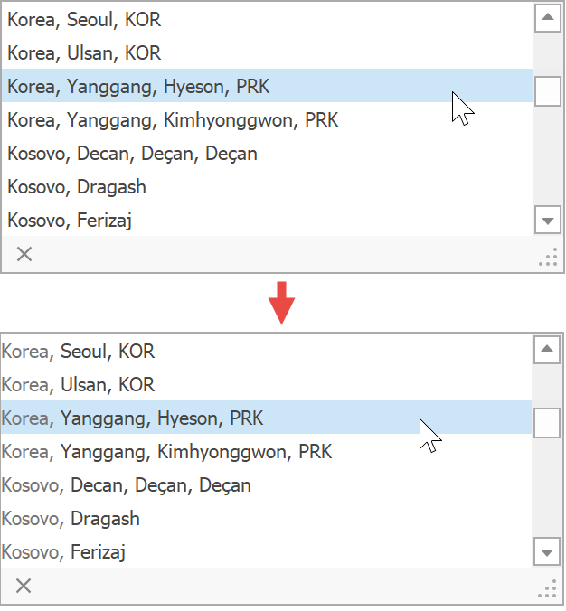
The code below demonstrates how this QueryAsync Task is implemented. The EnsureAllEntries method retrieves all locations from the source. If a user opens the editor drop-down menu, all these entries are visible. Otherwise, the method compares user text with data source records.
public static Task<ICollection> QueryAsync(string text, CancellationToken cancellation) {
    var contains = IgnoreCaseComparisonFunctions.GetContains(
        CultureInfo.CurrentCulture.CompareInfo, CompareOptions.IgnoreCase);
    return Task.Run(() => {
        var entries = CsvDataHelper.EnsureAllEntries();
        var parts = text.Split(new char[] { ' ' }, StringSplitOptions.RemoveEmptyEntries);
        if(parts.Length == 0)
            return entries as ICollection;
        else
            return entries.Where(e => {
                // stop task if needed
                cancellation.ThrowIfCancellationRequested();
                return parts.All(x => e.Tags.Any(tag => contains(tag, x)));
            }).ToList() as ICollection;
    });
}
In this demo, the data source is the “Data\cities.csv” Excel file that stores approximately 13,000 city names. Each record also contains country and state names, country UN code, and Unicode city name. All records are extracted inside the custom Entry class.
public sealed class Entry {
    readonly static List<Entry> allEntries = new List<Entry>();
    public static IEnumerable<Entry> EnsureAllEntries() {
        lock(allEntries) {
            if(allEntries.Count == 0 && File.Exists("Data\cities.csv")) {
                var lines = File.ReadLines("Data\cities.csv").Skip(1);
                var entries = lines.Select(x => new Entry(x))
                        .OrderBy(e => e.Country)
                        .ThenBy(e => e.City);
                foreach(Entry entry in entries)
                    allEntries.Add(entry);
            }
            return allEntries;
        }
    }
//. . .
}
The Entry class contains data fields for Excel file columns, plus additional data fields for values combined from standard fields.
Tags- a portion of a record to be checked against an entered user text: City, Unicode City Name, and State Name;Text- full location address in the “CountryName, CityName, StateName” format.HtmlText- same asText, but country name is displayed with grayed-out text. This field is used to custom draw lookup items (see the “Additional Customization” section below).
public sealed class Entry {
    //standard fields
    public string Country { get; private set; }
    public string City { get; private set; }
    public string City_Unicode { get; private set; }
    public string Admin_Name_Unicode { get; private set; }
    public string Country_UN { get; private set; }
    //additional fields
    public string[] Tags { get; private set; }
    public string Text { get; private set; }
    public string HtmlText { get; private set; }
}
You can call the LookUpEditBase.StartAutoSuggest method to manually trigger the AutoSuggest event.
Custom Item Draw
The HtmlText property declared in the Entry class is optional - it is not required to implement the auto-suggest functionality. This property is used to manually re-paint lookup items so that country names appear washed out. To do that, handle the RepositoryItemLookUpEdit.CustomDrawCell event.
lookUpEdit1.CustomDrawCell += OnCustomDrawCell;

void OnCustomDrawCell(object sender, LookUpCustomDrawCellArgs e) {
    e.DrawHtmlText(WorldCities.GetHtmlText(e.Row));
    e.Handled = true;
}
Custom Highlight Ranges
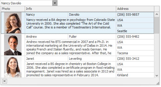
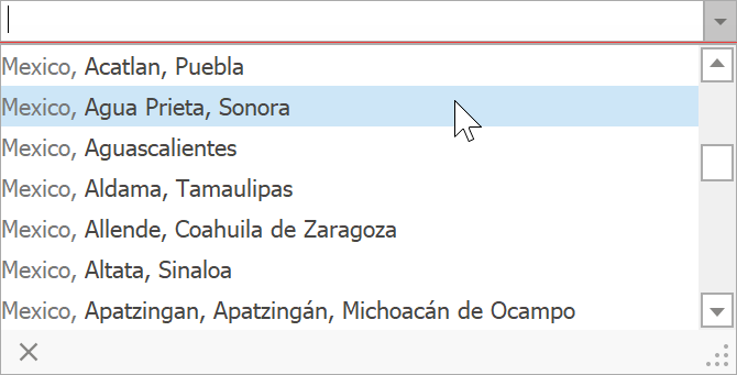
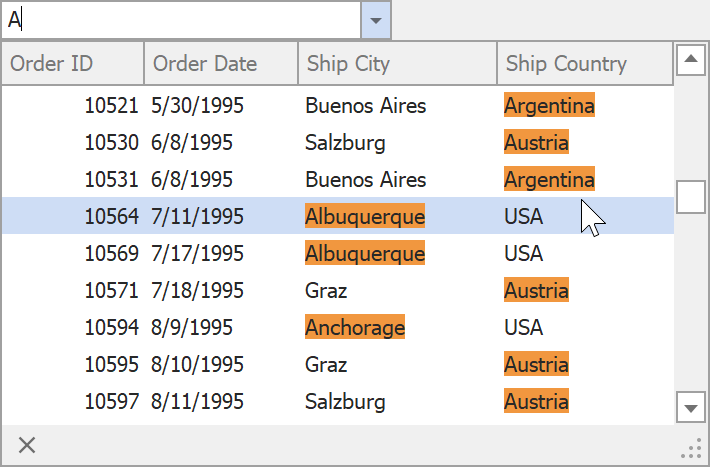
The QueryAsync Task compares user text with the entry Tags property. This property includes city name, city unicode name, and state name - country names are ignored. For example, the figure below illustrates that the demo database contains many Mexican cities.
If a user enters “ex”, from all Mexican cities only “Mexicali” and “Mexico City” remain visible - the Task behaves correctly and filters out non-matching records. However, although the Task ignores countries, the editor highlights “ex” in country names as well.
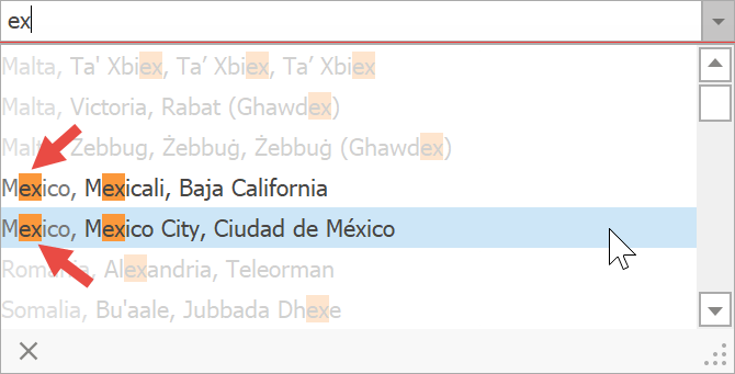
This happens because there are two separate processes that take place in a lookup editor.
- A Task assigned to the QuerySuggestions property scans the data source and chooses records to show in a drop-down menu.
- A lookup editor scans items returned by the Task, and looks for user text matches.
If these two processes use different algorithms, a misleading highlight behavior similar to that mentioned above may happen. If this happens, define custom highlight range(s) with the SetHighlightRange / SetHighlightRanges methods. The demo code below uses the same logic as in the QueryAsync task to display the correct ranges.
void OnAutoSuggest(object sender, LookUpEditAutoSuggestEventArgs e) {
    //...
    // Set Custom Highlight Strategy
    e.SetHighlightRanges(HighlightTags(e.Text));
}

static Func<string, string, DisplayTextHighlightRange[]> HighlightTags(string pattern) {
    var indexOf = IgnoreCaseComparisonFunctions.GetIndexOf(
        CultureInfo.CurrentCulture.CompareInfo, CompareOptions.IgnoreCase);
    var parts = pattern.Split(new char[] { ' ' },
        StringSplitOptions.RemoveEmptyEntries);
    return (displayText, fieldName) => {
        var tags = displayText.Split(new string[] { ", " },
            StringSplitOptions.RemoveEmptyEntries);
        var ranges = new List<DisplayTextHighlightRange>();
        for(int i = 1/*skip country tag*/; i < tags.Length; i++) {
            int tagStart = displayText.IndexOf(tags[i]);
            for(int j = 0; j < parts.Length; j++) {
                int index = indexOf(tags[i], parts[j]);
                if(index != -1)
                    ranges.Add(new DisplayTextHighlightRange(tagStart + index, parts[j].Length));
            }
        }
        return ranges.ToArray();
    };
}
The AutoSuggest event parameter offers a number of methods that you can use to define custom highlight ranges.
- HighlightAny - selects every item caption part that matches the given text.
- HighlightFirst - selects the first text entry.
- HighlightFromStart - selects the first N characters of item captions.
AutoSearch Mode
The AutoSearch mode allows users to search for required data source items.
Change Search Logic
Handle the AutoSearch event (LookUpEdit.AutoSearch \ GridLookUpEdit.AutoSearch) and use a SetParameters method overload to specify how the editor should compare user text with editor items.
- parserKind parameter - specifies how user text parts divided by a space character should be combined (see the ColumnViewOptionsFind.ParserKind property for examples).
- condition parameter - specifies which function should be used to build filter expressions (see the ColumnViewOptionsFind.Condition Data Grid property for examples).
- field or fields[] parameter - allows you to limit the search by specific data fields only.
- text parameter - allows you to replace the user text.
The example below illustrates how to make the editor look for items whose text starts with the user text.
lookUpEdit1.AutoSearch += OnAutoSearch;

void OnAutoSearch(object sender, LookUpEditAutoSearchEventArgs e) {
    string[] fields = new string[] { "ShipCity", "ShipCountry" };
    e.SetParameters(fields, e.Text, FindPanelParserKind.And, FilterCondition.StartsWith);
}
You can call the LookUpEditBase.StartAutoSearch method to manually trigger the AutoSearch event.
Custom Text Highlight Ranges
Lookup editors highlight text portions that match user text. Handle the AutoSearch event to implement custom highlight ranges. This mode uses same highlight API as the AutoSuggest mode does.
The example below illustrates how to make a lookup editor highlight the entire field value if it starts with the specified user text.
private void LookUpEdit1_AutoSearch(object sender, LookUpEditAutoSearchEventArgs e)
{
    e.SetAutoSearchParameters(FindPanelParserKind.And, FilterCondition.StartsWith);
    e.SetHighlightRanges(CustomHightlight(e.Text));
}

static Func<string, string, DisplayTextHighlightRange[]> CustomHightlight(string userText)
{
    return (displayText, fieldName) =>
    {
        if (fieldName == "ShipCity" || fieldName == "ShipCountry")
        {
            if (displayText.StartsWith(userText))
                return new DisplayTextHighlightRange[] {
                    new DisplayTextHighlightRange(0, displayText.Length) };
        }
        return null;
    };
}
Example 1
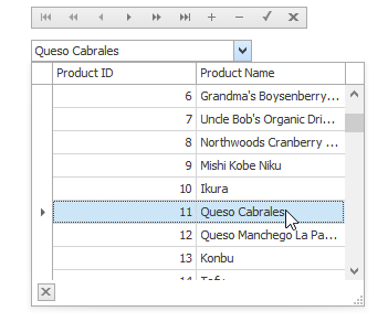
The following example demonstrates how to create and customize a GridLookUpEdit control at runtime.
In the example, a lookup editor will be used to edit the values of the “ProductID” field in the “Order Details” table (NWind database). It must display a list of the available products in the dropdown, which are stored in the “Products” table in the NWind database. By selecting a row from the dropdown an end-user will change the current order’s product. Also a data navigator will be created that will assist an end-user to navigate through the “Order Details” table.
To implement the required functionality the following key properties of the lookup editor must be set:
- The editor’s BaseEdit.EditValue property is bound to the “ProductID” field in the “Order Details” table via the DataBindings property.
- The editor’s RepositoryItemLookUpEditBase.DataSource property is set to a DataView object which contains rows from the “Products” table in the NWind database.
- The editor’s RepositoryItemLookUpEditBase.ValueMember property is set to the “ProductID” field in the “Products” table. This field’s value must match the editor’s edit value, and so the “ProductID” field in the “Order Details” table.
- The editor’s RepositoryItemLookUpEditBase.DisplayMember property is set to the “ProductName” field in the “Products” table. This identifies the field in the DataSource whose values match the editor’s display text.
- Two columns are created within the underlying View via the ColumnView.Columns property. These will display values from the “ProductID” and “ProductName” fields in the dropdown data source.
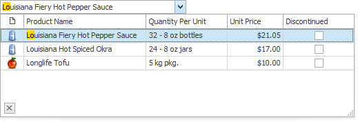
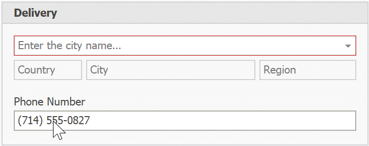
The result of the example is shown in the following image:
using DevExpress.XtraEditors;
using DevExpress.XtraGrid.Columns;
using System.Data.OleDb;

// A lookup editor created at runtime.
GridLookUpEdit gridLookup;
// A navigator control to navigate the "Order Details" table.
DataNavigator dataNav;

// DataView for the "Order Details" table.
DataView dvMain;
// DataView for the "Products" table.
DataView dvDropDown;

//...


private void Form1_Load(object sender, System.EventArgs e) {
   gridLookup = new GridLookUpEdit();
   gridLookup.Bounds = new Rectangle(10, 40, 200, 20);
   this.Controls.Add(gridLookup);

   dataNav = new DataNavigator();
   dataNav.Bounds = new Rectangle(10, 10, 250, 20);
   this.Controls.Add(dataNav);

   InitData();
   InitLookUp();

   dataNav.DataSource = dvMain;
}

private void InitData() {
   // Dataset to provide data from the database
   DataSet ds = new DataSet();
   string connestionString =
     "Provider=Microsoft.Jet.OLEDB.4.0;Data Source=C:\\DB\\nwind.mdb";

   // Connect to the "Order Details" table
   System.Data.OleDb.OleDbDataAdapter dbAdapter =
     new OleDbDataAdapter("SELECT * FROM [Order Details]", connestionString);
   // Load data from the "Order Details" table to the dataset
   dbAdapter.Fill(ds, "Order Details");
   // Connect to the "Products" table
   dbAdapter = new OleDbDataAdapter("SELECT * FROM Products", connestionString);
   // Load data from the "Products" table into the dataset
   dbAdapter.Fill(ds, "Products");

   DataViewManager dvm = new DataViewManager(ds);
   dvMain = dvm.CreateDataView(ds.Tables["Order Details"]);
   dvDropDown = dvm.CreateDataView(ds.Tables["Products"]);
}


private void InitLookUp() {
   // Bind the edit value to the ProductID field of the "Order Details" table;
   // the edit value matches the value of the ValueMember field.
   gridLookup.DataBindings.Add("EditValue", dvMain, "ProductID");

   // Prevent columns from being automatically created when a data source is assigned.
   gridLookup.Properties.PopupView.OptionsBehavior.AutoPopulateColumns = false;
   // The data source for the dropdown rows
   gridLookup.Properties.DataSource = dvDropDown;
   // The field for the editor's display text.
   gridLookup.Properties.DisplayMember = "ProductName";
   // The field matching the edit value.
   gridLookup.Properties.ValueMember = "ProductID";

   // Add two columns in the dropdown:
   // A column to display the values of the ProductID field;
   GridColumn col1 = gridLookup.Properties.PopupView.Columns.AddField("ProductID");
   col1.VisibleIndex = 0;
   col1.Caption = "Product ID";
   // A column to display the values of the ProductName field.
   GridColumn col2 = gridLookup.Properties.PopupView.Columns.AddField("ProductName");
   col2.VisibleIndex = 1;
   col2.Caption = "Product Name";

   // Set column widths according to their contents.
   gridLookup.Properties.PopupView.BestFitColumns();
   // Specify the total dropdown width.
   gridLookup.Properties.PopupFormWidth = 300;
}
Example 2
Assume that a GridLookUpEdit control needs to be used in multiple places, and all editors must display data from one predefined data source and contain predefined columns. In this instance, you can create a custom GridLookUpEdit control.
This example shows how to create a custom GridLookUpEdit control, and initialize its properties as required. The structure of descendant classes is based on the code template shown in the Custom Editors.Editors Structure topic.
To customize the control’s settings, the OnLoaded method is overridden. In this method, the control’s DataSource, columns and some other options are initialized. Note that columns created in this method are not accessible at design time.
using System.Drawing;
using System.Reflection;
using System.ComponentModel;
using System.Windows.Forms;
using DevExpress.XtraEditors;
using DevExpress.XtraEditors.Repository;
using DevExpress.XtraEditors.Registrator;
using DevExpress.XtraEditors.Drawing;
using DevExpress.XtraEditors.ViewInfo;
using DevExpress.XtraGrid.Columns;
using DevExpress.XtraGrid.Views.Grid;
using System.Data;


namespace DevExpress.MyGridLookUpEditors {

    //The attribute that points to the registration method
    [UserRepositoryItem("RegisterMyGridLookUpEdit")]
    public class RepositoryItemMyGridLookUpEdit : RepositoryItemGridLookUpEdit {

        //The static constructor which calls the registration method
        static RepositoryItemMyGridLookUpEdit() { RegisterMyGridLookUpEdit(); }

        //Initialize new properties
        public RepositoryItemMyGridLookUpEdit() {
        }

        protected override void OnLoaded() {
            base.OnLoaded();
            if (IsDesignMode) return;
            // Create two columns
            GridColumn colId = new GridColumn();
            colId.FieldName = colId.Caption = "ID";
            colId.VisibleIndex = 0;
            GridColumn colName = new GridColumn();
            colName.FieldName = colName.Caption = "Name";
            colName.VisibleIndex = 1;
            GridView gView = this.View;
            gView.Columns.Clear();
            gView.Columns.Add(colId);
            gView.Columns.Add(colName);
            // Hide the group panel
            gView.OptionsView.ShowGroupPanel = true;
            // Initialize data source
            DisplayMember = "Name";
            ValueMember = "ID";
            DataSource = GetData();
        }

        private DataTable GetData() {
            DataTable table = new DataTable();
            table.Columns.Add(new DataColumn("ID", typeof(int)));
            table.Columns.Add(new DataColumn("Name", typeof(string)));
            table.Rows.Add(new object[] { 0, "A" });
            table.Rows.Add(new object[] { 1, "B" });
            table.Rows.Add(new object[] { 2, "C" });
            return table;
        }


        //The unique name for the custom editor
        public const string MyGridLookUpEditName = "MyGridLookUpEdit";

        //Return the unique name
        public override string EditorTypeName { get { return MyGridLookUpEditName; } }

        //Register the editor
        public static void RegisterMyGridLookUpEdit() {
            //Icon representing the editor within a container editor's Designer
            Image img = null;

            EditorRegistrationInfo.Default.Editors.Add(new EditorClassInfo(MyGridLookUpEditName,
              typeof(MyGridLookUpEdit), typeof(RepositoryItemMyGridLookUpEdit),
              typeof(GridLookUpEditBaseViewInfo), new ButtonEditPainter(), true, img));
        }


        //Override the Assign method
        public override void Assign(RepositoryItem item) {
            BeginUpdate();
            try {
                base.Assign(item);
                RepositoryItemMyGridLookUpEdit source =
                    item as RepositoryItemMyGridLookUpEdit;
                if (source == null) return;
            }
            finally {
                EndUpdate();
            }
        }
    }


    public class MyGridLookUpEdit : GridLookUpEdit {

        //The static constructor which calls the registration method
        static MyGridLookUpEdit() {
            RepositoryItemMyGridLookUpEdit.RegisterMyGridLookUpEdit(); }

        //Initialize the new instance
        public MyGridLookUpEdit() {
            //...
        }

        //Return the unique name
        public override string EditorTypeName { get { return
            RepositoryItemMyGridLookUpEdit.MyGridLookUpEditName; } }

        //Override the Properties property
        //Simply type-cast the object to the custom repository item type
        [DesignerSerializationVisibility(DesignerSerializationVisibility.Content)]
        public new RepositoryItemMyGridLookUpEdit Properties {
            get { return base.Properties as RepositoryItemMyGridLookUpEdit; }
        }

    }
}