MemoEdit Class
Allows you to display and edit multi-line text.
Namespace: DevExpress.XtraEditors
Assembly: DevExpress.XtraEditors.v21.2.dll
NuGet Packages: DevExpress.Win.Design, DevExpress.Win.Navigation
Declaration
Remarks
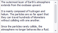
The MemoEdit control represents an editor which allows for the display and editing of multi-line text. It provides a MemoEdit.Lines property defining the list of strings displayed. The image below shows a sample memo editor.
You can use the RepositoryItemMemoEdit.WordWrap property to specify whether long strings, which do not contain any return characters, are wrapped automatically at the right edge of a memo edit control. To determine whether scroll bars should be displayed in a memo editor, use the RepositoryItemMemoEdit.ScrollBars property.
The RepositoryItemMemoEdit.AcceptsReturn and RepositoryItemMemoEdit.AcceptsTab properties define how a memo editor interprets ENTER and TAB key presses by the user. If a memo editor accepts returns (RepositoryItemMemoEdit.AcceptsReturn is true), inserting carriage-return/linefeed characters creates a new text line within the editor; otherwise, return key presses are processed by the form. Tabs can be used either to align text within the memo editor or move focus to another control.
Use the MemoEdit.Properties and RepositoryItem.LookAndFeel members to specify the behavior and look & feel of a memo editor.
The editor does not support editing in masked mode, therefore RepositoryItemTextEdit.Mask object settings are not in effect.
Tooltips
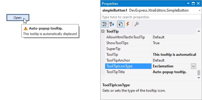
DevExpress controls support regular and super tooltips. If the ShowToolTips option is enabled, tooltips are shown when the mouse pointer hovers over the control.
Use the following properties to specify a regular tooltip’s content:
- ToolTip — A regular tooltip’s text. If the text is not specified, the tooltip is not displayed even if the title is specified. You can use line breaks in regular tooltips. Use the AllowHtmlTextInToolTip property to specify whether to parse HTML tags in the text. HTML tags allow you to format the text: size, style, hyperlinks, etc.
- ToolTipTitle — A regular tooltip’s title. If the title is not specified, it is not displayed.
ToolTipIconType — A regular tooltip’s predefined icon. Use the controller’s IconSize property to specify the image size.
To display a custom image in all regular tooltips, use the controller’s ImageList and ImageIndex properties.
To display a custom image in a specific regular tooltip, handle the BeforeShow event. Use the ImageOptions event argument to assign a raster or vector image to the processed tooltip.
Use the SuperTip property to assign a super tooltip to a control. Enable the AllowHtmlText property to use HTML tags in the super tooltip.
To replace regular tooltips with super tooltips, set the ToolTipController.ToolTipType property to SuperTip. The controller automatically converts regular tooltips to super tooltips. To access this property, you can use the DefaultToolTipController component or a custom controller assigned to the ToolTipController property. See the following topic for more information: Tooltips.