TextEdit Class
The single-line text editor.
Namespace: DevExpress.XtraEditors
Assembly: DevExpress.XtraEditors.v21.2.dll
NuGet Packages: DevExpress.Win.Design, DevExpress.Win.Navigation
Declaration
[DefaultBindingPropertyEx("Text")]
public class TextEdit :
    BaseEdit,
    ITextEditControllerProvider,
    IDXMenuSupport,
    IMouseWheelSupport,
    ISupportsBaselineAlignment,
    ISupportsAutoSize,
IDirectXClientProviderRelated API Members
The following members return TextEdit objects:
Remarks
The TextEdit.Properties property allows access to the RepositoryItemTextEdit object - a repository item that stores editor settings.
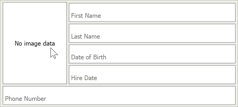
The image below shows a sample text edit.

The following table enumerates main TextEdit API:
Description | API |
|---|---|
Editor text | |
Character casing (normal, uppercase, or lowercase) | |
Maximum text length | |
Default text shown when the editor is empty | RepositoryItem.NullText |
Methods that manage the caret’s position and text selection | TextEdit.SelectionStart |
Clipboard operations | |
Shortcuts | LEFT or UP arrow - moves the caret forward |
Editors derived from the TextEdit class have the same features. You can modify the TextEditStyle property (for instance, RepositoryItemButtonEdit.TextEditStyle) to disable or hide the text box and prevent users from entering values.
Advanced Mode
All editors derived from the TextEdit class (except for TokenEdit, RepositoryItemHypertextLabel and HyperLinkEdit) can operate in Advanced Mode. In this mode editors use a custom DevExpress text box instead of the standard Windows Forms masked box. This custom text box supports unique features, such as embedded editor labels and custom caret animations.
See these links for more information about Advanced Mode:
Tooltips
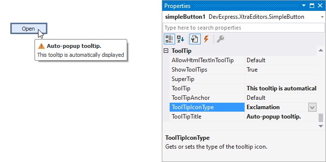
DevExpress controls support regular and super tooltips. If the ShowToolTips option is enabled, tooltips are shown when the mouse pointer hovers over the control.
Use the following properties to specify a regular tooltip’s content:
- ToolTip — A regular tooltip’s text. If the text is not specified, the tooltip is not displayed even if the title is specified. You can use line breaks in regular tooltips. Use the AllowHtmlTextInToolTip property to specify whether to parse HTML tags in the text. HTML tags allow you to format the text: size, style, hyperlinks, etc.
- ToolTipTitle — A regular tooltip’s title. If the title is not specified, it is not displayed.
ToolTipIconType — A regular tooltip’s predefined icon. Use the controller’s IconSize property to specify the image size.
To display a custom image in all regular tooltips, use the controller’s ImageList and ImageIndex properties.
To display a custom image in a specific regular tooltip, handle the BeforeShow event. Use the ImageOptions event argument to assign a raster or vector image to the processed tooltip.
Use the SuperTip property to assign a super tooltip to a control. Enable the AllowHtmlText property to use HTML tags in the super tooltip.
To replace regular tooltips with super tooltips, set the ToolTipController.ToolTipType property to SuperTip. The controller automatically converts regular tooltips to super tooltips. To access this property, you can use the DefaultToolTipController component or a custom controller assigned to the ToolTipController property. See the following topic for more information: Tooltips.