BorderStyles Enum
Specifies the style for borders to draw on a Graphics surface.
Namespace: DevExpress.XtraEditors.Controls
Assembly: DevExpress.Utils.v20.1.dll
NuGet Packages: DevExpress.Utils, DevExpress.Wpf.Core
Declaration
Members
| Name | Description |
|---|---|
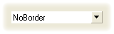
NoBorder
|
There are no borders. The image below demonstrates the NoBorder style applied to the ButtonEdit control.
|
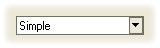
Simple
|
Borders are flat. The image below demonstrates the Simple style applied to the ButtonEdit control.
|
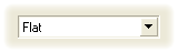
Flat
|
Borders are flat. The image below demonstrates the Flat style applied to the ButtonEdit control.
|
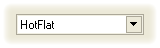
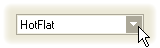
HotFlat
|
Borders are flat. Borders and the client area are highlighted when the mouse pointer is positioned over them. The image below demonstrates the HotFlat style applied to the ButtonEdit control.
|
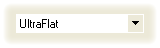
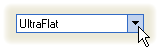
UltraFlat
|
Borders have an Office XP style. Borders and the client area are highlighted when the mouse pointer is positioned over them or they are focused. Otherwise, there are no borders. The image below demonstrates the UltraFlat style applied to the ButtonEdit control.
|
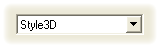
Style3D
|
Borders are three-dimensional. The image below demonstrates the Style3D style applied to the ButtonEdit control.
|
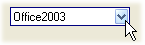
Office2003
|
Borders have an Office 2003 style. The image below demonstrates the Office2003 style applied to a ButtonEdit control.
|
Default
|
The border style is determined by the current Look-and-Feel settings. For example, text editors’ borders are painted according to the RepositoryItem.LookAndFeel object’s settings. |
Remarks
Various controls declare style properties of the BorderStyles type. This allows you to control the appearance of control elements (buttons and control borders). The control style determines the appearance of a control in all possible states (normal, hot-tracked and pressed).