Combo Box Editors
- 6 minutes to read
Combo Box Editors
Combo box editors are used to select a value from a fixed or dynamically changing list. Such editors provide an edit box and a dropdown window displaying a single column list. These editors derive common popup window management features from the PopupBaseEdit class. Please refer to the Dropdown Editors Overview topic for additional information.
The XtraEditors library provides three combo box editors: ComboBoxEdit, ImageComboBoxEdit and MRUEdit.
Note
Combo box editors do not support the undo functionality.
ComboBoxEdit Control
The ComboBoxEdit control displays a fixed set of items in its dropdown list. End-users are not allowed to add new items (unless you implement this in code).
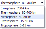
Each item in ComboBoxEdit controls is an object (usually a string). To add a new item, you need to add an object to the RepositoryItemComboBox.Items collection. Strings displayed within the dropdown list are text versions of these objects and a text string is obtained using the ToString method.
The code below shows how to add items to a ComboBoxEdit control.
DevExpress.XtraEditors.Repository.RepositoryItemComboBox properties = comboBoxEdit1.Properties;
properties.Items.AddRange(new string [] {"Barcelona", "Berlin", "Frankfurt",
  "Helsinki", "Kirkland", "London", "Madrid"});
//Select the first item
comboBoxEdit1.SelectedIndex = 0;
//Disable editing
properties.TextEditStyle = DevExpress.XtraEditors.Controls.TextEditStyles.DisableTextEditor;
To edit a data source field whose values are defined by a list, you can use a ComboBoxEdit control whose items match these values. In some cases, however, you may want to provide a special text representation of values. Suppose you have a ‘PaymentType’ data source field which stores integer values representing possible payment types (0 - ‘Cash’, 1 - ‘Visa’, 2 - ‘American Express’, etc). The LookUpEdit control may be used in this case. Note: it can only be used when there is a data table listing this correspondence of edit and display values. If such a table doesn’t exist, you will need to use a ImageComboBoxEdit control instead.
The ComboBoxEdit control does not restrict user input. So, end-users may enter any string in the edit box regardless of the item set. To allow selecting items only, disable the edit box by setting the RepositoryItemButtonEdit.TextEditStyle property to TextEditStyles.DisableTextEditor.
ImageComboBoxEdit Control
A ImageComboBoxEdit control displays a set of items within its dropdown list. Such controls also support item images in the edit box and the dropdown. Text editing is not supported, so the edit value can only be changed by selecting an item from the dropdown list.
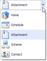
Each item is represented by an ImageComboBoxItem object that provides a value (ComboBoxItem.Value), description (ImageComboBoxItem.Description) and image properties (ImageComboBoxItem.ImageIndex). An item’s value specifies the editor’s edit value when the item is selected. The item’s description is used to present this item on screen.
ImageComboBoxEdit supports small and large images for its items. These are specified by the RepositoryItemImageComboBox.SmallImages and RepositoryItemImageComboBox.LargeImages properties. If you supply both small and large images for the editor, the item in the edit box is displayed with a small image while items in the dropdown window are displayed with large images. Supplying a single image list results in displaying the same images within the dropdown and the edit box. If image lists are not provided, items are represented by their descriptions only.
The sample code below shows how to add items to an ImageComboBoxEdit editor.
using DevExpress.XtraEditors.Repository;

RepositoryItemImageComboBox properties = imageComboBoxEdit1.Properties;
//Specify lists with large and small images
properties.LargeImages = imageList1;
properties.SmallImages = imageList2;
//Prevent updates while adding items
properties.Items.BeginUpdate();
try {
    //Initialize each item with the display text, value and image index
    properties.Items.Add(new ImageComboBoxItem("Column Designer", 0, 0));
    properties.Items.Add(new ImageComboBoxItem("Band Designer", 1, 1));
    properties.Items.Add(new ImageComboBoxItem("Style Designer", 2, 2));
    properties.Items.Add(new ImageComboBoxItem("View Designer", 3, 3));
    properties.Items.Add(new ImageComboBoxItem("Printing", 4, 4));
}
finally {
    properties.Items.EndUpdate();
}
//Select the second item
imageComboBoxEdit1.SelectedIndex = 1;
MRUEdit Control
Use the MRUEdit control to allow end-users to choose the most recently entered values from the dropdown list. MRUEdit controls extend the functionality of ComboBoxEdit controls allowing end-users to add items to the dropdown list. When an end-user enters a new string, then moves focus to another control or presses the ENTER key (provided that the RepositoryItemMRUEdit.ValidateOnEnterKey property is set to true), the string is inserted as the top item in the dropdown list.
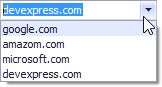
The maximum number of items that can be displayed within the dropdown list is specified by the RepositoryItemMRUEdit.MaxItemCount property. If the property value is 0, the number of items is unlimited. If the number of items is limited, adding an item may result in removing the least recently used item from the list.
Common Properties of Combobox Editors
All combo box editors support an automatic completion feature. This allows end-users to select an item from the dropdown by typing its first characters. When you type text in the editor, the control finds an item starting with the characters typed, highlights the item in the dropdown (if it’s open) and displays the full item’s caption in the edit box. Use the RepositoryItemComboBox.AutoComplete property to enable or disable automatic completion. The RepositoryItemComboBox.CaseSensitiveSearch property specifies whether automatic completion is case sensitive. The RepositoryItemPopupBaseAutoSearchEdit.ImmediatePopup property specifies whether the dropdown list is opened automatically when the user starts typing.
When a combo box editor is focused, end-users can select the next/previous item without opening the dropdown list by using the UP and DOWN arrow keys. To prevent this from being done accidentally, you can set the RepositoryItemComboBox.UseCtrlScroll property to true. In this case, the CTRL+UP and CTRL+DOWN combinations should be used.
End-users can also scroll through items by double-clicking the edit box. This is only available if the RepositoryItemComboBox.CycleOnDblClick property value is true and the RepositoryItemPopupBase.ShowDropDown property value is ShowDropDown.Never.
The height of the dropdown list is controlled by the RepositoryItemComboBox.DropDownRows property. To specify the height of an item, use the RepositoryItemComboBox.DropDownItemHeight property. This can be useful if you need to custom paint the dropdown list using the ComboBoxEdit.DrawItem event.