Records
- 4 minutes to read
The Vertical Grid Control (VGridControl) arranges data into rows and records. The rows correspond to the fields of an underlying dataset and are arranged horizontally. The records correspond to the dataset’s records and are comprised of data cells arranged one under another.
The Property Grid Control (PropertyGridControl) doesn’t support multiple records. It always display a single record (value column), which displays values of a bound object’s properties. So the information covered in this document and other documents related to records concerns the VGridControl component, not the PropertyGridControl.
The current topic lists the differences in record presentation when various layouts are applied to the VGridControl control and gives information on customizing its appearances.
Records, Layouts and Data Modes
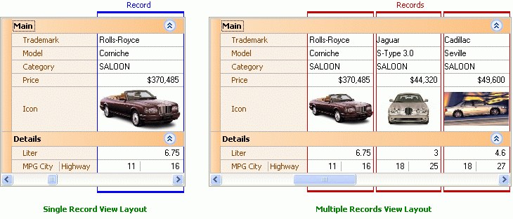
The VGridControl control can use three different layouts to display data. When the multiple records view layout or single record view layout is applied to the control, records are represented as “columns” displayed in front of the row header panel. The only difference between these two layouts is that the multiple records view layout displays several records simultaneously, while the single records view layout displays a single record at a time. The image below illustrates record arrangement when the two mentioned layouts are applied to the control.
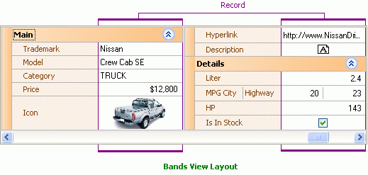
When the bands view layout is applied to the control a single record is displayed at a time. Also, the control cannot be scrolled vertically when this layout type is used. If there are too many rows to fit into the control vertically, the displayed record (together with the corresponding row headers) is arranged into a number of bands. The image below shows an example of such an arrangement.
If the grid uses an external data store, each record in the control is associated with a record from the underlying dataset. In bound mode, you may face additional tasks of adding and deleting records and moving focus between them. The Adding and Deleting Records and Focusing and Scrolling Records topics contain all the information you will need to perform these tasks.
When the grid control works in unbound mode, there is a single record maintained by the control. This record’s data is stored internally - one value per each row item. Thus, the tasks of adding and deleting records or moving record focus are not applicable to this mode. The best layouts to apply when this mode is used are the single record view layout and the bands view layout.
Customizing the Appearance of Records
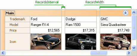
One way to customize the appearance of records implies changing their width and the interval between them. Note that these settings are applied to the whole control - you cannot change the width of an individual record or the interval between just two records. To modify the settings you should use the VGridControlBase.RecordWidth and VGridControlBase.RecordsInterval properties of the control, respectively. The image below illustrates the effect of these properties.
Another aspect of record appearance that can be customized is the style of data cells. Two ways can be used to implement this:
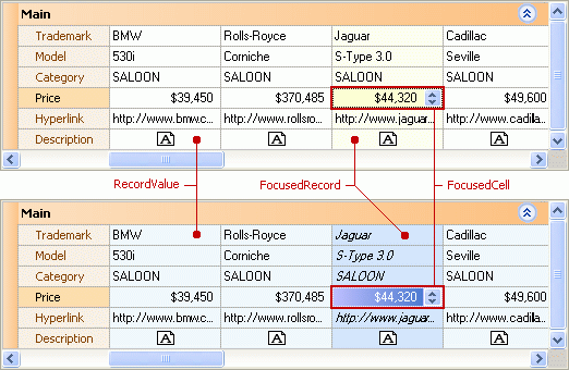
Using the Appearance settings. This technology gives you the ability to change the appearance object applied to all data cells within the control, the appearance settings of cells residing within the currently focused row and the focused cell’s appearance. This can be performed by customizing the RecordValue, FocusedRecord and FocusedCell properties respectively. The image below shows how changes to these styles affect the control’s appearance.
Please refer to the Appearances topic for details on customizing the appearance settings.
- Customizing appearances of individual cells. This can be performed by handling either the VGridControlBase.RecordCellStyle or the VGridControlBase.CustomDrawRowValueCell event. Both events fire for individual cells before these cells are painted. The first enables you to change the appearance of the processed cell. The second gives you the ability to paint cells in a custom manner. You can use these events to implement conditional formatting of records - cells residing within records satisfying a particular condition will have a different appearance. Please refer to the Customizing Appearances of Individual Cells and Custom Painting topics for details on implementing this.