Scheduler
- 3 minutes to read
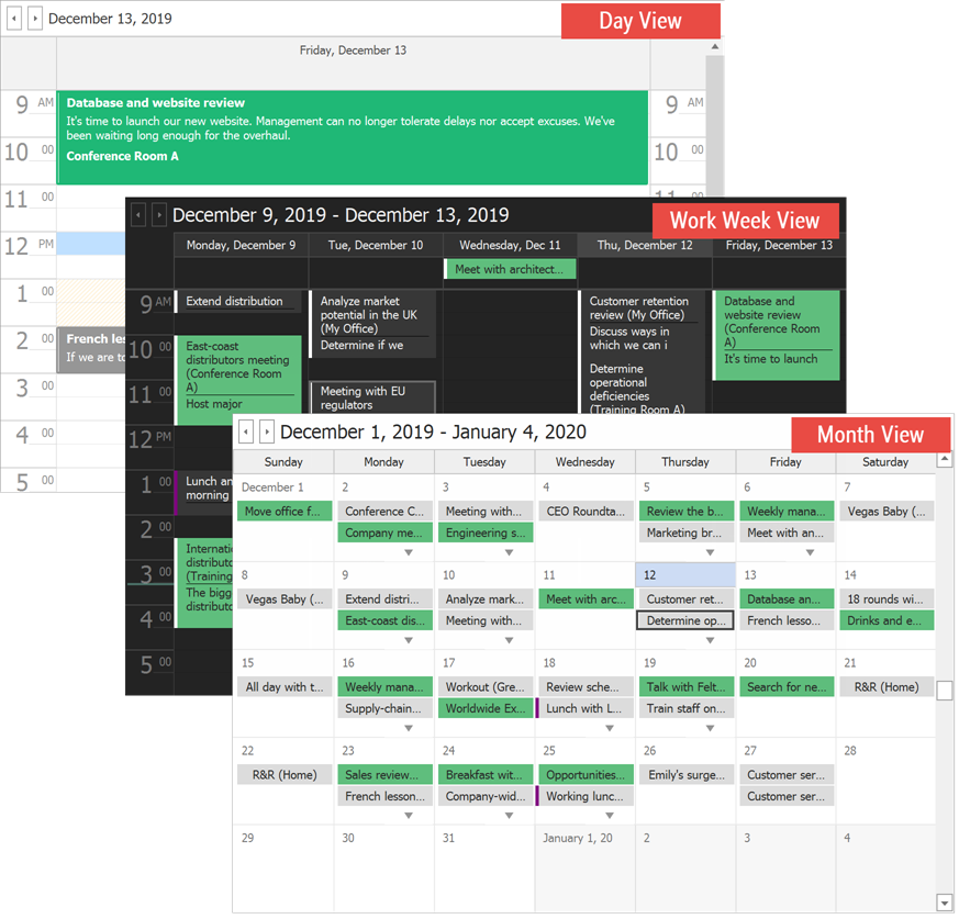
The DevExpress WinForms Scheduler (SchedulerControl) displays appointments in different views and allows users to create and edit regular and recurring appointments.
Try DevExpress WinForms Scheduler in Your Project
See the following page to learn more about this product’s features, capabilities, and pricing options: WinForms Scheduler Control. To try DevExpress controls and libraries in your projects, download our fully-functional 30-day trial version.
Learn the Basics
The Getting Started topic explains how to:
- Populate a Scheduler with appointments stored in a data source.
- Retrieve resources from a source.
- Add a Ribbon with actions.
- Pair a DateNavigator with a Scheduler.
- Map the properties of the Scheduler’s elements to data source fields.
- Replace the default appointment edit form.
- Convert values retrieved from a data source.
The Appointments section contains documents with the following information:
- What data an appointment can display and how to show custom data on appointment surfaces.
- How to create recurring appointments.
- How to add appointments in code.
- How to prevent users from editing appointments at runtime.
- How to create time intervals and prohibit users from creating appointments in these intervals.
- How to group and sort appointments.
- What appointment labels and statuses are and how to change them.
- How to create and manage reminders.
Views
Depending on the active View, a Scheduler can divide the timeline into months, weeks (including or excluding weekends), and days.

The following views are also available in the Scheduler:
- Timeline View
- Displays appointments as horizontal bars along a time scale and an optional Resources Tree on the side.
- Agenda View
- A chronological list of appointments grouped by day.
- Gantt View
- Allows you to schedule tasks and monitor the project progress. Note that in v19.2 and higher, the DevExpress WinForms controls suite ships with a standalone Gantt Control.
- Week View
- The legacy version of the Full Week View. This View displays a week as a 2x3 table where each day occupies a cell. Saturday and Sunday are combined in the last cell. This View is not available in the Scheduler. To enable it, set the
SchedulerControl.Views.WeekView.Enabledproperty totrue.
Data Binding
The Data Binding section explains how to add Scheduler elements (appointments, resources, etc.) from a data source, or create them in code.
Import and Export Data
The Scheduler can import/export or synchronize data with external calendar services.
- Google Calendars (complete synchronization)
- Microsoft Outlook (manual import/export)
- iCalendar (manual import/export)
- VCalendar 1.0 (manual import/export)
Printing and Reports
Refer to the Printing topic for information on how to print the Scheduler’s data or save it to a file. If you need to create a report populated with Scheduler data, refer to the Reports section.
Drag-and-Drop
The control allows users to drag an appointment within the control bounds to reschedule the appointment, and drag data from another control or application to create a new appointment. Refer to the following topic for more details: Drag-and-Drop Operations.