Timeline View
- 4 minutes to read
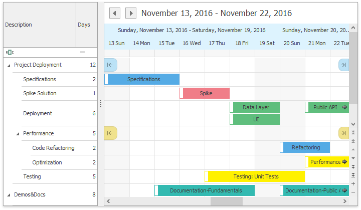
The Timeline View displays appointments as horizontal bars along the Time Scales, and provides end-users with an overview for scheduling purposes. The view is implemented by the TimelineView class, accessible by using the SchedulerControl.TimelineView property. To show the view, set the SchedulerControl.ActiveViewType property to the SchedulerViewType.Timeline type.

You can create your own time scale with a custom format and layout, and add it to the collection of Timeline scales. To accomplish this, create a descendant of one of the built-in scales, or from the base scale class TimeScaleFixedInterval. For more information, see the Time Scales article.
When switching from the Timeline view to other views, the visible interval may change. This behavior is expected because from the Timeline view can have a selected cell (the SchedulerControl.SelectedInterval) outside the currently visible interval. If you select a cell and scroll the view, the selection remains the same, although it goes beyond the visible area. When switching views, the time interval of a new view is calculated so that it starts with the interval selected in the SchedulerControl. Thus the new visible interval may be quite different from the visible interval of the Timeline view. This behavior is specific to the Timeline view.
You can bind the Resources Tree control to the SchedulerControl to display hierarchical resources. For proper display and synchronization of controls, the SchedulerViewBase.GroupType property should be set to the SchedulerGroupType.Resource value.
The following table lists the methods and properties of the TimelineView class, which implement the Timeline View’s basic functionality.
Member Name | Description |
|---|---|
Provides access to the properties that control the appearance of the TimelineView’s elements. | |
Provides access to the TimelineViewAppointmentDisplayOptions instance, containing the appointment’s display options for the Timeline View. | |
Hides the horizontal scrollbar in the Timeline View. Note There is no equivalent WPF property. | |
Returns the most detailed enabled time scale. Use its TimeScale.Width property to specify the TimelineView column width. | |
Specifies how the selection behaves when the time scale is changed in the Timeline view. See OptionsSelectionBehavior.UpdateSelectionDurationAction for more information. | |
Provides access to a collection of time scales displayed in the timeline view. You can create a custom scale and add it to the collection. | |
Gets the time interval currently selected in the scheduler’s active view by an end-user. | |
Provides access to the selection bar options. | |
Gets or sets whether resource headers are displayed. | |
If a view is grouped by dates or resources, a vertical scrollbar appears, which enables an end-user to scroll a row to see hidden appointments. | |
Returns a copy of the visible time interval collection for the current view. | |
Fills the visible time interval collection with new items. | |
Gets or sets the work time interval for a Timeline View. |
The following table lists events that allow you to customize the View’s layout.
Event Name | Description |
|---|---|
Fires when the SchedulerViewBase.GroupType is set to SchedulerGroupType.Date. Allows you to manually paint the square area at the top left corner of the view. | |
Allows you to manually paint a Day of Week header. | |
Allows you to paint a group separator in a custom manner. | |
Allows you to paint a navigation button in a custom manner. | |
Allows you to paint a resource header in a custom manner. | |
Allows you to paint the time cells in a custom manner. |
The following table lists services that allow you to customize the View’s layout.
| Service | Description |
|---|---|
| HeaderCaptionService | Allows you to custom format the header captions. |
| HeaderToolTipService | Allows you to specify custom tooltips for the day headers. |