Step 2 - Dock Manager
- 3 minutes to read
In this step, you will learn how to use the Document Manager component along with the Dock Manager in a single application. The Dock Manager provides centralized control over the behavior and view settings of the dock panels it owns.
Locate the DockManager component in the Visual Studio ToolBox and drop it onto the form.
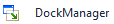
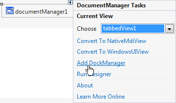
Alternatively, you can do it via the DocumentManager’s smart tag, as illustrated in the figure below.
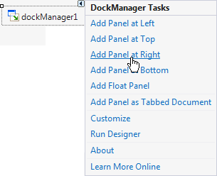
Invoke the DockManager smart tag and add the required DockPanels via the corresponding links.
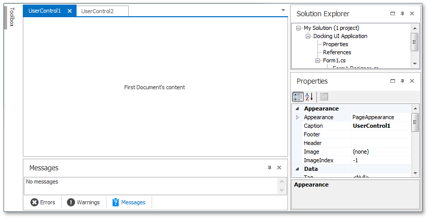
In Visual Studio, the Toolbox auto-hide panel is docked to the form’s left edge, the Solution Explorer and Properties panels are docked to the right edge, and the Errors, Warnings and Messages panels are combined in a tabbed group at the bottom of the form. Emulate the layout illustrated below by adding six panels.
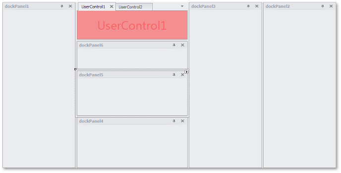
Notice that the Document Manager component is scaled automatically as new panels appear.
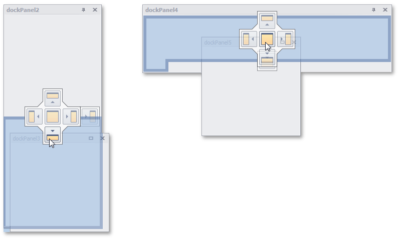
Drag the panels to rearrange and dock them to specific places via docking hints.
After customizing the panels, you should have a UI similar to the one below.
Now, when both DockManager and DocumentManager are used in a single form, you will gain several unique features from these controls. Their two main features are listed below.
- End-users can press Ctrl+Tab or Ctrl+Shift+Tab to navigate via Documents and panels within the Document Selector. See the Document Selector topic for details.
- DockPanels can be docked to DocumentManager as tabbed Documents. However, you cannot do the opposite - Documents cannot be docked to panels. This behavior is controlled by the DockManager.DockMode property, and emulates the behavior of Visual Studio.
Refer to the Interaction with Dock Panels topic for more features.
Dock panels display default buttons - Close, Auto-hide and Maximize. You can hide these buttons via the BaseDockOptions.ShowCloseButton, BaseDockOptions.ShowAutoHideButton and BaseDockOptions.ShowMaximizeButton properties and/or add your own Header Buttons. The figure below illustrates a custom ‘Print’ button added to the Errors panel.
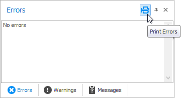
As you can see, the custom Print button icon is painted in the skin color on hover. This feature is called Glyph Skinning, and allows you to paint your own custom buttons in the same pattern as default buttons. You can also use it to build monochrome UIs for your applications, where item captions and glyphs are painted in the same color. Many other controls besides DockManager support this feature. See the Glyph Skinning topic for a complete list.
Your Visual Studio-inspired application is almost complete. The final step is to add an application menu based on the Bar Manager component.