Touch-Enabled Tile UI
- 5 minutes to read
Touch-enabled applications, sometimes referred to as Hybrid apps, are applications that are easy to use on both desktops and touch devices. There are no strict patterns for building touch-enabled apps, except that controls in the application should be optimized for touch input. You can read more about developing for touch-enabled devices in the Intel’s Developer Zone blog. This section describes one common application pattern and shows some of DevExpress controls which are most suitable for creating this kind of application.
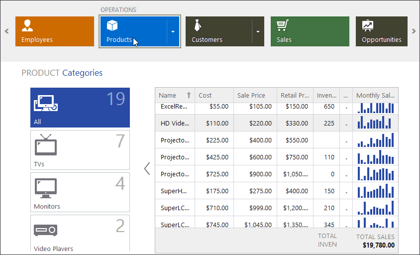
The figure below illustrates a “Touch-Enabled Hybrid App” demo available in the DevExpress Demo Center.
- Common Application Settings
- Content Area
- Navigation Area
- Switching Between Modules
- Additional Components
- Template Gallery
Common Application Settings
This section enumerates tips useful for developing touch-enabled apps.
Touch UI Mode
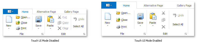
DevExpress provides the WindowsFormsSettings class with multiple static properties that affect the appearance and behavior common to all DevExpress controls. These properties allow you to modify the entire application with just one setting. For Hybrid applications, there is the static WindowsFormsSettings.TouchUIMode property. With this setting enabled, all UI elements will tend to increase their sizes and margins, making it more comfortable for your end-user to work using their fingers. For instance, the following figure illustrates the Ribbon Control with and without TouchUI mode applied.
Touch-Aware Scrolling
Set the static WindowsFormsSettings.ScrollUIMode property to Touch in order to enable scrolling using touch gestures.
Skins
Use modern DevExpress Skins (such as “Office 2013” and newer) as they offer a ‘clean’ and flat appearance.
Hide Control Borders
Hide unnecessary borders by disabling the controls’ BorderStyle or BorderVisibility properties.
Glyph Skinning
The Glyph Skinning feature paints item icons with these items’ fore colors, which creates a flat monochrome application look.
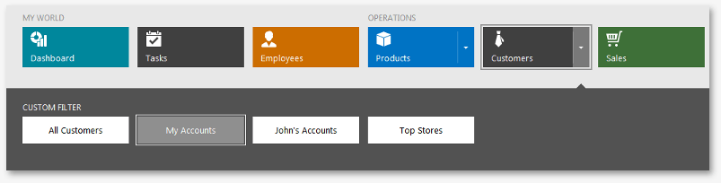
Content Area
The client area displays a module (a UserControl) currently selected by an end-user. The User Control may provide table data, charts, gauges, calendars, terrain data, etc. Hence, you can choose any control that fits your needs.
Although you can enable the static WindowsFormsSettings.TouchUIMode property to make any DevExpress control suitable for the use on touch-enabled devices, some controls are initially designed to fit Hybrid apps. For instance, if you want Data Grid control to present data from a data source, consider using its Tile View instead of traditional tabular Views.

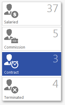
Apart from showing regular tiles, this View can represent data similar to the Microsoft Office 365 data grids (see the figure below). To do so, switch the TileViewItemOptions.LayoutMode to the “List” value.
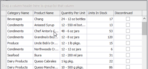
Another Data Grid View, the WinExplorer View (on the figure below) is helpful for presenting records in a manner similar to Microsoft Windows Explorer.
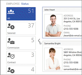
Navigation Area
It is recommended that you utilize tile-based navigation controls: due to their geometry and size, tiles are easier to hit with fingers compared to traditional toolbar buttons.
TileNavPane allows you to implement a hierarchical tile-based menu consisting of up to three levels. Built-in navigation breadcrumbs help an end-user keep track of the current location in the navigation hierarchy.
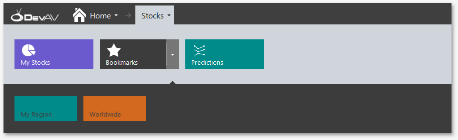
TileBar is a simplified version of the Tile Nav Pane without the breadcrumb bar. Supports both horizontal and vertical layout modes.
- Switch the AccordionControl to the Hamburger Menu mode to hide navigation elements when they are not needed and save the screen space. To enable this mode, use the AccordionControl.ViewType property.
Tile Control provides static and live (animated) tiles that can be arranged into multiple columns and rows. This control is appropriate for building simple tile menus.
Switching Between Modules
For multi-screen applications, utilize the following DevExpress content containers:
- NavigationFrame container helps you implement a single document interface (SDI). It features no navigation buttons or tab headers for its child modules, to switch between modules you have to manually change the NavigationFrame.SelectedPage property. Provides built-in animation effects.
- TransitionManager component supplies any content container with animation effects, played when a container changes its modules. When utilizing Navigation Frame, Transition Manager is not required.
Additional Components
The following lists detail other useful controls and components suitable for touch-enabled applications.
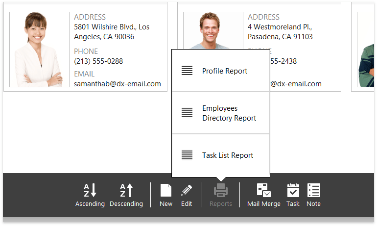
Buttons and Menus
Instead of standard rectangular buttons, use the WindowsUIButtonPanel that hosts circle-shaped Windows 10-inspired buttons.
Using the same control, you can create simple toolbars with built-in peek panels (see the WindowsUIButtonPanel.QueryPeekFormContent event).
Flyouts and Pop-Up Menus
Employ the Flyout Panel component to create flat flyouts and pop-ups.
Messages
Utilize the Flyout Dialog control to create modern notification messages.
Notifications
For Windows Modern-inspired notifications, utilize the Toast Notification Manager component.
Form Layout
As for any other UI type, use the Layout and Data Layout Controls component to effectively arrange your UI elements across an application module. The Data Layout Control can automatically generate an editing UI based on a given data source.
Splash Screen
Utilize the Splash Screen Manager to supply your application with splash screen and wait forms.
Split Container
The SplitContainerControl component breaks a form space into two resizeable regions. You can modify the SplitContainerControl.CollapsePanel property to replace a drag-and-drop splitter with an expand/collapse button.
Auxiliary Containers
One-pixel border side panels support panel snapping and overlay resize features.
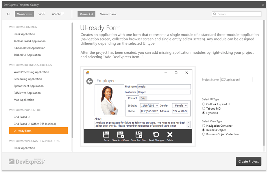
Automatic UI Generation
The DevExpress Template Gallery provides various templates to jump-start application development. For touch-enabled applications, go to the gallery “WinForms Popular UIs | UI-ready Form” section and select the “Hybrid UI” type.
For data-managment applications, you can utilize the Scaffolding Wizard to automatically generate a fully functional and ready to use application based on the given data source. The application created by Wizard consists of multiple separate interconnected modules and follows the MVVM pattern.