Input Box
- 3 minutes to read
An XtraInputBox is a skinable dialog that displays one editor for end-users to set a desired value, and OK/Cancel buttons to confirm or reject this value. This dialog is a simplified version of the XtraDialog control with minimum customization options.
Input Boxes are created and customized entirely from code. To do that, call one of the XtraInputBox.Show methods.
Display an Input Box With a Default TextEdit Editor
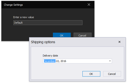
To display an Input Box of this type, call the XtraInputBox.Show method overload with three string parameters.
| Parameter Name | Description |
|---|---|
| Prompt | The text string above the editor. |
| Title | The dialog caption. |
| DefaultResponce | The default editor value, shown when the input box appears on screen. |
The image and code below illustrate an example.
This XtraInputBox.Show method returns an editor value when an end-user clicks “OK”. Otherwise, returns String.Empty.
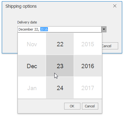
Display an Input Box With a Custom Editor
To display an Input Box with any DevExpress editor within, call the XtraInputBox.Show method overload that takes an instance of the XtraInputBoxArgs class as a parameter. The XtraInputBoxArgs class exposes the following public properties.
| Property | Description |
|---|---|
| XtraInputBoxArgs.Editor | The editor displayed by an Input Box |
| XtraInputBoxArgs.DefaultResponse | The default editor value, shown when the input box appears on screen. |
| XtraInputBoxArgs.Prompt | The text above the editor. |
| XtraInputBoxArgs.Showing | This event allows you to access and customize a form within the dialog. For instance, you can set a dialog icon. |
| DefaultButtonIndex | Specifies what Input Box button is a default one. When an end-user presses the Enter key, the default button is considered clicked. Set this property to 0 to make “OK” the default button, 1 for the “Cancel” button instead. |
| Caption | The Input Box title. |
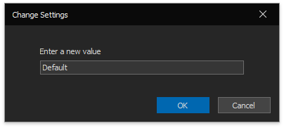
At the following figure, an Input Box displays a DateEdit editor. The code below illustrates how to create such Input Box.
using DevExpress.XtraEditors;

// initialize a new XtraInputBoxArgs instance
XtraInputBoxArgs args = new XtraInputBoxArgs();
// set required Input Box options
args.Caption = "Shipping options";
args.Prompt = "Delivery date";
args.DefaultButtonIndex = 0;
args.Showing += Args_Showing;
// initialize a DateEdit editor with custom settings
DateEdit editor = new DateEdit();
editor.Properties.CalendarView = DevExpress.XtraEditors.Repository.CalendarView.TouchUI;
editor.Properties.Mask.EditMask = "MMMM d, yyyy";
args.Editor = editor;
// a default DateEdit value
args.DefaultResponse = DateTime.Now.Date.AddDays(3);
// display an Input Box with the custom editor
var result = XtraInputBox.Show(args).ToString();
// set a dialog icon
private void Args_Showing(object sender, XtraMessageShowingArgs e) {
    e.Form.Icon = this.Icon;
}
When an end-user clicks “OK”, this XtraInputBox.Show method returns an Object that is the editor’s edit value. Otherwise, the method returns null.