Skins
- 12 minutes to read
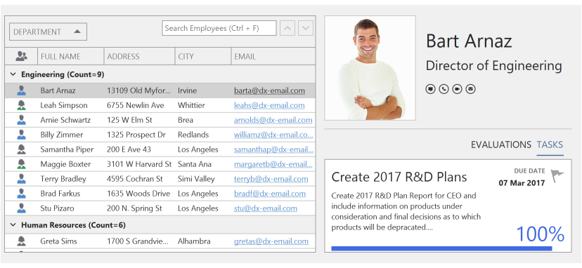
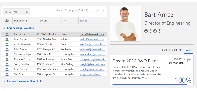
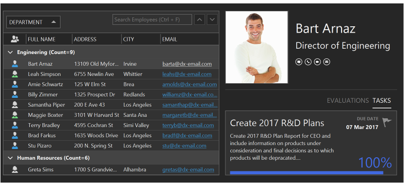
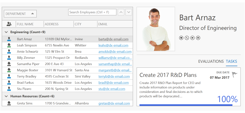
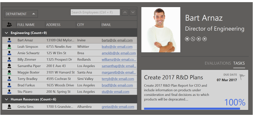
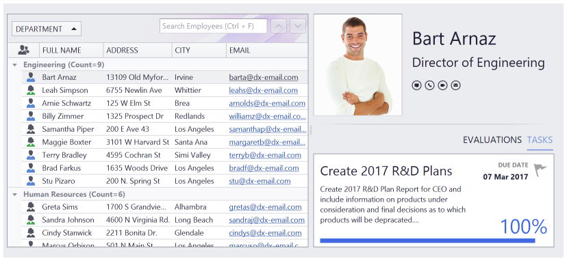
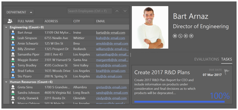
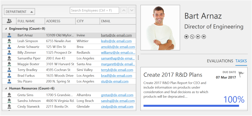
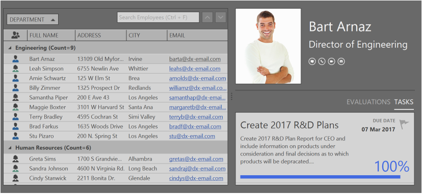
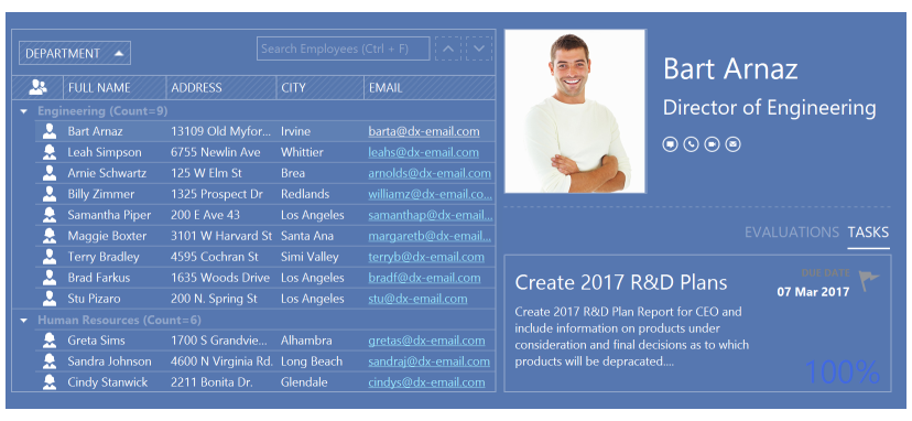
DevExpress WinForms controls include many ready-to-use paint themes (or skins) for changing DevExpress forms’ and controls’ appearance. You can see the different skins by running WinForms Demo Applications and switching between the available themes using a Skin Selector.
This topic describes the available raster and vector skins, how to apply a skin to the entire application and individual controls, how to alter a skin’s color palette and how to create a custom skin.
- Vector Themes
- Basic Raster Skin Set
- Additional Raster Themes
- High Contrast Skins
- Apply Themes to Entire Application
- Persist Selected Theme Between Application Sessions
- Form Title Bar and Border Skinning
- Runtime Skin Selector UI
- Color Mixer: Adjust Raster Skin Colors
- How to Distinguish Light from Dark Skins in Code
- Skin Editor: Modify and Re-Package Skins
- Form Borders
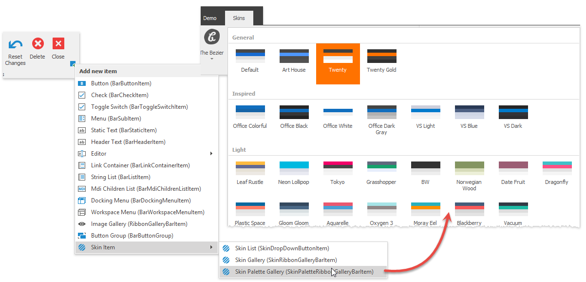
Vector Themes
Vector skins utilize vector images for all UI elements to improve the display quality on high-resolution devices. Vector skins are stored in the DevExpress.Utils library.
1. Basic
2. Bezier
3. Office 2019 Black
4. Office 2019 Colorful
5. Office 2019 Dark Gray
6. Office 2019 White
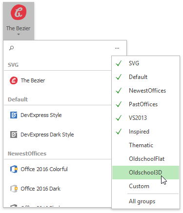
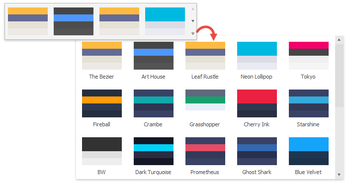
Each vector skin can have multiple palettes (swatches) that are skin color themes. RibbonControl includes the “Skin Palette Gallery” item that allows users to switch palettes at runtime.
The following code illustrates how to modify the default palette and\or create additional ones:
//obtain a vector skin
var commonSkin = CommonSkins.GetSkin(LookAndFeel);
//create a new palette
SvgPalette svgPalette = new SvgPalette();
//set up palette colors
svgPalette.Colors.Add(new SvgColor("Paint", Color.FromArgb(242, 242, 242)));
svgPalette.Colors.Add(new SvgColor("Paint High", Color.FromArgb(255, 255, 255)));
svgPalette.Colors.Add(new SvgColor("Paint Shadow", Color.FromArgb(222, 222, 222)));
svgPalette.Colors.Add(new SvgColor("Brush", Color.FromArgb(80, 80, 80)));
svgPalette.Colors.Add(new SvgColor("Brush Light", Color.FromArgb(150, 150, 150)));
svgPalette.Colors.Add(new SvgColor("Brush High", Color.FromArgb(80, 80, 80)));
svgPalette.Colors.Add(new SvgColor("Brush Major", Color.FromArgb(180, 180, 180)));
svgPalette.Colors.Add(new SvgColor("Brush Minor", Color.FromArgb(210, 210, 210)));
svgPalette.Colors.Add(new SvgColor("Accent Paint", Color.FromArgb(23, 107, 209)));
svgPalette.Colors.Add(new SvgColor("Accent Paint Light", Color.FromArgb(191, 224, 255)));
svgPalette.Colors.Add(new SvgColor("Accent Brush", Color.FromArgb(255, 255, 255)));
svgPalette.Colors.Add(new SvgColor("Accent Brush Light", Color.FromArgb(81, 148, 224)));
svgPalette.Colors.Add(new SvgColor("Key Paint", Color.FromArgb(71, 71, 71)));
svgPalette.Colors.Add(new SvgColor("Key Brush", Color.FromArgb(255, 255, 255)));
svgPalette.Colors.Add(new SvgColor("Key Brush Light", Color.FromArgb(150, 150, 150)));
svgPalette.Colors.Add(new SvgColor("Red", Color.FromArgb(226, 54, 66)));
svgPalette.Colors.Add(new SvgColor("Green", Color.FromArgb(60, 146, 92)));
svgPalette.Colors.Add(new SvgColor("Blue", Color.FromArgb(58, 116, 194)));
svgPalette.Colors.Add(new SvgColor("Yellow", Color.FromArgb(252, 169, 10)));
svgPalette.Colors.Add(new SvgColor("Black", Color.FromArgb(122, 122, 122)));
svgPalette.Colors.Add(new SvgColor("Gray", Color.FromArgb(190, 190, 190)));
svgPalette.Colors.Add(new SvgColor("White", Color.FromArgb(255, 255, 255)));
//replace the default color palette with a custom one
commonSkin.SvgPalettes[Skin.DefaultSkinPaletteName].CustomPalette = svgPalette;
LookAndFeelHelper.ForceDefaultLookAndFeelChanged();
//or
//add a new swatch
commonSkin.CustomSvgPalettes.Add(new SvgPaletteKey(commonSkin.CustomSvgPalettes.Count, "PALETTE_NAME"), svgPalette);
Tip
Starting with version 19.1, you can also use the Project Settings Page to create custom palettes.
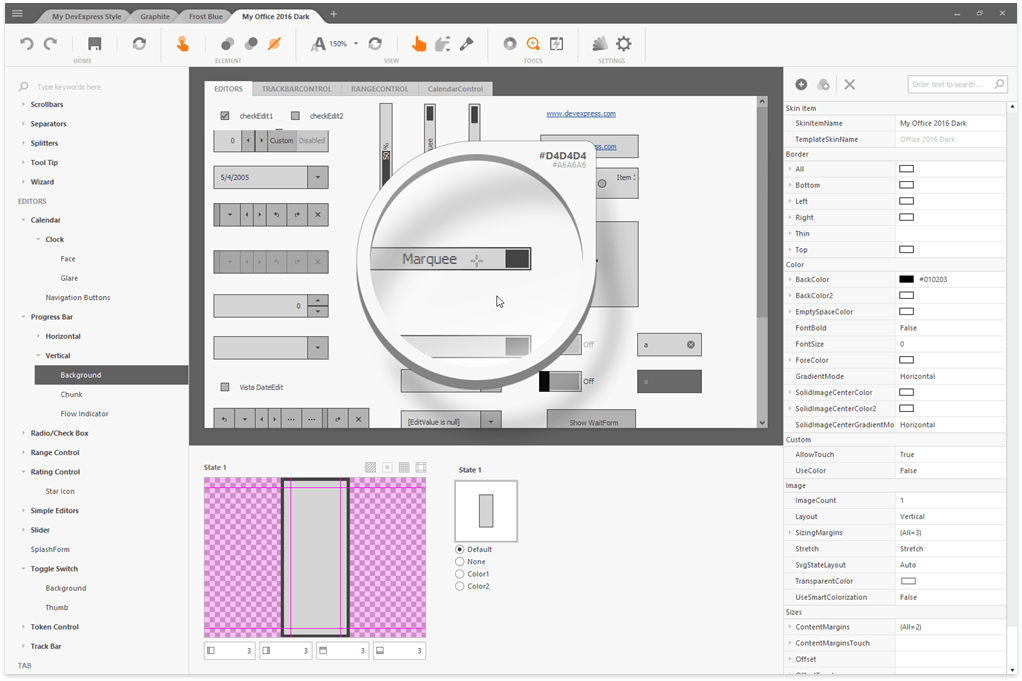
You can repaint vector skins and change their palettes in the updated WinForms Skin Editor. See the Working with Vector Skins article to learn more.
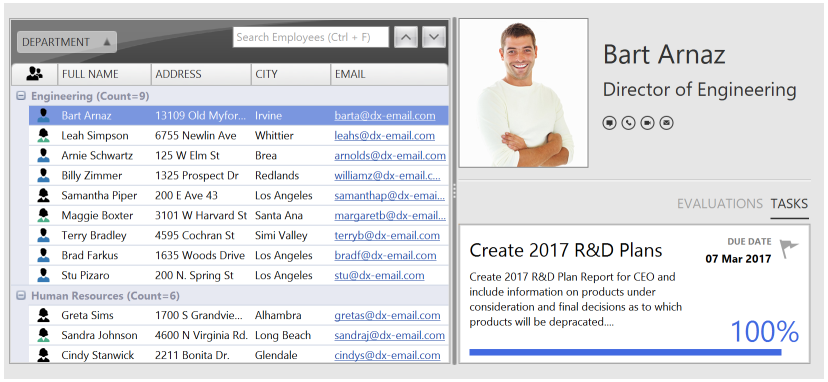
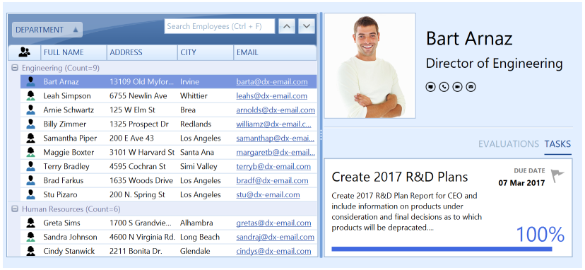
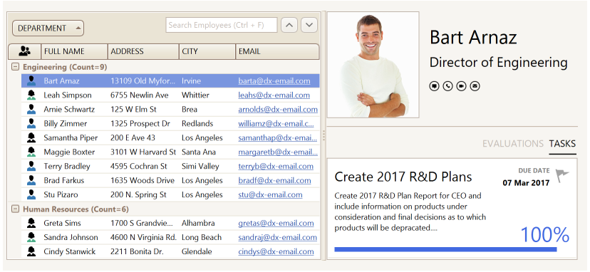
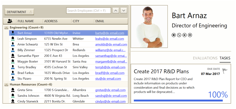
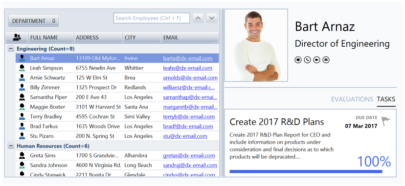
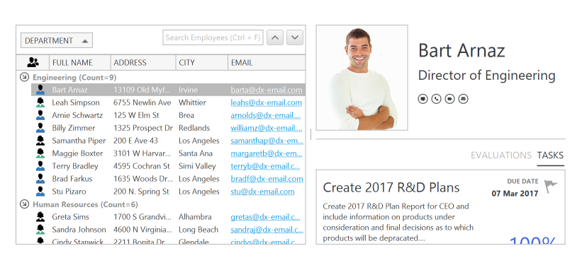
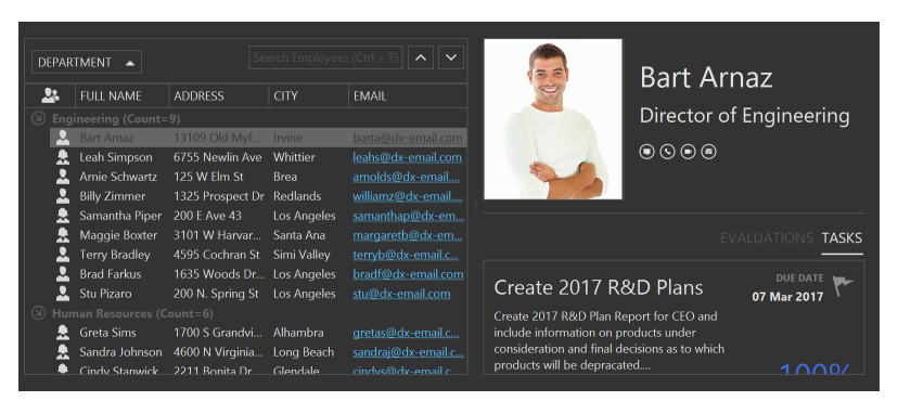
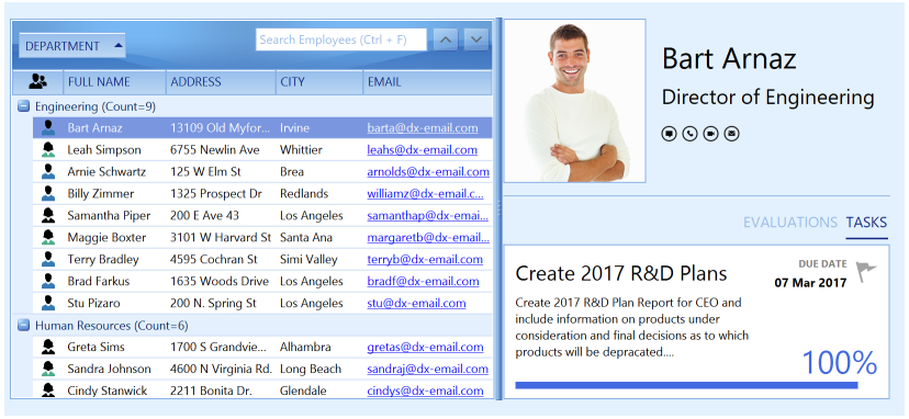
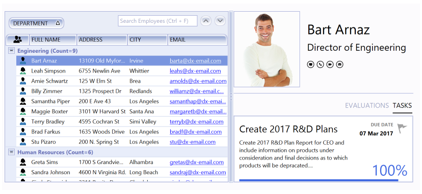
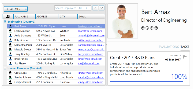
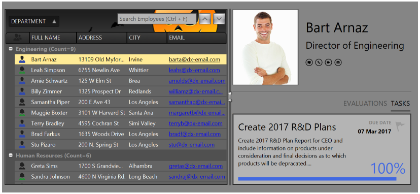
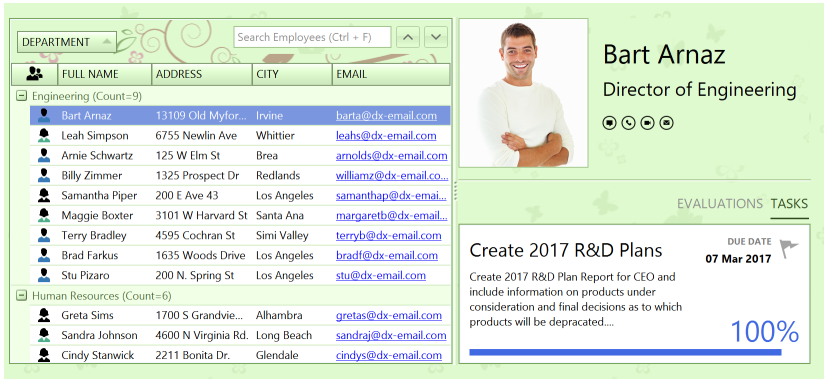
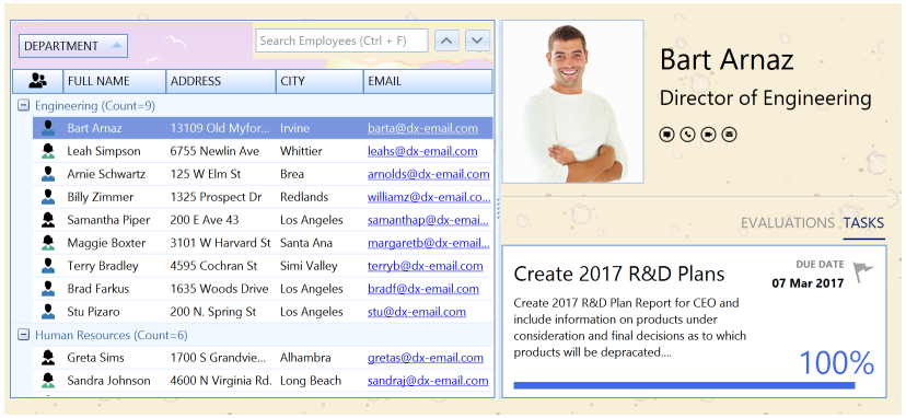
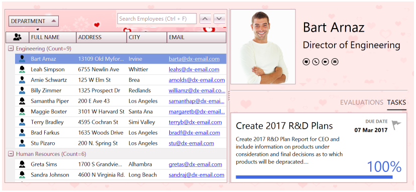
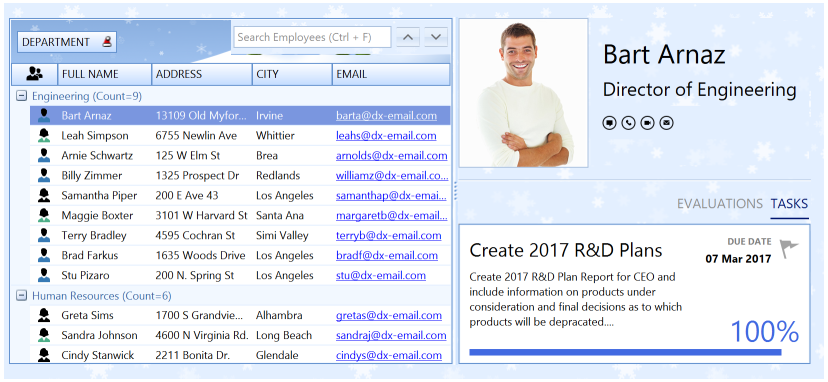
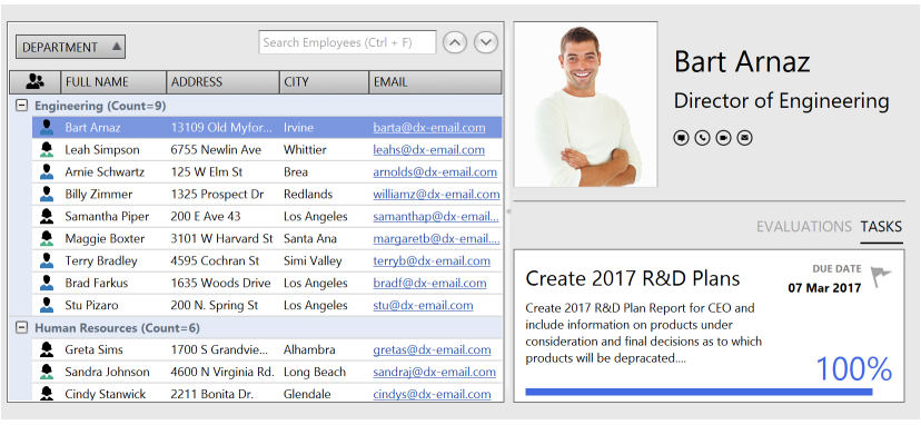
Basic Raster Skin Set
The following gallery demonstrates the default skins that are part of the DevExpress.Utils library (all projects that use DevExpress WinForms controls require this library):
1. DevExpress Style
2. DevExpress Dark Style
3. Office 2016 Colorful
4. Office 2016 Dark
5. Office 2016 Black
6. Office 2013 White (Skin name: Office 2013)
7. Office 2013 Dark Gray
8. Office 2013 Light Gray
9. Office 2010 Blue
10. Office 2010 Black
11. Office 2010 Silver
12. Visual Studio 2013 Blue
13. Visual Studio 2013 Dark
14. Visual Studio 2013 Light
15. Seven Classic
16. Visual Studio 2010 (Skin name: VS2010)
Additional Raster Themes
Add the DevExpress.BonusSkins assembly to your project to use additional skins that are not included in the basic set described above.
Bonus skins are divided into the following two categories:
Bonus Skins
1. Black
2. Blue
3. Caramel
4. Coffee
5. Dark Side
6. Darkroom
7. Foggy
8. Glass Oceans
9. High Contrast (classic)
10. iMaginary
11. Lilian
12. Liquid Sky
13. London Liquid Sky
14. Metropolis
15. Metropolis Dark
16. Money Twins
17. Office 2007 Black
18. Office 2007 Blue
19. Office 2007 Green
20. Office 2007 Pink
21. Office 2007 Silver
22. Seven
23. Sharp
24. Sharp Plus
25. Stardust
26. The Asphalt World
Theme Skins
1. Pumpkin
2. Springtime
3. Summer (Skin name: Summer 2008)
4. Valentine
5. Xmas (Blue) (Skin name: Xmas 2008 Blue)
6. McSkin
7. Blueprint
8. Whiteprint
To access bonus skins at design time, select Register BonusSkins from the DefaultLookAndFeel component’s smart tag. If this command is not available, then the bonus themes have already been registered. Certain DevExpress Project Templates automatically register bonus skins.
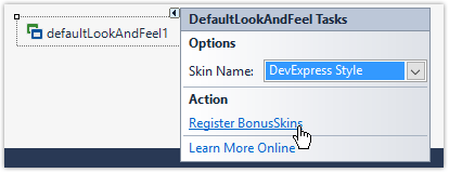
To register bonus skins in code, first ensure that your project references the DevExpress.BonusSkins assembly. Then call the DevExpress.UserSkins.BonusSkins.Register method before the main application form runs.
namespace WindowsFormsApplication1 {
    static class Program {
        [STAThread]
        static void Main() {
            DevExpress.UserSkins.BonusSkins.Register();

            Application.EnableVisualStyles();
            Application.SetCompatibleTextRenderingDefault(false);
            Application.Run(new Form1());
        }
    }
}
You can apply bonus skins once they are registered. The following code sets the Pumpkin bonus skin as the application’s default skin:
private void Form1_Load(object sender, EventArgs e) {
    DevExpress.LookAndFeel.UserLookAndFeel.Default.SetSkinStyle("Pumpkin");
}
High Contrast Skins
Prior to v21.1, the DevExpress skin pack had a single theme for users with a low vision impairment - the raster “High Contrast” skin available as a part of the bonus skins category.
In v21.1 this raster skin was renamed to “High Contrast (classic)”. The “High Contrast” name now belongs to a new vector skin that ships with multiple color palettes.
The appearance and availability of this theme depends on user settings (the “Personalize | High contrast settings” menu in Windows).
- If Windows high contrast mode is off, users can select the “High Contrast” skin like any other DevExpress theme. Skin palette selectors are also available.
- If Windows high contrast is on, all UI selectors that allow users to change skins and palettes are disabled, and the vector “High Contrast” skin with the “Default” palette becomes active. The “Default” palette uses same colors a user sets in the Windows “High contrast settings” screen.
You can disable the static WindowsFormsSettings.TrackSystemHighContrastMode property to prevent your application from tracking the actual state of Windows high contrast mode. In this case applications do not switch the “High Contrast” skin on or off, and users can select any skin they want.
Apply Themes to Entire Application
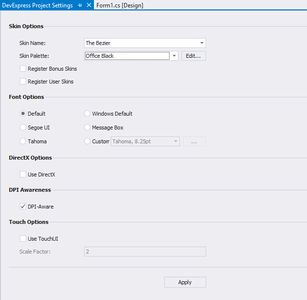
Invoke the DevExpress Project Settings page and select a desired theme to apply it to the entire application.
Alternatively, call the UserLookAndFeel.Default static object’s UserLookAndFeel.SetSkinStyle method.
To apply a vector skin in code, use the UserLookAndFeel.SetSkinStyle method overload that takes a SkinSvgPalette object as a parameter. This parameter allows you to apply a pre-defined color palette (swatch) to a skin.
Persist Selected Theme Between Application Sessions
Windows Forms Application Settings feature allows you to create, store, and maintain custom application and user preferences on client computers. You can use this feature to save and restore active skins and palettes when your application restarts.
Double-click the “Settings.settings” file in the Visual Studio Solution Explorer and create two entries of the String type. Set the scope of both entries to “User”. When an application is about to close, save values of the UserLookAndFeel.Default.SkinName and UserLookAndFeel.Default.ActiveSvgPaletteName properties to Application Settings. When an application starts, read these saved values and pass them to the UserLookAndFeel.SetSkinStyle method as parameters.
<?xml version='1.0' encoding='utf-8'?>
<SettingsFile xmlns="http://schemas.microsoft.com/VisualStudio/2004/01/settings" CurrentProfile="(Default)" GeneratedClassNamespace="DXApplication1.Properties" GeneratedClassName="Settings">
  <Profiles/>
  <Settings>
    <Setting Name="SkinName" Type="System.String" Scope="User">
      <Value Profile="(Default)" />
    </Setting>
    <Setting Name="Palette" Type="System.String" Scope="User">
      <Value Profile="(Default)" />
    </Setting>
  </Settings>
</SettingsFile>
private void Form1_FormClosing(object sender, FormClosingEventArgs e) {
    var settings = Properties.Settings.Default;
    settings.SkinName = UserLookAndFeel.Default.SkinName;
    settings.Palette = UserLookAndFeel.Default.ActiveSvgPaletteName;
    settings.Save();
}

protected override void OnShown(EventArgs e) {
    base.OnShown(e);
    var settings = Properties.Settings.Default;
    if(!String.IsNullOrEmpty(settings.SkinName)) {
        if(!String.IsNullOrEmpty(settings.SkinName)) {
            UserLookAndFeel.Default.SetSkinStyle(settings.SkinName, settings.Palette);
        }
        else
            UserLookAndFeel.Default.SetSkinStyle(settings.SkinName);
    }
}
Form Title Bar and Border Skinning
Skins and palettes change the appearance of DevExpress forms and message boxes.
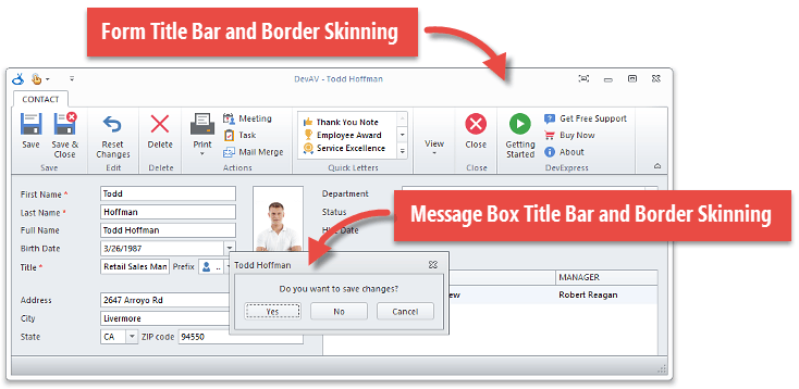
To disable title bar and border skinning, use a compatibility option (see Version Compatibility: Default Property Values) or call the WindowsFormsSettings.DisableFormSkins method.
Related API
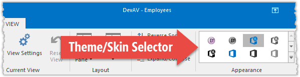
Runtime Skin Selector UI
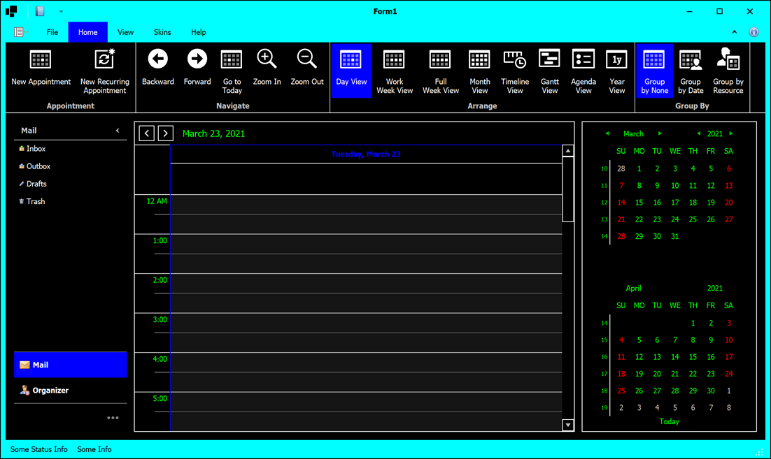
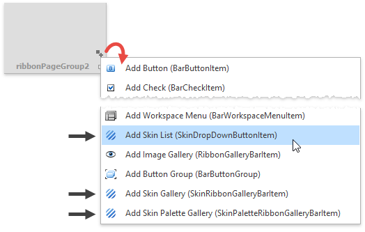
DevExpress Toolbars and Menus and Ribbon include pre-defined skin selector items - SkinBarSubItem and SkinRibbonGalleryBarItem - which are automatically populated with available skin items and allow end-users to switch an application theme at any time.
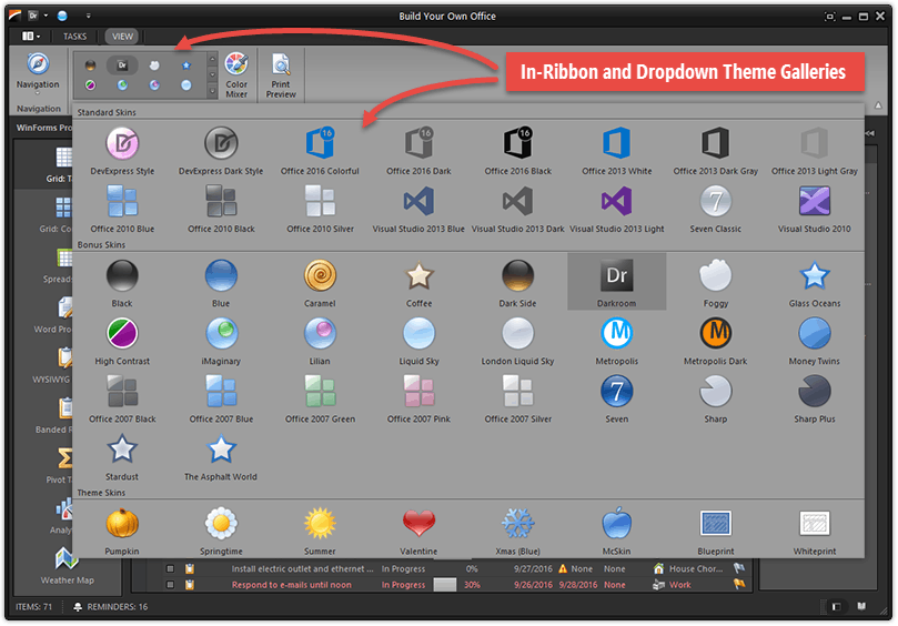
You can also add the SkinDropDownButtonItem and SkinPaletteRibbonGalleryBarItem skin selectors.
The SkinDropDownButtonItem displays available skins in a drop-down list. Unlike SkinBarSubItem, the SkinDropDownButtonItem allows you to search for a specific skin by its name and hide unwanted skin groups.
The SkinPaletteRibbonGalleryBarItem selector displays swatches instead of skins. It is hidden if a traditional raster skin is currently active. Note that this item is only available in the Ribbon Control and does not support the Bar Manager.
You can create all these skin selectors at design time using the Ribbon and Toolbar smart tags.
To change skin selectors’ item captions and icons, handle the static DevExpress.XtraBars.Helpers.SkinHelper.CreateGalleryItem event.
SkinHelper.CreateGalleryItem += (s, e) => {
     if(e.SkinName.Equals(MySkinName)) {
        e.GalleryItem.Image = e.UseLargeIcons ? MyLargeIcon : MySmallIcon;
        e.GalleryItem.HoverImage = MyLargeIcon;
        e.GalleryItem.Caption = "Glacier";
    }
};
You can also manually obtain the list of available skin styles and create a custom UI element to switch between them. Refer to the following topics to learn how to use a built-in selector and create a custom one:
- Add and Customize the Toolbar and Menu Skin Selector
- Add and Customize the Ribbon Gallery Skin Selector
- Build a Custom End-User Skin Selector
- How To: Localize Bar and Ribbon Skin Items
Adjust Skin Colors
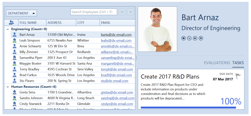
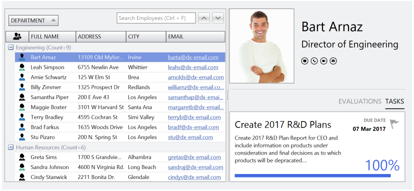
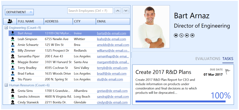
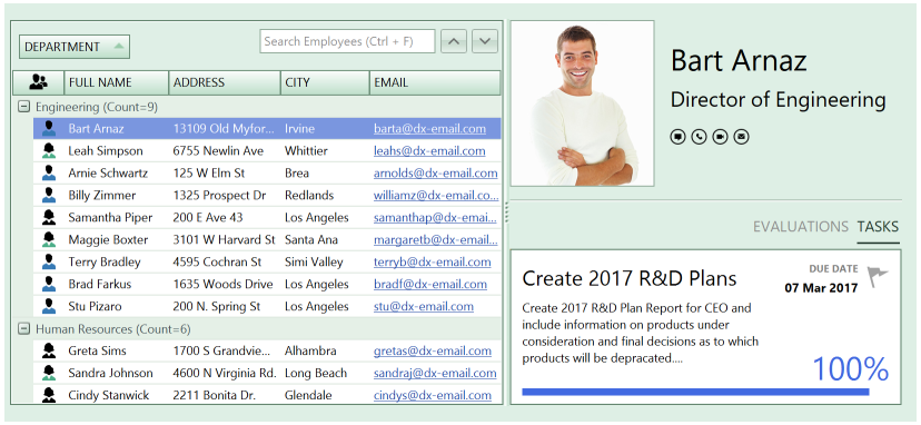
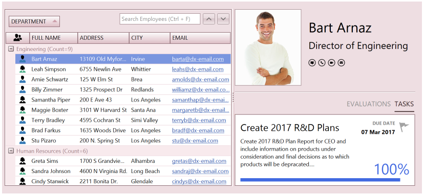
DevExpress skins allow you to modify their default color palettes. For example, you can adjust the Office 2016 Colorful skin’s default colors (which are based on MS Outlook colors) to match other MS Office applications’ color palette.
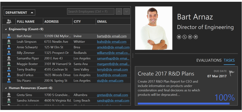
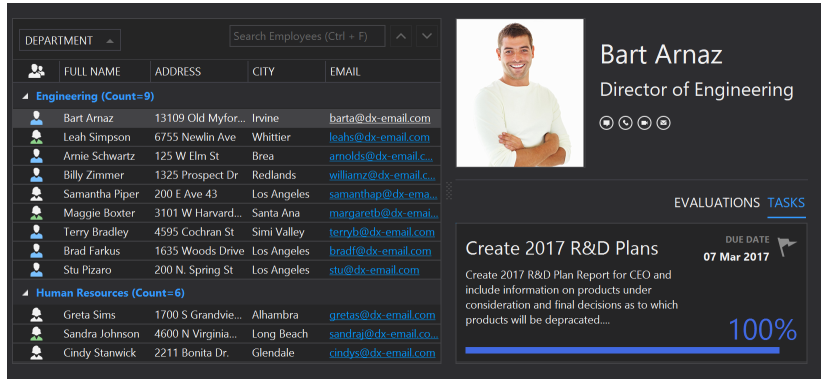
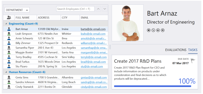
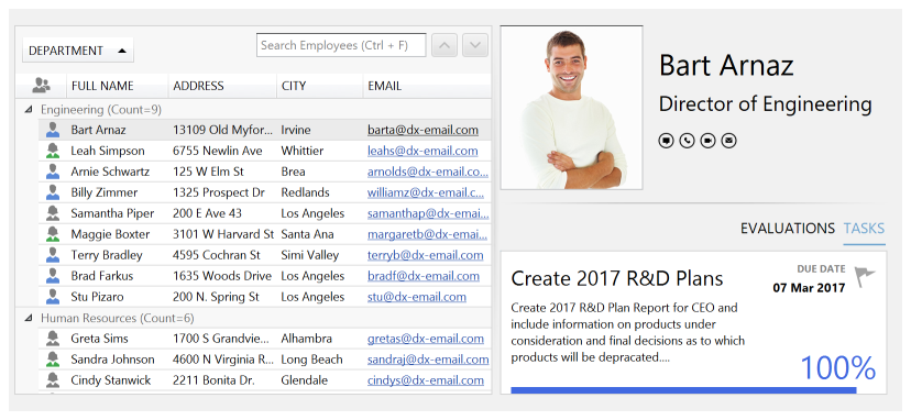
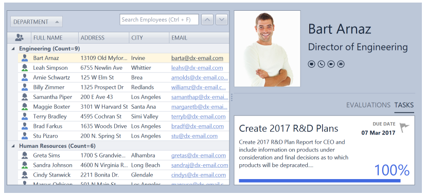
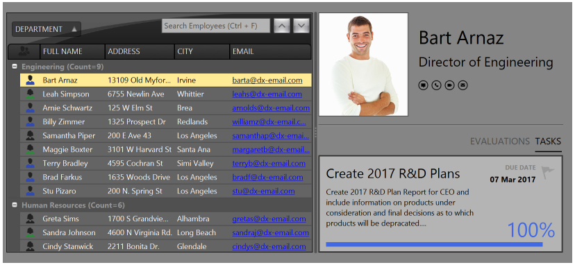
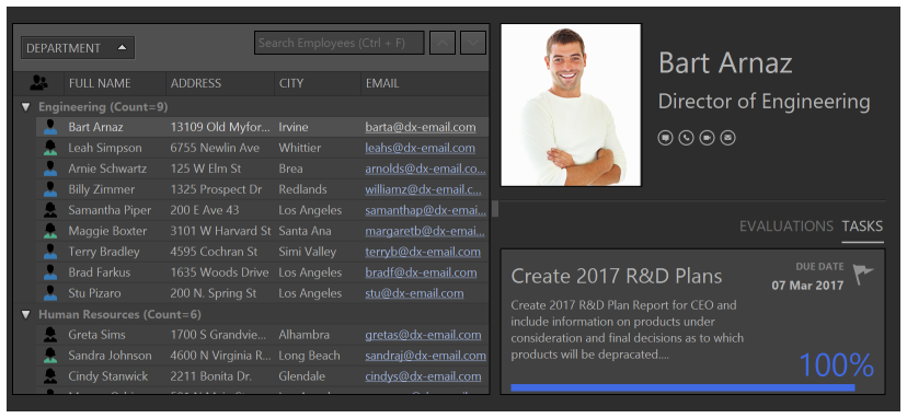
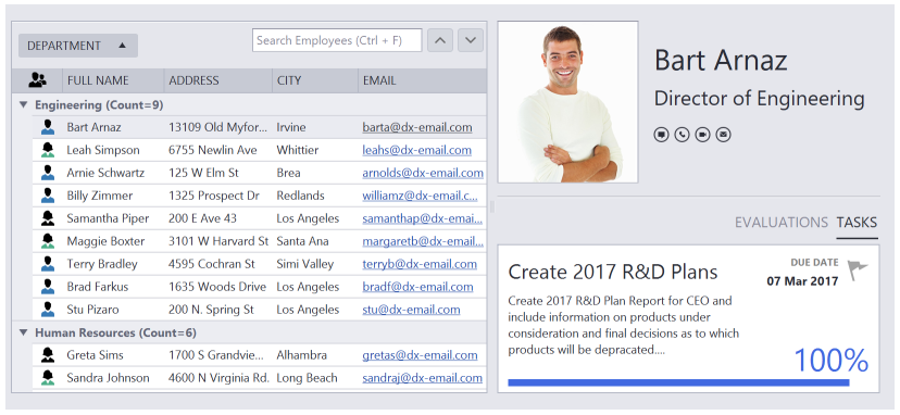
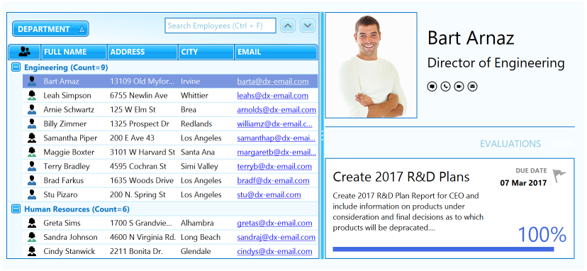
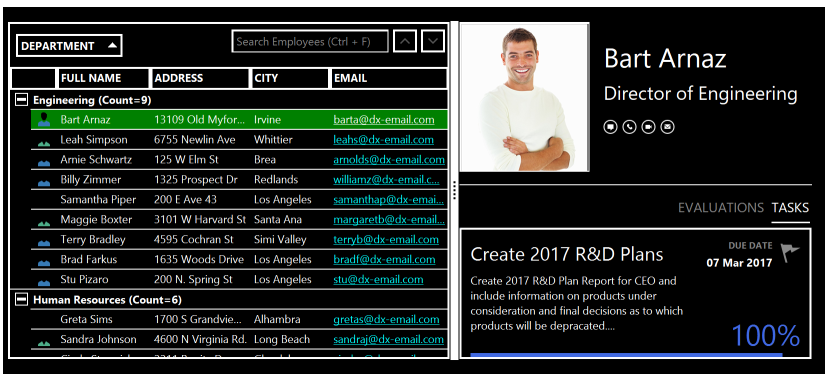
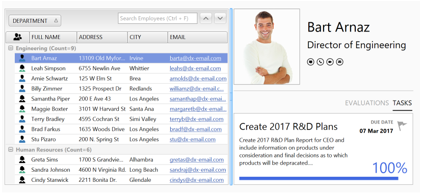
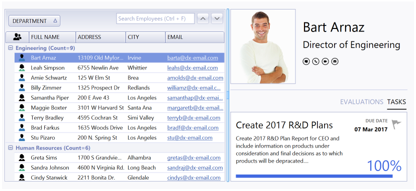
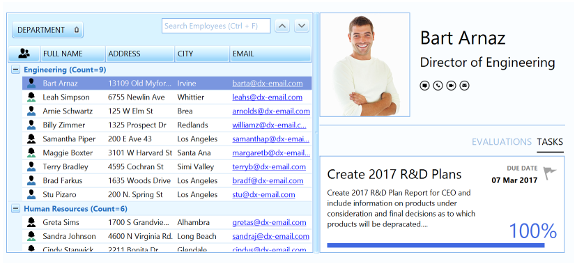
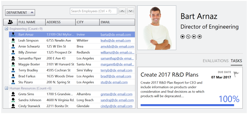
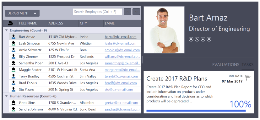
You can use the pre-defined Color Mixer dialog to adjust the skin color in DevExpress WinForms demos, as shown below.
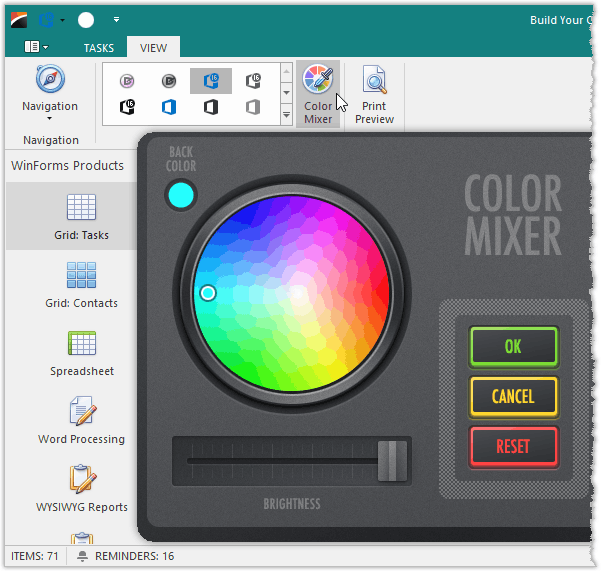
Use the following code to invoke this dialog in your application:
using DevExpress.XtraEditors.ColorWheel;
//..
ColorWheelForm cwForm = new ColorWheelForm();
cwForm.Show();
You can also use an application’s DefaultLookAndFeel component or a specific control’s LookAndFeel property to customize the skin color palette at design time or in code.
| Member | Description |
|---|---|
| UserLookAndFeel.SkinMaskColor | Specifies the primary or background color. |
| UserLookAndFeel.SkinMaskColor2 | Specifies the highlight color. |
| UserLookAndFeel.SetSkinMaskColors | Allows you to set both colors in one call. |
You can access these properties at design time.
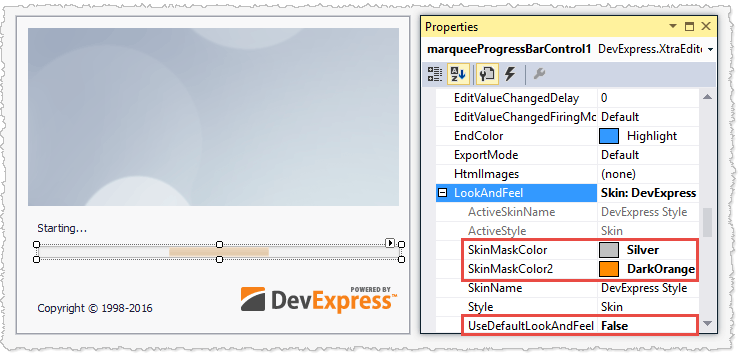
Call the method below to adjust the skin palette in code.
How to Distinguish Light from Dark Skins in Code
All DevExpress skins and palettes fall into two categories: dark and light. To identify an active theme category, call the DevExpress.Utils.Frames.FrameHelper.IsDarkSkin method.
using DevExpress.Utils.Frames;
//...
if (FrameHelper.IsDarkSkin(this.GetActiveLookAndFeel())) {
    //current skin/palette is dark
}
else {
    //current skin/palette is light
}
Skin Editor: Modify and Re-Package Skins
A skin is a set of bitmaps, fonts, and alignment settings that determine how control elements are painted in all possible states: normal, hot-tracked, selected, etc. DevExpress designers use the Skin Editor application to associate skin attributes with individual controls, and this information is compiled into the skin assemblies mentioned earlier. You can access the Skin Editor application from the DevExpress menu in Visual Studio to modify skins to fit a specific corporate style or re-package skins into lightweight DLLs.
Form Borders
In modern flat skins like “Office 2019 Colorful”, DevExpress forms have thin borders. This may be inconvenient for users, since when they try to resize a form they have to aim for those thin borders with a mouse pointer. To improve the user experience, the resize area of DevExpress forms includes both borders and a form shadow/glow skin element. This allows a user to resize a form when a mouse pointer hovers over the form shadow.
In certain cases, forms cannot display shadows.
- When you manually disable the XtraForm.FormBorderEffect property.
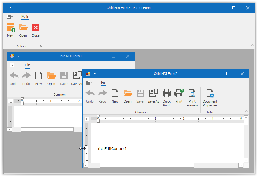
- When forms are child MDI forms.
- When a user accesses the application through a Remote Desktop connection.
In these cases, you can increase form border size to broaden the resize area.
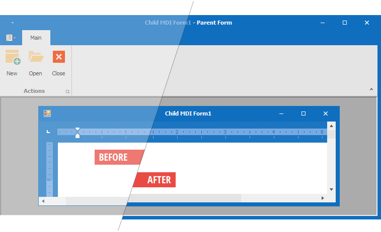
To do that, enable either the WindowsFormsSettings.FormThickBorder or WindowsFormsSettings.MdiFormThickBorder property depending on whether you want to increase border size for all DevExpress forms, or only those that serve as child MDI forms.
Use the WindowsFormsSettings.ThickBorderWidth property to change the thick border width.
Tip
Forms switch to thick borders when you enable the Remote Connection Optimization mode. Disable the FormThickBorder property to keep skin-based borders when this mode is on.