Tile View
- 14 minutes to read
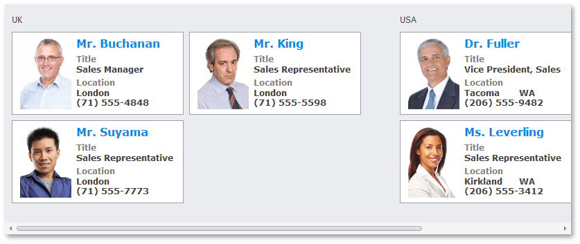
TileView displays data records as tiles. Each tile can contain multiple UI elements arranged in a custom layout. Tile elements can be bound to data source fields.
Getting Started
Create a TileView
- Drop the
GridControlfrom the Toolbox onto a Form. - Bind the
GridControlto a data source and create columns. Select the default View (
GridView) and convert it toTileView.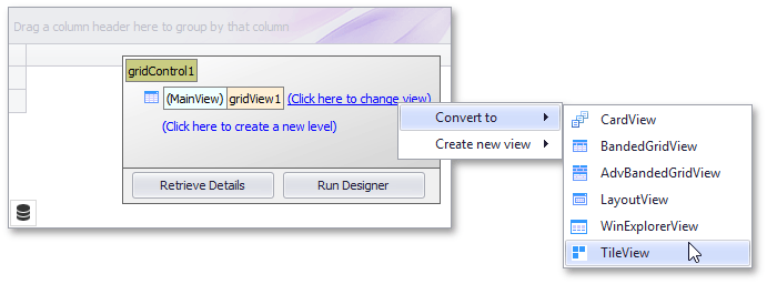
Create a Tile Template
TileView uses templates to generate tiles. A tile template defines the layout and appearance of UI elements within a tile.
Standard Tile Template
The standard tile template divides the design surface into logical rows and columns. Each element is positioned in a specific cell.
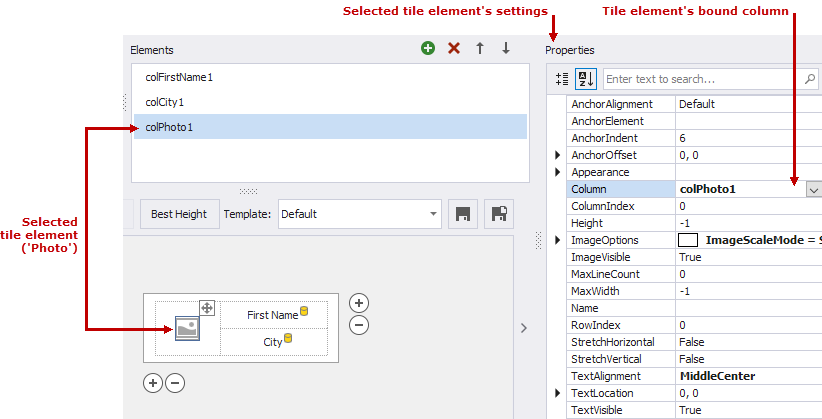
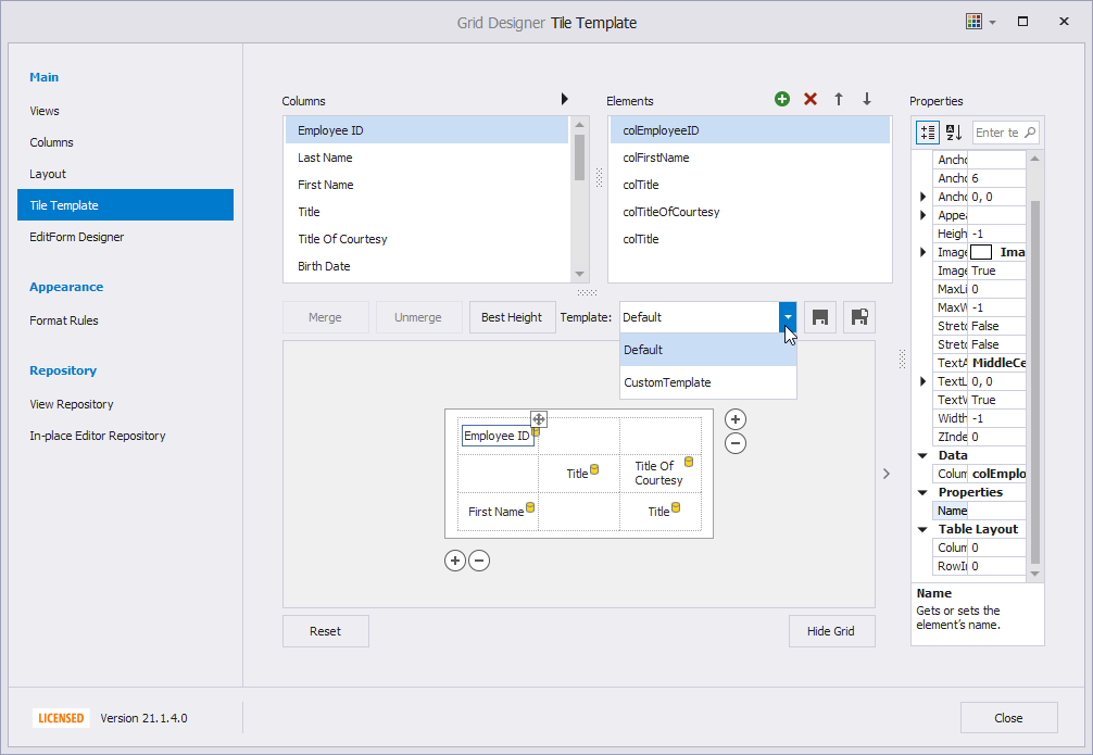
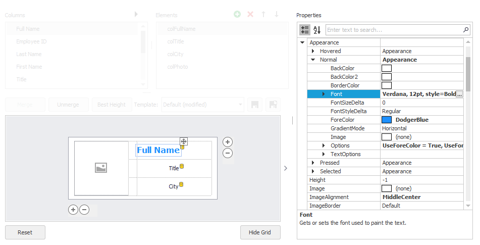
Use the Data Grid Designer to create and modify the tile template at design time.
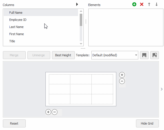
You can customize the tile template in the following ways:
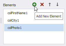
- Drag columns from the “Columns” list to template cells (which creates bound tile elements - TileViewItemElement).
- Move elements between cells.
- Place multiple elements in one cell (use alignment settings to prevent overlap).
- Merge and unmerge cells.
- Resize individual cells or the entire template.
- Add or remove rows and columns.
- Select tile elements or cells and specify their properties (size, padding, type) in the Properties window.
- Save the tile template.
The code snippet creates the following tile template:
using DevExpress.XtraEditors.TableLayout;
using DevExpress.XtraEditors;
using DevExpress.XtraGrid;
using DevExpress.XtraGrid.Views.Tile;
using System.Data;
using System.Drawing;
using System.Windows.Forms;
namespace DXTileViewDemo {
public partial class Form1 : XtraForm {
GridControl grid;
TileView tileView1;
public Form1() {
InitializeComponent();
grid = new GridControl(){ Dock = DockStyle.Fill, DataSource = Data.GetData() };
Controls.Add(grid);
tileView1 = new TileView(grid);
grid.MainView = tileView1;
InitTileTemplate();
}
void CreateTileTemplate() {
tileView1.OptionsTiles.ItemSize = new Size(300, 160);
TableColumnDefinition tableColumn1 = new TableColumnDefinition();
TableColumnDefinition tableColumn2 = new TableColumnDefinition();
tableColumn1.Length.Value = 120;
tableColumn1.Length.Type = TableDefinitionLengthType.Pixel;
tableColumn2.Length.Value = 180;
tableColumn2.Length.Type = TableDefinitionLengthType.Pixel;
tileView1.TileColumns.Add(tableColumn1);
tileView1.TileColumns.Add(tableColumn2);
TableRowDefinition tableRow1 = new TableRowDefinition();
TableRowDefinition talbeRow2 = new TableRowDefinition();
tileView1.TileRows.Add(tableRow1);
tileView1.TileRows.Add(talbeRow2);
TableSpan tableSpan1 = new TableSpan(){ RowIndex = 0, ColumnIndex = 0, RowSpan = 2};
tileView1.TileSpans.Add(tableSpan1);
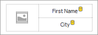
TileViewItemElement tileElementFirstName = new TileViewItemElement() {
Column = tileView1.Columns["FirstName"],
ColumnIndex = 1,
RowIndex = 0,
TextAlignment = TileItemContentAlignment.MiddleCenter
};
TileViewItemElement tileElementCity = new TileViewItemElement() {
Column = tileView1.Columns["City"],
ColumnIndex = 1,
RowIndex = 1,
TextAlignment = TileItemContentAlignment.MiddleCenter
};
TileViewItemElement tileElementPhoto = new TileViewItemElement() {
Column = tileView1.Columns["Photo"],
ColumnIndex = 0,
RowIndex = 0
};
tileElementFirstName.ImageOptions.ImageAlignment = TileItemContentAlignment.MiddleCenter;
tileElementFirstName.ImageOptions.ImageScaleMode = TileItemImageScaleMode.Squeeze;
tileElementCity.ImageOptions.Assign(tileElementFirstName.ImageOptions);
tileElementPhoto.ImageOptions.Assign(tileElementFirstName.ImageOptions);
tileView1.TileTemplate.Add(tileElementFirstName);
tileView1.TileTemplate.Add(tileElementCity);
tileView1.TileTemplate.Add(tileElementPhoto);
}
}
public class Data {
public static DataTable GetData() {
DataTable dt = new DataTable();
dt.Columns.Add("FirstName", typeof(string));
dt.Columns.Add("City", typeof(string));
dt.Columns.Add("Photo", typeof(Image));
//dt.Rows.Add("John", "NY", Image.FromFile(@"c:\media\photo.png"));
return dt;
}
}
}
HTML & CSS-based Template
TileView supports HTML/CSS templates.
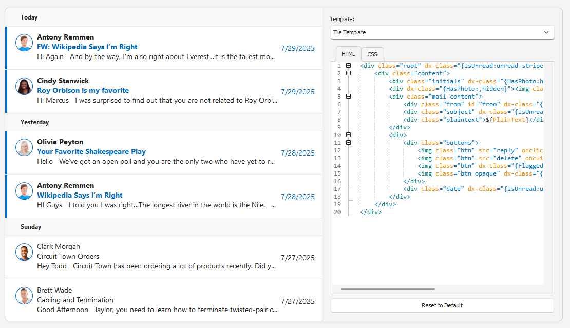
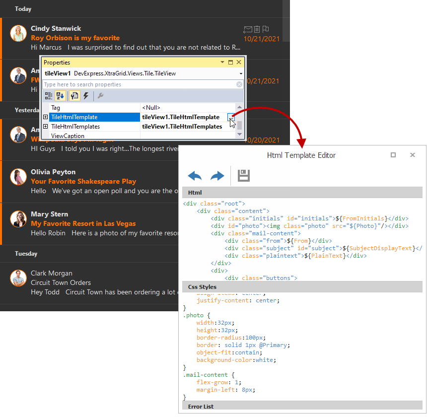
Use the TileHtmlTemplate property to assign an HTML template:
- Click the ellipsis button in the Properties window to open the HTML Template Editor.
- Add HTML markup and CSS styles.
- Save the template.
HTML-CSS template features:
- Bind to Data
Use
${FieldName}syntax to insert values from the data source. See the following help topic for more information: HTML-CSS Templates - Bind to Data.Note
TileViewautomatically creates columns for all fields in a data source if its TileView.Columns collection is empty.- Images
- Use the
<img>tag to display images. See the following help topic for more information: HTML-CSS Templates - Images. - Buttons
- Use the
<div>tag to emulate button behavior. See the following help topic for more information: HTML-CSS Templates - Buttons. - Data Editors
Use the
<input>tag to embed editors. These editors map to repository items by name.<input name="repositoryItemButtonEdit1" value="${Price}" class="editor"/>Use the In-place Editor Repository page in the Grid Designer to create and configure repository items for HTML templates.
See the following help topic for more information: HTML-CSS Templates - Data Editors.
TileView raises the following events to handle interactions with HTML elements:
- HtmlElementMouseClick
- HtmlElementMouseDown
- HtmlElementMouseOut
- HtmlElementMouseOver
- HtmlElementMouseUp
Tile Customization
Tile Elements and Alignment
Bound and Unbound (Static) Elements
Bound tile elements display values from their assigned columns. TileView automatically selects a display mode (text or image) based on the column’s data type.
Use TileItemElement.Text and TileItemElement.ImageOptions properties to display static content (such as labels or images). Static content is not bound to a data source.
The following code snippet creates a label:
TileViewItemElement tileElementID = new TileViewItemElement() {
    ColumnIndex = 1,
    RowIndex = 0,
    Text = "ID",
    TextAlignment = TileItemContentAlignment.MiddleCenter
};
tileView1.TileTemplate.Add(tileElementID);
Alignment Options
Tile elements are centered both vertically and horizontally within their cells.
Use the following properties to align tile elements:
- Align within a cell
- Use the TileItemElement.TextAlignment property for text and the TileItemElement.ImageAlignment property for images.
- Align relative to another tile element
- Use TileItemElement.AnchorElement and TileItemElement.AnchorAlignment properties.
To align text relative to an image within the same element, use the TileItemElement.ImageOptions.ImageToTextAlignment property.
Tile Size and Layout
Layout Modes
Tile View supports three layout modes:
- Default
- Tiles wrap across rows or columns, depending on layout orientation. Orientation and row count determine layout direction (down-then-across or across-then-down).
- Kanban
Tiles are grouped by a data field. Tile wrapping is disabled.
See the following help topic for more information: Kanban Board.
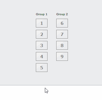
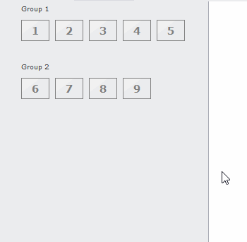
- List
- Tiles stretch to fill available space in a single column or row.
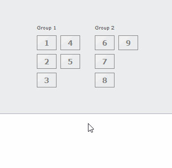
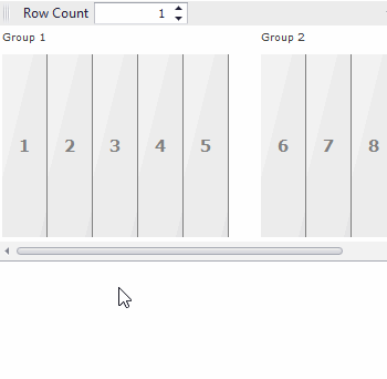
Tile View - LayoutMode: Default
Orientation: Horizontal, RowCount: 3
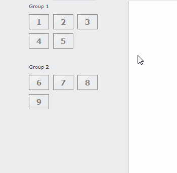
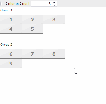
Tile View - LayoutMode: Default
Orientation: Vertical, ColumnCount: 3
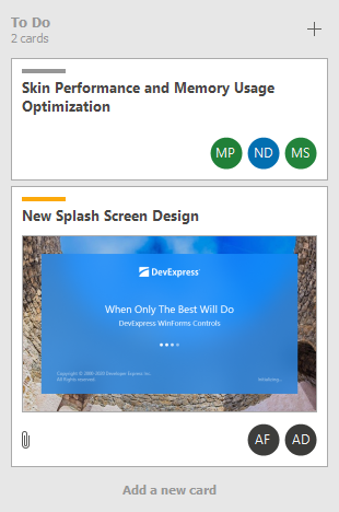
Tile View - LayoutMode: Kanban
Orientation: Horizontal
Tile View - LayoutMode: Kanban
Orientation: Vertical
Tile View - LayoutMode: List
Orientation: Horizontal
Tile View - LayoutMode: List
Orientation: Vertical
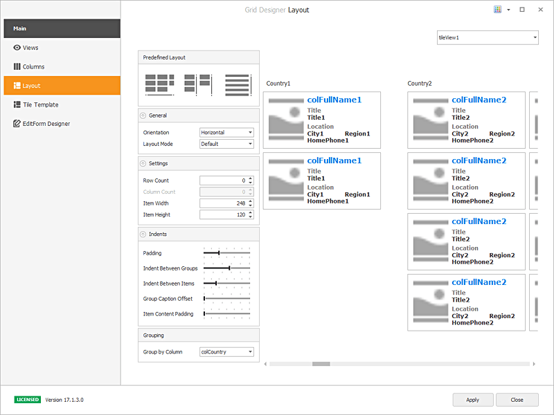
Open the Grid Designer’s Layout page to specify the layout mode and customize layout settings at design time:
Use the TileView.OptionsTiles.LayoutMode property to specify the layout mode.
The following code snippet activates the Kanban mode and groups tiles by the “Country” column:
tileView1.OptionsTiles.LayoutMode = TileViewLayoutMode.Kanban;
tileView1.ColumnSet.GroupColumn = tileView1.Columns["Country"];
Tile Options
Use the TileView.OptionsTiles property to access tile settings.
Property | Description |
|---|---|
Gets or sets the way tiles are arranged, horizontally or vertically. | |
Specifies the row count in the horizontal orientation in List layout mode. In Default layout mode, this property specifies the maximum number of rows. | |
Specifies the column count in the vertical orientation in List layout mode. In Default layout mode, this property specifies the maximum number of columns. | |
Gets or sets the size of tiles within this TileView. | |
Gets or sets whether tiles are stretched to fit the View’s width/height (depending on the Orientation setting). The property is ignored in List layout mode. | |
Gets or sets the current TileView padding. | |
Gets or sets the distance between neighboring tile groups. | |
Gets or sets the distance between neighboring tiles within this TileView. | |
Gets or sets the amount of empty space around a group header text (see TileViewColumns.GroupColumn). | |
Gets or sets the padding for all tiles within the TileView. |
Auto Height
Tiles can have different heights when automatic height calculation is enabled. Set the TableRowDefinition.AutoHeight property to true to enable auto height for a template row. When this option is activated, each tile’s height adapts to the content of its rows.
Note
Automatic tile height calculation is not supported in Server Mode.
Check State
TileView can display a check mark in the top-right corner of tiles.
Use the TileView.ColumnSet.CheckedColumn property to specify a Boolean column that determines whether a tile is checked.
Users can right-click tiles to toggle their checked state. Handle the following events in response:
Enable/Disable Tiles
TileView disables individual tiles based on a Boolean data field. Disabled tiles do not respond to mouse actions.
Assign a Boolean column to the TileView.ColumnSet.EnabledColumn property to control each tile’s enabled state:
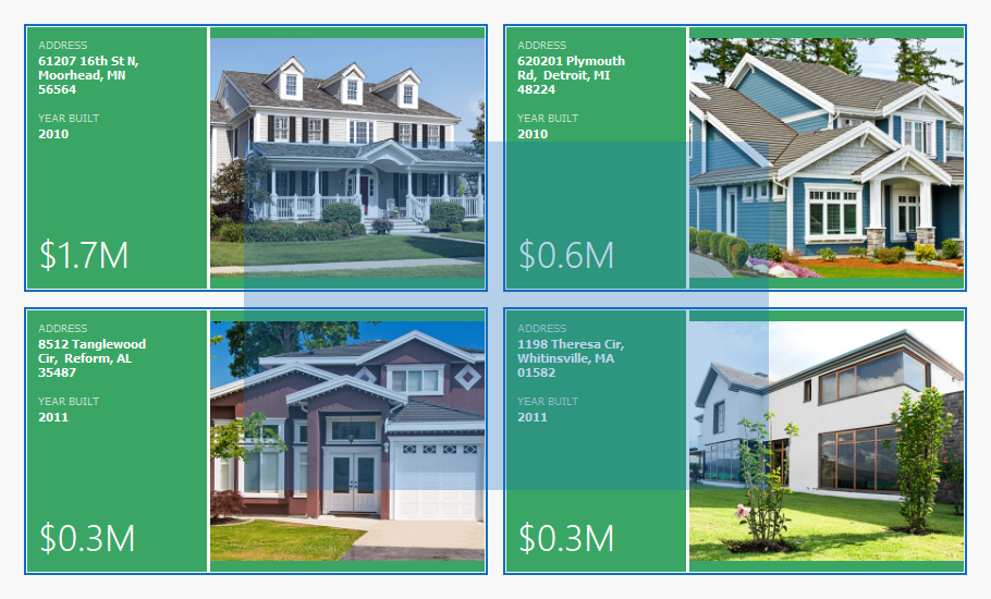
Tile Background Image
TileView can display background images for individual tiles. Assign a grid column that contains images to the TileView.ColumnSet.BackgroundImageColumn property:
Use the following properties to customize image layout:
- TileViewItemOptions.ItemBackgroundImageAlignment - Specifies background image alignment within the tile.
- TileViewItemOptions.ItemBackgroundImageScaleMode - Controls how the background image is scaled.
Customize Individual Tiles
Custom Tile Template
Handle the CustomItemTemplate event to assign a specific template to individual tiles based on custom logic.
The following code snippet applies a custom template to tiles where the Country field contains “UK”:
void tileView1_CustomItemTemplate(object sender, TileViewCustomItemTemplateEventArgs e) {
    TileView tileView = sender as TileView;
    string country = tileView1.GetRowCellDisplayText(e.RowHandle, "Country");
    if (country == "UK")
        e.Template = e.Templates["CustomTemplate"];
}
Open the Data Grid Designer’s Tile Template page to create predefined tile templates at design time. TileView stores custom templates in the TileView.Templates collection.
Custom Content and Appearance
Handle the ItemCustomize event to modify element content, appearance, or layout for individual tiles.
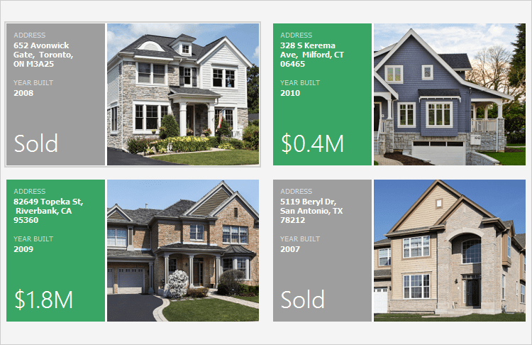
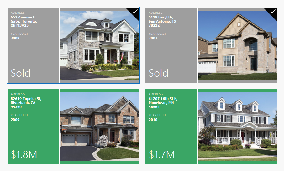
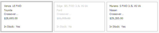
The following code snippet modifies the text and image of tile elements based on the “Price” and “Sold” fields:
void tileView1_ItemCustomize(object sender, DevExpress.XtraGrid.Views.Tile.TileViewItemCustomizeEventArgs e) {
    e.Item.Elements[6].Text = String.Format("${0}M", ((Decimal)(Int32)tileView1.GetRowCellValue(e.RowHandle, colPrice) / 1000000).ToString("0.0"));
    if ((bool)tileView1.GetRowCellValue(e.RowHandle, colSold) == true) {
        e.Item.Elements[1].Image = global::TileViewHomes.Properties.Resources.gray_element;
        e.Item.Elements[6].Text = "SOLD";
    }
}
The following screenshot shows the result:
Data Editing
TileView supports the following editing options:
- Display a modal Edit Form to edit tile data.
- Use HTML-CSS templates with
<input>tags to enable in-place editing in tiles.
See the following help topic for more information: Tile Editing.
Group Tiles
TileView supports grouping tiles by a single data column (tiles cannot be grouped by multiple columns). Tiles with the same group value are placed into a TileViewGroup.
Assign a column to the TileView.ColumnSet.GroupColumn property to enable grouping:
Related API
- TileView.Appearance.Group
- TileViewItemOptions.GroupTextPadding
- TileViewItemOptions.IndentBetweenGroups
- TileViewItemOptions.ShowGroupText
Select Tiles
Set the TileView.OptionsSelection.MultiSelect property to true to enable multiple tile selection.
Set the TileView.OptionsSelection.AllowMarqueeSelection property to true to enable marquee selection. Marquee selection selects all tiles within the dragged rectangle.
Related API
- TileView.Appearance.ItemSelected — Specifies appearance settings used to paint selected tiles.
- ColumnView.GetSelectedRows() — Returns handles of selected tiles.
- ColumnView.SelectedRowsCount — Gets the number of selected tiles.
- ColumnView.SelectRow(Int32) — Selects the specified tile.
- ColumnView.SelectAll() — Selects all tiles.
- ColumnView.SelectRange(Int32, Int32) — Selects multiple tiles.
Drag & Drop Tiles
TileView supports built-in drag & drop operations. Set the TileViewOptionsDragDrop.AllowDrag property to true to enable drag & drop.
tileView1.OptionsDragDrop.AllowDrag = true;
Use the following events to handle drag & drop operations:
Set the TileView.OptionsDragDrop.ShowDropIndicators property to true to display visual drop indicators during the operation.
To enable drag & drop between different grid controls, attach a drag & drop behavior from the BehaviorManager component.
Context Buttons
TileView supports context buttons (interactive icons displayed on tiles). Context buttons can perform custom actions, open dialogs, or reflect state changes when clicked.
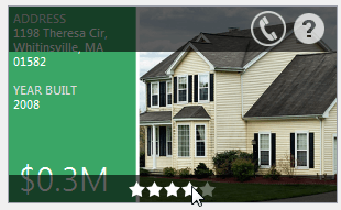
To display context buttons, create and add them to the TileView.ContextButtons collection:
tileView1.ContextButtonOptions.TopPanelColor = Color.FromArgb(160, 0, 0, 0);
tileView1.ContextButtonOptions.BottomPanelColor = Color.FromArgb(160, 0, 0, 0);

ContextButton cb_delete = new ContextButton();
cb_delete.AlignmentOptions.Panel = ContextItemPanel.Center;
cb_delete.AlignmentOptions.Position = ContextItemPosition.Center;
cb_delete.ImageOptionsCollection.ItemNormal.Image = Image.FromFile(".\\cross.png");
cb_delete.Click += (o, e) =>
{
    if (XtraMessageBox.Show("Delete the item?", "Warning", MessageBoxButtons.YesNo) == DialogResult.Yes)
        tileView1.DeleteSelectedRows();
};
tileView1.ContextButtons.Add(cb_delete);

TrackBarContextButton cb_track = new TrackBarContextButton();
cb_track.AlignmentOptions.Panel = ContextItemPanel.Top;
tileView1.ContextButtons.Add(cb_track);

RatingContextButton cb_rate = new RatingContextButton();
cb_rate.ImageOptionsCollection.ItemNormal.Image = Image.FromFile(".\\Stars3_1.png");
cb_rate.ImageOptionsCollection.ItemChecked.Image = Image.FromFile(".\\Stars3_3.png");
cb_rate.Visibility = ContextItemVisibility.Visible;
cb_rate.AlignmentOptions.Panel = ContextItemPanel.Bottom;
tileView1.ContextButtons.Add(cb_rate);
To conditionally display, hide, or customize buttons for individual tiles, handle the ContextButtonCustomize event.
Appearance and Conditional Formatting
Tile View Appearance
Use the TileView.Appearance property to specify appearance settings for all tiles and tile elements.
Tile Appearance
Handle the TileView.ItemCustomize event to override default settings for specific tiles. Use the e.Item.AppearanceItem property to modify tile item appearance settings.
Tile Element Appearance
To override appearance settings for individual elements within a tile, use the element’s TileItemElement.Appearance property.
Handle the TileView.ItemCustomize event to customize tile element appearance settings based on a specific condition.
Custom Draw Tiles
Handle the TileView.CustomDrawTile event to take full control over tile rendering.
Conditional Formatting
TileView supports conditional formatting. You can modify the appearance of tiles or tile elements based on cell values.
You can apply the following types of format rules:
- Modify appearance settings of tile elements that meet specific conditions.
- Highlight minimum, maximum, duplicate, unique, or average-related values.
- Display icons based on value ranges.
- Use two- or three-color scales to visualize value distribution.
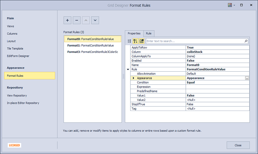
To create conditional formats at design time:
- Open the Grid Designer.
- Switch to the Appearance → Format Rules page.
- Click the
+button to add a new format rule. - Configure the rule type, appearance settings, and conditions.
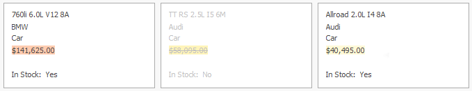
The following code snippet creates a conditional formatting rule to highlight products that are out of stock (UnitStock = 0):
- Tiles are rendered with gray text.
- The “Price” field is displayed with a strikethrough effect.
// Create a format rule.
DevExpress.XtraGrid.GridFormatRule formatRule1 = new DevExpress.XtraGrid.GridFormatRule();
formatRule1.ApplyToRow = true;
formatRule1.Column = colInStock;
// Define a format condition.
DevExpress.XtraEditors.FormatConditionRuleValue ruleGrayOutText = new DevExpress.XtraEditors.FormatConditionRuleValue();
ruleGrayOutText.Appearance.ForeColor = System.Drawing.Color.Silver;
ruleGrayOutText.Condition = DevExpress.XtraEditors.FormatCondition.Expression;
ruleGrayOutText.Expression = "[InStock] = False";
// Apply the rule to the tile.
formatRule1.Rule = ruleGrayOutText;
tileView1.FormatRules.Add(formatRule1);

DevExpress.XtraGrid.GridFormatRule formatRule2 = new DevExpress.XtraGrid.GridFormatRule();
formatRule2.Column = colInStock;
formatRule2.ColumnApplyTo = colPrice;
DevExpress.XtraEditors.FormatConditionRuleValue ruleStrikethroughText = new DevExpress.XtraEditors.FormatConditionRuleValue();
ruleStrikethroughText.Appearance.FontStyleDelta = FontStyle.Strikeout;
ruleStrikethroughText.Condition = DevExpress.XtraEditors.FormatCondition.Expression;
ruleStrikethroughText.Expression = "[InStock] = False";
formatRule2.Rule = ruleStrikethroughText;
tileView1.FormatRules.Add(formatRule2);
Demos
Online Videos
- TileView Basics
See how to switch from the standard grid layout to
TileView. This video explains tile template configuration, including how to add bound and unbound elements and position them within the template.- TileView Layout & Appearance
See how to add items to tiles, arrange them freely, and configure their appearance.
- Service Columns & Tile Customization
See how to group data in
TileView, enable or disable tiles based on field values, and handle events to customize tiles.