Filter Elements
- 3 minutes to read
Starting from v18.2, you can use Filter Elements to filter the GridControl / TreeListControl‘s data. Filter Elements are separate controls within your application that automatically retrieve available values, format settings, and other information from the bound control.
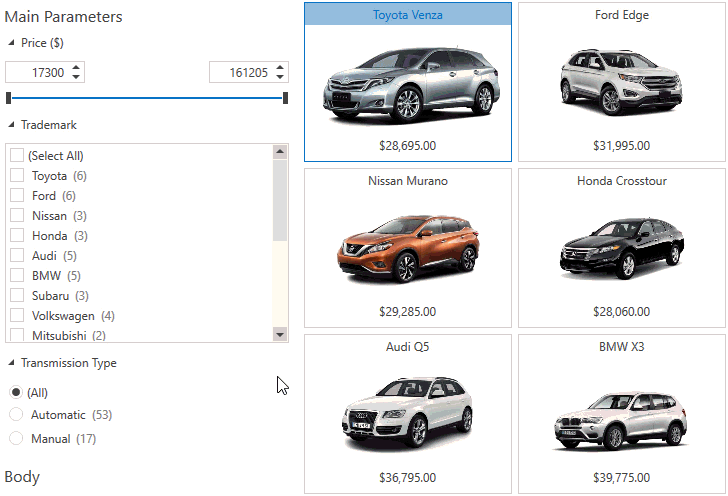
Using Filter Elements, you can build your own UI to filter control data. As an example, here is a UI that uses Filter Elements for a filtering panel displayed next to the GridControl:
How to Use Filter Elements
- Add a filter element (the FilterElement class descendants) to the markup.
- Set the attached FilterElement.Context property to associate the filter element with the GridControl‘s filter context.
- Specify the field name of the column you want to filter using the FilterElement.FieldName property.
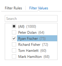
The following code sample uses the CheckedListFilterElement to filter the GridControl‘s data by the City column values:
<dxg:GridControl x:Name="grid" ... />
<!-- ... -->
<dxfui:CheckedListFilterElement Context="{Binding FilteringContext, ElementName=grid}" FieldName="City"/>
The image below shows the result:
Filter Element Types
Filter Element | Image | Description |
|---|---|---|
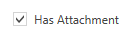
| Allows a user to filter by boolean values. | |
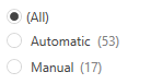
| Allows a user to select one filter value from a set. | |
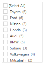
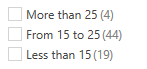
| Allows a user to select multiple filter values from a set.
| |
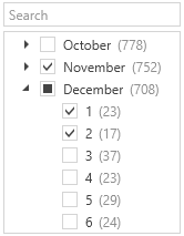
| Allows a user to filter by hierarchical values.
| |
| Allows a user to apply a column’s Predefined Filters. Use the BaseColumn.PredefinedFilters property to specify predefined filters. | |
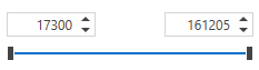
| Allows a user to filter by numeric values. | |
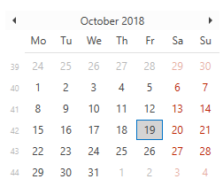
| Allows a user to filter by date values. | |
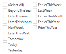
| Allows a user to apply predefined date filters. | |
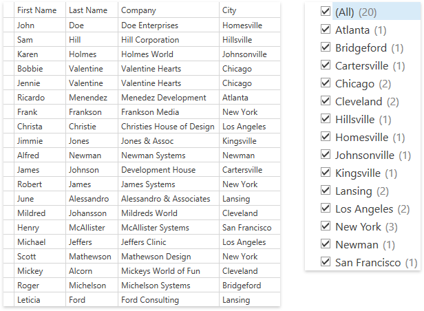
| Consists of two tabs. The first tab allows a user to apply filter conditions. The second tab provides an Excel-style checklist.
|