SVG Images
- 5 minutes to read
This topic describes how to display SVG images and change their palettes.
You can use the SVG Icon Builder or any third-party vector graphics editor to create SVG images.
Display SVG Images in XAML
DevExpress components include properties of the ImageSource type that accept image URIs. Set the component’s property to a target SVG image URI to assign the SVG image to a DevExpress component:
<Window ...
    xmlns:dxb="http://schemas.devexpress.com/winfx/2008/xaml/bars">
    <StackPanel>
        <dxb:ToolBarControl>
            <dxb:BarButtonItem Glyph="Images/Open2.svg"/>
            <dxb:BarButtonItem Glyph="Images/Up.svg"/>
            <dxb:BarButtonItem Glyph="Images/Open.svg"/>
        </dxb:ToolBarControl>
    </StackPanel>
</Window>
SvgImageSource Markup Extension
Use the markup extension with any property that supports the ImageSource value. The SvgImageSource allows you to specify the following SVG image properties:
| Extension property | Description |
|---|---|
| SvgImageSourceExtension.Uri | Gets or sets a System.Uri object that specifies the SVG image’s file. |
| BaseSvgImageSourceExtension.Size | Gets or sets the SVG image’s output width and height. |
| BaseSvgImageSourceExtension.UsePalette | Gets or sets whether the image uses the WpfSvgPalette. |
Note
The SvgImageSource cannot work with Freezable objects.
The following code sample uses the SvgImageSourceExtension to display an SVG image as a SimpleButton glyph and specifies the glyph’s Size and UsePalette properties:
<Window ...
    xmlns:dx="http://schemas.devexpress.com/winfx/2008/xaml/core"
    dx:ThemeManager.ThemeName="Office2019HighContrast">
    <StackPanel>
        <dx:SimpleButton Glyph="{dx:SvgImageSource Uri='Images/Open2.svg', Size='20,20'}"/>
        <dx:SimpleButton Glyph="{dx:SvgImageSource Uri='Images/Up.svg', Size='60,60', UsePalette='false'}"/>
        <dx:SimpleButton Glyph="{dx:SvgImageSource Uri='Images/Open.svg'}"/>
    </StackPanel>
</Window>

DXImage Markup Extension
Use the DXImage markup extension to load images from the DevExpress.Images.v25.2.dll assembly.
Tip
Use the Image Picker tool to access the SVG image collection stored in the DevExpress.Images.v25.2.dll assembly.
<Window ...
    xmlns:dxb="http://schemas.devexpress.com/winfx/2008/xaml/bars">
    <StackPanel>
        <dxb:ToolBarControl>
            <dxb:BarButtonItem Glyph="{dx:DXImage 'SvgImages/Actions/Open2.svg'}"/>
            <dxb:BarButtonItem Glyph="{dx:DXImage 'SvgImages/Actions/Up.svg'}"/>
            <dxb:BarButtonItem Glyph="{dx:DXImage 'SvgImages/Actions/Open.svg'}"/>
        </dxb:ToolBarControl>
    </StackPanel>
</Window>
Display SVG Images at Runtime
- Specify the SVG image’s absolute path and assign it to a URI value.
- Pass the URI to the WpfSvgRenderer.CreateImageSource method. Assign the method to a control property that supports the ImageSource value:
Uri uri = new System.Uri("C:/Work/SVGImages/SVGImages/Open.svg");
baritem_open.Glyph = WpfSvgRenderer.CreateImageSource(uri);
The example creates ImageSource objects from image paths and shows images in a ListBox.
SVG Image Palettes
A DevExpress Theme can adapt an SVG image’s colors to the application theme. If SVG image elements use the following predefined color styles, the application theme adjusts SVG image colors to match the theme:
- Red
- Green
- Blue
- Yellow
- Black
- White
The following SVG image uses the Green and White color styles:
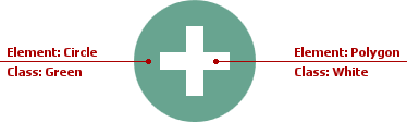
<?xml version="1.0" encoding="utf-8"?>
<svg version="1.1" id="Layer_1" xmlns="http://www.w3.org/2000/svg" xmlns:xlink="http://www.w3.org/1999/xlink" x="0px" y="0px"
            viewBox="0 0 32 32" style="enable-background:new 0 0 32 32;" xml:space="preserve">
    <g id="Add">
        <circle class="Green" cx="16" cy="16" r="14"/>
        <polygon class="White" points="24,14 18,14 18,8 14,8 14,14 8,14 8,18 14,18 14,24 18,24 18,18 24,18"/>
    </g>
</svg>
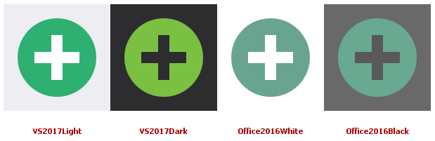
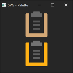
Application themes can change an SVG image’s colors:
Change Palette Colors
The following code sample shows how to use the WpfSvgPalette to replace the theme’s SVG palette with custom colors:
<?xml version="1.0" encoding="utf-8"?>
<svg version="1.1" id="Open2" xmlns="http://www.w3.org/2000/svg" xmlns:xlink="http://www.w3.org/1999/xlink" x="0px" y="0px"
     viewBox="0 0 32 32" style="enable-background:new 0 0 32 32;" xml:space="preserve">
    <style type="text/css">
        .Green{fill:#039C23;}
        .Yellow{fill:#FFB115;}
        .st0{opacity:0.75;}
        .CustomBlue{fill:#2A9DF4;}
    </style>
    <g class="st0">
        <path class="Yellow" d="M19.2,10H12V7c0-0.6-0.4-1-1-1H3C2.4,6,2,6.5,2,7v18c0,0.2,0,0.3,0.1,0.4c0,0,0.1-0.1,0.1-0.2l5.5-10
            C8,14.5,8.7,14,9.5,14h13.7L19.2,10z"/>
    </g>
    <path class="CustomBlue" d="M29.3,16H9.6L4,26h19.8c0.5,0,1.1-0.2,1.3-0.6l4.9-8.9C30.1,16.2,29.8,16,29.3,16z"/>
    <path class="Green" d="M28,8c0-3.3-2.7-6-6-6s-6,2.7-6,6c0-2.2,1.8-4,4-4s4,1.8,4,4h-4l6,6l6-6H28z"/>
</svg>
Use the SvgImageSourceExtension or the DXImage class to display the customized SVG image:
<Window ...
    xmlns:dx="http://schemas.devexpress.com/winfx/2008/xaml/core">
    <Image Source="{dx:SvgImageSource Uri=Images/Open.svg}">
        <dx:WpfSvgPalette.Palette>
            <dx:WpfSvgPalette>
                <SolidColorBrush x:Key="Green" Color="LawnGreen"/>
                <SolidColorBrush x:Key="CustomBlue" Color="LightBlue"/>
            </dx:WpfSvgPalette>
        </dx:WpfSvgPalette.Palette>
    </Image>
</Window>

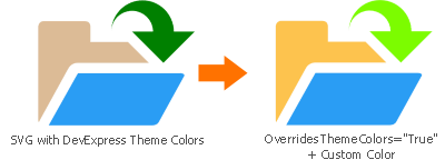
Override Theme Colors
To ignore the theme’s SVG palette, set the WpfSvgPalette.OverridesThemeColors property to true. In this case, the SVG image keeps its original colors in all themes unless you override a color in a specific WpfSvgPalette:
<Window ...
    xmlns:dx="http://schemas.devexpress.com/winfx/2008/xaml/core">
    <Image Source="{dx:SvgImageSource Uri=Images/Open.svg}">
        <dx:WpfSvgPalette.Palette>
            <dx:WpfSvgPalette OverridesThemeColors="True">
                <SolidColorBrush x:Key="Green" Color="LawnGreen"/>
            </dx:WpfSvgPalette>
        </dx:WpfSvgPalette.Palette>
    </Image>
</Window>
Ignore the SVG Image’s Palette
When you use the SvgImageSource Markup Extension, you can set the BaseSvgImageSourceExtension.UsePalette property to false to ignore the theme’s SVG palette and display the SVG image’s original colors.
The following code sample displays two SVG images. The first image gets its colors from an application theme (“Office2019Black”). The second image’s UsePalette property is set to false to ignore this theme’s SVG palette:
<dx:ThemedWindow ...
  xmlns:dx="http://schemas.devexpress.com/winfx/2008/xaml/core"
  dx:ThemeManager.ThemeName="Office2019Black">
  <StackPanel>
    <dx:DXImage Source="{dx:SvgImageSource Uri='pack://application:,,,/DevExpress.Images.v25.2;component/SvgImages/Outlook Inspired/CustomerProfileReport.svg'}"/>
    <dx:DXImage Source="{dx:SvgImageSource Uri='pack://application:,,,/DevExpress.Images.v25.2;component/SvgImages/Outlook Inspired/CustomerProfileReport.svg', UsePalette = false}"/>
  </StackPanel>
</dx:ThemedWindow>
Change SVG Image Colors in Specific States
The WpfSvgPalette allows you to create certain palettes for specific states. You can bind SvgImageHelper.State to any property to create a state based on this property.
The following code sample uses the SvgImageHelper.State attached property to change an SVG image’s color (Green) when the mouse pointer is over the image:
<Window ...
    xmlns:dx="http://schemas.devexpress.com/winfx/2008/xaml/core">
    <dx:SimpleButton Glyph="{dx:SvgImageSource Uri=Images/Open.svg}"
                     dx:SvgImageHelper.State="{Binding Path=IsMouseOver, RelativeSource={RelativeSource Self}}">
        <dx:WpfSvgPalette.Palette>
            <dx:WpfSvgPalette>
                <dx:WpfSvgPalette.States>
                    <dx:WpfSvgPalette x:Key="True">
                        <SolidColorBrush x:Key="Green" Color="Coral"/>
                    </dx:WpfSvgPalette>
                </dx:WpfSvgPalette.States>
            </dx:WpfSvgPalette>
        </dx:WpfSvgPalette.Palette>
    </dx:SimpleButton>
</Window>

The example uses the SvgImageHelper class to change SVG image colors based on an application theme.
Supported SVG Elements
The WPF SVG render engine supports the following SVG elements:
- Path - <path>
- Group - <g>
- Use - <use>
- Rectangle - <rect>
- Circle - <circle>
- Ellipse - <ellipse>
- Line - <line>
- Polyline - <polyline>
- Polygon - <polygon>
- Embedded Image - <image>
- Linear Gradients - <linearGradient>
- Radial Gradients - <radialGradient>
Limitations
DevExpress controls support only base SVG elements and features. The list of unsupported elements includes (but is not limited to) the following items:
- Animations and mouse events
- External .CSS styles
- Masks
- Relative values (percentages) in all elements except for brushes
- Custom fonts
- Text paths
- Complex opacity settings with the enable-background parameter
- The “pattern” element
- The
displayattribute - The
hrefattribute in gradients - Multiple CSS classes of an element
- Styles based on
classandidattributes