VCL Charts: Line View Tutorial. Step 4. Chart Appearance Customization
- 5 minutes to read
The previous step explained how to display value markers and labels, customize line appearance, and change legend pane position.
This step describes how to add optional visual chart elements and customize general chart appearance settings to enhance diagram readability.
Axis Customization
The axis of arguments (X-Axis) and the axis of values (Y-Axis) form a two-dimensional Cartesian coordinate system. Axis-related settings allow you to display grid lines, highlight interlaced diagram areas associated with an axis, add an axis title, and adjust an axis scale.
Display Vertical Grid Lines
The chart already displays horizontal grid lines. To add vertical grid lines to the diagram, follow the steps below:
Select dxChartControl1XYDiagram1 in the Chart Designer dialog.
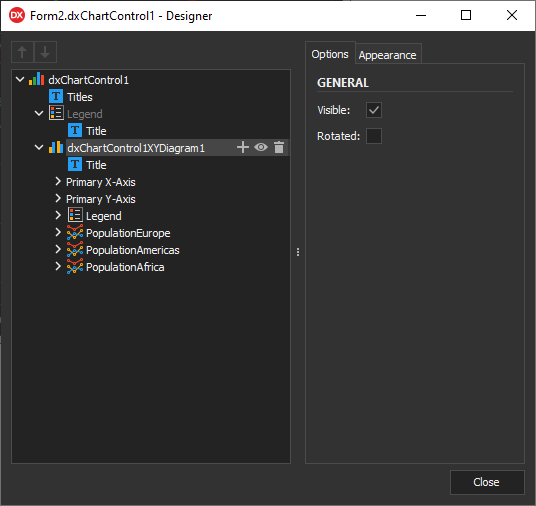
Expand the following nodes in the Object Inspector: Axes → AxisX → Gridlines.
Set the Visible property to
True.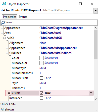
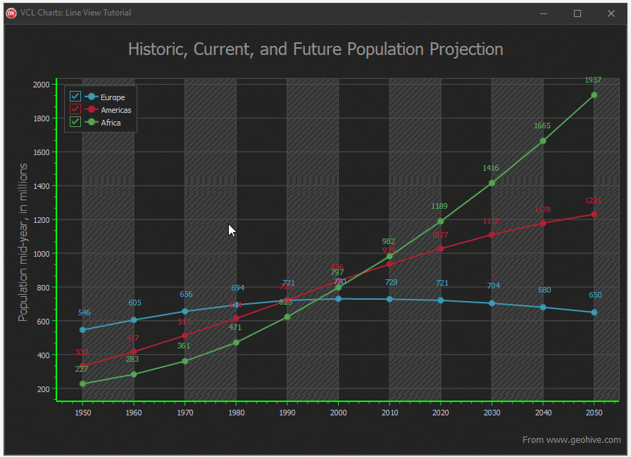
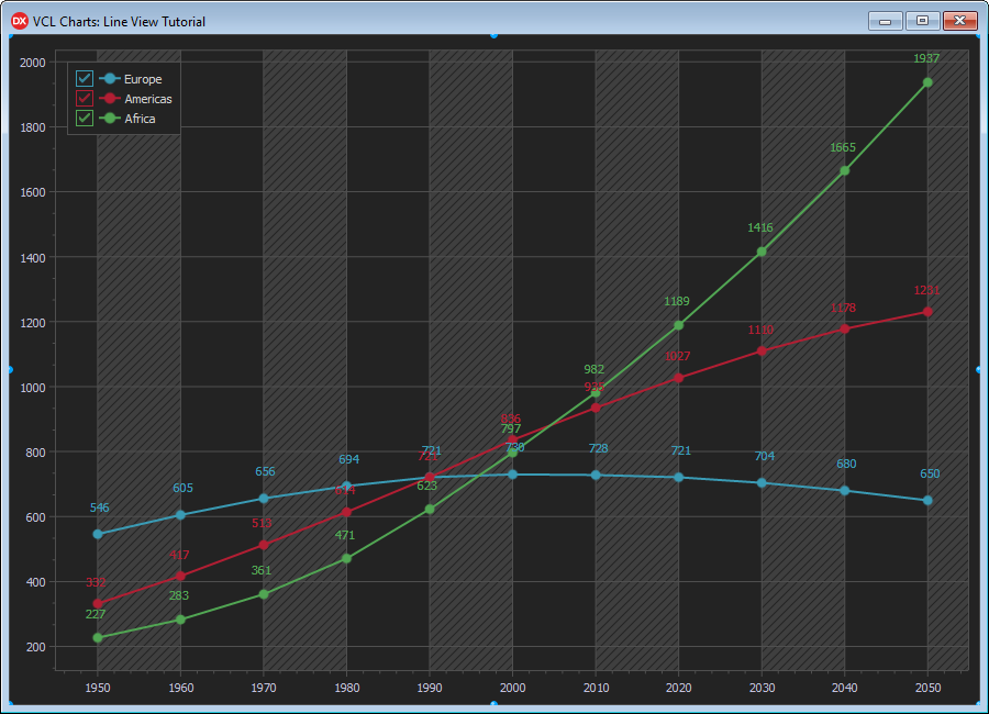
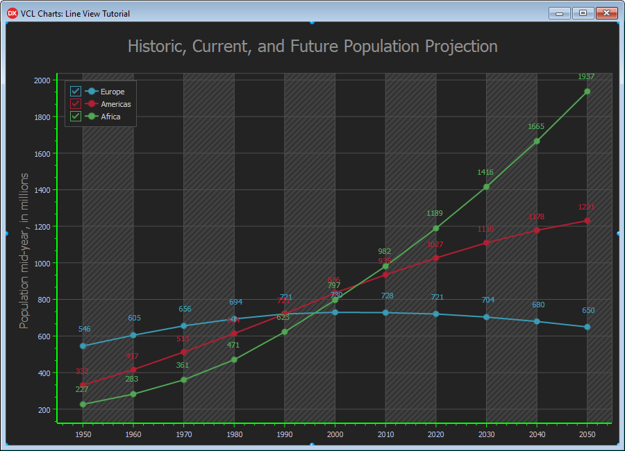
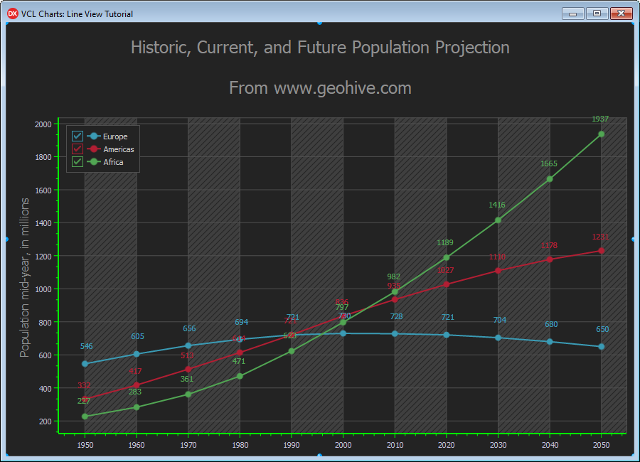
As a result, the diagram displays both horizontal and vertical major grid lines.
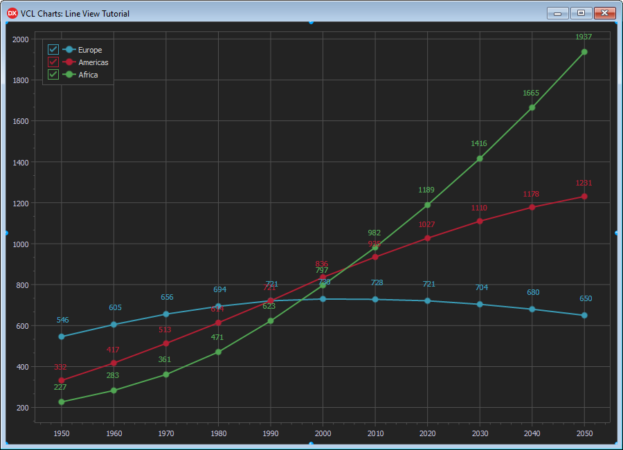
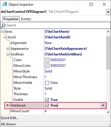
Highlight Vertical Interlaced Diagram Areas
Like grid lines, interlacing can improve chart readability. To enable this effect, set the Interlaced property to True in the AxisX node in the Object Inspector.
The fill effect within vertical interlaced areas complements horizontal and vertical grid lines within the diagram area.
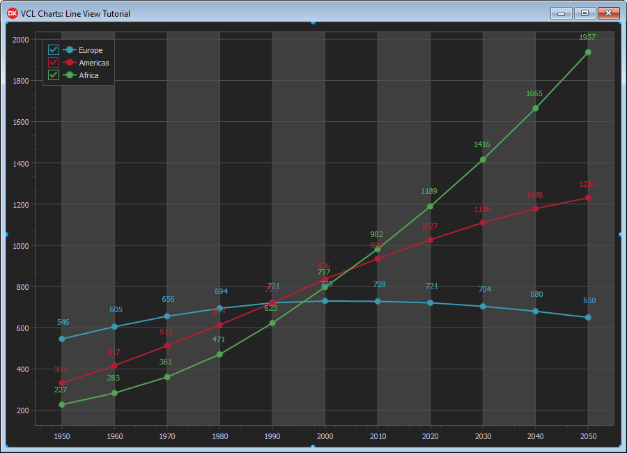
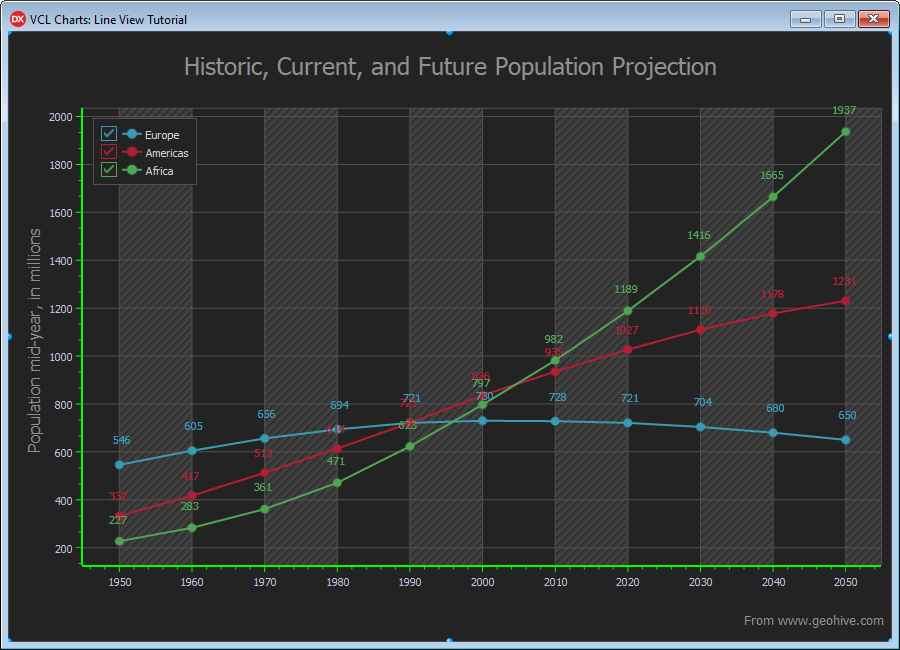
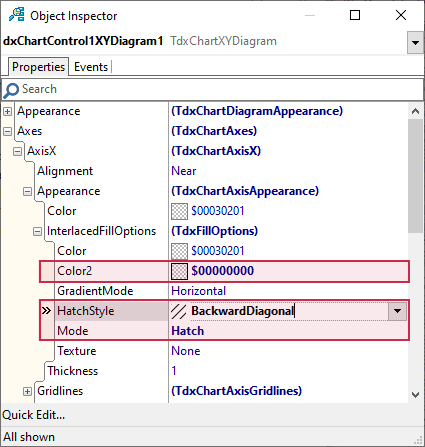
You can customize the fill effect within the interlaced areas if necessary. For example, you can hatch these areas with diagonal lines:
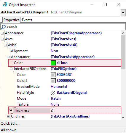
- Make sure that dxChartControl1XYDiagram1 is selected.
- Expand the following nodes in the Object Inspector: Axes → AxisX → Appearance → InterlacedFillOptions.
- Set the Color2 property to
$00000000. - Change the Mode property value to TdxFillOptionsMode.Hatch.
Assign TdxFillOptionsHatchStyle.BackwardDiagonal to the HatchStyle property.
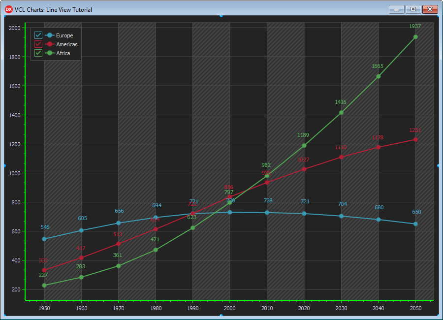
The current diagram appearance changes as follows:
Tip
Refer to the TdxFillOptions class description for detailed information on all available area fill options.
Emphasize Axes Visually
You can also visually emphasize axis lines and tick marks. For example, you can change width and color for argument and value axes:
- Make sure that dxChartControl1XYDiagram1 is selected.
- Expand the following nodes in the Object Inspector: Axes → AxisX → Appearance.
- Set the Color property to
clLime. Change the Thickness property value to
2.
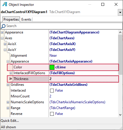
Expand the following nodes in the Object Inspector: Axes → AxisY → Appearance.
- Set the Color property to
clLime. Change the Thickness property value to
2.
As a result, the axes stand out compared to the diagram area.
Add an Axis Title
You can add a title to an axis. Axis titles are particularly useful for numeric axes.
For example, you can add a title to the axis of values:
- Make sure that dxChartControl1XYDiagram1 is selected.
- Expand the following nodes in the Object Inspector: Axes → AxisY → Title.
Assign the following text string to the Text property:
'Population mid-year, in millions'.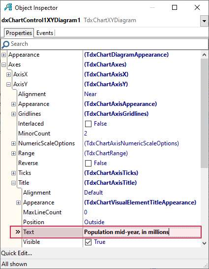
The axis of values displays the assigned title.
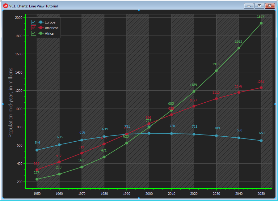
Chart Customization
The Chart control has general appearance and behavior settings, such as zoom, scroll, and background fill options. The control also allows you to add a number of titles to explain the purpose of displayed diagrams and list additional information.
Add a Main Title
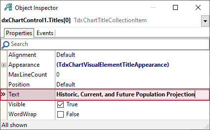
To add a main title, select the Chart control and navigate to the Titles node in the Object Inspector.
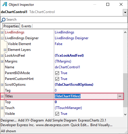
Click the ellipsis button to the right to invoke a built-in collection manager dialog. Then, click the Add New button to create a new chart title.
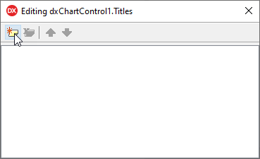
The newly created chart title is automatically selected. Assign the following string to the Text property in the Object Inspector: 'Historic, Current, and Future Population Projection'.
The main chart title is positioned above the diagram area.
Add an Additional Chart Title
You can use extra chart titles to display additional information. For example, you can specify the original source of displayed data.
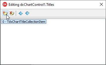
Click the Add New button to create another chart title in the title collection manager dialog.
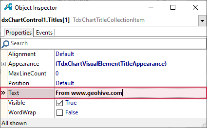
Assign the following string to the Text property of the newly created chart title: 'From www.geohive.com'.
The created extra chart title appears under the main chart title.
To move the extra title to the bottom-right corner of the Chart control area, follow the steps below:
- Set the Alignment property to TdxAlignment.Far.
Change the Position property value to TdxChartTitlePosition.Bottom.
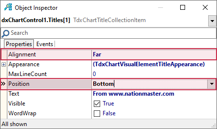
The extra title is in the target position but its font size is too large.
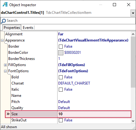
To reduce the font size of the extra title, follow the steps below:
- Expand Appearance and FontOptions nodes in the Object Inspector.
Set the Size property to
10.
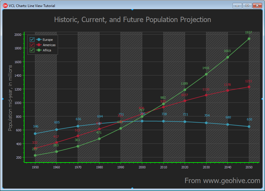
The image below shows the extra title’s final appearance.
Result
Build the project and run the resulting application. Hold down the right mouse button, move the mouse pointer diagonally, and release the right mouse button to test marquee zoom functionality. Then, you can drag the diagram area to pan it. Finally, you can rotate the mouse wheel while holding the Ctrl key to zoom the diagram area in or out.