VCL Charts: Line View Tutorial. Step 3. Series Appearance Customization
- 4 minutes to read
The previous step explained how to bind created line series to data.
This step details how to display value markers and labels, customize line appearance, and change legend pane position.

Series Value Markers and Labels
The Chart control offers multiple options that can enhance diagram readability. For example, you can display markers and labels for series values.
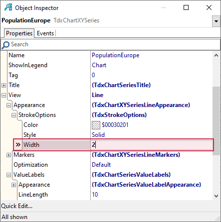
Double-click the Chart control to invoke the Chart Designer dialog if it is closed. Select the PopualtionEurope series.
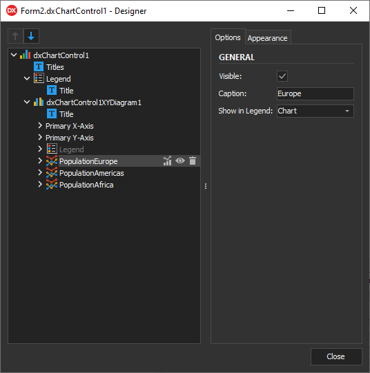
Display Value Markers
Expand View and Markers nodes for the selected series in the Object Inspector and set the Visible property to True to display value markers.
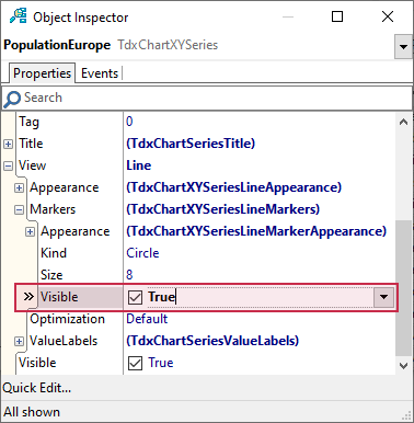
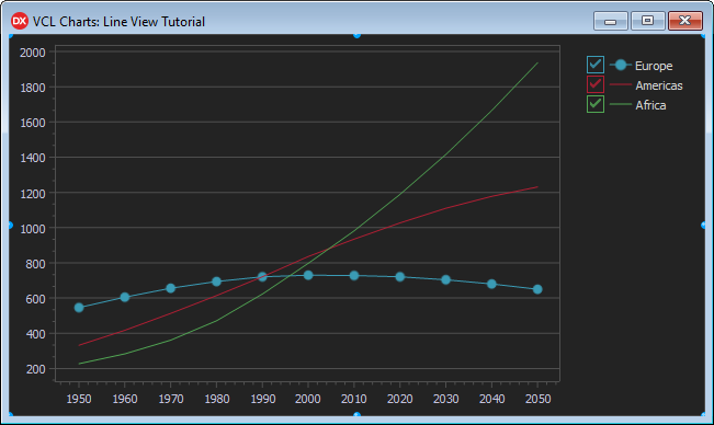
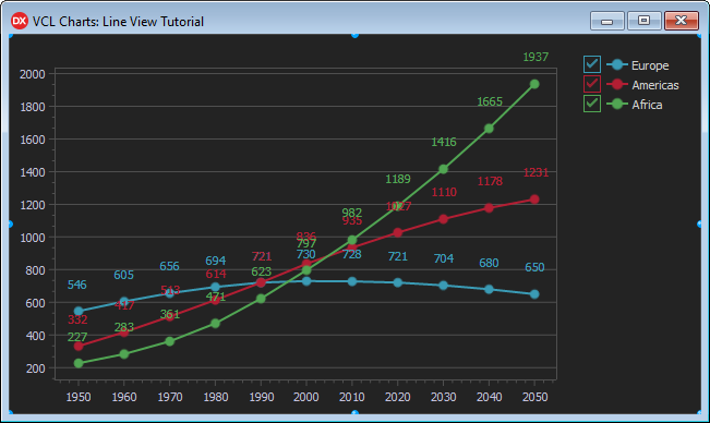
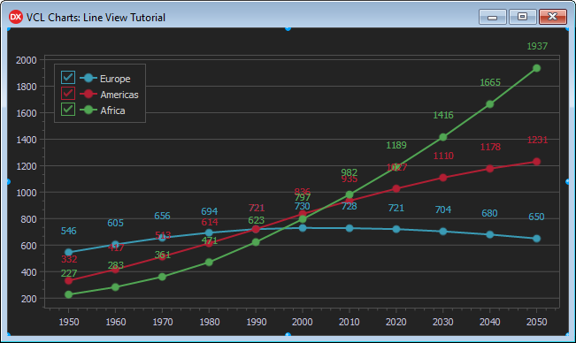
Value markers are visible for the PopulationEurope series as a result.
Display Value Labels
Expand the View.ValueLabels node in the Object Inspector and set the Visible property to True to display value labels.
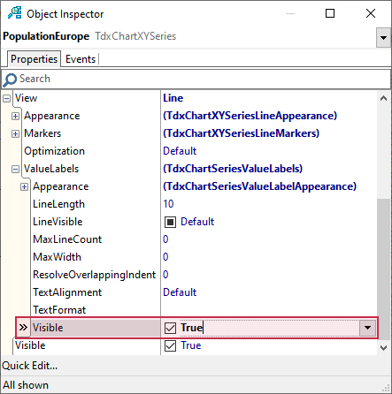
Value labels complement value markers for the PopulationEurope series.
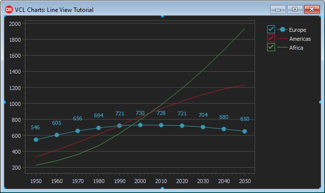
Adjust Line Width
You can increase the default line width as you see fit. Expand View.Appearance and StrokeOptions nodes, and set the Width property to 2 to increase line width.
The resulting line width better matches the current value marker size.

Apply the Same Visual Changes to Remaining Series
Display value labels and markers for PopulationAmericas and PopulationAfrica series and increase their line width the same way you did for PopulationEurope.
Legend Customization
The Chart control can display series captions in a legend pane at the chart (default) or diagram level. In the latter case, the legend pane is positioned within the diagram area. You can move series between chart and diagram legend panes individually.
Select the PopulationEurope series in the Chart Designer dialog and set the ShowInLegend property to TdxChartSeriesShowInLegend.Diagram.
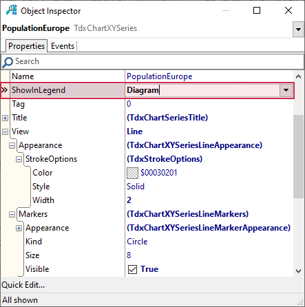
As a result, the Chart control displays a legend pane with one series within the diagram area.
Move Remaining Series Captions to the Diagram Legend Pane
Set the ShowInLegend property to TdxChartSeriesShowInLegend.Diagram for PopulationAmericas and PopulationAfrica series to move their captions to the diagram legend pane.

Customize and Move the Legend Pane
The diagram legend pane with the default appearance settings blends with the diagram background and partially overlaps a series line. You can display a border for the legend pane and move it within the diagram area.
To display a border for the diagram legend pane, follow the steps below:
- Select dxChartControl1XYDiagram1 in the Chart Designer dialog.
- Expand the Legend node in the Object Inspector.
- Expand the Appearance node.
Set the Border property to
True: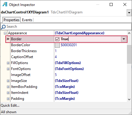
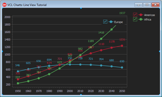
The diagram legend pane displays a border but still overlaps the PopulationAfrica series line.
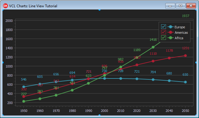
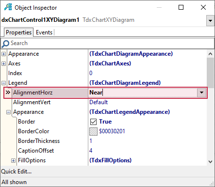
To move the legend pane to the upper-left diagram corner, set the Legend.AlignmentHorz property to TdxChartLegendAlignment.Near.
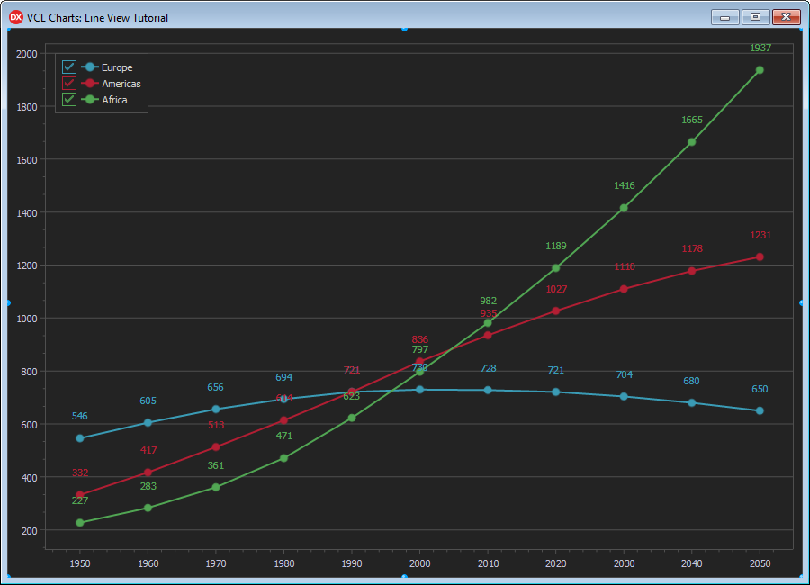
As a result, the legend pane no longer overlaps series lines.
Reduce Value Label Overlapping
To minimize value label overlapping, you can resize the form and adjust value label positions.
Resize the Form
Set the form’s Width and Height properties to 900 and 650, respectively.
Adjust Value Label Positions
You can use View.ValueLabels.LineLength and View.ValueLabels.TextAlignment properties of a line series to adjust value label positions to minimize overlapping:
- Select the PopulationEurope series in the Chart Designer dialog.
- Expand View and ValueLabels nodes in the Object Inspector.
- Change the LineLength property value to
0. - Set the TextAlignment property to TdxAlignment.Far.
- Select the PopulationAmericas series.
- Change the LineLength property value to
5. - Assign TdxAlignment.Near to the TextAlignment property.
- Select the PopulationAfrica series.
- Set the LineLength property to
7. - Change the TextAlignment property value to TdxAlignment.Near.
Result
The Chart control displays three line series with value markers and labels. The legend pane in the upper-left diagram corner lists series captions together with the corresponding colored value markers.
Next Step
The next step describes how to add optional visual chart elements and customize general chart appearance settings to make diagrams more readable.