DxTreeList.CustomizeElement Event
Allows you to customize TreeList cells and rows according to their values.
Namespace: DevExpress.Blazor
Assembly: DevExpress.Blazor.v25.1.dll
NuGet Package: DevExpress.Blazor
Declaration
[Parameter]
public Action<TreeListCustomizeElementEventArgs> CustomizeElement { get; set; }
Parameters
| Type | Description |
|---|---|
| TreeListCustomizeElementEventArgs | An object that defines data for this event. |
Remarks
The CustomizeElement event fires each time the TreeList component is re-rendered; for instance, when you update data from an asynchronous data source or call the AutoFitColumnWidths() method.
The event fires for most TreeList elements. Use ElementType, VisibleIndex, and Column event arguments to get information about the processed element.
CssClass, Style, and Attributes event arguments allow you to customize element settings.
Task-Based Examples
Customize Appearance and Display a Custom Tooltip
The following code customizes the appearance of TreeList elements that meet the following criteria:
- Rows that have child rows are highlighted.
- Cells in March Change and September Change columns that display values larger than
5%are colored green. - Cells in March Change and September Change columns that display negative values are colored red.
<DxTreeList Data="Data"
            KeyFieldName="ID"
            ParentKeyFieldName="RegionID"
            CustomizeElement="TreeList_CustomizeElement">
    <Columns>
        <DxTreeListDataColumn FieldName="Region" />
        <DxTreeListDataColumn FieldName="MarchSales" DisplayFormat="c0" />
        <DxTreeListDataColumn FieldName="SeptemberSales" DisplayFormat="c0" />
        <DxTreeListDataColumn FieldName="MarchChange" DisplayFormat="p2" />
        <DxTreeListDataColumn FieldName="SeptemberChange" DisplayFormat="p2" />
        <DxTreeListDataColumn FieldName="MarketShare" DisplayFormat="p0" />
    </Columns>
</DxTreeList>

@code {
    object Data { get; set; }

    protected override void OnInitialized () {
        Data = SalesByRegionDataProvider.GenerateData();
    }

    void TreeList_CustomizeElement(TreeListCustomizeElementEventArgs e) {
        if(e.ElementType == TreeListElementType.DataRow
                         && (int)e.TreeList.GetRowValue(e.VisibleIndex, "RegionID") == 0) {
            e.CssClass = "parent-region-row";
        }
        if(e.ElementType == TreeListElementType.DataCell && e.Column is ITreeListDataColumn dataColumn) {
            if(dataColumn.FieldName == "MarchChange" || dataColumn.FieldName == "SeptemberChange") {
                var value = (decimal)e.TreeList.GetRowValue(e.VisibleIndex, dataColumn.FieldName);
                if(value > 0.05M) {
                    e.CssClass = "win-threshold";
                }
                else if(value < 0) {
                    e.CssClass = "loss-threshold";
                }
            }
        }
    }
}
.parent-region-row {
    background-color: color-mix(in srgb, var(--bs-gray-300), transparent 50%);
}
td.loss-threshold {
    background-color: rgba(245, 198, 203, 0.5);
}
td.win-threshold {
    background-color: rgba(198, 245, 203, 0.5);
}

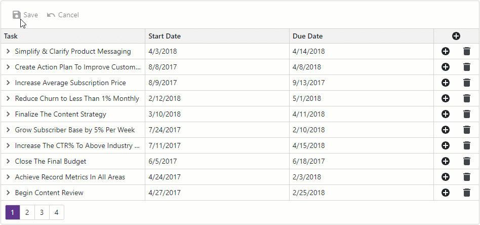
Highlight Modified Cells
<div>
    <DxTreeList @ref="TreeList"
                Data="DataSource"
                KeyFieldName="Id"
                ParentKeyFieldName="ParentId"
                EditMode="TreeListEditMode.EditCell"
                EditModelSaving="TreeList_EditModelSaving"
                CustomizeElement="TreeList_CustomizeElement"
                CustomizeEditModel="TreeList_CustomizeEditModel">
        <Columns>
            <DxTreeListDataColumn FieldName="Name" Caption="Task" />
            <DxTreeListDataColumn FieldName="StartDate" />
            <DxTreeListDataColumn FieldName="DueDate" />
            <DxTreeListCommandColumn>
                @* ... *@
            </DxTreeListCommandColumn>
        </Columns>
        @* ... *@
    </DxTreeList>
</div>

@code {
    ITreeList TreeList { get; set; }
    IList<EmployeeTask> DataSource { get; set; }
    Dictionary<EmployeeTask, DataChange> UnsavedChanges { get; } = new();
    @* ... *@
    void TreeList_CustomizeElement(TreeListCustomizeElementEventArgs ea) {
        if(ea.ElementType == TreeListElementType.DataCell) {
            var employee = (EmployeeTask) TreeList.GetDataItem(ea.VisibleIndex);
            var column = (ITreeListDataColumn) ea.Column;
            bool isNew = employee == null;
            if(!isNew && UnsavedChanges.TryGetValue(employee, out var changes)) {
                if(changes.Type == DataChangeType.Addition || changes.ChangedFields.Contains(column.FieldName))
                    ea.CssClass = "treelist-modified-cell";
            }
        }
    }
    @* ... *@
}
Alternate Row Style
This following code sample highlights alternating (odd) rows with a different style to enhance readability:
<DxTreeList Data="Data"
            KeyFieldName="ID"
            ParentKeyFieldName="RegionID"
            CustomizeElement="TreeList_CustomizeElement">
    <Columns>
        <DxTreeListDataColumn FieldName="Region" />
        <DxTreeListDataColumn FieldName="MarchSales" DisplayFormat="c0" />
        <DxTreeListDataColumn FieldName="SeptemberSales" DisplayFormat="c0" />
        <DxTreeListDataColumn FieldName="MarchChange" DisplayFormat="p2" />
        <DxTreeListDataColumn FieldName="SeptemberChange" DisplayFormat="p2" />
        <DxTreeListDataColumn FieldName="MarketShare" DisplayFormat="p0" />
    </Columns>
</DxTreeList>

@code {
    object Data { get; set; }

    protected override void OnInitialized () {
        Data = SalesByRegionDataProvider.GenerateData();
    }

    void TreeList_CustomizeElement(TreeListCustomizeElementEventArgs e) {
        if(e.ElementType == TreeListElementType.DataRow && e.VisibleIndex % 2 == 1) {
            e.CssClass = "alt-item";
        }
    }
}
.alt-item {
    background-color: color-mix(in srgb, var(--bs-gray-300), transparent 50%);
}

Change Focus and Selection Color
<DxTreeList CustomizeElement="TreeList_CustomizeElement" ... />

@code {
    void TreeList_CustomizeElement(TreeListCustomizeElementEventArgs e) {
        if (e.ElementType == TreeListElementType.DataRow && e.TreeList.IsRowSelected(e.VisibleIndex)) {
            e.CssClass = "custom-selection-style";
        }
        if (e.ElementType == TreeListElementType.DataRow && e.TreeList.IsRowFocused(e.VisibleIndex)) {
            e.CssClass = "custom-focus-style";
        }
    }
    // ...
}
Modify Data Cell Paddings
void TreeList_CustomizeElement(TreeListCustomizeElementEventArgs e) {
    if (e.ElementType == TreeListElementType.DataCell) {
        e.Style = "padding: 0px";
    }
}
Conditionally Hide Commands
void TreeList_CustomizeElement(TreeListCustomizeElementEventArgs e) {
    if (e.ElementType == TreeListElementType.CommandCell &&
            (System.Int32)e.TreeList.GetRowValue(e.VisibleIndex, "Status") == 100) {
        e.CssClass = "hidden-item";
    }
}
.hidden-item button {
    visibility: hidden;
}
Modify Column Header Style Based on Sort Settings
void TreeList_CustomizeElement(TreeListCustomizeElementEventArgs e) {
    if (e.ElementType == TreeListElementType.HeaderCell) {
        var column = (DxTreeListDataColumn)e.Column;
        if (column.AllowSort == false)
            e.CssClass = "nonsortable-header";
        else
            e.CssClass = "my-header-cell";
    }
}
.nonsortable-header {
    background-color: red !important;
}
.my-header-cell[aria-sort="ascending"] {
    background-color: green !important;
}
.my-header-cell[aria-sort="descending"] {
    background-color: red !important;
}
Change Data Row Height
void Grid_CustomizeElement(GridCustomizeElementEventArgs e) {
    if(e.ElementType == GridElementType.DataCell) {
        e.Style = "min-height: 40px";
    }
}