Themes
- 5 minutes to read
The DevExpress Blazor component suite ships with a set of built-in DevExpress themes:
- Fluent
- Design System-based themes that use CSS variables to declare color, typography, spacing, border, opacity, and shadow styles. Key features include:
- Predefined accent colors
- Custom accent color support
- Light and dark modes
- High contrast mode support
- Theme customization via public
--dxds-CSS variables
- Classic
- Themes that use SCSS to implement styles and include both DevExpress and Bootstrap CSS rules. The following Classic themes are available:
- Blazing Berry
- Blazing Dark
- Office White
- Purple
- Bootstrap
- External Bootstrap themes that can be applied using Bootstrap theme stylesheets.
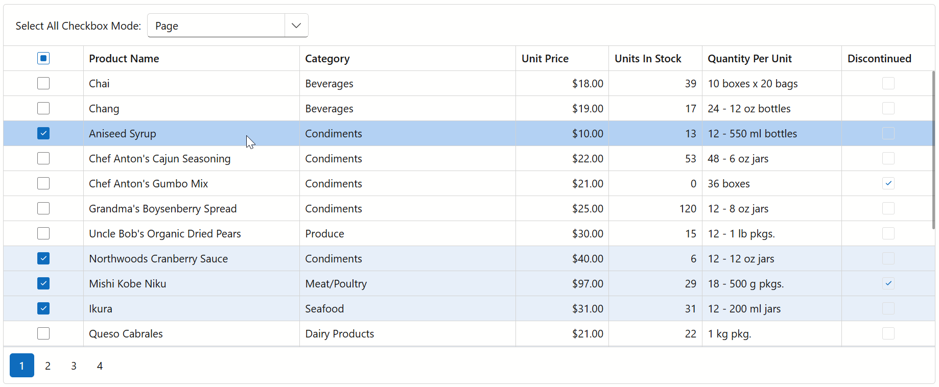
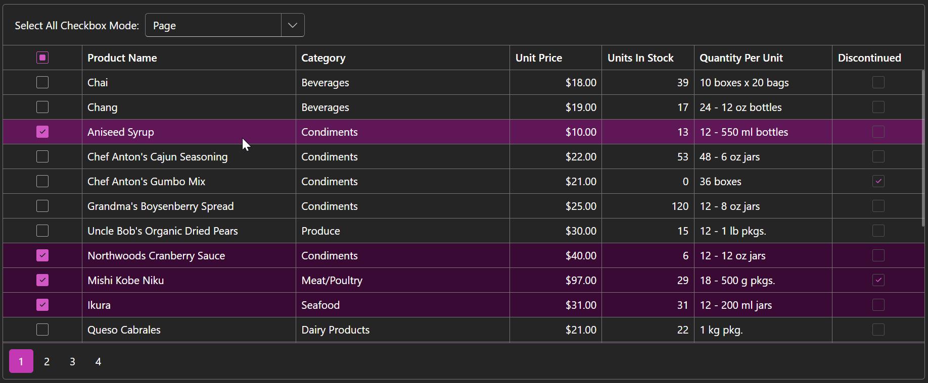
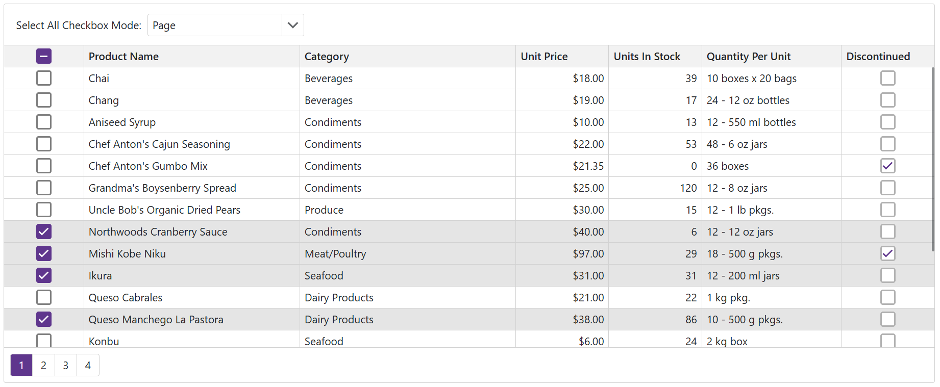
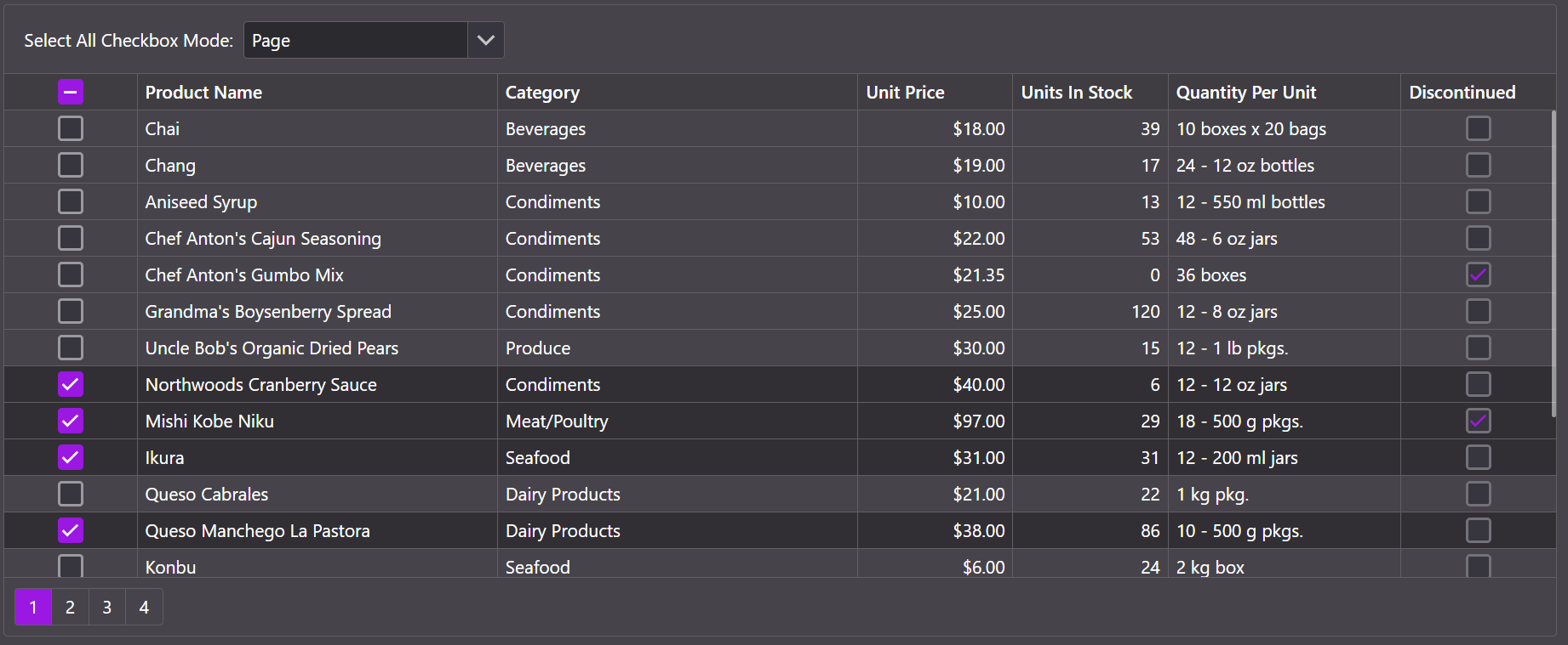
To see how a theme affects the appearance of various DevExpress components, explore DevExpress Blazor Demos and use a theme switcher in the top right corner.
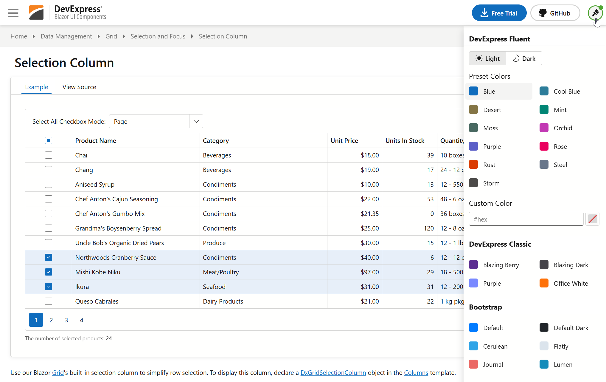
You can inject IThemeChangeService and use its APIs to implement a custom theme switcher in your Blazor application. Refer to the following example for implementation details:
Apply a Theme
Once you install DevExpress Blazor components, the following themes are available as DevExpress.Blazor dependencies:
Modern themes:
- Fluent Light (
Themes.Fluent) - Fluent Dark (
Themes.Fluent/ThemeMode.Dark)
Classic themes:
- Blazing Berry (
Themes.BlazingBerry) - Blazing Dark (
Themes.BlazingDark) - Office White (
Themes.OfficeWhite) - Purple (
Themes.Purple) - Bootstrap (
Themes.BootstrapExternal, requires theme-specific stylesheets)
To apply a theme, call the DxResourceManager.RegisterTheme(ITheme) method and pass your theme as a parameter:
Blazor Server or WebAssembly: Add a method call to the
<head>section of the App.razor or Components/App.razor file:<head> @*...*@ @DxResourceManager.RegisterTheme(Themes.Fluent) </head>Blazor WebAssembly Standalone: Add the
<HeadContent>tag to the App.razor file and call the method:<Router> @*...*@ </Router> <HeadContent> @DxResourceManager.RegisterTheme(Themes.Fluent) </HeadContent>
See sections below for additional information on how to apply different themes: Fluent, Classic, and Bootstrap.
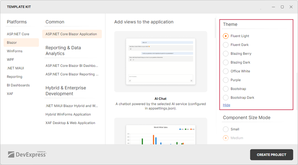
You can also choose a built-in theme in the DevExpress Template Kit when you create a new Blazor application. Once you select a theme and click the Create Project button, the application automatically adds all resources the selected theme requires.
Apply a Fluent Theme
The default DevExpress Blazor theme is Fluent Light Blue. To apply this theme to an application, call the RegisterTheme(ITheme) method and pass Themes.Fluent as a parameter:
@DxResourceManager.RegisterTheme(Themes.Fluent)
You can clone and modify the default Fluent Light Blue theme using the Clone(ThemeFluentProperties) method. This method allows you to access and configure theme settings as follows:
- Set a unique theme identifier.
- Change the theme mode to
Dark. - Change the accent color.
- Manage theme-specific styles for non-DevExpress elements.
@DxResourceManager.RegisterTheme(Themes.Fluent.Clone(properties => {
    properties.Name = "Fluent Dark Orchid";
    @* Change the theme mode to dark *@
    properties.Mode = ThemeMode.Dark;
    @* Choose the accent color*@
    properties.AccentColor = ThemeFluentAccentColor.Orchid;
    @* Disable theme-specific styles for non-DevExpress elements *@
    properties.ApplyToPageElements = false;
}))
Tip
If you need to add Bootstrap styles to your Fluent theme, enable the UseBootstrapStyles property in a Clone method call. This property applies the Bootstrap theme stylesheet configured for the Blue accent color. Use this capability for Fluent Blue themes only.
@DxResourceManager.RegisterTheme(Themes.Fluent.Clone(properties => {
    properties.UseBootstrapStyles = true;
}))
Apply a Classic Theme
To apply a DevExpress Classic theme, pass the corresponding Themes structure field to the DxResourceManager.RegisterTheme(ITheme) method as a parameter:
@DxResourceManager.RegisterTheme(Themes.BlazingBerry)
@* or *@
@DxResourceManager.RegisterTheme(Themes.BlazingDark)
@* or *@
@DxResourceManager.RegisterTheme(Themes.Purple)
@* or *@
@DxResourceManager.RegisterTheme(Themes.OfficeWhite)
Apply a Bootstrap Theme
The DevExpress.Blazor.Themes package includes the bootstrap-external stylesheet that allows you to apply an external Bootstrap theme (using a theme-specific stylesheet). Follow the steps below:
- Download a Bootstrap theme. You can use one of the free themes available in the Bootswatch library.
- Copy theme files to your application’s wwwroot/css folder.
- Call the RegisterTheme(ITheme) method in the Components/App.razor file and pass Themes.BootstrapExternal as a parameter.
- Call the Clone(ThemeProperties) method to access theme properties.
- Set a unique identifier (theme name) to the Name property.
- Call the AddFilePaths(String[]) method to add a theme-specific stylesheet.
- Optional. Change the color mode using the
data-bs-themeattribute.
<html lang="en" data-bs-theme="dark">
    <head>
        @*...*@
        @DxResourceManager.RegisterTheme(Themes.BootstrapExternal.Clone(properties => {
            properties.Name = "Lumen Bootswatch";
            properties.AddFilePaths("css/lumen/bootstrap.min.css");
        }))
    </head>
</html>
Apply a Theme via Stylesheet Links (Blazor Hybrid Specifics)
In Blazor Hybrid, all application stylesheets are stored in the Index.html file. To apply a theme, add the corresponding theme link (or links for Fluent and Bootstrap themes) to this file:
<head>
    @*...*@
    <link href="_content/DevExpress.Blazor.Themes.Fluent/core.min.css" rel="stylesheet" />
    <link href="_content/DevExpress.Blazor.Themes.Fluent/global.min.css" rel="stylesheet" />
    <link href="_content/DevExpress.Blazor.Themes.Fluent/modes/light.min.css" rel="stylesheet" />
    <link href="_content/DevExpress.Blazor.Themes.Fluent/accents/blue.min.css" rel="stylesheet" />
    @*...*@
</head>
You can also use stylesheet links to apply themes in Blazor Web applications (in the Components/App.razor file). However, we recommend that you call the RegisterTheme(ITheme) method. This method automatically manages CSS browser cache between DevExpress versions to avoid rendering issues.
Customize a Theme (Add Stylesheets)
You can customize DevExpress Blazor themes as follows:
- Add your own stylesheets.
- Customize Fluent theme accent color palette (primary and secondary colors): Accent Colors in Fluent Themes.
- Use public CSS variables available in Fluent themes : CSS Variables in Fluent Themes.
- Customize SCSS variables for Classic themes: Classic Theme Customization (SCSS).
This section describes how to add your own stylesheets to a theme (available for all themes).
DevExpress Blazor theme APIs include the AddFilePaths(String[]) method that adds your own stylesheets to a theme and loads them when applying the theme.
Follow the steps below to apply custom stylesheets:
- Call the RegisterTheme(ITheme) method in the Components/App.razor file.
- Pass a theme as a parameter and call its Clone() method to access theme properties and modify the theme.
- Call the AddFilePaths(String[]) method and pass stylesheet paths as a parameter. You can pass one or more paths in a single method call.
Note
Bootstrap themes require AddFilePaths() method calls to add both theme-specific and custom stylesheets.
@DxResourceManager.RegisterTheme(Themes.Fluent.Clone(properties => {
    properties.Name = "Fluent Light Custom";
    properties.AddFilePaths("css/fluent/FluentCustomStyles.css");
}))