Tag Box
- 2 minutes to read
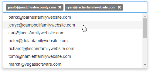
The BootstrapTagBox editor provides the ability to autocomplete tags from a predefined list. When the tag box is focused, the drop-down window displays a list of predefined items. End-users can select tags from a drop-down list, or type them manually. Additionally, end-users can provide custom tags. Note that editor tags must be unique.
To remove a tag, an end-user can use either the Remove button or the BACKSPACE key.
The Bootstrap Tag Box provides the following features.
Data-Bound and Unbound Mode Support
Editor items can be generated dynamically by binding the editor to a data source, as well by populating the control’s item collection manually.
Incremental Filtering
You can enable your end-users to filter list items dynamically, based on the text typed into the editor’s input area on the client side (“find-as-you-type” filtering).
Custom Tags
You can restrict the tags available to an item collection, or allow an end-user to provide custom tags.
Support for Embedding Tags into the Bootstrap Grid View (See online demo)
You can use the Tag Box for editing column values in the Bootstrap Grid View control.
Full-Featured Client-Side API
The Bootstrap Tag Box provides a comprehensive client-side API. This API is implemented using JavaScript and is exposed via the BootstrapClientTagBox object. The BootstrapClientTagBox object serves as the client-side equivalent of the BootstrapTagBox control.