Radio Button List
The BootstrapRadioButtonList editor is a radio button group that provides end-users with the capability to select a single item at a time.
Bound and Unbound Modes
Bootstrap Radio Button List supports both data-bound and unbound modes. This means that its contents can be generated dynamically by binding the editor to a data source, as well manually populating the control’s item collection.
Selection
The item selected within Bootstrap Radio Button List can be determined by iterating through list items and inspecting an item’s ListEditItem.Selected property, or by using specific properties declared at the editor level (ASPxListEdit.SelectedItem, ASPxListEdit.SelectedIndex). You can easily manipulate a selected item on the client side by using specific client methods (ASPxClientListEdit.GetSelectedItem/ASPxClientListEdit.SetSelectedItem, ASPxClientListEdit.GetSelectedIndex/ASPxClientListEdit.SetSelectedIndex).
Layout Customization
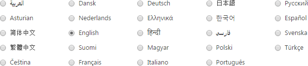
The Bootstrap Radio Button List layout can be flexibly customized. You can display check box items in several columns using the ASPxCheckListBase.RepeatColumns property.
Item Images
Use the IconCssClass property to display custom icons for list items. The property should be set to a corresponding class name of an available icon set. For example, if Font Awesome Icons are enabled in your project, you can change an icon for a corresponding item as shown below:
<dx:BootstrapListEditItem Value="First level" Text="" IconCssClass="fa fa-camera-retro fa-lg" />