Upload Control Appearance Customization
- 2 minutes to read
ASPxUploadControl allows you to customize its appearance, including the browse button and text box. You can also apply DevExpress Themes (such as Office 2010, Red Wine, and others from the available themes list) to improve the control’s appearance.
ASPxUploadControl allows you to customize its appearance in multiple ways.
Use DevExpress Themes
DevExpress ASP.NET Controls ship with a number of predefined themes that allow you to control the appearance of multiple controls or an entire website. You can apply a theme to controls individually or globally.
The code sample below demonstrates how you can customize the upload control appearance using themes. In particular, the “RedWine” theme is assigned to ASPxUploadControl using its ASPxWebControl.Theme property. The image below shows the result.
<dx:ASPxUploadControl ID="ASPxUploadControl1" runat="server" Theme="RedWine"
     ShowAddRemoveButtons="True" ShowProgressPanel="True" ShowUploadButton="True">
</dx:ASPxUploadControl>
Customize Individual UI Elements
ASPxUploadControl allows you to customize the appearance of individual elements. The table below lists the main members that affect element appearance.
| Elements | Visibility | Appearance | Spacing / Alignment |
|---|---|---|---|
| Add Button | ShowAddRemoveButtons | ButtonStyle AddButton |
AddUploadButtonsSpacing AddUploadButtonsHorizontalPosition |
| Cancel Button | ShowProgressPanel | ButtonStyle CancelButton |
CancelButtonSpacing CancelButtonHorizontalPosition |
| Remove Button | ShowAddRemoveButtons | ButtonStyle RemoveButton |
RemoveButtonSpacing |
| Upload Button | ShowUploadButton | ButtonStyle UploadButton |
AddUploadButtonsSpacing AddUploadButtonsHorizontalPosition |
| Browse Button | - | BrowseButton BrowseButtonStyle |
FileInputSpacing |
| Progress Bar | ShowProgressPanel | ProgressBarStyle ProgressBarIndicatorStyle |
- |
| Text Box | - | TextBoxStyle | FileInputSpacing |
| File List | EnableFileList | FileListStyle | - |
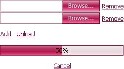
The code sample below demonstrates how you can customize the upload control appearance via control properties. The image below shows the result.

<dx:ASPxUploadControl ID="ASPxUploadControl1" runat="server" ShowAddRemoveButtons="True" ShowProgressPanel="True" ShowUploadButton="True">
     <RemoveButton>
          <Image Url="~/Delete.png" />
     </RemoveButton>
     <TextBoxStyle>
          <Border BorderColor="#CC6699" />
     </TextBoxStyle>
     <BrowseButtonStyle BackColor="#990033" ForeColor="White">
          <Border BorderColor="#990033" />
     </BrowseButtonStyle>
     <ButtonStyle ForeColor="#990033" />
     <ProgressBarStyle BackColor="#990033">
          <Border BorderColor="#990033" />
     </ProgressBarStyle>
     <ProgressBarIndicatorStyle BackColor="#FFCCFF" />
</dx:ASPxUploadControl>
Select Appearance Mode
You can use a single property to specify whether the control should be rendered with a previous (native) or a new (fully customizable) appearance mode. If the ASPxUploadControl.Native property is set to true, the file input element is rendered as a standard HTML input element. In this case, it is painted in the Windows(tm) native style and the element’s appearance depends upon system settings only. The other control elements can be customized in either of the two ways described above.
The code sample below demonstrates how you can customize the upload control appearance via control properties when the Native property is set to true. The image below shows the result.

<dx:ASPxUploadControl ID="ASPxUploadControl1" runat="server" ShowAddRemoveButtons="True" ShowProgressPanel="True"  ShowUploadButton="True" Native="True">
     <RemoveButton>
          <Image Url="~/Delete.png" />
     </RemoveButton>
     <ButtonStyle ForeColor="#990033" />
     <ProgressBarStyle BackColor="#990033">
          <Border BorderColor="#990033" />
     </ProgressBarStyle>
          <ProgressBarIndicatorStyle BackColor="#FFCCFF">
     </ProgressBarIndicatorStyle>
</dx:ASPxUploadControl>