The Wizard's Structure: The Presentation Page Group
- 4 minutes to read
This document describes the options of the Chart Wizard’s Presentation page.
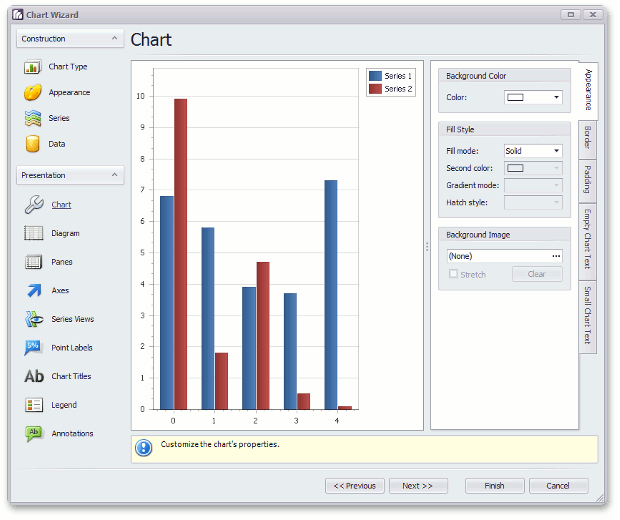
Chart
This page allows you to adjust the chart’s background color and fill style, or a background image, and border options (their visibility, color and thickness).
Diagram
This page provides access to the diagram‘s options.
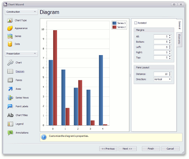
The diagram’s main function is to determine the chart type, being stiffly tied with the view types of a chart’s series. Multiple diagram types exist, that determine the compatibility of series view types. And, for this reason, each diagram type provides its own list of specific settings and chart elements (such as axes, secondary axes, or panes). For more information on this, refer to Diagram.
So, in this page, you can add or remove these elements. The created secondary axes and panes can be associated with series later, in the Series Views page.
Panes
This page provides options for adjusting panes, if they are supported by the chart’s diagram type. Here, for a default or additional pane, you can specify its size (relative to other panes, or absolute), appearance (background color, fill style, or background image), border color, and shadow.
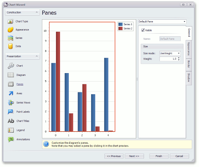
Note that to select a pane, you can click it directly in the chart preview.
Axes
This page provides access to the options of both primary and secondary axes. Here, you can distribute axes among different panes, set their alignment (Near, Far, or Zero), their axis range, and appearance.
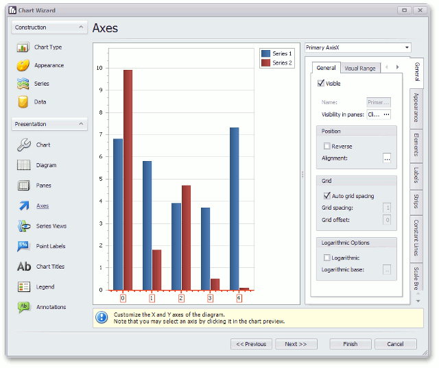
Furthermore, there are numerous chart elements that belong to axes, such as axis title, grid lines and tickmarks, and axis labels. Their options are available in the appropriate tabs on this page.
Among additional chart elements which belong to axes are: strips, constant lines, and scale breaks. Refer to the appropriate custom documents for more information on their use and customization capabilities.
Note that to select an axis, you can click it directly in the chart preview.
Series Views
This page provides access to the view-type-specific options of series. For details on this, refer to Series Views.
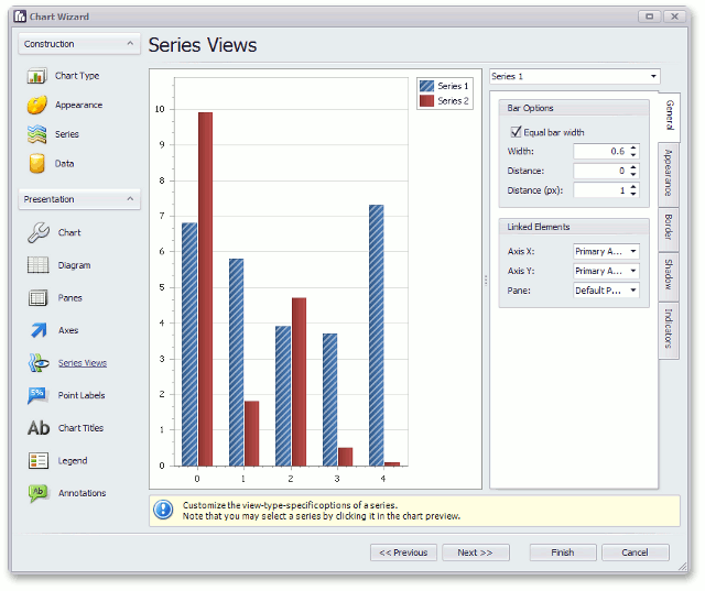
Note
Apart from the capability to customize view type options, you can enable and adjust special analytical tools that are available for some view types, such as Fibonacci Indicators, Trend Lines, and Regression Lines.
Note that to select a series, you can click it directly in the chart preview.
Point Labels
This page provides means to customize the appearance of series labels, which accompany series points. Here, you can apply an overlap resolving algorithm which helps to organize lengthy labels, adjust labels text settings (font, text color, and antialiasing), labels position and visibility, and so on.
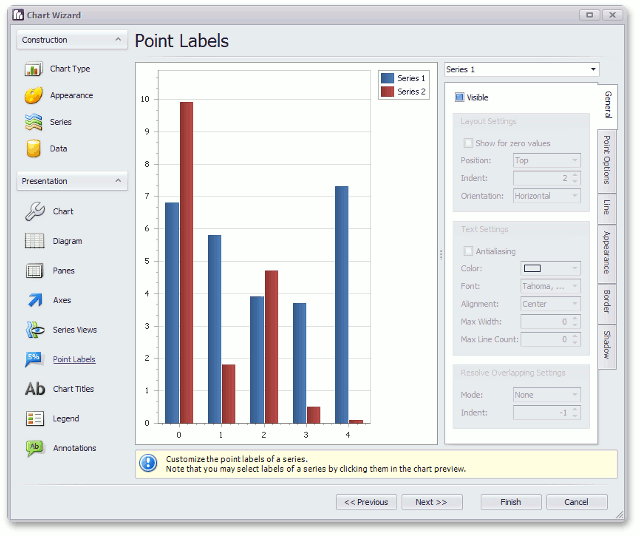
Note that to select labels of a series, you can click this series’ label directly in the chart preview.
Chart Titles
This page allows you to accompany your chart with an unlimited number of textual titles (with word-wrap and basic HTML support). Each title’s position and appearance is also adjustable here. For more information, refer to Chart Titles.
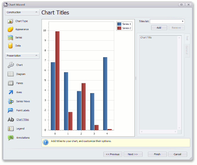
Note that to select a chart title, you can click it directly in the chart preview.
Legend
This page allows you to specify the options of the chart’s legend: its visibility, position, direction of its items, appearance, and text settings.
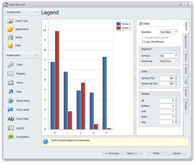
Note
To adjust the actual content that should be displayed by a legend item (e.g. display series points’ arguments, values, or both, or series names), switch back to the Legend Point Options tab of the Series page.
Annotations
This last page allows you to create text and image annotations anchored to your chart, panes, and series points.
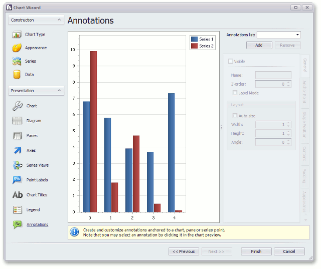
You can adjust position, layout, appearance, and other settings for chart, panes, and series points.