Legend Overview
- 5 minutes to read
This document describes the basics of using the Legend in the ASP.NET Chart Control and demonstrates how to access it at design time and customize it at runtime.
Legend Overview
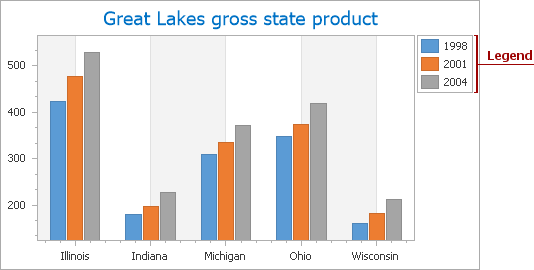
The Legend is an explanatory component that accompanies a chart’s diagram, identifying its most important visual elements: series, series points (in some cases), constant lines, strips and indicators. Note that it is only possible to create one legend on each chart.
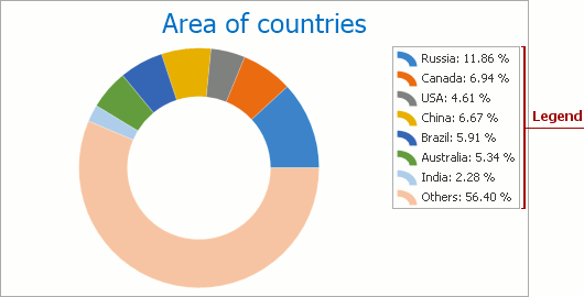
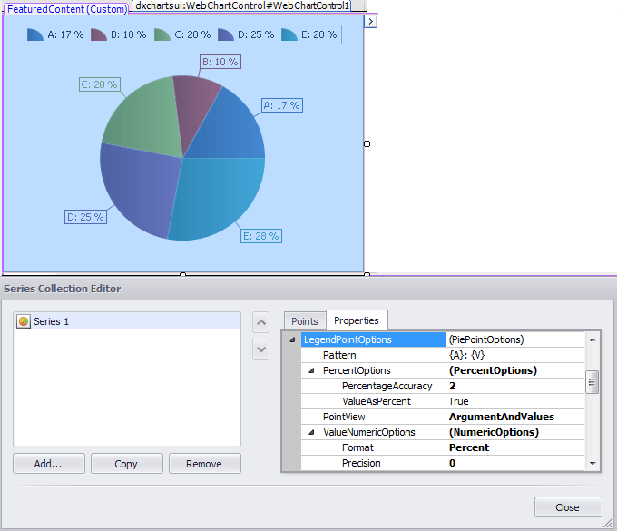
In most cases, a legend can display series names. The chart legend can also show data points that belong to the same series. To apply this legend representation format to series of most view types, enable their SeriesViewColorEachSupportBase.ColorEach property. Note that this legend view is automatically applied to the Pie series.
A legend, which lists and identifies data points belonging to a single series is demonstrated in the following image, using a pie chart as an example.
Each item shown in the legend can be represented by the following:
a marker and textual description pair for the legend item (the default option);
a checkbox and textual description pair for the legend item.
Note
The chart’s visual element can be displayed on a legend if its Visible and ShowInLegend properties are enabled (ConstantLine.Visible, Indicator.Visible, SeriesBase.Visible, Strip.Visible).
If you wish to see multiple series on a legend, they should have compatible view types. For details on this, refer to the Combining Different Series Views topic.
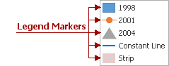
Legend Markers
The appearance (shape and color) of the legend marker varies, depending on the item type it identifies. So, the marker’s image is different for series of different view types, and for constant lines and strips as well. And, its color is determined by the color of the corresponding chart element that it represents.
For series and indicators, the description is based on their names (defined by the Series.Name and Indicator.Name properties). For constant lines and strips, the description is determined by their ConstantLine.LegendText and Strip.LegendText properties, respectively.
Note
To control whether or not a certain series should be represented in the legend, use this series SeriesBase.ShowInLegend property. Similarly, to show or hide strips, constant lines and indicators in the legend, use their Strip.ShowInLegend, ConstantLine.ShowInLegend and Indicator.ShowInLegend properties, respectively.
For series of the pie and doughnut view types, it is often necessary to choose the format in which their points should be represented in the legend, (e.g. whether only their values should be reflected, or their arguments, or both). In addition, it may be necessary to display point values as percentages. The series SeriesBase.LegendTextPattern property allows you to specify the necessary format to the point values. A detailed tutorial on this can be found in the How to: Show Currency Values in the Legend of a Pie Chart tutorial.
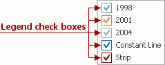
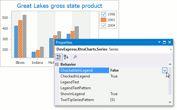
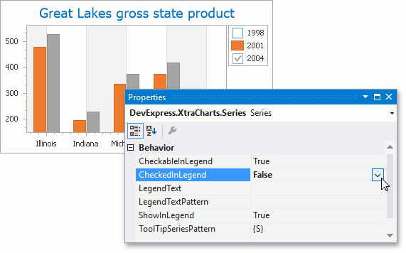
Legend Check Boxes
As mentioned in the Legend overview section, you can accompany all legend items with legend check boxes which are shown instead of legend markers.
To use check boxes instead of markers or together with them for all legend items, set the Legend.MarkerMode property to the MarkerAndCheckBoxes or CheckBoxesAndMarkers value.
If you wish to show check boxes for each legend item individually, set the CheckableInLegend property to true (ConstantLine.CheckableInLegend, Indicator.CheckableInLegend, SeriesBase.CheckableInLegend, Strip.CheckableInLegend).
Note
The ChechableInLegend property is in effect for legend items when the Legend.MarkerMode property is set to MarkerAndCheckBox or CheckBoxAndMarker.
When the check box appears on a legend (The Legend.MarkerMode property is set to MarkerAndCheckBox or CheckBoxAndMarker and CheckableInLegend is set to true), you can control the visibility of a chart element displayed in the legend using the CheckedInLegend property (ConstantLine.CheckedInLegend, Indicator.CheckedInLegend, SeriesBase.CheckedInLegend, Strip.CheckedInLegend).
Note
The indicator check boxes are disabled automatically when the SeriesBase.CheckedInLegend property is set to false for the series to which indicators belong.
You can provide a custom legend check box by changing its default behavior in the WebChartControl.LegendItemChecked event.
Example
The following example shows how to implement custom radio buttons to control the visibility of chart series based on the legend check box behavior.
Legend Runtime Customization
At runtime, you can customize the appearance of legend items for individual series and points (e.g. based on a certain condition), in the WebChartControl.CustomDrawSeries or WebChartControl.CustomDrawSeriesPoint event handlers.
In addition, in these events, you can provide image markers for legend items using the CustomDrawSeriesEventArgsBase.LegendMarkerImage and CustomDrawSeriesEventArgsBase.LegendMarkerImageSizeMode properties.
This example demonstrates how you can conditionally customize legend items in the ChartControl.CustomDrawSeriesPoint event handler.
using System;
using System.Windows.Forms;
using DevExpress.XtraCharts;
// ...

private void chartControl1_CustomDrawSeriesPoint(object sender,
CustomDrawSeriesPointEventArgs e) {
    if (Convert.ToDouble(e.SeriesPoint.Values[0]) > 5) {
        e.LegendText = "exceeded";
        e.LegendTextColor = Color.Red;
    }
    else {
        e.LegendMarkerVisible = false;
        e.LegendTextVisible = false;
    }
}