Series Point Labels
- 9 minutes to read
This document describes how series points can be accompanied by text labels, how you can control the data they show, and format their output. It describes the ways in which you can resolve label overlapping if labels are too long and numerous. In addition, it explains how series labels can be accessed, and the ways in which you can adjust their appearance.
This document consists of the following sections.
- Series Point Labels Overview
- Access Series Labels
- Resolve Overlapping of Series Labels
- Customize the Display Format of Series Labels
- Customize the Layout of Series Labels
- Customize the Appearance of Series Labels
Series Point Labels Overview
Each series point can be accompanied by a text label representing data related to the point. These are the series point labels (or, simply series labels, for short).
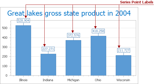
For series of different view types, points represent different kinds of data, hence the corresponding series labels can carry a point’s value, argument, or both (How to: Change the Display Format for Series Labels of a Pie Chart). If required, you can also make a label display any custom information (How to: Make Series Labels Display Custom Information) or conditionally control its appearance (How to: Conditionally Hide Series Labels).
Note
Series point labels are hidden in the ASP.NET Chart control by default (the crosshair cursor is shown instead). If you wish to display point labels on a diagram, set the SeriesBase.LabelsVisibility property for a particular series to true (e.g., LineSeriesView.LabelsVisibility).
The following sections of this document highlight the most important aspects of series labels.
Access Series Labels
To access the settings that specify the contents, position and appearance of series labels at design time, click the Series ellipsis button in the Properties window, and expand the SeriesBase.Label property in the Properties tab of the Series Collection Editor.
To access these settings at runtime, use the following code.
SideBySideBarSeriesLabel label = chart.Series[0].Label as SideBySideBarSeriesLabel;
if (label != null) {
    label.Position = BarSeriesLabelPosition.Top;
}
Note that the set of the available options is specific for each series view type. For the purpose of simplicity, and since Line is among the most popular view types, we’ll use it in this document, to describe the functionality of series labels.
The series labels options fall into the following two categories, described in the appropriate document sections.
- The settings that control resolving series label overlapping (Resolve Overlapping of Series Labels).
- And, the settings related to the appearance of series labels (Customize the Appearance of Series Labels).
Resolve Overlapping of Series Labels
The series labels may overlap in the following cases:
- when there are too many data points in a series;
- when series arguments or values are too long.
In these situations, you can use the overlap resolving algorithms provided by the ASP.NET Chart Control, which are varied, to meet specific requirements. This feature is available for both 2D and 3D series view types.
Note that the series labels are hidden, by default. And a crosshair cursor is enabled to interact quickly with huge data. In addition, you can enable chart tooltips appearing when a series point is hovered with a mouse, using the WebChartControl.ToolTipEnabled property without writing a single line of code. To learn more, see Tooltips.
To enable overlap resolution, set the SeriesLabelBase.ResolveOverlappingMode to a value other than None. The available modes are described below.
Note
For the Pie series, the SeriesLabelBase.ResolveOverlappingMode property can be accessed only if their PieSeriesLabel.Position property is set to either PieSeriesLabelPosition.TwoColumns, or to PieSeriesLabelPosition.Outside.
The overlap resolution modes are available selectively for different series view types. Moreover, the same mode may be implemented differently to meet the specific requirements of a series view type.
The following table demonstrates the availability of these modes for different series view types.
| Mode | Description | Series View Type |
|---|---|---|
| Default | This algorithm re-positions labels in a random way, to avoid overlapping labels. This mode only changes the position of labels that are overlapped. | All the view types, with respect to the view type’s specifics. |
| HideOverlapped | In this mode, if two or more labels overlap, some of them are automatically hidden, to avoid overlapping. | All the view types, with the exception of the Pie, Doughnut and Funnel series. |
| JustifyAroundPoint | Only labels that are overlapping change their position. They are re-positioned in such a way, so they are moved around the corresponding point’s center, but their indent from the point center is preserved. This mode only changes the position of labels that are overlapped. | By definition, this mode is supported for series view types that visually represent a data point as a point. So, this encompasses all view types, with the exception of the Pie and Doughnut, Gantt, Bar and Column, Bubble, and Stock series. |
| JustifyAllAroundPoint | All labels (both overlapping and non-overlapping) change their position. They are re-positioned in such a way, so they are moved around the corresponding point’s center, but their indent from the point center is preserved. | By definition, this mode is supported for series view types that visually represent a data point as a point. So, this encompasses all view types, with the exception of the Pie and Doughnut, Gantt, Bar and Column, Bubble, and Stock series. |
After any overlapping mode is enabled, the SeriesLabelBase.ResolveOverlappingMinIndent property is in effect, which allows you to determine the minimum indent between two adjacent series point labels. Note that this property is synchronized for all series, so setting this property for one series will apply the changes for all series within a chart. This option is not available for the Pie and Doughnut, Bubble and Stock series.
The following images demonstrate this property in action (with the SeriesLabelBase.ResolveOverlappingMode set to JustifyAroundPoint).
| ResolveOverlappingMinIndent = -1 | ResolveOverlappingMinIndent = 10 |
|---|---|
 |
 |
Note
Data Point Markers are hidden in the ASP.NET Chart control by default. If you wish to display markers on a diagram, set the MarkerVisibility property for a particular series to true (e.g., LineSeriesView.MarkerVisibility).
Customize the Displaying Format of Series Labels
Since series labels represent data of their corresponding series points, you can apply formatting to this data using the SeriesLabelBase.TextPattern property. This property defines a pattern for displaying text by series labels. Various placeholders enclosed in braces correspond to the available display patterns.
The full list of available placeholders is listed below.
| Pattern | Description |
|---|---|
| {A} | Displays a series point argument. |
| {V} | Displays series point values. |
| {VP} | Displays series point values as percentages (for a Pie series and Full-Stacked series views). |
| {S} | Displays the name of the series. |
| {G} | Displays the name of a stacked group. |
| {W} | Displays the weight (for a Bubble series). |
| {V1} | Displays the first value (for a Range series). |
| {V2} | Displays the second value (for a Range series). |
| {HV} | Displays the high value (for a Financial series). |
| {LV} | Displays the low value (for a Financial series). |
| {OV} | Displays the open value (for a Financial series). |
| {CV} | Displays the close value (for a Financial series). |
| {HINT} | Displays a hint for a series point. |
You can use standard and custom format specifiers, together with the placeholders to format numeric and date/time values (e.g., “{A}: {V:F1}”) .
The result is shown below.
To learn more, see the Format Specifiers topic.
In addition, you can specify a pattern using the Pattern Editor. The editor contains numerous predefined chart placeholders together with the date-time, numeric, percent, currency, and special formats allowing you to create a text pattern.
To invoke the editor, click the ellipsis button of the SeriesLabelBase.TextPattern property in the Properties window.
You can also customize the text pattern in the “Text Pattern” tab, which is located in the “Point Labels” Chart Wizard section.
The image below shows the Pattern Editor invoked for the SeriesLabelBase.TextPattern property.

Customize the Layout of Series Labels
The following layout options are available for labels of the Bar and Column series view types.
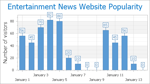
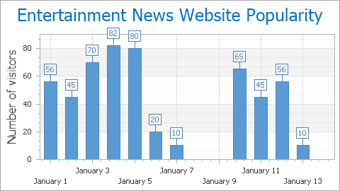
The BarSeriesLabel.ShowForZeroValues property determines whether the labels should be displayed for zero data point values.
| ShowForZeroValues = true | ShowForZeroValues = false |
|---|---|
 |
 |
The SeriesLabelBase.TextOrientation property specifies the direction of text within the series labels.
| TextOrientation = Horizontal | TextOrientation = TopToBottom | TextOrientation = BottomToTop |
|---|---|---|
 |
 |
 |
The BarSeriesLabel.Position property determines the position of series point labels, relative to their corresponding Bars. And the BarSeriesLabel.Indent property maintains the indent between labels and the corresponding Bar side.
| Position = Auto | Position = Center | Position = Top |
|---|---|---|
 |
 |
 |
| Position = BottomInside | Position = TopInside |
|---|---|
 |
 |
For the Gantt and Range Bar series, there are specific options available, to meet the requirements of these view types: the RangeBarSeriesLabel.Indent, RangeBarSeriesLabel.Kind and RangeBarSeriesLabel.Position properties.
For the Bubble series, the following layout options are available:
- The BubbleSeriesLabel.IndentFromMarker property, which is available when the PointSeriesLabel.Position property is set to Outside. It determines the indent between a marker’s edge and its label;
- The SeriesLabelBase.TextPattern property, which specifies the pattern for series labels to display a point’s Weight, Value or both.
For the Pie and Doughnut series, the PieSeriesLabel.Position property allows you to organize series labels in two columns, on either side of the series.
Finally, the PointSeriesLabel.Angle property allows you to define the angle value of series point labels relative to the corresponding data points. The angle is measured in degrees, and counterclockwise from the horizontal.
| Angle = 45 | Angle = 0 | Angle = -60 |
|---|---|---|
 |
 |
 |
Note
This option is not available under the ResolveOverlappingMode.JustifyAllAroundPoint mode, and for certain series view types, such as Pie and Doughnut and Stock. For the Bubble series, it is available when the PointSeriesLabel.Position property is set to Outside.
Customize the Appearance of Series Labels
The set of appearance options available for series labels varies, depending on the view type of the series. The most common options are listed below.
- The following properties control the Font options of series labels: SeriesLabelBase.Font, SeriesLabelBase.Antialiasing, and SeriesLabelBase.TextColor.
- The following properties control the Label Line options of series labels: SeriesLabelBase.LineColor, SeriesLabelBase.LineLength, SeriesLabelBase.LineStyle and SeriesLabelBase.LineVisibility.
- The following properties control the Appearance options of series labels: SeriesBase.LabelsVisibility, SeriesLabelBase.BackColor, SeriesLabelBase.FillStyle, SeriesLabelBase.Border and SeriesLabelBase.Shadow.