Grid Lines,Tickmarks and Interlacing
- 5 minutes to read
This document describes the concepts of using axis grid lines and tickmarks in the ASP.NET Chart Control. In addition, it highlights how a chart’s diagram can be made interlaced. Before reading this text, it may be useful to review the basics of using axes and axis scale types in the WebChartControl.
This document consists of the following sections.
Grid Lines and Tickmarks Overview
Tickmarks divide an axis into equal sections by a step whose value is determined by the special options of an axis. Tickmarks are used to improve the readability of chart data. Tickmarks may be accompanied by axis labels.
Grid Lines are the reference lines used to improve the readability of a chart’s visual data. They are drawn across an axis from its tickmarks through the entire chart.
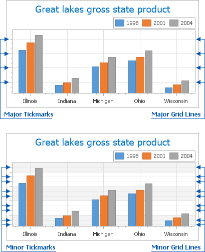
There are two types of tickmarks and grid lines: major and minor. The following images demonstrate them.
Besides tickmarks, it is also possible to enable Interlacing for the chart’s diagram from any of its axes. You can make the diagram’s background “ribbed” (alternating two colors) from the AxisBase.Interlaced property. The default interlacing color can be changed from the AxisBase.InterlacedColor property, referenced to its fill style (Axis2D.InterlacedFillStyle).
Note that interlacing does not depend on whether or not axis grid lines or tickmarks are visible. Moreover, interlacing and grid lines are maintained after the Axis2D.Visibility property is set to false. This situation is illustrated in the following image.
Interlacing depends on the spacing of grid lines. It is automatically determined by the ScaleGridOptionsBase.AutoGrid property (set to true by default) based on the major tickmarks of the axis.
To manually determine the step interval between grid lines, use the ScaleGridOptionsBase.GridSpacing property. Note that changing the grid line spacing affects label placement along the axis. Since ScaleGridOptionsBase.GridSpacing cannot be set to 0, if its value is less than 1 (e.g., 0.1) it is always rounded to 1.
Note that after you assign a value to the ScaleGridOptionsBase.GridSpacing property, the ScaleGridOptionsBase.AutoGrid property is disabled. And after you re-enable the ScaleGridOptionsBase.AutoGrid property, this resets the ScaleGridOptionsBase.GridSpacing property.
You can access these properties at design time in the Properties window, after you select the required numeric or date-time scale.
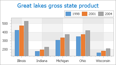
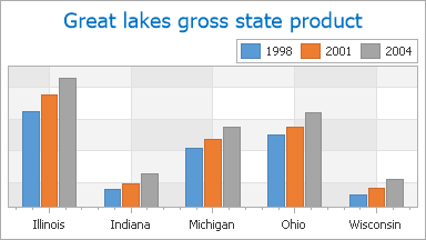
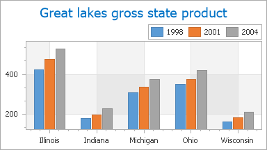
The following images demonstrate the ScaleGridOptionsBase.GridSpacing property applied to the Y-axis.
AutoGrid = true | AutoGrid = false GridSpacing = 10 |
|---|---|
|
|

To learn how tickmarks and grid lines (both major and minor) can be individually customized, refer to the following sections of this document: Customizing Tickmarks and Customizing Grid Lines.
Customizing Tickmarks
To access the properties of axis tickmarks at design time, expand the Axis2D.Tickmarks property in the Properties window, as shown in the following image.
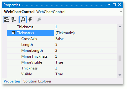
You can customize the appearance of both minor and major tickmarks from these properties, briefly described below.
The only property that affects both major and minor tickmarks is the TickmarksBase.CrossAxis property, which draws all tickmarks across the axis.
The following properties determine the appearance of major tickmarks only.
- To show or hide major tickmarks, use the TickmarksBase.Visible property.
- To define the length of major tickmarks (in pixels), use the TickmarksBase.Length property.
- To define the thickness of major tickmarks (in pixels), use the TickmarksBase.Thickness property.
The following properties determine the appearance of minor tickmarks only.
- To show or hide minor tickmarks, use the TickmarksBase.MinorVisible property.
- To define the length of minor tickmarks (in pixels), use the TickmarksBase.MinorLength property.
- To define the thickness of minor tickmarks (in pixels), use the TickmarksBase.MinorThickness property.
In addition, you can manually define the number of minor tickmarks to be shown between each pair of major tickmarks from the AxisBase.MinorCount property. Note that this property also affects the number of minor grid lines, which are described in the next section of this document.
The overall number of major tickmarks to be drawn along an axis is determined automatically (along with the number of major grid lines), since the ScaleGridOptionsBase.AutoGrid property is enabled by default. To learn more about this, refer to the Grid Lines and Tickmarks Overview section of this document.
Customizing Grid Lines
To access the properties of grid lines at design time, expand the AxisBase.GridLines property in the Properties window, as shown in the following image.
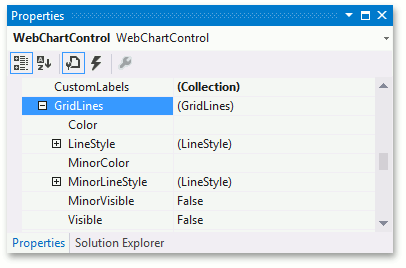
With the ASP.NET Chart Control, it is possible to define the appearance of major and minor grid lines independently, from the properties described below.
The following properties determine the appearance of major grid lines only.
- To show or hide major grid lines, use the GridLines.Visible property.
- To define the color of major grid lines, use the GridLines.Color property.
- To customize the line style of major grid lines, use the GridLines.LineStyle property.
The following properties determine the appearance of minor grid lines only.
- To show or hide minor grid lines, use the GridLines.MinorVisible property.
- To define the color of minor grid lines, use the GridLines.MinorColor property.
- To customize the line style of minor grid lines, use the GridLines.MinorLineStyle property.
As with tickmarks, the number of minor grid lines to be displayed between each pair of major gridlines is determined by the AxisBase.MinorCount property. Again, note that this property affects both minor tickmarks and grid lines.
The overall number of major grid lines to be drawn along an axis is determined automatically (along with the number of major tickmarks), since the ScaleGridOptionsBase.AutoGrid property is enabled by default. To learn more on this, refer to the Grid Lines and Tickmarks Overview section of this document.