Adaptivity
- 4 minutes to read
The ASPxCardView control allows you to create adaptive layouts that ensure a consistent appearance on different devices.
Note
In adaptive mode, the control’s width should be specifies in percentage.
Card View Layout
The Card View includes three layout modes that allow you to define the number and arrangement of cards displayed on a single page. You can specify the layout mode by setting the ASPxCardViewSettings.LayoutMode property to one of the following values.
- Layout.Table - Organizes cards in a table with a specified number of rows and columns (the CardViewTableLayoutSettings.ColumnCount and CardViewTableLayoutSettings.RowsPerPage properties).
- Layout.Flow - Arranges cards one after another to occupy all the available space. The CardViewFlowLayoutSettings.ItemsPerPage property specifies the number of cards displayed on a page.
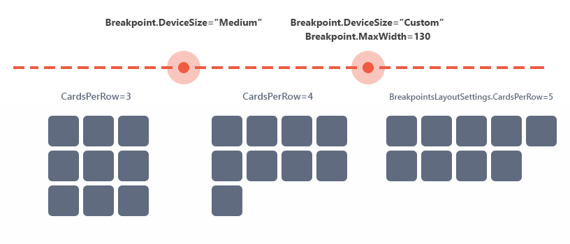
Layout.Breakpoints - Reorganizes cards according to custom layout scenarios for different browser widths. It allows you to display, for example, three cards in a row for smaller screens or five cards in a row for larger screens.
This functionality is based on specifying the browser widths (breakpoints) at which the grid shifts and resizes its items to arrange the control’s content.
Note
The ASPxCardView cards have a fixed height (specified in the .dxcvFlowCard_<ThemeName> or .dxcvBreakpointsCard_<ThemeName> CSS selectors) when the control is in Flow or Breakpoints layout modes. Use the ASPxCardView.Styles.FlowCard.Height or ASPxCardView.Styles.BreakpointCard.Height (CardViewCardStyle.Height) properties to specify a custom card’s height in these modes.
... <Styles FlowCard-Height="260" /> ...ASPxCardView stores breakpoints in the BreakpointsLayoutCollection<T> object, which is accessed at the ASPxCardViewBreakpointsLayoutSettings object level. Each breakpoint is a CardViewBreakpoint class instance. You can change the following characteristics of individual breakpoints.
Property Description BreakpointsLayoutBreakpoint.DeviceSize Specifies the device size (“Small”, “Medium”, “Large”). ASPxCardViewBreakpointsLayoutSettings.CardsPerRow, CardViewBreakpoint.CardsPerRow Specifies the number of cards the Card View displays in a row. BreakpointsLayoutBreakpoint.MaxWidth Specifies the maximum browser width at which the control rearranges its cards when the BreakpointsLayoutBreakpoint.DeviceSize property is set to BreakpointsLayoutDeviceSizes.Custom. Creating a CardViewBreakpoint object declares a range of browser widths between 0 and the BreakpointsLayoutBreakpoint.DeviceSize/BreakpointsLayoutBreakpoint.MaxWidth property value (if there are no breakpoints with a lower DeviceSize/MaxWidth property value) where the Card View arranges the specified number of cards in a row (CardViewBreakpoint.CardsPerRow).
Use the ASPxCardViewBreakpointsLayoutSettings.CardsPerRow property to define how many cards the Card View displays in a row if there are no specified breakpoints for a given browser’s width.
Online Demo
Example
The following example illustrates the programmatic and declarative approaches for implementing three different layout scenarios for different browser sizes (Small, Medium, Large).
Declarative approach:
<Settings LayoutMode="Breakpoints" />
<SettingsAdaptivity>
    <BreakpointsLayoutSettings CardsPerRow="5">
        <Breakpoints>
            <dx:CardViewBreakpoint DeviceSize="Small" CardsPerRow="3" />
            <dx:CardViewBreakpoint DeviceSize="Custom" MaxWidth="1300" CardsPerRow="4" />
        </Breakpoints>
    </BreakpointsLayoutSettings>
</SettingsAdaptivity>
Programmatic approach:
CardView.Settings.LayoutMode = Layout.Breakpoints;
CardView.SettingsAdaptivity.BreakpointsLayoutSettings.CardsPerRow = 5;

CardView.SettingsAdaptivity.BreakpointsLayoutSettings.Breakpoints.AddRange(new List<CardViewBreakpoint>() {
    new CardViewBreakpoint() { DeviceSize = BreakpointsLayoutDeviceSizes.Small, CardsPerRow = 3 },
    new CardViewBreakpoint() { DeviceSize = BreakpointsLayoutDeviceSizes.Custom, MaxWidth = 1300, CardsPerRow = 4 },
});
Card Layout
Use the ASPxCardView.CardLayoutProperties property to customize a card’s layout. This property provides access to the built-in form layout that defines the columns’ arrangement within a card.
The Card View’s form layout incorporates the adaptive mode that is available through the FormLayoutProperties.SettingsAdaptivity property. This mode provides the capability to automatically reorganize form layout content into one column when the browser window’s inner width is less than or equal to the FormLayoutAdaptivitySettings.SwitchToSingleColumnAtWindowInnerWidth property. To enable adaptive mode, set the FormLayoutAdaptivitySettings.AdaptivityMode to the FormLayoutAdaptivityMode.SingleColumnWindowLimit‘s value.
The Adaptive Layout demo illustrates the Card View with the form layout in adaptive mode.
Adaptive Popups
The Card View control also incorporates adaptive popup dialogs based on Popup Control’s adaptive mode. In adaptive mode, the popup dialog is transformed into a modal window that covers the screen’s content.
You can access the popup dialog’s settings using its SettingsAdaptivity property. The table below lists available dialogs.
Refer to the listed demos to see a popup dialog’s adaptive behavior. Each demo uses the SettingsAdaptivity property.
Text Truncation with Ellipsis
The ASPxCardView control can automatically truncate cell values if they do not fit into a cell’s width. The control displays an ellipsis (‘…’) if the ASPxGridBehaviorSettings.AllowEllipsisInText property is set to true to indicate that the text is truncated.
Online Demo
Card View - Text Truncation with Ellipsis