Gauge Styles
- 2 minutes to read
The Gauge control ships with numerous styles that you can apply to most gauge elements (for example, scales, needles, background and effect layers, and level bars).
This topic explains gauge styles, lists the available style types, and describes how to assign a style to a gauge element at design time.
Built-In Styles
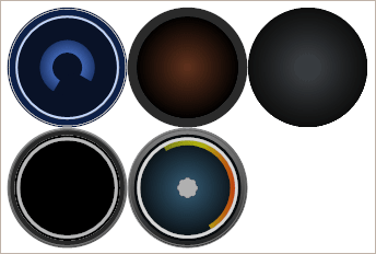
Gauge styles are predefined images that are stored in a vector format, so they can be easily zoomed or stretched without a loss in quality. Gauge styles define the size, proportion and appearance settings of its elements.
For example, the image below shows some styles that you can use to paint the background of circular gauges.
The alternative way to change gauge appearance is to use ready-to-use gauge presets with applied styles.
You can see a full list of gauge presets in the Preset Manager shown below.
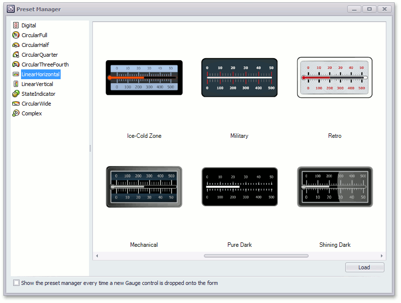
For more information on how to use this manager, see the following topic: Preset Manager.
Style Change
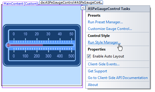
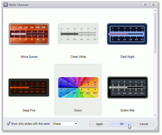
The Gauge control includes a Style Chooser that allows you to change gauge appearance.
Run the Style Manger to access this editor. To do this, click the gauge’s smart tag and select Run Style Manager… as shown below.
Then, select the Gauges Style tab and click Change Style…
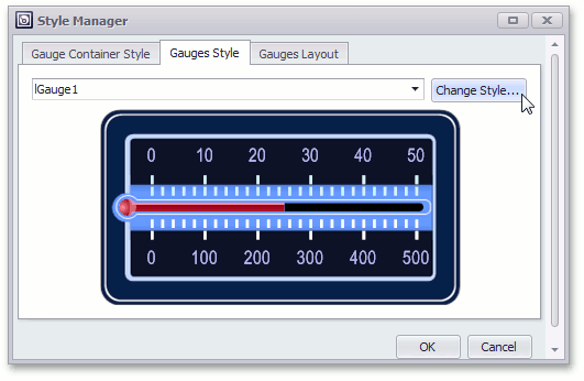
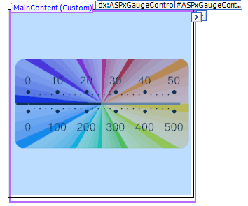
In the invoked Style Chooser, select the required preset (for example, Disco) and click OK.
The Web panel appears as follows:
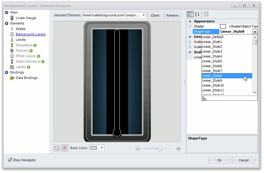
In some cases, you may need to change the style of a specific gauge element. To accomplish this, change the ShapeType property of the required element.
The following image shows how you can use the Element Designer to change the background layer element’s style.
See the following topic to learn more: Designer.