Gauge Appearance Customization
- 2 minutes to read
ASPxGaugeControl contains settings that allow you to customize the appearance of gauges and their elements according to your needs.
This topic lists the tools available to customize gauge appearance, and describes how to access them at design time.
Brushes
You can use brushes to paint an element’s background, borders, content, and text.
Brushes alter the appearance of the following gauge elements:
- In circular and linear gauges: scales and their major and minor tickmarks, labels, range bars.
- In digital gauges: segments, labels.
- In state indicators: labels.
Use the properties from the Appearance section to configure brushes.
You can use the gauge element’s Designer to access brushes.
Follow these steps to access the brush properties list:
Click the Gauge control’s smart tag and select Customize Gauge Control…

In the Visual Gauge Control Designer, click the scale’s smart tag and choose Run Designer.

In the Scales - Element Designer, you can specify properties for an ArcScaleComponent object, which is an instance of a scale in circular gauges.
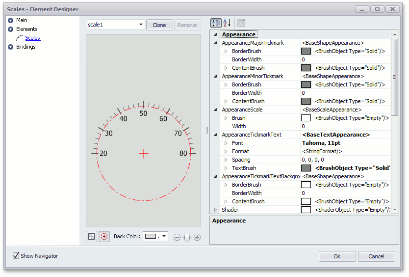
You can alter the scale’s appearance. To do this, change the ArcScaleComponent.AppearanceScale and ArcScaleComponent.AppearanceTickmarkText properties as shown below.
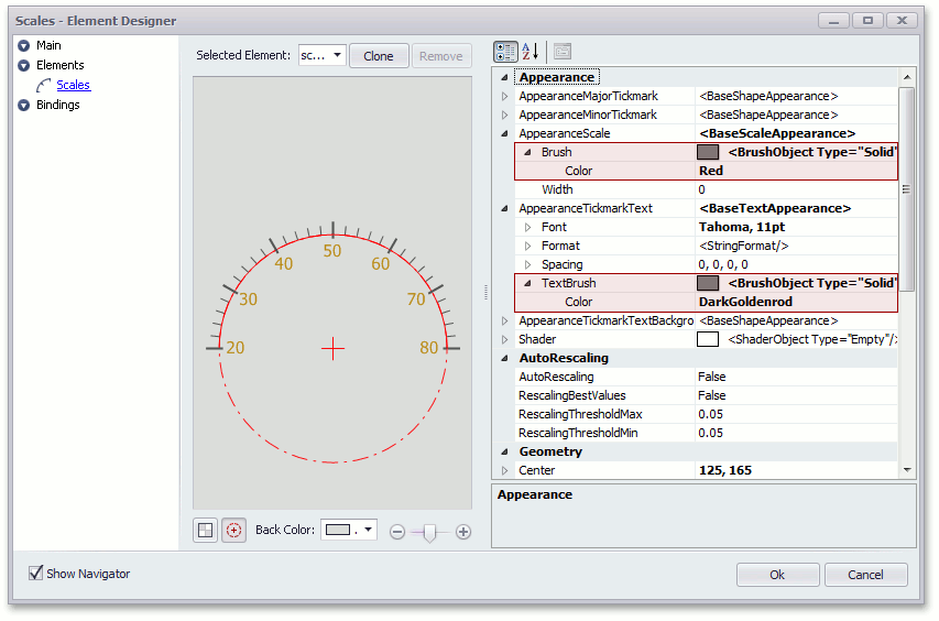
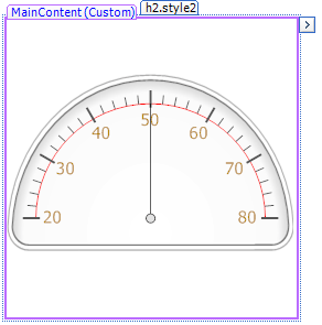
The circular gauge appears as follows.
Shaders
The current gauge style (predefined style) applied to an individual gauge specifies the appearance of most of its elements.
In addition, you can use the shader mechanism that allows you to change the color theme by mixing default colors with custom colors.
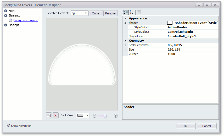
A shader is an object that implements the color blending feature. Use an element’s BaseLeafPrimitive.Shader property to specify a shader for a gauge element.
The image below shows a list of shader options for the ArcScaleBackgroundLayerComponent object.
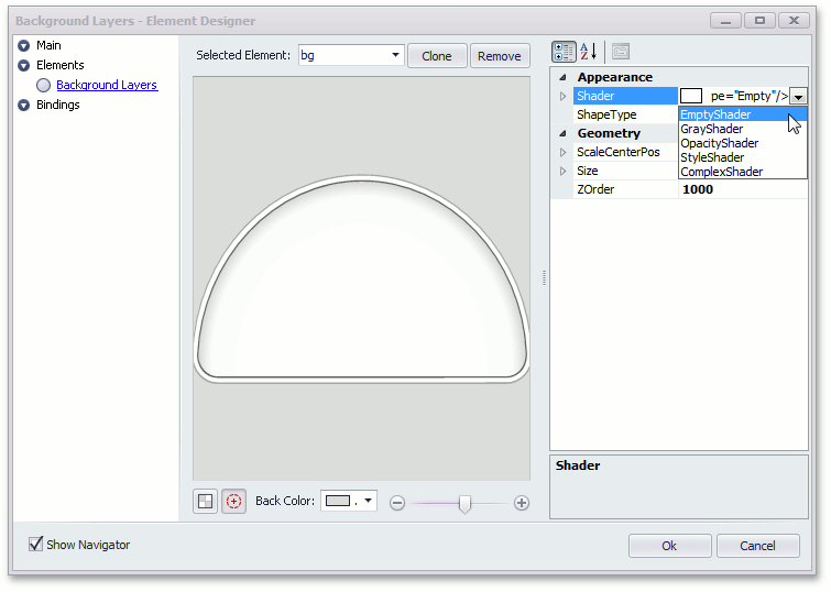
A StyleShader is the most used shader. It allows you to specify two colors, which are combined to create the resultant background layer’s appearance.
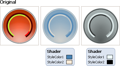
The StyleShader works in the following way:
The StyleShader calculates a gray tone (a value between 0 and 255) that corresponds to the input color of the predefined image.
The shader’s two colors define the range of colors in the color space.
The output color is calculated as a projection of the gray tone onto this range.
The following image shows the resulting color blend for a sample background layer.
See the following topic to learn more about background layers: Background Layer.