Circular Gauge
- 5 minutes to read
Arc Scale
An Arc Scale is the main circular gauge element on which all other elements (for example, range bars, needles, ranges) are placed.
A scale shows a range of values with tickmarks and scale labels. The arc scale’s object is an instance of the ArcScale class.
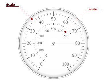
A circular gauge can contain multiple scales. The image below shows a gauge with two scales.
The following table lists the main properties that affect element behavior and appearance.
Needle
A Needle element indicates a specific value in a circular scale. The needle starts at the center of the scale and ends at the scale’s current value.
You can place multiple needles on a scale. Needle objects are instances of the ArcScaleNeedle class.
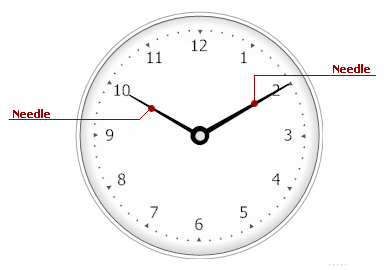
The following image shows a circular gauge with two needles:
At design time, you can customize a gauge’s needles using the Preset Manager.
The table below lists the main properties that affect element behavior and appearance.
| Characteristics | Members |
|---|---|
| Data | ValueIndicatorComponent<TProvider>.Value |
| Layout | ArcScaleNeedle.StartOffset,ArcScaleNeedle.EndOffset,BaseLeafPrimitive.ZOrder |
| Appearance | ArcScaleNeedle.ShapeType |
Marker
A Marker is a small shape (for example, a rhombus, an arrow) that indicates the current value along a scale. A Circular Gauge supports numerous marker shapes and allows you to place each of them on a scale.

A marker object is an instance of the ArcScaleMarker class.
The table below lists the main properties that affect element behavior and appearance.
| Characteristics | Members |
|---|---|
| Data | ValueIndicatorComponent<TProvider>.Value |
| Layout | ArcScaleMarker.ShapeOffset,ArcScaleMarker.ShapeScale,BaseLeafPrimitive.ZOrder |
| Appearance | ArcScaleMarker.ShapeType,ArcScaleMarker.Shape |
Range Bar
A circular gauge’s Range Bar is a filled sector that always starts at a fixed value along a scale and extends to another value (the scale’s current value or another fixed value).
The range bar extends to the scale’s current value (the default setting), so when the scale’s value changes, the range bar’s boundaries also change.
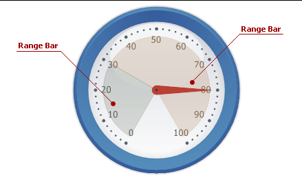
The image below illustrates two range bars with different start values (0 and 30) that extend to another scale value (30 and 100, respectively).
A range bar object is an instance of the ArcScaleRangeBar class.
The table below lists the main properties that affect element behavior and appearance.
| Characteristics | Members |
|---|---|
| Data | BaseRangeBar.AnchorValue,BaseRangeBar.Value,BaseRangeBar.ActualValue |
| Layout | BaseRangeBar.StartOffset,BaseRangeBar.EndOffset,BaseLeafPrimitive.ZOrder |
| Appearance | BaseRangeBar.Appearance,BaseLeafPrimitive.Shader |
Range
A Range marks a certain interval on a circular gauge. A circular gauge can contain multiple ranges that are displayed as bars along a scale.

A range object is an instance of the ArcScaleRange class.
The table below lists the main properties that affect element behavior and appearance.
| Characteristics | Members |
|---|---|
| Data | BaseRange.StartValue,ScaleRange.StartPercent,BaseRange.EndValue,ScaleRange.EndPercent |
| Layout | BaseRange.ShapeOffset |
| Appearance | BaseRange.AppearanceRange,BaseRange.StartThickness,BaseRange.EndThickness |
Tickmarks
Tickmarks are marks on an axis scale. You can display major and minor tickmarks on a circular gauge (see the image below).

Tickmark objects implement the IMajorTickmark or IMinorTickmark interface.
The table below lists the main properties that affect element behavior and appearance.
Labels
Two kinds of Labels are available for an Arc Scale:
- Scale Labels that show the current values of an arc scale.
- Custom Labels that you can place at any location along a scale.

Scale label objects implement the ILabel interface. Use the ArcScale.Labels property to return the LabelCollection collection that contains the scale label objects.
Custom label objects are instances of the Label class. Use the BaseGaugeWin.Labels property to return the LabelComponentCollection collection that contains the custom label objects.
The table below lists the main properties that affect element behavior and appearance.
| Characteristics | Members |
|---|---|
| Data | Label.Name,Label.Text,Label.FormatString,Label.AllowHTMLString |
| Layout | Label.Position,Label.Size,Label.TextOrientation,Label.TextShape |
| Appearance | ArcScale.Appearance,Label.AppearanceText,Label.AppearanceBackground |
Background Layer
A Background Layer defines the background of the circular gauge.
Every new background layer is painted behind all other gauge elements, because its BaseLeafPrimitive.ZOrder property is set to 1000 (the default setting). To bring this layer to the front of other gauge elements (or paint it above other layers, if there are any), set the ZOrder property to a lower value.
For example, the following picture illustrates a background layer that is overlapped by the scale whose ZOrder is set to 0 (the default setting).

A background layer object is an instance of the ArcScaleBackgroundLayer class.
The table below lists the main properties that affect element behavior and appearance.
| Characteristics | Members |
|---|---|
| Appearance | ArcScaleBackgroundLayer.ShapeType,BaseLeafPrimitive.Shader |
| Geometry | ArcScaleBackgroundLayer.Size,BaseLeafPrimitive.ZOrder,ArcScaleBackgroundLayer.ScaleCenterPos |
Effect Layer
An Effect Layer adds a style effect (for instance, a glare effect) to a gauge.
When you add a new effect layer to the gauge, this layer is displayed in the foreground because the BaseLeafPrimitive.ZOrder property’s default value is -1000.
You can set the ZOrder property to a higher value to move this layer behind other gauge elements.

An effect layer object is an instance of the ArcScaleEffectLayer class.
The table below lists the main properties that affect element behavior and appearance.
| Characteristics | Members |
|---|---|
| Appearance | ArcScaleEffectLayer.ShapeType,BaseLeafPrimitive.Shader |
| Geometry | ArcScaleEffectLayer.Size,BaseLeafPrimitive.ZOrder,ArcScaleEffectLayer.ScaleCenterPos |
Spindle Cap
A Spindle Cap is a fixed element that is located at the center of a circular gauge.

A spindle cap object is an instance of the ArcScaleSpindleCap class.
The table below lists the main properties that affect element behavior and appearance.
| Characteristics | Members |
|---|---|
| Appearance | ArcScaleSpindleCap.ShapeType,BaseLeafPrimitive.Shader |
| Layout | ArcScaleSpindleCap.Size,BaseLeafPrimitive.ZOrder |
State Indicator
A State Indicator is a small object that shows a static image based on a set of predefined states specified in the StateIndicator.States property.
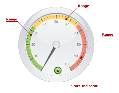
The image below shows a state indicator that changes its state when a Needle enters a new Range on a circular gauge.
A state indicator object is an instance of the StateIndicator class.
The table below lists the main properties that affect element behavior and appearance.
| Characteristics | Members |
|---|---|
| Behavior | StateIndicator.States,StateIndicator.StateIndex,StateIndicator.State |
| Appearance | BaseLeafPrimitive.Shader |
| Geometry | StateIndicator.Size,BaseLeafPrimitive.ZOrder,StateIndicator.Center |