Digital Gauge
- 4 minutes to read
Background Layer
A Background Layer is a visual element that defines the background of the digital gauge.
When you add a new background layer to the gauge, it is painted behind all other gauge elements because its BaseLeafPrimitive.ZOrder property is set to 1000 (the default setting). To bring this layer to the front of other gauge elements (or paint it above other layers, if there are any), set the ZOrder property to a lower value.
For example, the following picture illustrates a background layer that is overlapped by symbols of the FourteenSegment view type.
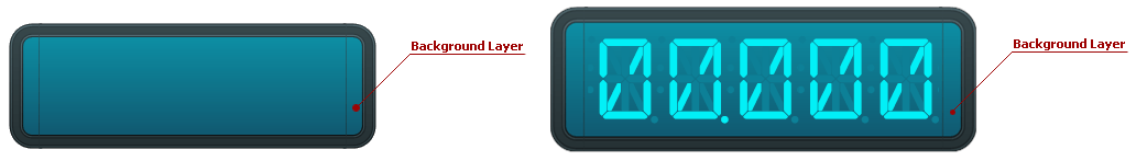
A background layer is an instance of the DigitalBackgroundLayer class.
The table below lists the main properties that affect element behavior and appearance.
| Characteristics | Members |
|---|---|
| Appearance | DigitalBackgroundLayer.ShapeType,BaseLeafPrimitive.Shader |
| Layout | DigitalBackgroundLayer.BottomRight,DigitalBackgroundLayer.TopLeft,BaseLeafPrimitive.ZOrder |
Effect Layer
An Effect Layer adds a style effect (for instance, a glare effect) to the digital gauge.
When a new effect layer is added to the gauge, it is painted in the foreground above all other elements because its BaseLeafPrimitive.ZOrder property is set to -1000 (the default setting).
Set the ZOrder property to a higher value to move this layer behind other gauge elements.

An effect layer is an instance of the DigitalEffectLayer class.
The table below lists the main properties that affect element behavior and appearance.
| Characteristics | Members |
|---|---|
| Appearance | DigitalEffectLayer.ShapeType,DigitalEffectLayer.Shape |
| Layout | DigitalEffectLayer.BottomRight,DigitalEffectLayer.TopLeft,BaseLeafPrimitive.ZOrder |
Symbols Panel
The Symbols Panel is a container that looks and behaves like a real LED device. It contains one or more symbols that display either characters or digits. The total number of displayed symbols is defined by the DigitalGauge.Text and DigitalGauge.DigitCount property values.
The appearance of the symbols panel depends on the digital gauge view type.
The images below show two symbol panels - the FourteenSegment and the Matrix8x14 view types.


The following table lists the main properties that affect element behavior and appearance.
Symbol
A Symbol is a visual element that displays information on the Digital Gauge control. This information may contain digits, characters, or any graphics that can be shown on LED devices.
You can divide any symbol into one or more parts, depending on its size. These parts can be either segments or matrix dots. To display a symbol on a digital gauge’s symbols panel, use the DigitalGauge.Text property.
Symbol appearance depends on the symbols panel type. The following images show symbols on different panels:
A SevenSegments view type has 7 main and 4 additional segments used to display a symbol.

A FourteenSegments view type contains 14 main and 4 additional segments.

A Matrix5x8 view type contains 40 matrix dots (5 horizontal X 8 vertical) for each symbol.

A Matrix8x14 view type contains 112 matrix dots (8 horizontal X 14 vertical) for each symbol.

The table below lists the main properties that affect element behavior and appearance.
| Characteristics | Members |
|---|---|
| Main | DigitalGauge.DisplayMode,DigitalGauge.Text,ASPxGaugeControl.Value |
| Appearance | DigitalGauge.AppearanceOn |
| Layout | DigitalGauge.LetterSpacing |
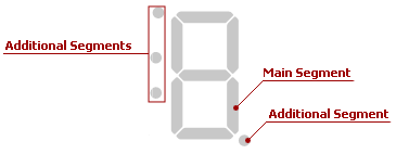
Segment
A Segment is a visual element into which every symbol can be divided.
The number of segments depends on the symbols panel type. The following images show the SevenSegments and FourteenSegments view types:
The SevenSegments view type has 7 main and 4 additional segments used to display a symbol.
The FourteenSegments view type contains 14 main and 4 additional segments.
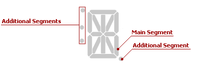
The main segments display both digits and characters in the symbols panel.
An additional segment displays either a dot, which divides the integral and fractional parts of a decimal number, or another subsidiary symbol.
The table below lists the main properties that affect element behavior and appearance.
| Characteristics | Members |
|---|---|
| Data | DigitalGauge.Text,DigitalGauge.DigitCount,ASPxGaugeControl.Value |
| Appearance | DigitalGauge.AppearanceOff |
Matrix Dot
A Matrix Dot is an element of a two-dimensional array used to display characters, digits, images, and more.
A DigitalGauge control supports two matrix types - Matrix5x8 and Matrix8x14, which are shown below.


To use matrix dots to display one or more symbols, specify the DigitalGauge.Text property value.
The table below lists the main properties that affect element behavior and appearance.
| Characteristics | Members |
|---|---|
| Data | DigitalGauge.Text,DigitalGauge.DigitCount,ASPxGaugeControl.Value |
| Appearance | DigitalGauge.AppearanceOff |
Custom Label
A Custom Label displays custom text that you can place at any location along a symbols panel.

Custom labels are instances of the Label class that are stored in the BaseGaugeWin.Labels collection.
The table below lists the main properties that affect element behavior and appearance.
| Characteristics | Members |
|---|---|
| Data | Label.Name,Label.Text,Label.FormatString,Label.AllowHTMLString |
| Layout | Label.Position,Label.Size,Label.TextOrientation,Label.TextShape,BaseLeafPrimitive.ZOrder |
| Appearance | Label.AppearanceText,Label.AppearanceBackground,BaseLeafPrimitive.Shader |