Customize the Document Viewer Tab Panel in React Application
- 2 minutes to read
This topic contains customization scenarios related to the Tab Panel in the Web Document Viewer.
Remove the Tab Panel
Use the CustomizeElements callback to get the Tab Panel by its PreviewElements‘ id and remove the Tab Panel from the collection of UI elements:
'use client';
import React from 'react';
import ReportViewer, { RequestOptions, Callbacks } from 'devexpress-reporting-react/dx-report-viewer';
import {PreviewElements} from 'devexpress-reporting/dx-webdocumentviewer';

function App() {
  const onCustomizeElements = ({ args }: { args: any }): void => {
    var panelPart = args.GetById(PreviewElements.RightPanel);
    var index = args.Elements.indexOf(panelPart);
    args.Elements.splice(index, 1);
  };
  return (
    <ReportViewer reportUrl="TestReport">
      <RequestOptions host="http://localhost:5000/" invokeAction="DXXRDV" />
      <Callbacks CustomizeElements={onCustomizeElements} />
    </ReportViewer>
  )
}

export default App
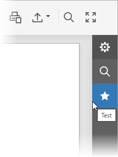
Add a New Tab to the Panel
You can create a new tab and add it to the tab collection in the Document Viewer’s View Model. The tab content is defined in a template specified in the tab constructor.
Use the BeforeRender callback to customize toolbar commands. The callback function receives the IPreviewModel object and the Document Viewer’s View Model object as arguments.
The view model’s tabPanel property allows you to access a tab collection in the Tab Panel. Create a new tab (an instance of the TabInfo<T> class) and add it to the collection.
In the TabInfo constructor, specify the template used to render the tab content and the template used to render the tab image.
The customized tab panel is shown in the image below:
'use client';
import React from 'react';
import ReportViewer, { RequestOptions, Callbacks } from 'devexpress-reporting-react/dx-report-viewer';
import { TemplateEngine } from 'devexpress-reporting-react/dx-report-viewer/core/template-engine';
import { TabInfo } from "@devexpress/analytics-core/analytics-utils"


function App() {
  const templateEngine = new TemplateEngine();
  templateEngine.setTemplate('fivestar', () => (
    <svg viewBox="-3.4 -4 32 32" xmlns="http://www.w3.org/2000/svg" xmlnsXlink="http://www.w3.org/1999/xlink">
      <g id="Layer_1" transform="translate(-3.4, -4)">
        <g id="Rating_1_">
            <polygon className="dxd-icon-fill" points="16,4 19.9,11.9 28.6,13.2 22.3,19.3 23.8,28 16,23.9 8.2,28 9.7,19.3 3.4,13.2 12.1,11.9" />
        </g>
      </g>
    </svg>
  ));
  templateEngine.setTemplate('my-test-panel', () => (
    <div>
      <button> <span>Test Panel</span> </button>
    </div>
  ));
  const onBeforeRender = ({ args }: { args: any }): void => {
    args.tabPanel.tabs.push(new TabInfo({
      text: "Test",
      template: "my-test-panel",
      imageTemplateName: "fivestar",
      model: null
    }));
  };
  return (
    <ReportViewer reportUrl="TestReport" templateEngine={templateEngine}>
      <RequestOptions host="http://localhost:5000/" invokeAction="DXXRDV" />
      <Callbacks BeforeRender={onBeforeRender} />
    </ReportViewer>
  )
}

export default App
Use our SVG Icon Builder tool to create custom icons. For more information, refer to the following help topic: How To: Draw and Use SVG Images.