Add a Custom Control to the Report Designer Toolbox
- 4 minutes to read
This document describes how to create a WPF project with a custom control and add the control to the WPF End-User Report Designer Toolbox.
Create a Project and Custom Control
- Create a new WPF project with the Report Designer named WpfApp_CustomNumericLabel.
- Add a new blank report to the project.
Implement a custom numeric label in a file named NumericLabel.cs:
Show Codeusing DevExpress.Utils.Design; using DevExpress.Utils.Serializing; using DevExpress.XtraReports; using DevExpress.XtraReports.Expressions; using DevExpress.XtraReports.UI; using System.ComponentModel; namespace WpfApp_CustomNumericLabel { [ToolboxItem(true)] [ToolboxSvgImage("WpfApp_CustomNumericLabel.NumericLabel.svg, WpfApp_CustomNumericLabel")] [DefaultBindableProperty("Number")] [DisplayName("Numeric Label")] public class NumericLabel : XRLabel { [DefaultValue(0)] [XtraSerializableProperty] public int Number { get; set; } // Set the "Browsable" and "EditorBrowsable" attributes to "false" and "Never" // to hide the "Text" property from the "Properties" window and editor (IntelliSense). [Browsable(false), EditorBrowsable(EditorBrowsableState.Never)] public override string Text { get { return Number.ToString(); } set { int i; Number = (int.TryParse(value, out i)) ? i : 0; } } // Implement a static constructor as shown below to add // the "Number" property to the Properties window's "Expressions" tab. static NumericLabel() { // Specify an array of events in which the property should be available. string[] eventNames = new string[] { "BeforePrint" }; // Specify the property position in the Properties window's "Expressions" tab. // 0 - first, 1000 - last. int position = 0; // Specify an array of the property's inner properties. string[] nestedBindableProperties = null; // Specify the property's category in the Properties window's "Expressions" tab. // The empty string corresponds the root category. string scopeName = ""; // Create and set description for the "Number" property. ExpressionBindingDescription description = new ExpressionBindingDescription( eventNames, position, nestedBindableProperties, scopeName ); ExpressionBindingDescriptor.SetPropertyDescription( typeof(NumericLabel), nameof(Number), description ); } } }
Add the Custom Control to the Toolbox
Use the RegisterControl<T>() method to add the custom control to the Toolbox:
using DevExpress.Xpf.Reports.UserDesigner;
//..

private void reportDesigner_Loaded(object sender, RoutedEventArgs e) {
    ReportDesigner.RegisterControl<NumericLabel>();
    reportDesigner.OpenDocument(new XtraReport1());
}
The added control inherits an icon from the XRLabel control.
Specify an Icon for the Custom Control
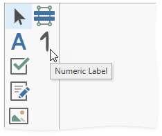
Add an .svg icon named NumericLabel.svg to the project and set the icon’s Build Action property to Embedded Resource.
Apply the ToolboxSvgImage attribute for the created custom control:
using DevExpress.Utils.Design;
//..

[ToolboxSvgImage("WpfApp_CustomNumericLabel.NumericLabel.svg, WpfApp_CustomNumericLabel")]
public class NumericLabel : XRLabel { ... }
Rebuild and run the project. The control with the specified icon appears in the toolbox.
Note
We recommend you use .svg icons for custom controls. If you need to specify non-svg icons, use the RegisterControl<T>(ImageSource) method.