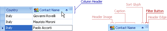
Filter Button
Filter buttons are displayed within column headers and can be clicked to activate filter dropdown lists. Such lists enable end-users to specify data filtering conditions.
The table below lists the main properties affecting element appearance.
Style | The GridOptionsView.HeaderFilterButtonShowMode property allows you to choose whether the filter buttons will be displayed as smart tags or in the traditional way - as regular buttons. |
Appearance | GridViewAppearances.ColumnFilterButton, GridViewAppearances.ColumnFilterButtonActive Note: These settings are not in effect in the following cases:
|
Custom Draw Event | |
Icon and Icon Settings | Since all DevExpress controls use images and settings from the currently applied skin, to modify the button icon you need to create a custom Skin. You can do this in the WinForms Skin Editor. The name of a skin element responsible for the Filter Button is “Smart Filter” (the “Grid - Column Headers - Filtering” category). |
Availability | A View’s GridOptionsCustomization.AllowFilter option and a column’s OptionsColumnFilter.AllowFilter option. |