Layout Items
- 2 minutes to read
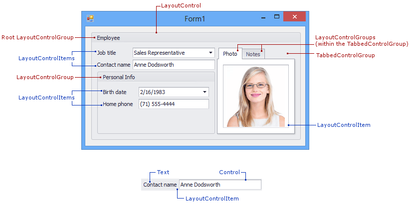
Any control can be displayed within the Layout Control with the help of layout items. A layout item is a component that can display an external control and some caption.
Important
Do not modify the following settings for a control that resides within a layout item. All these control settings are managed by the parent layout item itself, and changing their values manually may break the layout.
- Size
- AutoSize
- Dock
- Location
- Anchor
The following image shows four layout items displayed within the ‘Personal Info’ layout group. The three layout items on the left have captions, while the layout item on the right does not:

A layout item is represented by the LayoutControlItem component. Its LayoutControlItem.Control property specifies the control that is displayed by this layout item.
To add a control to the Layout Control drag it to the layout control’s area. This will create a new layout item with the specified control.
Layout items can only be displayed within layout groups. By default, the Layout Control contains a single group - root - that accommodates all layout items and nested groups if any. You can combine layout items into groups and tabbed groups using the Context Menu, hide the items to the Customization Form, rearrange them using drag-and-drop operations, and resize them on the form, etc.
Concepts
Task-Based Help
- How to: Create a layout in Regular mode in code
- How to: Create layout groups and items in code
- How to: Create a tabbed group in code
- How to: Create custom ‘fixed’ item
- How to: Specify which properties to display in the Property Grid when selecting layout items