Tab Control
- 3 minutes to read
An XtraTabControl is a container for tab pages that can display other controls, and allows them to be organized in multiple pages. It’s shown in the image below.
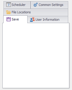
The pages are stored in the tab control’s XtraTabControl.TabPages collection. Each page has a tab header like a divider in a notebook. An end-user can click the tab header to switch between the pages. The currently active tab page is specified by the XtraTabControl.SelectedTabPage property.
The page headers can display images. The source of the images is specified by the XtraTabControl.Images property. The image’s horizontal alignment within the header is specified by the XtraTabControl.PageImagePosition property.
The tab control supports both horizontal and vertical page headers. The orientation and position of the page headers is specified by the XtraTabControl.HeaderOrientation and XtraTabControl.HeaderLocation properties, respectively.
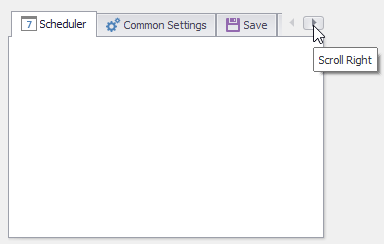
The tab control allows more than one row of page headers to be displayed if they don’t fit the available space. This is controlled by the XtraTabControl.MultiLine property. If this property is set to ‘False’, only one row of tabs is displayed - even if all the page headers don’t fit in the available space. In this case, navigation buttons are displayed which allow end-users to scroll through the tab pages.
The header panel can display the Close, Next and Prev buttons. The Next and Prev buttons enable end-users to scroll through the tab pages when the tab control’s width (height) is insufficient to display all the tab pages simultaneously. To specify which buttons can be displayed, use the XtraTabControl.HeaderButtons property. To specify when the tab buttons must be displayed, use the XtraTabControl.HeaderButtonsShowMode property.
By default, the paint scheme of a Tab Control control and other DevExpress controls is controlled by the static DefaultLookAndFeel object. You can use the DefaultLookAndFeel component to access the DefaultLookAndFeel object, and customize the default look and feel settings.
If you want to customize look and feel settings of a specific Tab Control, and stop the control from using the default look and feel settings, you can set the UserLookAndFeel.UseDefaultLookAndFeel property of the XtraTabControl.LookAndFeel object to false. Then, use the XtraTabControl.LookAndFeel property to customize the look and feel settings.
In addition to the standard painting schemes that are available using the XtraTabControl.LookAndFeel property, the Tab Control also provides some additional painting schemes. These are available using the XtraTabControl.PaintStyleName property.
To customize the control’s appearance settings (background and foreground colors, font settings, etc.), use the XtraTabControl.Appearance and XtraTabControl.AppearancePage properties. Note that specific appearance settings (for instance, the background colors used to paint page headers and client area) are ignored in Skin and WindowsXP painting schemes. To select a painting scheme, use the XtraTabControl.PaintStyleName property, or customize look and feel settings using the DefaultLookAndFeel object or the XtraTabControl.LookAndFeel property.
For information on appearances, refer to Application Appearance and Skin Colors