Ribbon Control
- 3 minutes to read
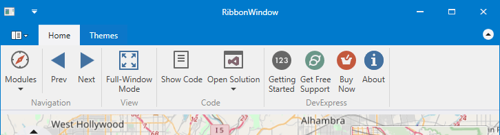
The RibbonControl is the main part of the Ribbon UI, designed to replace traditional toolbars and menus with tabbed pages. Each page contains various elements (buttons, sub-menus, in-place editors, galleries, etc.), combined into one or multiple groups.
Ribbon Window
Typically, you place a Ribbon Control at the top of a window. Instead of the regular Window class, we suggest that you use the ThemedWindow, which supports integration with the Ribbon Control.
Ribbon Control Elements
Visually, Ribbon Control consists of the following regions.
- Command Region - Displays various bar items (buttons, sub-menus, in-place editors, galleries, etc.) combined into groups and pages.
- Quick Access Toolbar - Displays frequently used commands. End-users can add commands to this bar at runtime using a context menu.
- Application Button - Used to provide a menu for the application.
In addition, you can create a Ribbon Status Bar at the bottom of the window. This bar is painted to concur with the RibbonControl’s look and feel. You can add commands to this status bar, aligning them to the bar’s left and right edges.
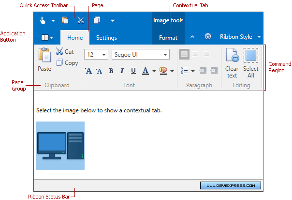
Structurally, a RibbonControl consists of page categories, which are containers of ribbon pages. There are two types of page categories:
- Default Page Category - It is designed to display default pages, which are typically always visible during application runtime. Unlike a custom category, the default category does not support a caption. The default page is never visible, only its contents are displayed. In the image above, the Home and Settings pages belong to the default page category.
- Custom Page Category - This category is designed to implement contextual ribbon pages, which can be temporarily made visible according to some logic. Captions are displayed for custom page categories. In addition, custom page categories and category pages’ headers are painted in a different manner than the default page headers. See Ribbon Page Categories and Contextual Pages to learn more.
A page category contains pages as children, which are represented as tabs. An end-user can click a tab to access the commands displayed in it.
Ribbon pages consist of page groups. These visually divide all bar items into logical groups within each tab.
For details on each individual ribbon element, see the corresponding topics.
- Populating Ribbon
- Ribbon Page Group
- Ribbon Page
- Ribbon Page Categories and Contextual Pages
- Ribbon Quick Access Toolbar
Ribbon Layout
The Ribbon Control provides a smart layout that maximally uses available space to display as much information (items, captions, etc.) as possible. For instance, if a page has been stretched and has no place to display all available items, it automatically becomes a drop button, which can display sub-items within a drop down panel.
Ribbon Style
The Ribbon Control supports different paint styles (e.g., Microsoft Office 2007 and Microsoft Office 2010). You can choose a paint style using the RibbonControl.RibbonStyle property.
Examples
- How to create a RibbonControl
- How to define a default ribbon category with commands
- How to define a custom ribbon category
- How to define a RibbonStatusBar
- How to create an Application Menu
- How to create a BarButtonGroup
- How to add items to the Quick Access Toolbar
- How to add commands to the Page Header Region
- How to define an in-ribbon gallery