How to: Create a Bars UI Containing a Sub-menu and Embedded Editor Using the BarManager Component
- 8 minutes to read
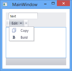
This topic shows how to create a Toolbar UI with sample bar items from scratch. Bars will contain a submenu and a text editor. The submenu will contain a regular button and a check button:
In this tutorial, you will not use the Instant Layout Assistant, which allows you to create a complete Toolbar UI with a few clicks. The Instant Layout Assistant is available starting with Visual Studio 2012.
Walkthrough
Create a new project
Create a new WPF Application, and specify “CreateSimpleBarLayout” as the project name. Open the Window1.xaml file in the Designer.
Add a BarManager
Drop the BarManager component from the Toolbox to the window. The BarManager is a container for bar containers and custom controls. This is the component you work with to add bars to your application.
In XAML, remove setters for the BarManager.Width and BarManager.Height properties, if any. Then set the BarManager.Margin property to 12. This will make the BarManager occupy the entire area of the window with an empty space around it.
Your XAML may look like the following markup. (If not, you can overwrite your code with the code below.)
<Window
        xmlns="http://schemas.microsoft.com/winfx/2006/xaml/presentation"
        xmlns:x="http://schemas.microsoft.com/winfx/2006/xaml"
        xmlns:dxb="http://schemas.devexpress.com/winfx/2008/xaml/bars"
        x:Class="CreateSimpleBarLayout.MainWindow"
        Title="MainWindow" Height="350" Width="525">
    <Grid>

        <dxb:BarManager Margin="12">
            <dxb:BarManager.Bars>
                <dxb:Bar x:Name="mainMenuBar" Caption="Main Menu" IsMainMenu="True">
                    <dxb:Bar.DockInfo>
                        <dxb:BarDockInfo ContainerType="Top"/>
                    </dxb:Bar.DockInfo>
                </dxb:Bar>
                <dxb:Bar Caption="bar1">
                    <dxb:Bar.DockInfo>
                        <dxb:BarDockInfo ContainerType="Top"/>
                    </dxb:Bar.DockInfo>
                </dxb:Bar>
                <dxb:Bar x:Name="statusBar" Caption="Status Bar" IsStatusBar="True">
                    <dxb:Bar.DockInfo>
                        <dxb:BarDockInfo ContainerType="Bottom"/>
                    </dxb:Bar.DockInfo>
                </dxb:Bar>
            </dxb:BarManager.Bars>
            <Grid Background="Transparent"/>
        </dxb:BarManager>

    </Grid>
</Window>
You can see that the BarManager contains three empty bars (mainMenuBar, bar1 and statusBar), which were automatically created when the BarManager was dropped onto the window.
Specify the controls displayed in the client area of the BarManager
Add a standard DockPanel object to the BarManager, to occupy its client area. You can add custom controls to the DockPanel. In the following example, a RichTextBox control is added.
<dxb:BarManager Margin="12">
    <dxb:BarManager.Bars>
    . . .
    </dxb:BarManager.Bars>
    <DockPanel >
        <RichTextBox >
            <FlowDocument>
                <Paragraph>
                    <Run Text="RichTextBox"/>
                </Paragraph>
            </FlowDocument>
        </RichTextBox>
    </DockPanel>
</dxb:BarManager>
Add a sub menu item to the bar
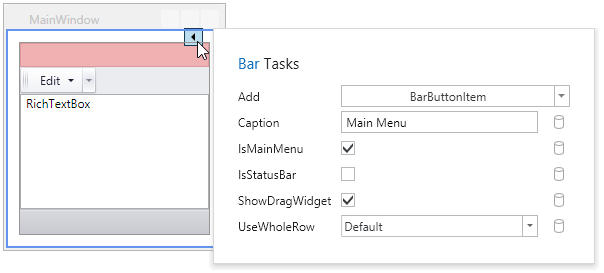
In the designer, select bar1 to access its smart tag. Click the smart tag to open the Bar Tasks pane.
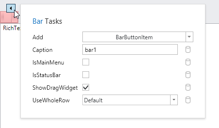
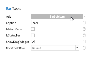
Click the dropdown button in the Add combo box, and select BarSubItem.
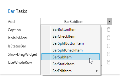
Next, click the BarSubItem button to add a new submenu to the selected bar (bar1):
This action creates a BarSubItem object within the BarManager.Items collection, and adds a link to this item to the bar.
<dxb:BarManager.Items>
    <dxb:BarSubItem x:Name="barSubItem1" Content="barSubItem1"/>
</dxb:BarManager.Items>
. . .
<dxb:Bar Caption="bar1">
    <dxb:Bar.DockInfo><dxb:BarDockInfo ContainerType="Top"/></dxb:Bar.DockInfo>
    <dxb:BarSubItemLink BarItemName="barSubItem1"/>
</dxb:Bar>
Customize the newly created sub menu
Select the barSubItem1 object in the designer and click its smart tag.
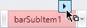
In the invoked Tasks pane, set the item caption to the “Edit” string from the Content property.
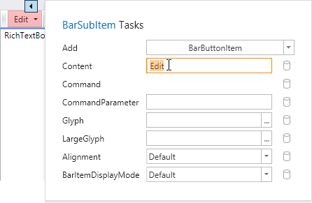
Items can be added to the submenu via the Add command at the top of the Tasks pane. In this example, two items will be added.
First, a regular button is added. Ensure that the BarButtonItem is selected in the Add combo box, and then click this button.
To add a check button, click the dropdown arrow in the Add combo box…
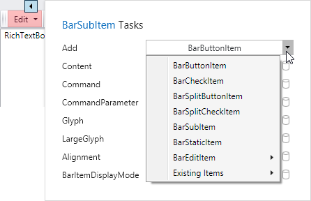
…and select the BarCheckItem option in the dropdown list. Then click the BarCheckItem button.

These two actions add BarButtonItem and BarCheckItem objects to the BarManager.Items collection, and add links to these buttons in the BarSubItem.
<dxb:BarManager.Items>
    <dxb:BarSubItem x:Name="barSubItem1" Content="Edit">
        <dxb:BarButtonItemLink BarItemName="barButtonItem1"/>
        <dxb:BarCheckItemLink BarItemName="barCheckItem1"/>
    </dxb:BarSubItem>
    <dxb:BarButtonItem x:Name="barButtonItem1" Content="barButtonItem1"/>
    <dxb:BarCheckItem x:Name="barCheckItem1" Content="barCheckItem1"/>
</dxb:BarManager.Items>
Customize the submenu items
Although items added to the submenu are hidden at design time, customization smart tags are displayed for them in the designer when you select these objects in XAML. The smart tags are displayed at the top-right corner of the BarManager control.
To display a smart tag for the hidden barButtonItem1, position the caret inside the following statement in XAML:
<dxb:BarButtonItem x:Name="barButtonItem1" Content="barButtonItem1"/>Now click the smart tag that will be displayed to open the Tasks pane.
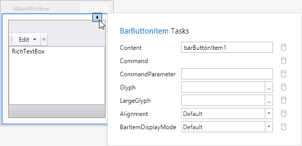
Change the item’s Content to “Copy”. To assign an image to the item, click the ellipsis button (“…“) for the Glyph property. This opens a DX Image Gallery, allowing you to select one of the predefined images.
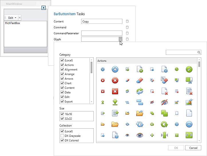
Use the search box at the top of the gallery to filter images by the “copy” text. Select the small “Copy” image and click OK.
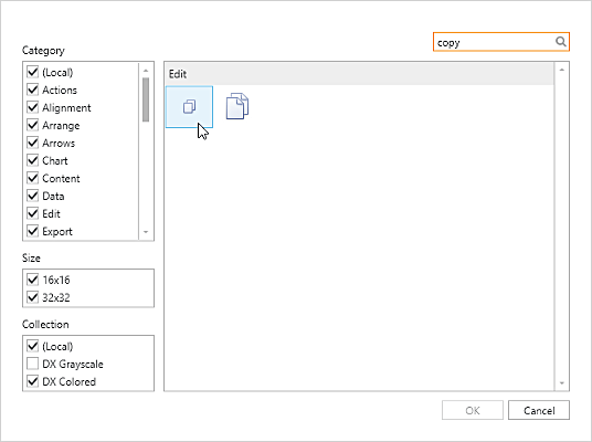
As a result, the DevExpress.Images assembly is added to the project, and the selected image is assigned to the button item.
In the same way, customize the hidden barCheckItem1 object. Position the caret within the XAML definition statement for the barCheckItem1 object. In the pane invoked by the smart tag, set the item’s Content to “Bold”. Click the ellipsis button (“…“) for the Glyph property to invoke the DX Image Gallery, and locate and choose a small “Bold” image.
Note
Remarks: In the previous step a user picks a small “Copy” image. Now, it’s needed to pick a small image named “Bold”.
The code that defines the barButtonItem1 and barCheckItem1 objects will appear as follows.
<dxb:BarButtonItem x:Name="barButtonItem1" Content="Copy" Glyph="pack://application:,,,/DevExpress.Images.v19.2;component/Images/Edit/Copy_16x16.png"/>
<dxb:BarCheckItem x:Name="barCheckItem1" Content="Bold" Glyph="pack://application:,,,/DevExpress.Images.v19.2;component/Images/Format/Bold_16x16.png"/>
Add a bar item representing an inplace TextEdit editor
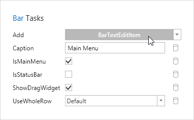
Select the top bar (mainMenuBar) in the designer and click the smart tag.
Click the dropdown arrow in the Add combo box, to open a list of available item types, and select the BarEditItem -> BarTextEditItem option. Now click the BarTextEditItem button, to add an inplace text editor to the bar.
A BarEditItem object displaying an embedded editor is added to the BarManager.Items collection in XAML.
<dxb:BarEditItem x:Name="barEditItem1" Content="barEditItem1">
    <dxb:BarEditItem.EditSettings>
        <dxe:TextEditSettings/>
    </dxb:BarEditItem.EditSettings>
</dxb:BarEditItem>
A link to the newly created item is also added to the mainMenuBar.
<dxb:Bar x:Name="mainMenuBar" Caption="Main Menu" IsMainMenu="True">
    . . .
    <dxb:BarEditItemLink BarItemName="barEditItem1"/>
</dxb:Bar>
The TextEditSettings object assigned to the BarEditItem.EditSettings property specifies the type of the inplace editor, and allows you to customize the editor’s settings.
To hide the caption for the barEditItem1 object, remove the setter of the Content property. To specify the embedded editor’s width and value, use the BarEditItem.EditWidth and BarEditItem.EditValue properties, respectively.
<dxb:BarEditItem x:Name="barEditItem1" EditWidth="100" EditValue="text">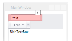
Subscribing to bar item events
To handle bar item clicks and changes in values, the following events need to be subscribed.
- the BarItem.ItemClick event for barButtonItem1 (the Copy button). You can use the BarManager.ItemClick event as well.
- the BarCheckItem.CheckedChanged event for barCheckItem1 (the Bold check item).
- the BarEditItem.EditValueChanged event for barEditItem1, which displays a text editor.
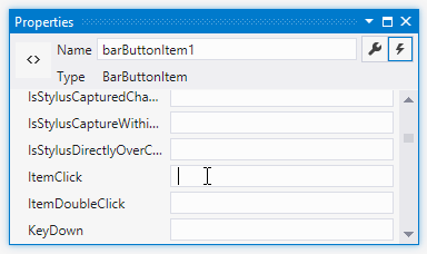
To subscribe to the ItemClick event for barButtonItem1, position the caret inside the object’s XAML definition. The properties of the object are now accessible via the Properties window. Click the Events tab in the Properties window, and subscribe to the ItemClick event by double-clicking within the corresponding edit box.
In the same manner, subscribe to the events of barCheckItem1 and barEditItem1. Switch to the Window1.xaml.cs file and implement the event handlers according to your logic.
Run the application and view the result
Complete Code
In this example, bars containing a sub-menu and embedded text editor are created.
Note
A complete sample project is available at https://github.com/DevExpress-Examples/how-to-create-a-bar-containing-a-menu-and-embedded-text-editor-e1696.
Imports Microsoft.VisualBasic
Imports System
Imports System.Collections.Generic
Imports System.Linq
Imports System.Text
Imports System.Windows
Imports System.Windows.Controls
Imports System.Windows.Data
Imports System.Windows.Documents
Imports System.Windows.Input
Imports System.Windows.Media
Imports System.Windows.Media.Imaging
Imports System.Windows.Navigation
Imports System.Windows.Shapes
Imports DevExpress.Xpf.Bars

Namespace CreateSimpleBarLayout
    ''' <summary>
    ''' Interaction logic for MainWindow.xaml
    ''' </summary>
    Partial Public Class MainWindow
        Inherits Window
        Public Sub New()
            InitializeComponent()
        End Sub

        Private Sub barButtonItem1_ItemClick(ByVal sender As Object, ByVal e As DevExpress.Xpf.Bars.ItemClickEventArgs)
            MessageBox.Show("The " & e.Item.Content.ToString() & " item has been clicked")
        End Sub

        Private Sub barCheckItem1_CheckedChanged(ByVal sender As Object, ByVal e As DevExpress.Xpf.Bars.ItemClickEventArgs)
            MessageBox.Show("The " & e.Item.Content.ToString() & " item has been toggled")
        End Sub

        Private Sub barEditItem1_EditValueChanged(ByVal sender As Object, ByVal e As RoutedEventArgs)
            Dim item As BarEditItem = TryCast(sender, BarEditItem)
            Dim newValue As Object = item.EditValue
            '...
        End Sub
    End Class
End Namespace