Bar Actions
- 5 minutes to read
The bar actions allow you to change existing ribbons, toolbars, and menus in the DevExpress (like Spreadsheet, RichEdit, and others) controls and your custom UserControls.
The bar actions allow you to make the following changes:
- add new elements
- replace the existing elements
- remove default elements
- update properties for the existing elements.
Element Actions
Bar actions implement the IControllerAction interface. All actions have the Execute method that implements the action’s functionality. When a list of actions is executed, the Execute method is called for every action, in the order defined by the list.
The following classes implement the IControllerAction interface and you can use them as actions:
- Bar
- RibbonPageCategoryBase
- RibbonPage
- RibbonPageGroup
- all the descendants of the BarItem and BarItemLink classes.
The table below lists the available scenarios for the elements mentioned above.
Action | Description |
|---|---|
Adds/inserts a Bar to any of the following collections: | |
BarItem class descendants
BarItemLinkBase class descendants | Adds/inserts an element to any of the following collections: |
Adds/inserts an element to the RibbonControl.Categories collection. | |
Adds/inserts an element to the RibbonPageCategoryBase.Pages collection. | |
Adds/inserts an element to the RibbonPage.Groups collection. |
You can configure the bar actions with the following attached properties:
Property | Description |
|---|---|
CollectionAction.ContainerName | Use this property to specify the name of the container to which you want to add an element. For example, to add an additional RibbonPageCategory to the diagram’s ribbon, set this property to the DefaultBarItemNames.Ribbon as follows: |
CollectionAction.Container | Specifies the container to which a collection action adds an element. Use this property if you have access to the container instance. |
CollectionAction.Index | Use this property to specify the zero-based index at which an element should be inserted. |
CollectionAction.CollectionTag | A container can have multiple collections of the required type. Use this property to specify a collection to which the bar action is applied. Use this property when you add a BarItem or BarItemLink object to the RibbonControl or RibbonStatusBarControl. For example, to add a BarButtonItem to the RibbonControl.PageHeaderItems collection, set the CollectionAction.CollectionTag property to the PageHeaderItems value: You can find the full list of the supported collection tags in the RibbonCollections enumeration. |
Collection Actions
The bar actions include the CollectionAction to modify collections of Ribbon, Toolbars, and Menus.
You can use collection actions to insert, remove or replace an item in the collection.
The table above lists the attached CollectionAction properties. The table below describes the CollectionAction properties used to modify collections:
Property | Description |
|---|---|
Kind | Specifies the kind of the action. You can choose one of the following values:
You can use the CollectionAction class descendants to make your markup more clear: |
ElementName | Specifies the name of an element which you want to add to a container. |
Element | Use this property to specify the element to which you want to add a container. The InsertAction and ReplaceAction use the Element property as their content property: |
Update Action
You can use the UpdateAction to modify CLR or dependency property values of Ribbon, Toolbars, and Menus.
For example, use this action to change item headers or bind their properties to your ViewModel.
The following table lists the UpdateAction‘s properties:
Property | Description |
|---|---|
ElementName | Specifies a name of an element which property the UpdateAction changes. |
Element | Specifies an element which property the UpdateAction changes. Use this property if you have access to an element instance. |
Property | Specifies a dependency property the UpdateAction changes: |
PropertyName | Specifies the name of the CLR or dependency property the action changes. The UpdateAction uses the Reflection API to set value for the property specified in this way. |
Value | Sets a value the action applies to the updated property. |
ValueBinding | Sets a data binding the action applies to the updated dependency property specified by the UpdateAction.Property property. The binding uses the inheritance context of an element that is specified by this UpdateAction. |
Execute Actions
Execute Bar Actions With Built-In Properties
The controls that contain built-in ribbon, toolbars, and menus provide properties useful to define bar actions, such as:
In most cases, you can use the built-in control *Customizations property to customize the toolbars, ribbon, and menu.
Tip
Refer to the following GitHub example for information on how to customize built-in menus: How to access and remove rows by using a custom cell’s context menu.
Execute Bar Actions With ControllerBehavior
Use the ControllerBehavior to execute bar actions in custom conditions:
Property | Description |
|---|---|
ExecutionMode, NewActionExecutionMode | Specifies how to execute the bar actions: manually, on event, or on associated object changing. |
Triggers | Use this property to specify when to trigger the behavior. |
Actions | A collection of actions executed by the behavior. |
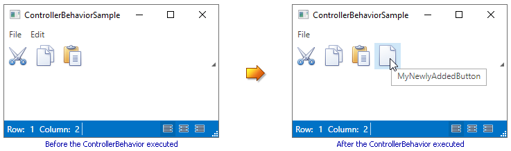
The code sample below demonstrates how to perform the following actions when the Loaded event occurs:
- Insert the MyNewlyAddedButton button into the File menu item.
- Remove the Edit menu item.
- Add the MyNewlyAddedButton button to the toolbar.
<Window x:Class="ControllerBehaviorSample.MainWindow"
        xmlns="http://schemas.microsoft.com/winfx/2006/xaml/presentation"
        xmlns:x="http://schemas.microsoft.com/winfx/2006/xaml"
        xmlns:dxb="http://schemas.devexpress.com/winfx/2008/xaml/bars"
        xmlns:dxmvvm="http://schemas.devexpress.com/winfx/2008/xaml/mvvm"
        xmlns:local="clr-namespace:ControllerBehaviorSample"
        xmlns:dx="http://schemas.devexpress.com/winfx/2008/xaml/core"
        Title="ControllerBehaviorSample" Height="350" Width="525">
    <Grid>
        <local:CustomUserControl>
            <dxmvvm:Interaction.Behaviors>
                <dxb:ControllerBehavior ExecutionMode="OnEvent">
                    <dxb:ControllerBehavior.Triggers>
                        <dxb:ActionTrigger EventName="Loaded" ExecuteOnce="True"/>
                    </dxb:ControllerBehavior.Triggers>
                    <dxb:ControllerBehavior.Actions>
                        <dxb:InsertAction ContainerName="biFile">
                            <dxb:BarButtonItem
                                Content="MyNewlyAddedButton"
                                Glyph="{dx:DXImage Image=Cut_16x16.png}"
                                LargeGlyph="{dx:DXImage Image=Cut_32x32.png}"/>
                        </dxb:InsertAction>
                        <dxb:RemoveAction ElementName="biEdit"/>
                        <dxb:InsertAction ContainerName="ToolBar">
                            <dxb:BarButtonItem
                                Content="MyNewlyAddedButton"
                                Glyph="{dx:DXImage Image=New_16x16.png}"
                                LargeGlyph="{dx:DXImage Image=New_32x32.png}"/>
                        </dxb:InsertAction>
                    </dxb:ControllerBehavior.Actions>
                </dxb:ControllerBehavior>
            </dxmvvm:Interaction.Behaviors>
        </local:CustomUserControl>
    </Grid>
</Window>
The image below illustrates the result.
Tip
A complete sample project is available at https://github.com/DevExpress-Examples/how-to-define-bars-and-bar-items-via-a-template-e1731.