A newer version of this page is available. .

Wizard Control

  • 2 minutes to read

Overview

Wizard - Overview Image

The WPF Wizard Control is a handy tool for building dialogs with multiple pages that guide your end-users through a specific process (e.g., product installation). The list below outlines the main Wizard Control features:

  • three types of pages, each with its own mark-up and set of features;
  • embedded wizard buttons;
  • various page templates;
  • rich navigation capabilities;
  • suits for creating both simple wizards where pages change one by one in a strict order, and wizards with a non-linear page sequence where one page can lead to various other pages depending on the specific criteria.

Concepts

  • Pages

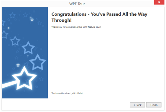
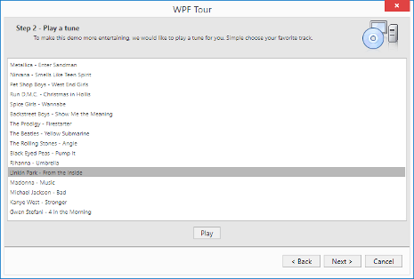
    The Wizard control provides pages of three types - start page, regular page and finish (completion) page. Pages of different types have their own specific mark-ups and are designed to display different types of content. This article outlines unique features specific for pages of this or that individual type, as well as describes common concepts shared by pages of all types.

  • Buttons

    Wizard pages can display four buttons - Back, Next, Finish and Cancel. In this article, you will learn how to display the required buttons for each individual page.

  • Navigation

    This article demonstrates how the Wizard navigates from one page to another in a simplest scenario, when one page follows another in a strict order.

Wizard - Concepts Page Image