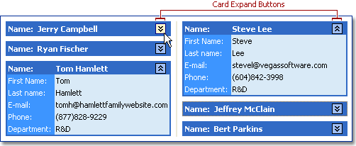
Card Expand Button
Card scroll buttons allow end-users to expand/collapse individual cards. When a card is collapsed it displays only its caption rows.
| Feature | Related Members |
|---|---|
| Availability | Card expand buttons are available if the View’s OptionsCustomize.CardExpanding property value is True and there is at least one caption row defined. |
| Appearance | The expand buttons’ appearance depends on the grid control’s LookAndFeel settings. |
| Layout | Expand buttons are displayed within the top caption row in a card. Their horizontal alignment within caption rows is specified by the View’s OptionsView.CardExpandButtonAlignment property. |