Data Representation Capabilities
- 6 minutes to read
In addition to the presentation of data in various forms (Table, Banded Table, Card, Layout, or Chart View), the ExpressQuantumGrid provides other features to help display records in a more convenient form. These features include sorting, grouping, filtering, summary calculation, previewing a specific column and incremental search support. A user can perform most of these operations at runtime, provided that the options are set accordingly.
One of the new features introduced by the ExpressQuantumGrid is the capability of displaying multiple Views within one grid control.
Multiple Views
Using our grid control, you can represent data from multiple data storages. This is implemented by Views connected to data storages (custom data sources and/or datasets) and they display data in various forms (tabular, card etc.). You can establish master-detail relationships between Views. Every master View can have one or more detail Views (details) linked by a specific key field(s). The grid control provides a convenient way of switching between detail Views via tabs.
In addition, you can display multiple non-related datasets at the top level and access them via tabs.
To learn more about multiple Views see the Data Representation section.
Sorting
Our grid control allows you to sort data in a grid View by multiple items (columns in a Table View and rows in a Card View). A user can switch between different sort modes by clicking the column caption (implemented only in a Table View). The first click on a column header sorts data in ascending order and the second by descending order, etc. To clear sorting by a column, click the column caption holding the Ctrl key down.
You can also sort data by multiple columns. To do this, click on column headers while pressing the Shift key.
A small arrow displayed within a column header indicates the current sort order. The up-arrow indicates the ascending sort order, the down-arrow – the descending sort order.
To sort by code, see the SortOrder attribute of an item. Probably, you will need to clear the current data details first. For this, use the View’s DataController.ClearSorting method.
Filtering
The ExpressQuantumGrid allows you to filter the data displayed by creating filter conditions. When filtering is applied, only the records matching all filter conditions set in the View are displayed.
Runtime filtering for a Table View is very easy. By default, every column has a down-arrow button at the left edge of its caption. Clicking this button displays a dropdown list containing unique values from the current column.

When a user selects a value from this list, a new EQUAL filter condition of type “Column = Value” is added to the existing filter criteria.
Selecting All from the list clears the filter condition for that column. The Custom item displays a filter dialog, enabling a user to define filter conditions with other operators (=, <>, <, <=, >, >=, LIKE and NOT LIKE). For more information on the filter dialog, refer to the Runtime Filtering section.
To set filter criteria programmatically, use the View’s DataController.Filter property.
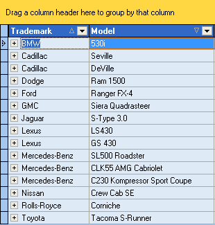
Grouping
When data in a grid View is grouped, records with the same value in the grouping column make up a group and the grid View’s content is displayed in a tree-like manner. Grouping is not supported in Card Views.
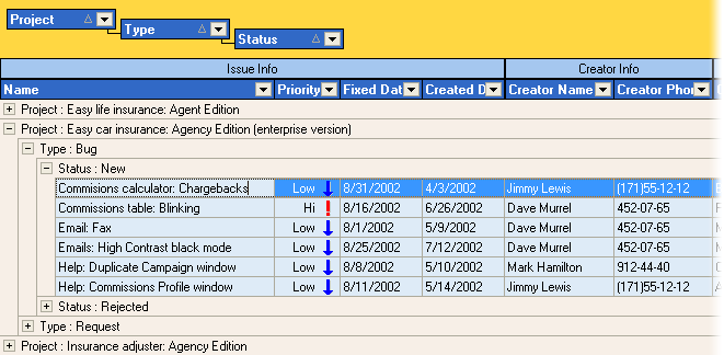
The grid control displays the Group By box (also called a group panel) by default, thus enabling a user to group data. He/she can easily group data by dragging a column caption to this panel and then ungroup data by dragging it back to the column header panel. When a user drags a column caption, two green arrows indicate the position where the column will be placed. The column dragged to the group panel is hidden within a View. Its header is now within the group panel and its values are displayed within group rows.
Grouping can be performed against multiple columns. A user can move column captions within the group panel to change the group order.
Column and View options allow you to prevent a user from grouping and moving columns (within the groups and standard columns). These options do not affect grouping performed programmatically.
At design and runtime, grouping can be performed by setting the column’s GroupIndex property. Actually, the access methods of this property call the TcxDataControllerGroups class’s methods, as grouping operations are performed by the data controller.
Summaries
Summaries allow you to calculate totals by specific columns against a group of records or all records in a View. There are two types of summaries provided by the grid control: footer summaries and group summaries.
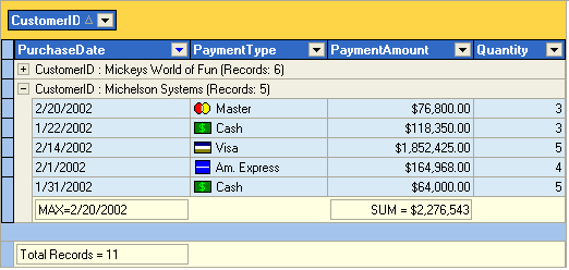
Footer summaries are calculated against all the records in the View and the resulting values are displayed within the footer panel at the bottom of the View. Group summaries are calculated for records of each View group. Their results can be displayed either within the group rows or within group footer panels.
To learn more about summaries see the Summaries and Creating Summaries topics.
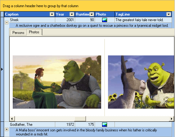
Preview
The ExpressQuantumGrid provides a convenient way to display large text fields within the preview section. The preview section is implemented only in tabular Views.
The preview section is a region that may occupy several columns and several lines to display the contents of a single column. You cannot edit the contents of the preview section. The following image demonstrates the preview section displayed at the bottom of a row. You can also make the preview to appear at its top.

To set options for the preview section, use the View’s Preview property. To display the preview you should:
assign a column for previewing via the Preview.Column property. When it is assigned, its original column is no longer displayed.
enable the preview section by setting Preview.Visible to True.
It is also possible to specify the preview column via the column’s IsPreview attribute.
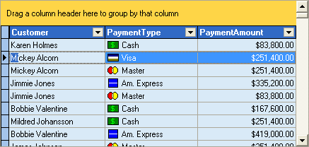
Incremental Search
The Incremental Search feature allows a user to locate records in a View by column values.
If Incremental Search is enabled (the View’s OptionsBehavior.IncSearch attribute is True), you can type in a column to jump to the first record with a column value starting with the typed letters.
| The ‘mi’ characters are pressed. As a result, the first ‘Mickey Alcorn’ record is located. | An ‘l’ character is pressed after ‘mi’ and focus has moved to the ‘Mildred Johanson’ record. |
|---|---|
 |
 |
Press the Ctrl+UpArrow or Ctrl+DownArrow key combination to continue searching in the appropriate direction.
Note that the column must not be in edit mode before applying the incremental search.