How to: Format Chart Elements
- 7 minutes to read
This example demonstrates how to enhance the appearance of an existing chart. For an example on how to create a basic chart in code, refer to the How to: Create and Modify a Chart article.
Select the action you wish to perform.
Apply the Built-in Chart Style
Chart styles allow you to quickly change chart appearance. The chart style changes the chart’s background fill, specifies the color of the data series, and applies different shape effects and outlines to the chart. To apply one of the predefined styles to the chart, utilize the ChartObject.Style property.
The example below demonstrates how to create a chart and apply one of the predefined styles to it using the ChartObject.Style property.
Worksheet worksheet = workbook.Worksheets["chartTask3"];
workbook.Worksheets.ActiveWorksheet = worksheet;

// Create a chart and specify its location.
Chart chart = worksheet.Charts.Add(ChartType.ColumnClustered, worksheet["B2:D4"]);
chart.TopLeftCell = worksheet.Cells["H2"];
chart.BottomRightCell = worksheet.Cells["N14"];

// Set the chart style.
chart.Style = ChartStyle.Accent1Dark;
Format an Individual Chart Element
The chart style allows you to apply a predefined set of format options. However, you can fine-tune these settings and specify custom formatting for individual chart elements by giving them a different color or outline. A full set of format characteristics available for a chart is provided by the ShapeFormatBase object. All objects that represent chart elements (Chart, PlotArea, Series, Axis, DataLabel, Legend, ChartTitle, etc.) inherit the ShapeFormatBase interface, so you can use its formatting properties to set a color and border of the required chart element.
Fill a Chart Element
To fill a chart element, use the ShapeFormatBase.Fill property. This property returns the ShapeFill object that contains the shape fill characteristics. You can fill a chart element with a solid color by using the ShapeOutlineFill.SetSolidFill method, make an element transparent by utilizing the ShapeOutlineFill.SetNoFill method, apply the gradient effect by calling the ShapeOutlineFill.SetGradientFill method, or specify a pattern or picture fill by using the ShapeFill.SetPatternFill or ShapeFill.SetPictureFill method.
Specify the Outline of a Chart Element
To set a border of a chart element, use the ShapeFormatBase.Outline property. This property provides access to the ShapeOutline object that contains options used to draw the border or line on a chart. Use the ShapeOutlineFill.SetSolidFill method to specify border or line color. To remove the outline, call the ShapeOutlineFill.SetNoFill method. You can also specify the line width (ShapeOutline.Width), adjust the appearance of the line end (ShapeOutline.CapType), set a dash style for a chart line (ShapeOutline.Dashing), specify a join type (ShapeOutline.JoinType) and compound style (ShapeOutline.CompoundType) for the chart elements.
Format Text of a Chart Element
To change font attributes for all chart elements at once, use the ChartObject.Font property. To format text contained in a specific chart element, use the element’s ShapeTextFormat.Font property. These properties obtain the ShapeTextFont object that contains a set of properties you can use to change font characteristics for the chart and axis titles, tick-mark labels, and data labels. To change the font attributes for legend entries, use the Legend.Font property.
[>[!note]
> The SpreadsheetControl does not display an individual font for each legend entry specified by the LegendEntry.Font property. The font specified by the Legend.Font property is applied to all entries. However, the LegendEntry.Font property can be retrieved in code, exported in supported formats, and visualized in Microsoft Excel.
If the Legend.Font property is not specified, but one or multiple of the legend entry has the Font property specified, the font is retrieved from the first entry in the collection.
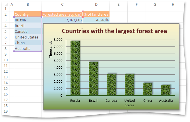
The example below demonstrates how to create a clustered column chart and adjust its appearance. First, add the chart title and change the font color via the ShapeTextFont.Color property. Make the plot area transparent by using the ShapeOutlineFill.SetNoFill method, and then apply the gradient fill to the chart area by utilizing the ShapeOutlineFill.SetGradientFill method. To set the picture fill for all columns in a chart, call the ShapeFill.SetPictureFill method for a series object. Finally, change the color of the primary axes by utilizing the ShapeOutlineFill.SetSolidFill method and specify the axis width via the ShapeOutline.Width property.
Worksheet worksheet = workbook.Worksheets["chartTask7"];
workbook.Worksheets.ActiveWorksheet = worksheet;

// Create a chart and specify its location.
Chart chart = worksheet.Charts.Add(ChartType.ColumnClustered, worksheet["B2:C8"]);
chart.TopLeftCell = worksheet.Cells["F2"];
chart.BottomRightCell = worksheet.Cells["N17"];

// Add and format the chart title.
chart.Title.SetValue("Countries with the largest forest area");
chart.Title.Font.Color = Color.FromArgb(0x34, 0x5E, 0x25);

// Set no fill for the plot area.
chart.PlotArea.Fill.SetNoFill();

// Apply the gradient fill to the chart area.
chart.Fill.SetGradientFill(ShapeGradientType.Linear, Color.FromArgb(0xFD, 0xEA, 0xDA), Color.FromArgb(0x77, 0x93, 0x3C));
ShapeGradientFill gradientFill = chart.Fill.GradientFill;
gradientFill.Stops.Add(0.78f, Color.FromArgb(0xB7, 0xDE, 0xE8));
gradientFill.Angle = 90;

// Set the picture fill for the data series.
chart.Series[0].Fill.SetPictureFill("Pictures\\PictureFill.png");

// Customize the axis appearance.
AxisCollection axisCollection = chart.PrimaryAxes;
foreach (Axis axis in axisCollection)
{
    axis.MajorTickMarks = AxisTickMarks.None;
    axis.Outline.SetSolidFill(Color.FromArgb(0x34, 0x5E, 0x25));
    axis.Outline.Width = 1.25;
}
// Change the scale of the value axis.
Axis valueAxis = axisCollection[1];
valueAxis.Scaling.AutoMax = false;
valueAxis.Scaling.Max = 8000000;
valueAxis.Scaling.AutoMin = false;
valueAxis.Scaling.Min = 0;
// Specify display units for the value axis.
valueAxis.DisplayUnits.UnitType = DisplayUnitType.Thousands;
valueAxis.DisplayUnits.ShowLabel = true;

// Hide the legend.
chart.Legend.Visible = false;
Specify the Chart View Options
There are specific settings for different chart types that affect chart appearance. Use the properties of the ChartView and View3DOptions objects to specify chart options for 2-D and 3-D charts.
The example below demonstrates how to create the 3-D clustered column chart and adjust its appearance. In particular, the code specifies how to customize the chart walls and floor by using the View3DOptions.BackWall, View3DOptions.SideWall and View3DOptions.Floor properties.
Worksheet worksheet = workbook.Worksheets["chartTask5"];
workbook.Worksheets.ActiveWorksheet = worksheet;

// Create a chart and specify its location.
Chart chart = worksheet.Charts.Add(ChartType.Column3DClustered, worksheet["B2:C8"]);
chart.TopLeftCell = worksheet.Cells["F2"];
chart.BottomRightCell = worksheet.Cells["L15"];

// Specify that each data point in the series has a different color.
chart.Views[0].VaryColors = true;
// Specify the series outline.
chart.Series[0].Outline.SetSolidFill(Color.AntiqueWhite);
// Hide the legend.
chart.Legend.Visible = false;

// Specify the side wall color.
chart.View3D.SideWall.Fill.SetSolidFill(Color.FromArgb(0xDC, 0xFA, 0xDD));
// Specify the pattern fill for the back wall.
chart.View3D.BackWall.Fill.SetPatternFill(Color.FromArgb(0x9C, 0xFB, 0x9F), Color.WhiteSmoke, DevExpress.Spreadsheet.Drawings.ShapeFillPatternType.DiagonalBrick);

SurfaceOptions floorOptions = chart.View3D.Floor;
// Specify the floor color.
floorOptions.Fill.SetSolidFill(Color.FromArgb(0xFA, 0xDC, 0xF9));
// Specify the floor border.
floorOptions.Outline.SetSolidFill(Color.FromArgb(0xB4, 0x95, 0xDE));
floorOptions.Outline.Width = 1.25;