Ribbon
- 6 minutes to read
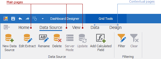
The Dashboard Designer’s Ribbon toolbar consists of two page categories:
- Main pages
- Contextual pages

The main pages include:
- Home
- Contains common dashboard commands that allow users to create a new dashboard and add dashboard items, add a title, save the created dashboard, and more.
- Data Source
- Contains commands used to create and edit data sources, calculated fields, and more.
- View
- Allows users to switch between built-in application themes.
Contextual pages contain commands related to a specific dashboard item. For instance, the contextual page commands on the image above are used to filter dashboard item data, execute layout operations, and so on.
Ribbon Elements
The Dashboard Designer’s Ribbon contains the following elements:

The table below lists these elements, their descriptions, and properties that affect element functionality and appearance.
Element | Description | Ribbon API |
|---|---|---|
Allows you to access the most important and frequently used features in the Dashboard Designer. | ||
Allows you to access the Dashboard Designer’s main menu. | ||
Contain common dashboard commands. | ||
Combines pages related to a specific dashboard item. | ||
Contain commands related to a specific dashboard item. | ||
Contain groups of bar item links within a Ribbon Page. | ||
Visual elements (for instance, command buttons, editors, submenus, and static text) displayed within the Ribbon. A Bar Item link refers to a specific bar item. |
Configure Ribbon at Design Time
Create Ribbon
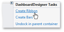
Click the DashboardDesigner‘s smart tag to create and initialize a Ribbon at design time within Visual Studio:

Select Create Ribbon in the invoked context menu to add the following visual and non-visual components:
- RibbonControl
- Creates a Ribbon toolbar with commands grouped into categories, pages, and page groups.
- BackstageViewControl descendant
- Emulates a menu found in Microsoft Office 2010-2016 products.
- DashboardPopupMenu
Allows you to customize Dashboard Designer’s popup menus at design time when you run the Run Designer command.

- DashboardBarAndDockingController
- Stores the Look and Feel, appearance, and customization settings of the Dashboard Designer. The
DashboardBarAndDockingControlleris a BarAndDockingController descendant. The DashboardDesigner.BarAndDockingController property allows you to access toDashboardBarAndDockingController. - DashboardBarController
- Supports the internal infrastructure.
- TextBoxEditorBarController
- Supports the UI of the Text Box dashboard item in edit mode.
Customize Ribbon
Click the RibbonControl smart tag and choose Run Designer to customize the Ribbon control. For more information on how to customize Ribbon items, the Quick Access Toolbar, popup menus, and more, see the following topic: Ribbon Control Designer.
Update Ribbon
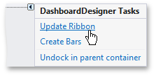
If your application already contains a Ribbon (for instance, from an earlier version of the Dashboard Designer), you can select the Update Ribbon menu item to update it:

The Update Ribbon command in the smart tag menu updates all elements related to the default ribbon created by the Dashboard Designer. If you customize default elements in the Ribbon and then use the Update Ribbon command, apply the same customizations after the update is complete.
Important
If you are upgrading your project to another major release, you should update the Ribbon.
Configure Ribbon at Runtime
Create Ribbon
Use the DashboardDesigner.CreateRibbon method to create and initialize a Ribbon in code. The Ribbon will appear at runtime.
Use the following code to obtain a RibbonControl instance:
using DevExpress.XtraBars.Ribbon;
//...
RibbonControl ribbon = dashboardDesigner.MenuManager as RibbonControl;
Customize Ribbon
Add Custom Page Groups
You can add new control elements to the current Ribbon instance. Use the DashboardDesignerBarExtensions class’ static methods to get the current Ribbon instance. The DashboardRibbonPage and DashboardBarItemCategory values specify the button’s position.
This example creates a new Custom Properties group on the Grid’s Design page and adds the Fix Columns button to it:
void AddBarItem(SvgImage svgImage) {
    RibbonControl ribbon = designer.Ribbon;
    RibbonPage page = ribbon.GetDashboardRibbonPage(DashboardBarItemCategory.GridTools, DashboardRibbonPage.Design);
    RibbonPageGroup group = page.GetGroupByName("Custom Properties");
    if(group == null) {
        group = new RibbonPageGroup("Custom Properties") { Name = "Custom Properties" };
        page.Groups.Add(group);
    }
    barItem = new BarCheckItem(ribbon.Manager);
    barItem.Caption = "Fix Columns";
    barItem.ImageOptions.SvgImage = svgImage;
    group.ItemLinks.Add(barItem);
    page.Groups.Add(group);
}
Refer to the following article for more information on how to integrate custom property functionality in a Dashboard: Create Custom Properties.
Add Custom Property Buttons
In this example, the Description button is added to the Dashboard group on the Dashboard’s Home page.
void AddBarItem(SvgImage barImage) {
    var page = ribbon.GetDashboardRibbonPage(DashboardBarItemCategory.None, DashboardRibbonPage.Home);
    RibbonPageGroup group = page.Groups.GetGroupByText("Dashboard");
    barItem = new BarButtonItem(ribbon.Manager, "Dashboard Description");
    if(barImage != null)
        barItem.ImageOptions.SvgImage = barImage;
    group.ItemLinks.Add(barItem);
}
Refer to the following article for more information on how to integrate custom property functionality in a Dashboard: Create Custom Properties.
Add Custom Item Buttons
Use the DashboardDesigner.CreateCustomItemBars method to add a custom item bar at runtime.
The CreateCustomItemBars method inserts a custom item’s bar into the Ribbon. Before you add a bar, make sure that you have registered the corresponding metadata type and created the Ribbon.
Call the CreateCustomItemBars method to add bars for all custom items whose metadata is registered. To add bars for the corresponding custom items, pass their metadata as the customItemMetadataTypes parameter.
using System.Windows.Forms;
using DevExpress.DashboardCommon;
using DevExpress.DashboardWin;

namespace TutorialsCustomItems {
public partial class Form1 : Form {
  public Form1(){
      InitializeComponent();
      dashboardDesigner1.CreateRibbon();
      dashboardDesigner1.CreateCustomItemBars();
    }
  }
}
Refer to the following article for more information on how to integrate custom items in a Dashboard: Create a Custom Item.
Hide Bar Items
You can remove items from the Ribbon’s Items collection to hide unnecessary commands. For example, the following code removes the Save As, Open, New, and Treemap commands:
using DevExpress.XtraBars;
using DevExpress.XtraBars.Ribbon;
using System.Collections.Generic;

namespace DXDashboardApp {
    public partial class DesignerForm1 : DevExpress.XtraBars.Ribbon.RibbonForm {
        public DesignerForm1() {
            InitializeComponent();
            dashboardDesigner.CreateRibbon();
            RemoveBarItems(dashboardDesigner.Ribbon);
        }
        private void RemoveBarItems(RibbonControl ribbonControl) {
            List<BarItem> itemsToRemove = new List<BarItem>();
            foreach (BarItem item in ribbonControl.Items) {
                if (item is DevExpress.DashboardWin.Bars.FileSaveAsBarItem) itemsToRemove.Add(item);
                if (item is DevExpress.DashboardWin.Bars.FileOpenBarItem) itemsToRemove.Add(item);
                if (item is DevExpress.DashboardWin.Bars.FileNewBarItem) itemsToRemove.Add(item);
                if (item is DevExpress.DashboardWin.Bars.InsertTreemapBarItem) itemsToRemove.Add(item);
            }
            foreach (BarItem item in itemsToRemove)
                ribbonControl.Items.Remove(item);
        }
    }
}