Data Paging
- 2 minutes to read
Data Paging Overview
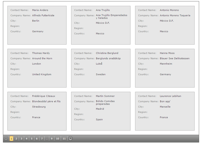
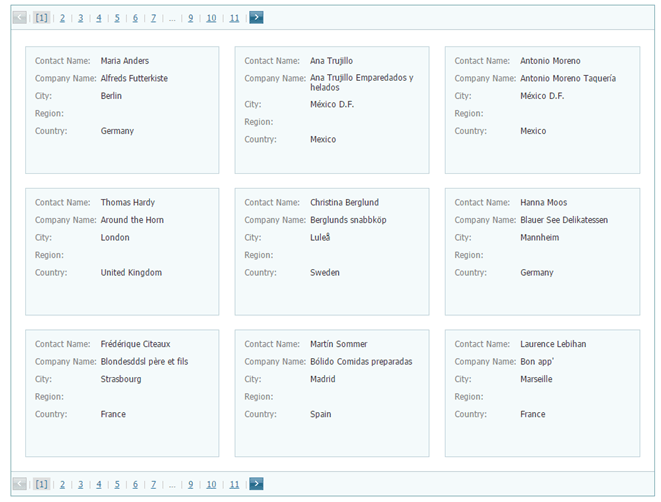
By default, the CardView automatically splits content across multiple pages and provides end-users with an embedded page navigation UI - Pager.

The built-in pager enables end-users to navigate through CardView data. It consists of navigation buttons: “next”, “last”, “previous”, “first”, “all”; an indicator that displays the current page number and the total number of pages, and a page size item allowing you to specify the maximum number of cards that can be displayed within a page. To access and customize pager settings, use the CardViewSettings.SettingsPager property.
The pager can be displayed above or below the cards, or on both sides.

Use the ASPxGridPagerSettings.Position property to specify the pager’s position within the CardView.
The maximum number of cards that can be displayed within a page, can be accessed by the CardViewFlowLayoutSettings.ItemsPerPage property, provided that the Settings.LayoutMode (see ASPxCardViewSettings.LayoutMode) property is set to Flow. In the Table layout mode, for this purpose, use the CardViewTableLayoutSettings.ColumnCount and the CardViewTableLayoutSettings.RowsPerPage properties.
To disable page-mode navigation and display all cards within a CardView, set the ASPxCardViewPagerSettings.Mode property to GridViewPagerMode.ShowAllRecords.
Navigation in Code
The CardView provides a client-side API that enables you to navigate a user to the location you desire. All these methods are listed in the following table.
| Member | Description |
|---|---|
| ASPxClientCardView.GotoPage | Navigates an end-user to the specified page. |
| ASPxClientCardView.NextPage | Navigates an end-user to the next page. |
| ASPxClientCardView.PrevPage | Navigates an end-user to the previous page. |
After the active page has been changed, the ASPxGridBase.PageIndexChanged event is raised.